


Houzz Tour: A Rejig Gives a Victorian Flat More Space and Light
Maximising daylight and reworking the floorplan gave this two-floor flat in a Victorian terrace a new lease of life

Sagging floors, cracked walls and a run-down interior meant this Victorian apartment was far from a desirable place to live when the owners called in architect Daniel Rees. As well as rectifying the structural issues, Daniel aimed to update and visually expand the space – but sympathetically.
Daniel dressed all of the windows in the flat, apart from the one in the bathroom, with roller blinds. “You don’t really see them,” he says, “and they fit nicely within the timber of the sliding sash windows, so when they roll down, you almost get a seal.”
In the living space, the blinds are opaque, but Daniel fitted blackout versions in the bedrooms.
Ritchie sofa, Made.com. Rugs, John Lewis.
In the living space, the blinds are opaque, but Daniel fitted blackout versions in the bedrooms.
Ritchie sofa, Made.com. Rugs, John Lewis.
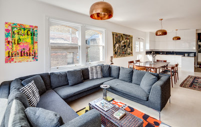
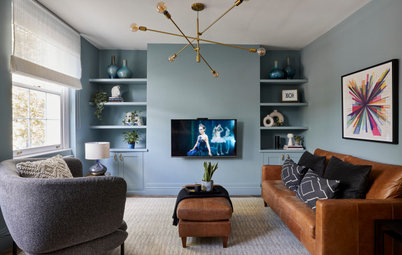
Daniel re-thought the flat’s colour scheme. “It felt quite small when we first went in,” he says. “Brightening up the walls and letting in as much light as possible made it feel a lot bigger.”
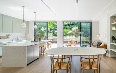
He helped the owners to select furniture with proportions to fit the open-plan living-dining space, and in a mix of styles to create a comfortable combination.
He helped the owners to select furniture with proportions to fit the open-plan living-dining space, and in a mix of styles to create a comfortable combination.
Rugs help to define the different zones of the room, and the pendant light above the dining table also helps to distinguish this area and give it a cosy atmosphere.
Albert pendant lamp, Made.com. Jerry dining table and chairs, Habitat. Artwork, MassifCentral.
Browse pendant lights in the Houzz Shop.
Albert pendant lamp, Made.com. Jerry dining table and chairs, Habitat. Artwork, MassifCentral.
Browse pendant lights in the Houzz Shop.
Daniel created an accent wall in the living room, using it as a backdrop to the TV and artwork. “Because it’s a simple room, it needed a little bit of animation,” he says.
The wall is shown off to best effect at the end of the day. “The sun hits it in the evenings and creates really nice shadows,” Daniel says. Neat, floating shelves create display space.
Wall painted in French Grey Dark, Little Greene.
The wall is shown off to best effect at the end of the day. “The sun hits it in the evenings and creates really nice shadows,” Daniel says. Neat, floating shelves create display space.
Wall painted in French Grey Dark, Little Greene.
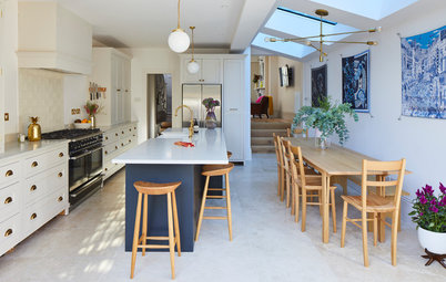
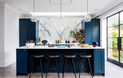
“We were going for a minimal look in the kitchen, but with a Shaker element to fit in with the Victorian style,” Daniel says.
He chose pale green for the base units, but the wall cabinets are white. “Keeping them in the same colour as the walls makes the kitchen feel bigger,” he says. The green, meanwhile, is both calming and refreshing.
To reduce the overall cost of the kitchen, the wall cabinets were from a less pricey supplier than the base units. “It’s better to spend money on the ones that get a lot of wear and tear,” Daniel says.
Hard-wearing quartz was chosen for the worktop and splashback.
Base units, British Standard. Wall units, Ikea.
Discover how to perfectly pair two different kitchen cabinet colours.
Daniel made sure there was a generous amount of kitchen storage relative to the size of the flat, which helps keep the open area free of clutter.
Rails above the worktop add further storage that makes items easy to grab. To accommodate small appliances such as the kettle and toaster without compromising preparation space, the surface is a deeper-than-usual 700mm.
Base units painted in Sage Green, Little Greene.
Rails above the worktop add further storage that makes items easy to grab. To accommodate small appliances such as the kettle and toaster without compromising preparation space, the surface is a deeper-than-usual 700mm.
Base units painted in Sage Green, Little Greene.
A solid wall originally separated the kitchen from the hallway, but Daniel opened this up with an internal window and glazed panels in the door. “It makes the kitchen feel bigger, as you can see part of the stairs,” he says.
The glass has the same opening-up effect on the narrow hall and stair area, too.
Wall painted in Obsidian Green, Little Greene. Voronoi pendant lights, Tala. Tap, Milano.
The glass has the same opening-up effect on the narrow hall and stair area, too.
Wall painted in Obsidian Green, Little Greene. Voronoi pendant lights, Tala. Tap, Milano.
The kitchen floor – like that in the rest of the open-plan living space – is made from ply. “We used a structural ply,” Daniel says. “It has a birch face, and spending a bit more for this meant we didn’t have to lay a whole new floor to get a timber finish.”
The same structural ply floor was used in the hallway, but here it was painted in a slate grey shade. “The colour difference creates separation between the rooms,” Daniel says.
Looking to revamp your home? Find professionals to help you achieve your dreams on Houzz.
Looking to revamp your home? Find professionals to help you achieve your dreams on Houzz.
The original staircase and banister were preserved during the refurbishment. Here, as throughout, new radiators sympathetic to the Victorian building were fitted.
Daniel created a new utility cupboard at the top of the stairs to house the washing machine, dryer and boiler.
“Before, the washing machine was in the kitchen, but a separate room means it’s not making lots of noise when the owners are watching TV or have friends round for dinner,” he says.
Cupboard painted in Blush, Little Greene.
“Before, the washing machine was in the kitchen, but a separate room means it’s not making lots of noise when the owners are watching TV or have friends round for dinner,” he says.
Cupboard painted in Blush, Little Greene.
The utility area was conceived as a dusky pink box. “The doors are flush, so it’s almost frameless,” Daniel says, “but you can see it’s something different.” The doors simply press open, so the effect is streamlined.
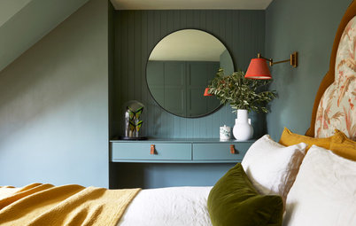
The upstairs of the flat was repartitioned to make the rooms a better size, creating two bedrooms of similar dimensions.
The bedrooms have the same ply flooring as the open-plan space below, with a colour change marking the distinct areas of landing and sleepspace.
Furniture in the same tone as the floor was chosen for the rooms.
Bed; Tatsuma Ash bedside table, both Habitat. Rug, Ikea.
Furniture in the same tone as the floor was chosen for the rooms.
Bed; Tatsuma Ash bedside table, both Habitat. Rug, Ikea.
Built-in wardrobes were finished in white to make them blend into the walls.
In the second bedroom, the bed is positioned in front of a the chimney breast. Daniel kept the structure in place, as the kitchen’s extractor ducting goes out of the home this way.
The slim alcoves either side are perfect for recessed shelving, which provides display space as well as storage. The items on the shelves add colour to the predominantly white scheme, chosen to keep the room looking as large as possible.
Tatsuma Ash chest of drawers, Habitat. ‘Enameled’ Warehouse pendant light, Zangra.
Tatsuma Ash chest of drawers, Habitat. ‘Enameled’ Warehouse pendant light, Zangra.
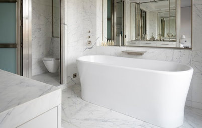
A wall-hung loo and basin make the small bathroom look more spacious. The mirror conceals storage, so the room isn’t cluttered.
The niche above the basin has a black metallic finish with an LED strip fitted to illuminate it, and creates a contrast with the crisp, white elements of the room.
The niche above the basin has a black metallic finish with an LED strip fitted to illuminate it, and creates a contrast with the crisp, white elements of the room.
Although the bathroom isn’t huge, the owners were keen to fit in a bath. They found a solution by choosing a shorter, 1,500mm design. “The plumbing dictated the layout,” Daniel says.
An LED strip light in the ceiling casts a soft glow over the shower area.
An LED strip light in the ceiling casts a soft glow over the shower area.
Large-format tiles were laid on the floor. “There are only two tiles,” Daniel says. “This eliminates grout lines to make it easier to clean the space.”
The combination of mosaic tiles behind the toilet and basin, an in-between size on the wall above the bath, and the big floor tiles, adds some texture and interest to the room.
The combination of mosaic tiles behind the toilet and basin, an in-between size on the wall above the bath, and the big floor tiles, adds some texture and interest to the room.
A glazed screen was put into the bathroom door, as the landing beyond was really dark. This way, light from the bathroom window filters deeper into the home.
The door handle is black with a copper edge, echoing the kitchen cabinet knobs. “Because we went for light paint throughout, it creates a good contrast and it’s more modern than chrome or stainless-steel,” Daniel says.
Handles, Karcher Design.
The door handle is black with a copper edge, echoing the kitchen cabinet knobs. “Because we went for light paint throughout, it creates a good contrast and it’s more modern than chrome or stainless-steel,” Daniel says.
Handles, Karcher Design.
Attention to detail is evident throughout the flat. “The thermostatic radiator valves fit in with the Victorian look,” Daniel says. “They look nicer than plastic.”
Tell us…
What do you think of this spacious flat? Let us know in the Comments section.
Tell us…
What do you think of this spacious flat? Let us know in the Comments section.

Sponsored
Who lives here? A professional couple
Location Victoria Park, east London
Property A converted Victorian terraced house
Size Two bedrooms and one bathroom
Architect Daniel Rees of REES Architects
Photos by Chris Snook
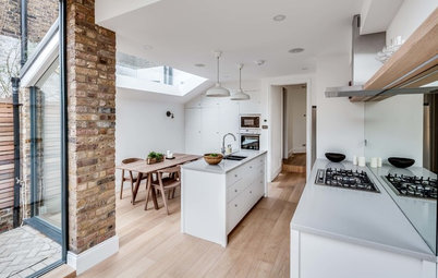
This Victorian flat in east London is laid out over two floors, with the living spaces on one, and two bedrooms and a bathroom on the level above. Daniel reworked the layouts on both floors to update the home.
Here on the lower level, he took down the wall separating the kitchen and living room, making the floorplan more open and allowing daylight from both aspects of the building into the space.