

Houzz Tour: A Traditional 1920s House is Sensitively Revived
A designer helps her clients add their personal style while respecting their home’s traditional 1925 architecture

A couple from Virginia, USA, saw great potential in this ‘foursquare’ (a two-storey, boxy house) in the city’s historic square, but they knew they had their work cut out for them. They called on Circle Design Studio, a firm they’d hired to renovate their previous home, to help give this one a refresh that respected the 1925 architecture.
Interior designer Emily Borg worked closely with the couple to preserve the home’s historic details while making the layout and style functional for them. The result is a fresh and personal mix of styles that works well with the traditional home.
Interior designer Emily Borg worked closely with the couple to preserve the home’s historic details while making the layout and style functional for them. The result is a fresh and personal mix of styles that works well with the traditional home.
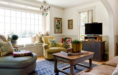
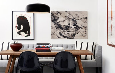
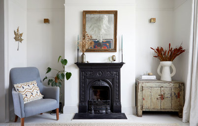
Emily was able to strike a balance between highlighting the architectural features of the home while updating it with a mix of furniture and accessories. One way she accomplished this was through light fixtures. She helped her clients choose fixtures that presented timeless shapes and finishes in a fresh, modern way.
The mouldings in this room are original, including the picture rails and wainscoting. Emily added a ceiling rose around the light fixture. “A ceiling [rose] is of the period, but we kept it more modern by streamlining it,” she says.
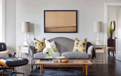
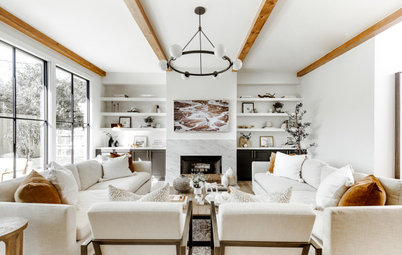
The homeowners brought much of their existing furniture with them and Emily helped them to incorporate new pieces to tie everything together. For example, they already had the living room sofa and Emily helped them find the right coffee table and channel-tufted leather armchairs to complement it.
Find a local design & build firm on Houzz.
The mouldings in this room are original, including the picture rails and wainscoting. Emily added a ceiling rose around the light fixture. “A ceiling [rose] is of the period, but we kept it more modern by streamlining it,” she says.
The homeowners brought much of their existing furniture with them and Emily helped them to incorporate new pieces to tie everything together. For example, they already had the living room sofa and Emily helped them find the right coffee table and channel-tufted leather armchairs to complement it.
Find a local design & build firm on Houzz.
“My clients had found the fabulous chartreuse chair at a thrift store,” Emily says. In addition to working with existing furniture, she helped them source art to fill out their collection.
“We wanted to take advantage of the picture rail in here,” she says. “I knew they liked artwork that reminded them of places they’d lived and loved, so we found some art that reflected Roanoke and Washington, DC, as well as a map of Nova Scotia – they had fond memories of a vacation there.”
Wainscoting and pocket door painted in Knitting Needle; ground floor walls painted in Gossamer Veil, both Sherwin-Williams.
Original double pocket doors separate the living room from the dining room. The team sanded off the paint to get to the original wood. “Our clients loved the honey tones in the original doors in the house,” Emily says. “We used a water-based seal to maintain this. A traditional oil sealant could have deepened the colour and made it appear more reddish.”
The red oak floors are original. The team used an oil-based sealant on them to help enhance the contrast between the tones of the floors and doors.
The red oak floors are original. The team used an oil-based sealant on them to help enhance the contrast between the tones of the floors and doors.
The clients already had the dining room furniture. “The chairs were another thrift find,” Emily says. “They were perfect with the couple’s chartreuse velvet cushions that connect them to the living room chair.”
She found the landscape painting that serves as a focal point. An oriental rug with lots of red tones warms the room and plays nicely off the chartreuse cushions.
The faceted light fixture is mercury glass. “They’d ordered a light they found online that looked nothing like they thought it would, so I found this one for them,” Emily says. “It turned out to be one of their favourite things in the whole house. It looks so good at night that neighbours who’ve seen it while walking by ask them about it.”
The original wide moulding around the windows and on the skirting boards is another traditional asset. And check out the beautiful original picture window with diamond-pane sidelights on the right.
The built-in cabinets on the left are original, but Emily replaced the partial wall on the right with a bar that connects the kitchen and dining room. Past the fridge there’s a boot room and pantry cupboard.
After adding the new bar on the right, Emily connected it to the original built-in cupboards on the left by repeating the columnar posts and wainscoting.
After adding the new bar on the right, Emily connected it to the original built-in cupboards on the left by repeating the columnar posts and wainscoting.
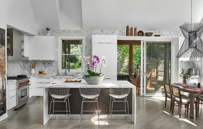
In the couple’s previous home, Emily had helped them with a two-tone cabinet scheme in grey and white. “They wanted to do two-tone again, but do it in a different way with wood,” she says. They landed on maple with a nice light tone, which works well with the red oak floors.
The wall cabinets and splashback are white. “The [metro] tiles are elongated, which updated this traditional element,” Emily says. “They’re almost pearlescent, which helps to make this such a light and airy kitchen.” The tiles also have a handmade, tumbled look that adds character. The worktops are quartzite, a natural stone with a marble-like look that’s more durable than marble.
The wall cabinets and splashback are white. “The [metro] tiles are elongated, which updated this traditional element,” Emily says. “They’re almost pearlescent, which helps to make this such a light and airy kitchen.” The tiles also have a handmade, tumbled look that adds character. The worktops are quartzite, a natural stone with a marble-like look that’s more durable than marble.
“These windows give the kitchen such great light,” Emily says. To enhance the airy feel, the homeowners were amenable to the idea of open shelving in the kitchen. They’d also shared lots of inspiration photos they liked that had art rails.
“I knew we couldn’t do deep floating shelves here because of the sink placement,” Emily says. “I found a source for these brass railings in Pennsylvania and we all thought they were really neat. I drew up a quick sketch of how they could work with the maple wood and the art, plants and knick-knacks my clients love and the result is unique.”
The long lower shelf provides a natural edge for the splashback, and Emily topped off the wall with an art light centred between the windows.
The splashback behind the cooker has special local significance. “These bricks were the original street paver bricks in Roanoke,” Emily says. “They have little star details that make them very recognisable, and people here know and love these bricks.” The homeowners found them in the garden, and the co-owner of the design & build firm, John Dorlini, came up with the idea to use them as a splashback.
This was a challenge, but it paid off. Because these are bricks and not a thin veneer, the wall behind the range had to be notched out so the bricks could line up with the rest of the splashback. “This detail makes the kitchen feel very personal and connected to Roanoke,” Emily says.
This was a challenge, but it paid off. Because these are bricks and not a thin veneer, the wall behind the range had to be notched out so the bricks could line up with the rest of the splashback. “This detail makes the kitchen feel very personal and connected to Roanoke,” Emily says.
The first floor has a guest bedroom and this bathroom. “Our clients wanted a bit of moodiness, so we went with a dark blue on the walls and ceiling,” Emily says. “It provides a nice contrast to the white tiles.
“They also wanted to mix the traditional style of the home with some modern touches,” she continues. “So while a console basin is of the home’s historic period, its clean lines are more modern.” The aged brass on the mirror and vintage print’s frame add some patina and age to the space.
Because this is a guest bathroom and there’s a cupboard right outside the door, they didn’t need much storage in here. The area around the basin’s edge and the ledge on the mirror provide spots for toothpaste and other travel-size toiletries.
Walls and ceiling painted in Naval, Sherwin-Williams.
The homeowners’ wishes for their primary bathroom informed the colour palette for the entire suite. “One of the homeowners loves green and she wanted to do something fun, different and more dramatic than usual in the bathroom,” Emily says. They landed on these beautiful tiles that bring in a variety of green tones.
“In their old house, the whole family shared one bathroom, so that made them want as much storage as possible,” Emily says. “And while I first suggested a trough sink, they knew they didn’t want to share!” She gave them two basins, maximised drawer space and added two recessed mirrored medicine cabinets for additional storage. The worktop is quartz.
The flooring is a through-body porcelain with a slate-like look. “This is highly durable, but through-body means it’s the same colour all the way through, so any chips or other damage won’t really show,” Emily says. “We chose [30cm x 60cm] tiles that require less grout, which means less to clean.”
The shower walls are also covered in large-scale tiles, this time in a lighter colour. “They didn’t want a glass shower surround because they didn’t want to deal with keeping it clean, so we closed it in,” Emily says.
There’s a rain shower head, a fixed shower head and a handheld wand. Emily placed the thermal controls on the left, so the bather can reach in and turn on the water without getting wet.
The shower floor is from the same line as the main bathroom floor, but in a smaller mosaic version. Emily gave the niche clean contrasting edges with dark-coloured Schluter strips.
“We pulled together the bedroom in response to the green tiles,” Emily says. “The owners brought two dressers with them, but I helped them put together everything else in the room.” The linen curtains and the rug pick up on the green hues, while the warmer tones provide complementary colours.
Natural materials such as the woven bench, rattan bedside tables and wood bed, work well with the green.
The mirror’s reflection reveals Emily’s use of another ceiling rose around the light fixture.
The mirror’s reflection reveals Emily’s use of another ceiling rose around the light fixture.
Off the bedroom was a porch that had been enclosed during a previous renovation. The team transformed it into a relaxing sitting room for reading. They also added a large wardrobe to the couple’s bedroom suite.
“At the time we were working on the project, their four-year-old daughter’s favourite colour was blue,” Emily says. The couple first considered painting the existing wainscoting blue and the walls and ceiling white, but then realised that children’s favourite colours are likely to change on a whim. Because it’s much easier to repaint flat walls than it is to get into all those little crevices on the wainscoting, they switched their strategy. The wainscoting can stay white and they can change the walls to any other colour of the rainbow in the future with much more ease.
After finding this cute chandelier, Emily knew painting the ceiling blue, too, would help it to stand out. She added more colours to the space through fun curtains, tassels on the duvet and a rug. This photo also shows the beauty of the original honey-toned wood doors.
Walls and ceiling painted in Blue Whirlpool, Sherwin-Williams.
Looking through her clients’ inspiration photos, Emily gleaned that they were drawn to dark cabinetry, white marble and very clean-looking tiles. Because of the door’s placement, she knew she needed a vanity unit that was shallower than the standard. She was able to find a ready-made unit just 48cm deep. This was a perfect fit and was already painted dark blue, saving on the budget. This served as the jumping-off point for the colour palette.
From there, Emily set out to find a floor tile that would have a degree of playfulness for the young girl. “My clients loved the geometric tiles I found and they provided a nice juxtaposition to the traditional and timeless marble look around the tub,” she says.
Tell us…
What do you love about this home makeover? Share your thoughts in the Comments.

Sponsored
Who lives here? A couple and their young daughter
Location Roanoke, Virginia, USA
Size Five bedrooms and three bathrooms (279 sq m)
Design & build company Theresa and John Dorlini of Circle Design Studio
Interior designer Emily Borg of Circle Design Studio
‘After’ photos by Kip Dawkins
First a word about the condition of the house in the ‘before’ photos. One of the homeowners is an estate agent and snapped up the house before it hit the market. So the state of it in these photos reflects the organising and packing up of a lifetime’s worth of belongings that was underway when the design and build firm popped in to start its planning.
The home had undergone a few renovations and an extension over the decades, and at one point it had been a duplex. But the beautiful architectural details, such as woodwork and pocket doors, were intact. It was these kinds of details and the location in the town square that drew the homeowners to the house.
Emily’s previous work with the homeowners gave her a running start, as she already understood their style. “When I worked with these clients before, they lived in a ranch house and were more interested in midcentury modern style,” she says. “But they knew with this house they wanted to lean into the traditional style of the architecture.”