


Houzz Tour: A Victorian Terraced House with a Modern Twist
Clever use of colour and pattern helps this property combine both period and ultra-modern design

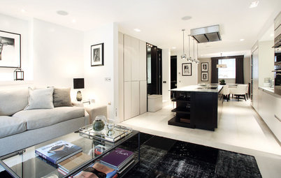
When interior designer Bunny Turner and her husband decided to renovate their family home, they wanted to create a series of distinct spaces that flowed easily from one to another. They achieved it by using subtle colour changes that both link and separate the rooms, and highlighted divisions with bold pattern.
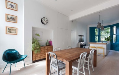
The biggest challenge was opening up their low-ceilinged kitchen, but with the help of architects Carmody Groarke, they found a solution. By lowering the kitchen’s floor by a whole metre, they could build a modern, gallery-like room that packs a punch and stands out from the rest of the home’s cosy period interior.
The biggest challenge was opening up their low-ceilinged kitchen, but with the help of architects Carmody Groarke, they found a solution. By lowering the kitchen’s floor by a whole metre, they could build a modern, gallery-like room that packs a punch and stands out from the rest of the home’s cosy period interior.
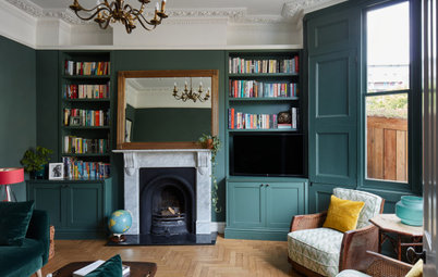
The Julio Rondo painting over the fireplace is a favourite of Turner’s. ‘I love how the looseness of it contrasts with the formal layout of the room,’ she explains.
The artworks on the right are by The Little Artists, who reproduce famous artworks and artists in Lego. The top one is Damien Hirst’s shark, while at the bottom are Gilbert and George.
The artworks on the right are by The Little Artists, who reproduce famous artworks and artists in Lego. The top one is Damien Hirst’s shark, while at the bottom are Gilbert and George.
Turner found this vintage trolley at Kempton Antiques Market and painted it white, so it would stand out against the dark blue walls. ‘It’s now become a very useful drinks trolley,’ she says. The lamp’s shade adds to the room’s yellow accents, while the base was deliberately chosen for its texture and colour.
Discover why you should add a splash of yellow to your interior
Discover why you should add a splash of yellow to your interior
As the living room is small, Turner didn’t want to fill it with floor-to-ceiling, built-in shelving, so she opted for freestanding cabinets instead. They give an airier feel and mean she can display interesting pieces on top.
The two rectangular armchairs sit snugly between the cabinets; each has its own wall light to help with reading. The animal skull and white ceramics provide a crisp, textured contrast to the walls.
Wall lamps, Lampe Gras.
The two rectangular armchairs sit snugly between the cabinets; each has its own wall light to help with reading. The animal skull and white ceramics provide a crisp, textured contrast to the walls.
Wall lamps, Lampe Gras.
The armchair is a family heirloom that Turner had reupholstered in a fun yellow pattern. So as not to distract from this and let it speak for itself, she chose a sisal rug in a neutral pattern, so it adds texture to the room without overshadowing the chair.
Behind the chair you can just make out the TV screen. ‘Dark walls are very useful for hiding screens,’ Turner says.
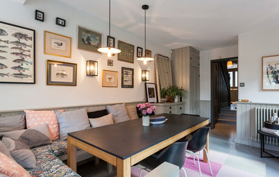
The hallway study, on the left in this photo, is separated from the calm living room by a glazed Crittall screen.
Chair fabric, Tissus d’Hélène. Triangle rug, Tim Page.
Behind the chair you can just make out the TV screen. ‘Dark walls are very useful for hiding screens,’ Turner says.
The hallway study, on the left in this photo, is separated from the calm living room by a glazed Crittall screen.
Chair fabric, Tissus d’Hélène. Triangle rug, Tim Page.
The couple wanted the feeling of flow an open-plan house provides, but with the option of dividing the rooms for privacy. The Crittall screen was the perfect practical solution. The added bonus here is that it allows a kickback of light to shine into the living room from the south-facing kitchen at the bottom of the staircase.
Hallways and landings can feel transient, so Turner chose the bold-patterned wallpaper to give this space more of a considered feel.
Next to the desk is a beautiful, multi-exposed still of a mountainscape by Richard Friend. Whoever is working at the desk can choose whether to use it as a quiet backdrop, or a contemplative piece in which to lose themselves.
Hicks Hexagon wallpaper, Cole & Son.
Next to the desk is a beautiful, multi-exposed still of a mountainscape by Richard Friend. Whoever is working at the desk can choose whether to use it as a quiet backdrop, or a contemplative piece in which to lose themselves.
Hicks Hexagon wallpaper, Cole & Son.
The antique mirror behind the desk increases the feeling of space and reflects the colour scheme of the living room next door. Its mottled finish gives the area a softer light, so it won’t distract.
The desk is a combination of two units and a white tabletop from Ikea that you can mix and match to fit your space.
Drawers and cabinet, Alex; white table top, Hissmon, all Ikea.
Find more ways to decorate with antique glass
The desk is a combination of two units and a white tabletop from Ikea that you can mix and match to fit your space.
Drawers and cabinet, Alex; white table top, Hissmon, all Ikea.
Find more ways to decorate with antique glass
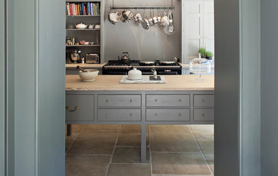
The couple designed the staircase that leads down to the kitchen with sharp edges to reflect the modern look of the cabinetry. They’ve tied it in with the rest of the house by using the same pine that runs throughout.
Photographs line the stairs and are a mixture of very old family photographs and more recent ones. Turner says she couldn’t bear the thought of them gathering dust in boxes and wanted her kids to be surrounded by family memories.
‘Hallways are often neglected,’ she says. ‘But as you don’t spend a lot of time in them, you can actually be braver with your design.’
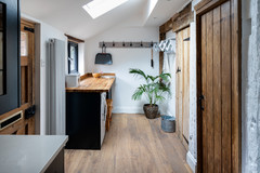
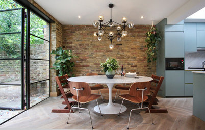
The original kitchen had a low ceiling, which gave it a dingy feel. The architect’s proposal to lower the floor by a metre presented the couple with a dilemma, as it didn’t add square footage to the house. However, Turner thinks it was the best decision they made, as it completely changed the feeling of the room.
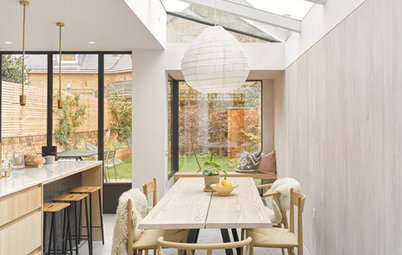
Extending into the side return did add to the space, though, and the result is a bright and sociable room with views of garden. The polished concrete floor inside leads out to trowelled concrete on the patio, adding to the feeling of flow Turner wanted for the whole house.
Extending into the side return did add to the space, though, and the result is a bright and sociable room with views of garden. The polished concrete floor inside leads out to trowelled concrete on the patio, adding to the feeling of flow Turner wanted for the whole house.
‘We really splashed out on the lights,’ says Turner of the sculptural and practical pendants above the island. The ceiling can be seen from the study area at the top of the stairs, so the couple wanted to keep it clean and avoid downlights. These striking pendants work as very bright task lights, and can also be dimmed to create mood lighting for dining.
Tube Chandelier lights, Michael Anastassiades.
Tube Chandelier lights, Michael Anastassiades.
The table is made from antique pine and softens the room. Red metal café chairs add a shot of bold colour, while the animal skins provide some extra softness.
Above the table was a large blank wall that needed to be filled. The couple have a much-loved whippet, so this shot of greyhound racing, which they commissioned a photographer friend to take, pays homage to him.
Red A chairs, Tolix.
Above the table was a large blank wall that needed to be filled. The couple have a much-loved whippet, so this shot of greyhound racing, which they commissioned a photographer friend to take, pays homage to him.
Red A chairs, Tolix.
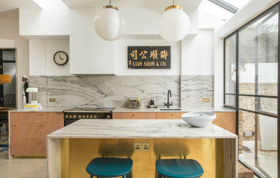
The side return was fitted with a right-angled roof and windows that run along the tops of the cupboards.
The units are a minimal design given a touch glamour with Carrara marble worktops and cladding at the rear of the island.
Voxtorp kitchen, Ikea.
The units are a minimal design given a touch glamour with Carrara marble worktops and cladding at the rear of the island.
Voxtorp kitchen, Ikea.
The couple decided to be bold with their daughter’s bedroom and chose a bright red patterned wallpaper. Turner sourced a calico fabric for the Roman blind that exactly matched the grey woodwork. She picked up the room’s colour scheme by adding a simple line of red and white braiding.
Squiggle wallpaper by Vivienne Westwood, Cole & Son.
Check out more ideas for decorating a teenager’s bedroom
Squiggle wallpaper by Vivienne Westwood, Cole & Son.
Check out more ideas for decorating a teenager’s bedroom
The guest bedroom has inky blue walls and calm tones of green in the fabrics. It’s a sunny room and incredibly cosy. The oil barrel bedside table adds an eclectic look to the room and makes it feel less formal.
Headboard fabric, Carnival from Christopher Farr. Walls painted in Squid Ink, Paint & Paper Library.
Headboard fabric, Carnival from Christopher Farr. Walls painted in Squid Ink, Paint & Paper Library.
A peg rail, painted in the same colour as the wall, hangs above a blanket box to provide a space for guests to hang their clothes without taking up too much room.
Ottoman fabric, Carnival from Christopher Farr.
Ottoman fabric, Carnival from Christopher Farr.
Turner chose woollen curtains, which, together with the red wool fabric on the bed, add warmth to the master bedroom. A flatweave rug zones the bed area and is soft underfoot. A dressing room is next door, so with no need for bulky storage, the couple could afford the luxury of a sofa at the foot of the bed.
Walls painted in Hardwick White, Farrow & Ball. Bed fabric, wool in Ladybird from Warwick. Curtains, Kirkby Design.
Walls painted in Hardwick White, Farrow & Ball. Bed fabric, wool in Ladybird from Warwick. Curtains, Kirkby Design.
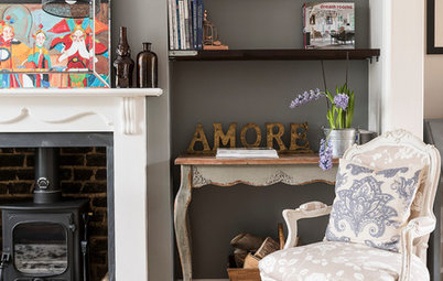
The fireplace isn’t used, so to prevent it looking cold and empty, Turner filled it with logs. The opaque frame around the large mirror above gives it an unobtrusive quality and makes it look more like a painting.
Mirror, Julian Chichester. Cupboards, OKA.
Mirror, Julian Chichester. Cupboards, OKA.


Sponsored
Who lives here Interior designer Bunny Turner with her husband, their three children and their pet dog
Location Brook Green, west London
Property A Victorian terraced house
Size 4 bedrooms, 3 bathrooms
Designer Bunny Turner of Turner Pocock
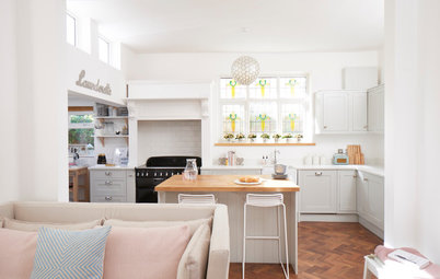
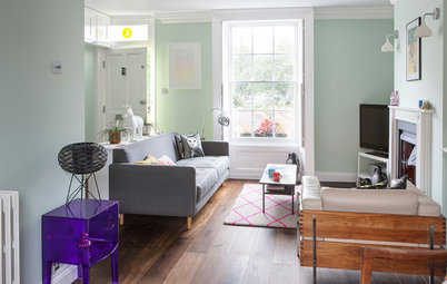
The living room is north-facing, so it’s naturally dark. ‘I have a mantra,’ explains Bunny Turner. ‘Don’t try to work against nature.’ Instead, the couple concentrated on making the room warm and inviting. The walls are painted in a rich blue that’s wonderfully cosy.
It’s the main relaxing area, so it was essential to ensure there were plenty of seats for guests. The teal herringbone sofa in the bay along with the yellow accents add brighter tones to the room.
Walls painted in Hague Blue, Farrow & Ball.