


Houzz Tour: An Edwardian Home is Lifted by Soft Tones and Texture
Layering materials, from soft neutral paints to textured fabrics, has given this home warmth and depth
Amanda Pollard
12 August 2019
Senior Editor at Houzz UK and Ireland. Journalist and editor specialising in interiors and architecture.
Senior Editor at Houzz UK and Ireland. Journalist and editor specialising in interiors... More
This Edwardian property was quite dark and traditional when the owners moved in. They hoped to create a cooler, calmer feel with plenty of texture, so they hired interior designer Sara Slade to help.
“They’re creative people, so I wanted to help them design a home to reflect that,” Sara says. “We worked closely together to create a space that perfectly suited their personalities and tastes.”
“They’re creative people, so I wanted to help them design a home to reflect that,” Sara says. “We worked closely together to create a space that perfectly suited their personalities and tastes.”
House at a Glance
Who lives here? A couple with two grown-up children at university
Location Cambridge
Property An Edwardian house
Size Three bedrooms (with two further bedrooms converted into a dressing room and study) and three bathrooms
Designer Sara Slade of Sara Slade Interiors
Specialist decorators Faux Creation
Photos by Jonathan Bond Photography
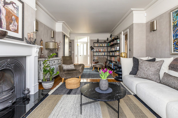
Texture and a natural palette were both key when it came to designing this Edwardian home. In the living room, Sara added an unusual textured backdrop with the help of specialist decorators Faux Creation, who gave the walls a concrete effect below the picture rail.
“There are five different colours that they built up in layers to give a soft, washed look,” Sara explains.
Who lives here? A couple with two grown-up children at university
Location Cambridge
Property An Edwardian house
Size Three bedrooms (with two further bedrooms converted into a dressing room and study) and three bathrooms
Designer Sara Slade of Sara Slade Interiors
Specialist decorators Faux Creation
Photos by Jonathan Bond Photography
Texture and a natural palette were both key when it came to designing this Edwardian home. In the living room, Sara added an unusual textured backdrop with the help of specialist decorators Faux Creation, who gave the walls a concrete effect below the picture rail.
“There are five different colours that they built up in layers to give a soft, washed look,” Sara explains.
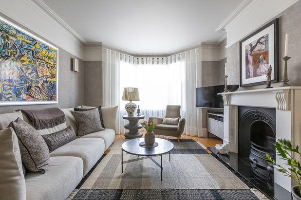
“We also added texture with rugs and fabric,” Sara says. “These two handmade rugs are made by adding layers to create a patchwork effect.”
The oak flooring has an orange tone, but it would have been too much of an upheaval to replace them, so the rugs help to tone down the hue.
At the window are sheer voiles to diffuse the light, with Roman blinds behind for privacy.
Rugs, Nanimarquina. Voile curtains, Osborne & Little. Curtain track, Silent Gliss. Coffee table, Gubi. Sofa, Ligne Roset.
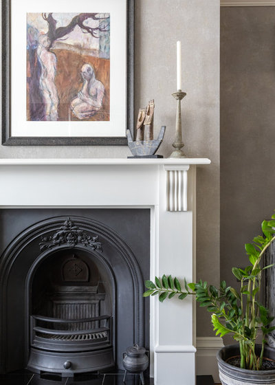
An orangey wood fireplace surround was painted in an off-white. “All the white throughout the house is a slight off shade,” Sara says.
Fireplace surround painted in Slate 1, Paint & Paper Library.
Fireplace surround painted in Slate 1, Paint & Paper Library.
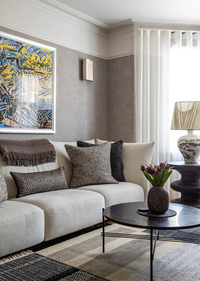
Traditional, chandelier-style wall lights were replaced with contemporary designs. “The house is flooded with light during the day and the owners wanted to have a nice soft glow in the evening,” Sara says. “We avoided pendants and complemented a few downlights with wall lights and lamps.”
Wall lights, Porta Romana.
Wall lights, Porta Romana.
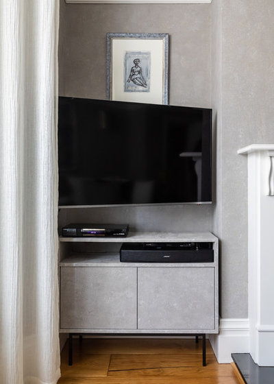
A TV unit was designed to fit discreetly in an alcove. The cabinet was made from MDF and finished with the same specialist effect as the walls.
“We raised it off the floor with handmade metal legs, so it doesn’t look too boxy,” Sara says.
“We raised it off the floor with handmade metal legs, so it doesn’t look too boxy,” Sara says.
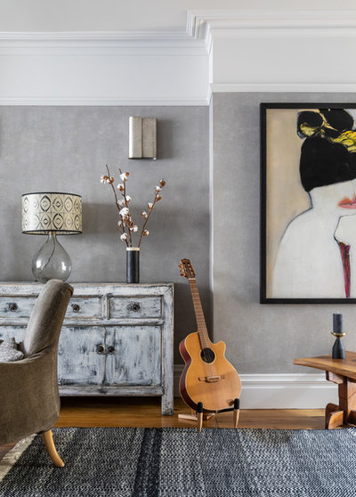
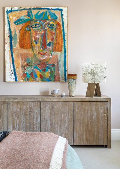
The owners have a number of unique furniture pieces and artworks, and the subtle colour scheme and textured walls frame these beautifully.
Find a local interior designer to help manage the transformation of your home.
Find a local interior designer to help manage the transformation of your home.
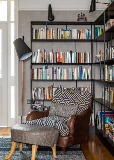
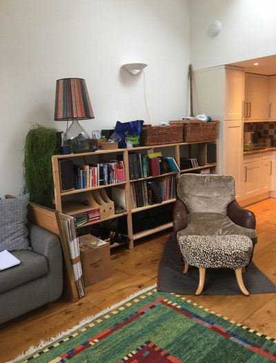
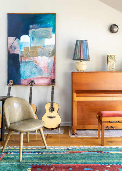
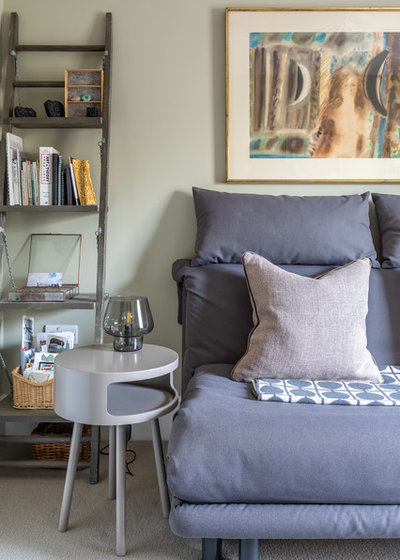
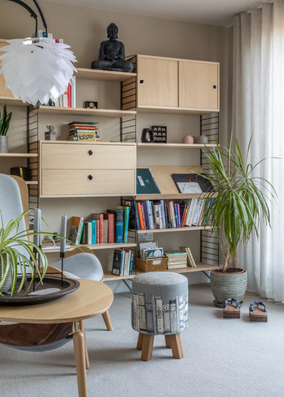
A reading nook at the rear of the living room is surrounded by metal shelving. “We originally quoted to design bespoke metal shelving, but it was very expensive,” Sara says. “So we found these bookshelves and put wall lights above to make them look built-in.”
Bookshelves, Pols Potten.
Bookshelves, Pols Potten.
The kitchen is located in the centre of the ground floor, with the sitting room at the front and a large open dining area at the rear.
Before Photo
The opening to the kitchen felt quite dark before the redesign. Sara left the cabinets in place, but focused on brightening up the space.
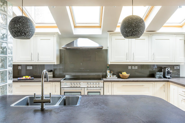
An orangey wood worktop and turquoise tiled splashback weren’t to the owners’ taste, so Sara updated these key elements.
“Our specialist decorators used a plaster technique to cover the wooden worktops to create a concrete effect,” she says. “We also hired a local glazing company to install a slate grey painted glass splashback.”
“Our specialist decorators used a plaster technique to cover the wooden worktops to create a concrete effect,” she says. “We also hired a local glazing company to install a slate grey painted glass splashback.”
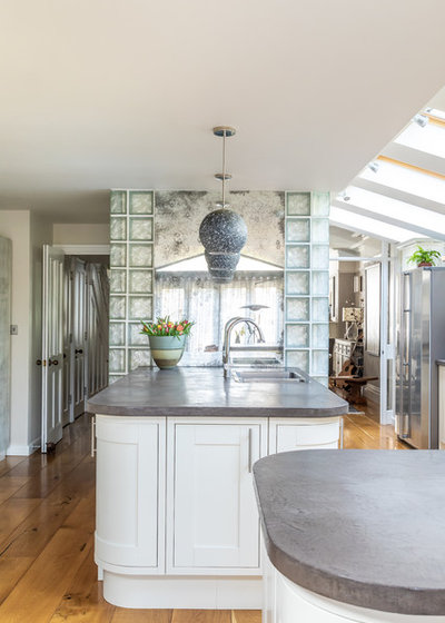
A wall of glass bricks had previously been installed to the side of the island, with a blue section in the centre. Sara covered the coloured bricks with a foxed mirror, which subtly reflects the light and looks less shiny than plain glass.
Pendant lights, Porta Romana.
Pendant lights, Porta Romana.
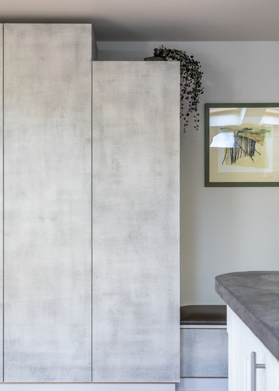
Along the opposite wall, Sara built a run of useful tall cabinets with an adjacent bench seat. The left-hand cupboard is for coats, while a heated rail inside the right-hand one is used for drying washing.
“Staggering the heights of the cupboards created an interesting look,” Sara says. “It’s also practical, as it allowed us to add vents to the top of the drying cabinet.”
The surfaces were given a similar finish to the concrete-effect walls in the living room, but with slightly different colours.
Walls painted in Slate III, Paint & Paper Library.
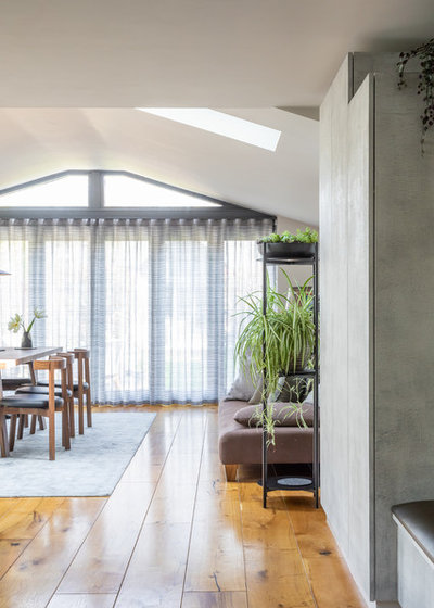
To add a cooler layer of colour to the oak floor, Sara had a comfortable rug made in anthracite grey for the dining area. A corridor of wooden floor creates a pathway from the kitchen to the garden, and the owners’ sofa provides a cosy place to relax.
Rug, Jacaranda. Sofa, owners’ own.
Rug, Jacaranda. Sofa, owners’ own.
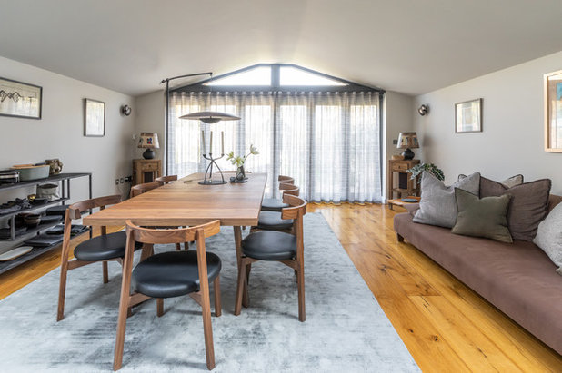
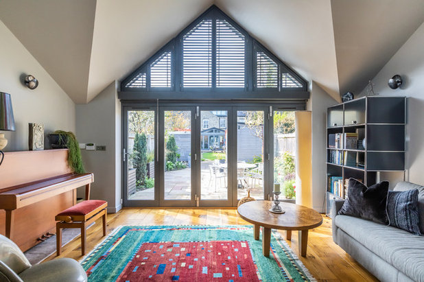
The glazing goes right up to the top of the slanted ceiling and lets in plenty of light. Sara added a voile fabric below with a very subtle shimmer to give a cosy feel to the room in the evening. She also fitted some roller blinds, which sit right back against the frame and pull down if the owners want some extra privacy.
Curtain fabric, Zimmer + Rohde. Cushions covered in fabric from de Le Cuona and Designers Guild.
Curtain fabric, Zimmer + Rohde. Cushions covered in fabric from de Le Cuona and Designers Guild.
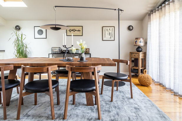
A midcentury-style dining table and chairs provide plenty of room for guests. “It’s always better to go for a few large pieces of furniture, rather than lots of smaller ones,” Sara advises.
A huge floor lamp hangs over the table in place of a pendant and gives off a warm, diffused light. “We couldn’t really put a pendant light here, as the ceiling goes up into the eaves,” Sara says.
Ginger floor lamp, Marset. Tadeo table in oiled nut wood, Walter Knoll. Dining chairs, Heal’s.
A huge floor lamp hangs over the table in place of a pendant and gives off a warm, diffused light. “We couldn’t really put a pendant light here, as the ceiling goes up into the eaves,” Sara says.
Ginger floor lamp, Marset. Tadeo table in oiled nut wood, Walter Knoll. Dining chairs, Heal’s.
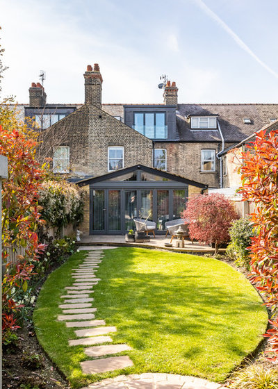
The patio door frames were originally orangey wood, so Sara’s specialist decorators painted them dark grey to tone in sympathetically with the grey hues of the traditional Cambridge brick.
“They took a whole week to paint, as lots of layers needed to be added to avoid chipping,” she says.
“They took a whole week to paint, as lots of layers needed to be added to avoid chipping,” she says.
Before Photo
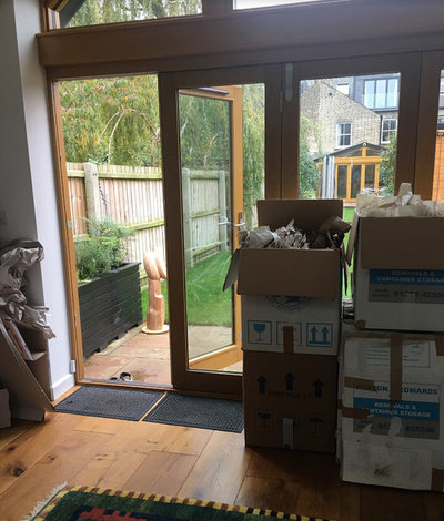
This ‘Before’ photo shows the door frames as they were previously.
At the end of the garden is a cabin, which the husband uses as his workspace and music room. The doors were again painted grey and, as this is also used as a guest room, Sara installed shutters at the top for privacy.
A box, painted in the same colour as the frames, was fitted along the top of the doors to conceal roller blinds.
Modular shelving, USM.
A box, painted in the same colour as the frames, was fitted along the top of the doors to conceal roller blinds.
Modular shelving, USM.
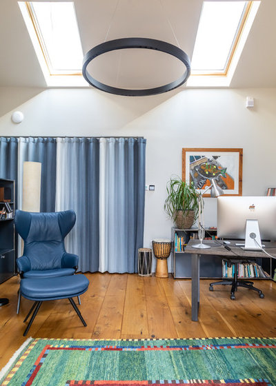
The owners already had the brightly coloured rug, and Sara introduced more colour with the blue armchair and footstool.
Freestanding storage furniture and a desk maintain the open feel the owners love, and a huge pendant provides plenty of light.
A kitchen is hidden away behind a curtained screen to keep the room calm and clutter-free.
Walls painted in Slate IV, Paint & Paper Library. Curtains, Designers Guild. Blue armchair and footsool, Cassina.
More of the couple’s artwork adds character and colour to the garden room.

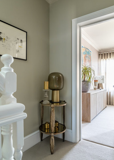
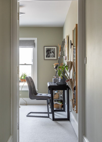
Back in the main house, a simple hallway scheme is complemented by the owners’ console table, which fits nicely into the narrow space.
A previous owner had fitted stained glass into the front door – Sara replaced the cobalt blue panels in the corners with a more subtle green. She also painted the door and added aged bronze hardware.
Light, Porta Romana.
A previous owner had fitted stained glass into the front door – Sara replaced the cobalt blue panels in the corners with a more subtle green. She also painted the door and added aged bronze hardware.
Light, Porta Romana.
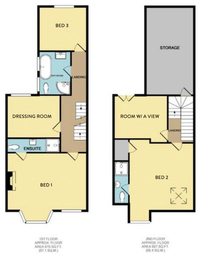
On the two upper floors are three bedrooms, a dressing room and a study, as well as a main bathroom and two en suites.
A natural-toned wool carpet covers all of the upstairs rooms.
Carpet, Crucial Trading. Walls painted in Wattle IV, Paint & Paper Library.
Carpet, Crucial Trading. Walls painted in Wattle IV, Paint & Paper Library.
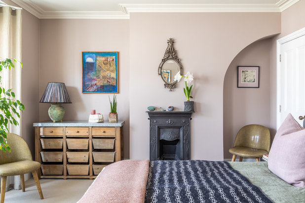
Sara gave the master bedroom a soft feel by choosing a plaster pink colour for the walls. She also picked out some beautiful mismatched linens for the bed, adding textural interest to the space.
The couple didn’t want standard storage, so Sara suggested moving their wooden drawer unit into here from the hallway.
Walls painted in China Clay Dark, Little Greene. Bed linen, By Mölle.
The couple didn’t want standard storage, so Sara suggested moving their wooden drawer unit into here from the hallway.
Walls painted in China Clay Dark, Little Greene. Bed linen, By Mölle.
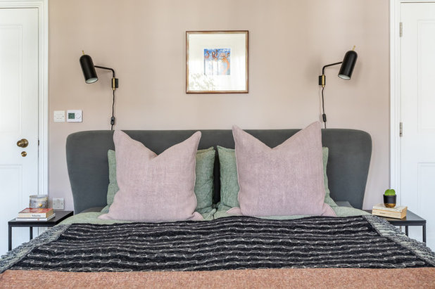
The couple’s large bed was a tight fit in the room, but Sara got around this by sourcing thin bedside tables and installing overhead wall lights.
Voile curtains frame the bay window and diffuse the light, while Roman blinds provide privacy.
Blinds, de Le Cuona. Voile curtains, Osborne & Little.
Blinds, de Le Cuona. Voile curtains, Osborne & Little.
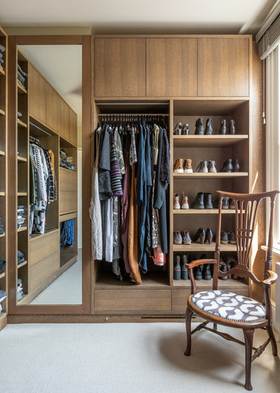
A small room next to the master suite has been turned into a practical dressing room for the couple. “We built a wardrobe into the alcove and utilised the protruding section of wall to hang a mirror,” Sara says. “The owners are very neat, so we could add a combination of open areas and closed cupboards.”
The joinery has a smoked oak veneer and is fitted with internal lighting, which makes it easy to see everything inside.
Do these 7 things to get an organised wardrobe.
The joinery has a smoked oak veneer and is fitted with internal lighting, which makes it easy to see everything inside.
Do these 7 things to get an organised wardrobe.
The couple’s daughter has a room for when she comes home from university, with space to spread out, a desk to work on and a comfy sofa-bed.
The calm green walls give the room a relaxed feel.
Walls painted in Wattle V, Paint & Paper Library. Side table, Habitat. Multy sofa-bed, Ligne Roset. Shelving unit, French Connection Home.
The calm green walls give the room a relaxed feel.
Walls painted in Wattle V, Paint & Paper Library. Side table, Habitat. Multy sofa-bed, Ligne Roset. Shelving unit, French Connection Home.
As the sofa-bed covers most of the small room, Sara needed to find a narrow desk. This one is ideal, as it has enough room for a laptop without taking up too much floor space.
Desk, Camerich.
Desk, Camerich.
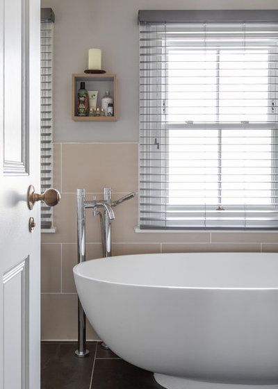
There wasn’t much to do in the bathroom, as the sanitaryware, fittings and tiling were already in place.
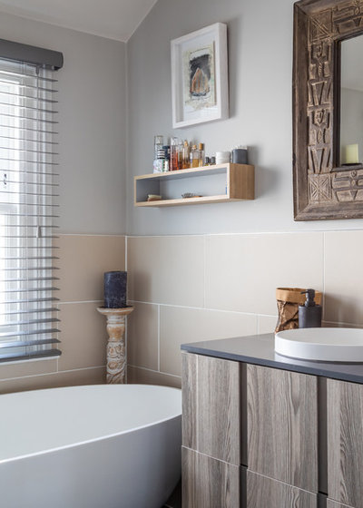
The couple chose a new vanity unit, which Sara’s team fitted for them.
Walls painted in Slate IV, Paint & Paper Library.
Walls painted in Slate IV, Paint & Paper Library.
The female owner has her own space in which to work and practice yoga on the top floor. “We chose this shelving unit to provide plenty of storage with an open feel,” Sara says.
Shelving unit, String. Walls painted in Stone IV, Paint & Paper Library. Armchair; side table; lamp, all Umage.
Shelving unit, String. Walls painted in Stone IV, Paint & Paper Library. Armchair; side table; lamp, all Umage.
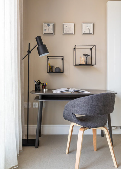
“It took a while to find the perfect desk for the room,” Sara says. “It’s nice working with small spaces, as it gives you more of a challenge.
“This desk is ideal, as the curved design prevents it from feeling as if it’s been plonked against the wall, and the angled legs ensure it doesn’t feel too heavy,” she says.
Desk, Schönbuch. Chair, Futon Company.
“This desk is ideal, as the curved design prevents it from feeling as if it’s been plonked against the wall, and the angled legs ensure it doesn’t feel too heavy,” she says.
Desk, Schönbuch. Chair, Futon Company.
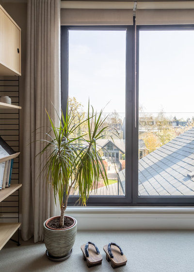
“We call this the ‘room with a view’, as the large windows and Juliet balcony provide a lovely vista of the Cambridge rooftops,” Sara says. “The owners are really pleased with the results. What’s really nice is they say it feels like their home.”
Voile curtains, de Le Cuona.
Tell us…
What do you like most about this Edwardian home? Share your thoughts in the Comments section.
Voile curtains, de Le Cuona.
Tell us…
What do you like most about this Edwardian home? Share your thoughts in the Comments section.

What are you working on?
Related Stories

House Tours
Houzz Tour: A Midcentury Home With a Strong Indoor-outdoor Link
By Becky Harris
A nature-inspired renovation has given this ranch house a relaxed mood and a connection to the outdoors from most rooms
Full Story

House Tours
Houzz Tour: Warm Tones and Luxurious Surfaces in a City Townhouse
An earthy colour palette, hidden storage and well-placed texture add character and practicality to this London home
Full Story

Room Tours
Kitchen Tour: A Gorgeous Extension With a Leafy Glasshouse Feel
By Kate Burt
When the owners of this terraced house extended, they were keen to retain its period feel and highlight the garden
Full Story

Gardens
Garden Tour: A Bare Roof Terrace Becomes a Pretty, Sociable Space
By Kate Burt
A retired couple got help transforming their large rooftop into a gorgeous, welcoming, multi-functional retreat
Full Story

House Tours
Houzz Tour: A Smart Layout and Genius Storage in a Victorian Home
Flipping the standard layout and carving out excellent storage have turned this tired house into a brilliant family home
Full Story

House Tours
Houzz Tour: A Victorian House Brought Impressively Up to Date
By Jo Simmons
A cohesive layout and warm colours combined with energy-efficiency measures thoroughly modernise this terraced home
Full Story

Kitchen Tours
Kitchen Tour: An Open, Airy Space Made for Entertaining
Combining two separate rooms has improved flow and created a sociable open-plan kitchen, dining and seating space
Full Story

House Tours
Houzz Tour: A Family Home Inspired by its Seaside Location
Coastal colours and practical design combine to create a house that will adapt as the family grows
Full Story

Kitchens
5 Inspiring Before and After Kitchen Transformations
Whether you want to boost storage, incorporate original features or maximise your space, take ideas from these designs
Full Story

House Tours
Houzz Tour: An Airy, Scandi Finish for a Tall Victorian House
By Kate Burt
From a tricky inherited bath to a sticky-out staircase, on-site problem-solving led to a seamless update for an old home
Full Story
Yes, Deborah, it must be amazing... I have to admit folk are more likely to browse your collection when it's on an open shelf but I've now placed a stool (+ cushion) next to my bookcase to invite them to do so. Glad I don't have the dusting... though I do have books that are 'out' on a floating shelf, under the coffee table, plus others in my bedroom and kitchen!
I love this update. I find too many designers create interiors that lack lived-in personality, but this looks like it has evolved naturally over time so has heaps of personality. Personally I find the fashion of grey interiors depressing and have avoided it completely myself, however mixing it with other pale neutrals and all the different textures and patterns have created a lovely home with some good ideas, oh and I love the artworks!
Thank you for your lovely comments. We love working with our clients existing pieces (especially their beautiful artwork) and aim to give the owners a home that works with their belongings to give it their personal identity. Grey is a great base for many room schemes, but it can look very flat, by adding texture and soft colours it can give it the lift it needs without the room looking too obvious.
I can see comments regarding the voiles, but this was really important to have at the front aspect of the home as the property is overlooked on all floors, and our clients particularly love the soft dappled light voiles can offer to a room.