Houzz Tour: Arches, Beams and Stones Make a Unique Home in France
The spaces and light sources of this apartment in Antibes have been redesigned without losing their original charm
Claire Tardy
12 March 2017
In search of an interesting renovation project with rough stones, Thomas Lefèvre came across this apartment in downtown Antibes in the French Riviera. The decorator immediately fell in love with this unusual place and realised its huge potential. “Despite it being clear there would be a lot of work to do, I was seduced by this space framed by old beams and stone. The price was reasonable, and many before me had failed to envisage themselves in this place. So I bought it, determined to turn it into a nice apartment to live in,” he says.

Photos by Franck Minieri
Houzz at a Glance
Who lives here: Thomas Lefèvre
Location: Antibes, France
Size: 45 square metres, with a 5-square-metre mezzanine
Budget: €35,000 euros (about AU$49,000) including all taxes, work and furniture
Designer: Thomas Lefèvre, from Lefèvre Design
The space, which had previously been used as a garage, hairdressing salon and accommodations, has been split into two areas to create a cosy apartment on one side and an independent office on the other.
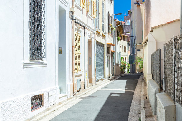
One of the main advantages of this apartment is its location in a quiet, little street of old-town Antibes. “It’s a pedestrian area packed with small restaurants and bars, a place where locals gather to have lunch or dinner. Here you can really feel the atmosphere of the port village,” says Lefèvre.
In renovating the property, the designer has been careful to respect its soul and history, preserving the charm of the past while adding a modern touch to it.
In renovating the property, the designer has been careful to respect its soul and history, preserving the charm of the past while adding a modern touch to it.
You enter the apartment through a large steel-framed sliding glass door. On sunny days, which are frequent in the area, it’s left open. And when the door is closed, the nature of the glass protects the privacy of the inhabitants: “Even though it’s not a two-way glass, it reflects enough light to mirror the street outside,” Lefèvre says. “And by the way, it’s pretty funny to see the passers-by looking at themselves without knowing that there’s someone on the other side.” A fabric drape emphasises privacy while waiting for the placement of climbing plants and shutters.
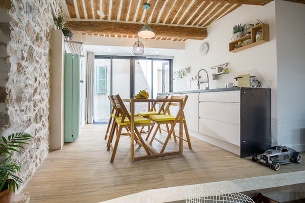
The kitchen is located just behind the full-length glass panels, and it has been raised slightly so as not to be on the same exact level as the alley outside.
The kitchen is located just behind the full-length glass panels, and it has been raised slightly so as not to be on the same exact level as the alley outside.
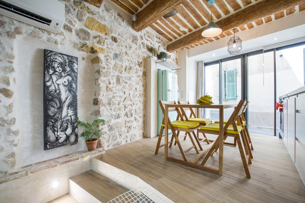
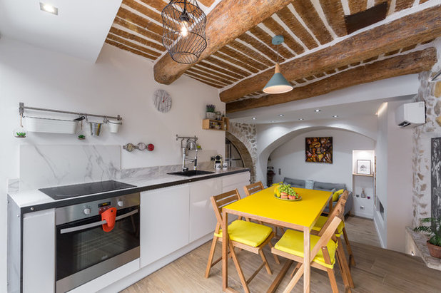
Newly exposed stone walls that were once covered with cement have been restored and reintegrated into the space, to add a touch of charm to the whole apartment. Part of the wall has been removed so there is room for the refrigerator, which could not be put anywhere else in the kitchen. “We chose an aesthetically pleasing device, and then we highlighted it with a cement frame and supported it with an IPN beam,” says Lefèvre.
Also, the ceiling has been restored to its original look and the old oak beams have been sanded and varnished. “The French ceiling in the kitchen was covered with cement and plaster,” the designer adds. “We removed everything and used a natural varnish on the beams instead of covering them with paint. The steel plate covers a crack the decorator found upon arrival.
“Rather than filling the crack in with a different kind of wood, we filled it with sheet metal. It feels antique and gives the impression of having always been there.”
The dropped ceiling which borders the window was used to hide the mechanism for motorised curtains, which were later removed to give way to an additional lighting source composed of spotlights.
Refrigerator: Smeg; copper pendant lights: Maisons du Monde; wire-mesh pendant lights: Meubles et Vous
The entrance is the main source of light for the apartment. To let as much light as possible pass through to the living room, which is at the rear, no high elements have been installed in the kitchen.
Lefèvre used several tricks to save on renovation costs. For example, he didn’t use a custom-made kitchen countertop; he bought furniture from a retailer and covered it with imitation Carrara marble tiles. The sheet steel finishing gives the impression of a massive work surface, and the wall and pattern in the clock resemble the same material.
To create the illusion of raw materials, on the floor you can find imitation wood tiling, which is resistant to wear and tear.
Kitchen unit: Leroy Merlin; table and clock: Habitat
The same choice applies to the kitchen unit, which is finished with a steel plate to provide character.
The floor of the living room is lower than that of the kitchen. They dug down to remove all the backfills added over the years and to increase ceiling height in the room. The floor of the kitchen has been extended over into the living room to increase floor area, without creating a block that would have reduced the space perceived in the living area.
“In this way we managed to gain a few additional square metres in the kitchen for all the necessary appliances and furnishings: a spice rack, an oven, a four-burner stove, a dishwasher under the sink and pot drawers,” says Lefèvre. This open workspace system also accommodates storage for the living room (in wooden boxes) and provides additional seating room.
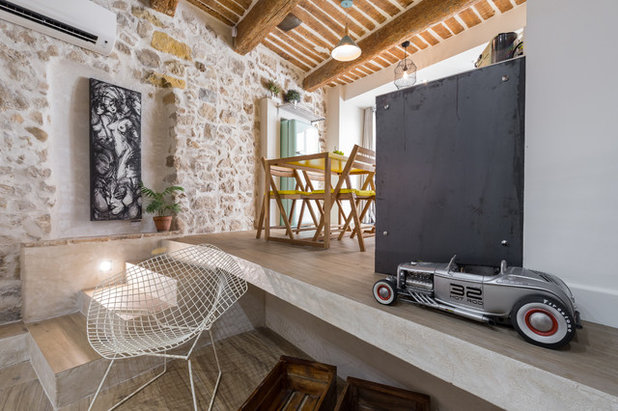
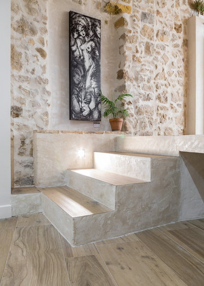
Three cement steps allow access to the living room below. Their texture hints at the spaces between the stones on the wall. A spotlight illuminates them and contributes to the overall lighting effects desired by the decorator.
The floor of the living room is lower than that of the kitchen. They dug down to remove all the backfills added over the years and to increase ceiling height in the room. The floor of the kitchen has been extended over into the living room to increase floor area, without creating a block that would have reduced the space perceived in the living area.
“In this way we managed to gain a few additional square metres in the kitchen for all the necessary appliances and furnishings: a spice rack, an oven, a four-burner stove, a dishwasher under the sink and pot drawers,” says Lefèvre. This open workspace system also accommodates storage for the living room (in wooden boxes) and provides additional seating room.
Three cement steps allow access to the living room below. Their texture hints at the spaces between the stones on the wall. A spotlight illuminates them and contributes to the overall lighting effects desired by the decorator.
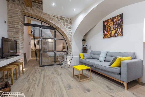
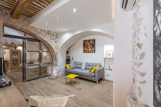
Originally, the living area (formerly a bedroom) was dark and constricted under the arches. Lowering the floor made it possible to gain 80 centimetres of ceiling height and to increase the volume of the room. The arches have also been cleared to highlight their curves.
The arch above the couch is covered with gypsum and has been smoothed to give a more modern look to the room, serving as a contrast to the exposed stones. The walls now accommodate storage niches, and the dropped ceiling has lighting in the form of spotlights. “I wanted to achieve a harmonious balance between the old and the contemporary by highlighting all the original elements that I could find,” says Lefèvre.
The brick arch that frames the glass wall was partly covered with cement and partly concealed in the ground. It was later cleared and highlighted by means of a light at the bottom.
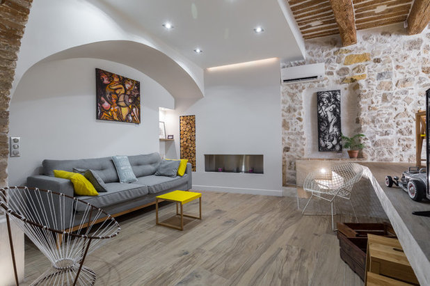
On the opposite side of the room, the design of a bio-ethanol fireplace reinforces the modern vibe of the space. It is installed along the stone wall, which also contains a closet, the door of which is made of small log cross-sections 2-3 centimetres thick.
To accentuate the contrast between the antique and the contemporary, relatively inexpensive vintage objects you would find at a secondhand market have been placed all around.
To accentuate the contrast between the antique and the contemporary, relatively inexpensive vintage objects you would find at a secondhand market have been placed all around.
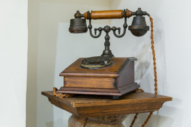
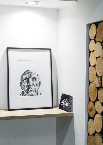
For example, to the left of the couch a vintage telephone stands on an old wooden screw that back in the day was used to grind wheat or flour. On the other side of the couch, a shelf holds the work of an artist that Lefèvre particularly likes: “It’s the face of Picasso by Guillaume Bonaud,” he says. “He does a lot of graphic paintings like that. This one is composed of pen using the pointillist technique.”
Painting: Atalante
Painting: Atalante
The furniture is a mixture of pieces purchased from big retailers and recovered pieces. “The Scoubidou and Diamond de Bertoia armchairs were found at a bargain with the help of a neighbour living on this alley, who is an expert,” says Lefèvre. The canvases hanging on the walls are works by the artist Hélène Mignot.
Coffee table: Habitat; sofa bed: Maisons du Monde
Coffee table: Habitat; sofa bed: Maisons du Monde
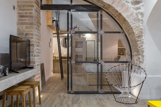
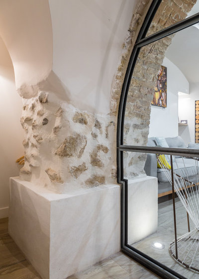
A glass wall separates the living room from the bedroom. It was custom made by an artisan metalworker to be perfectly in sync with the arch of the apartment. “A cement base has been added to the post of the arch for aesthetic reasons and to give the impression that the pillar is old. This element highlights the character of the apartment,” says Lefèvre.
The brick post on the other side of the glass wall is new and made out of materials matching those of the original arch to integrate it well with the rest of the room.
The brick post on the other side of the glass wall is new and made out of materials matching those of the original arch to integrate it well with the rest of the room.
The bedroom took the place of the old kitchen, and since it had been separated from the original entrance by an independent office, it happened to be very dark. The glass wall allows light in through the living room, while an opaque fabric drape ensures privacy. It can be hidden behind the brick column created especially for this purpose.
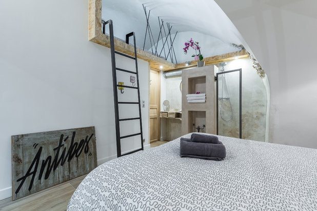
The mezzanine is another source of light for the room: “Initially, we mounted a partition that went directly to the ceiling to separate the apartment from the office, and then we made a window at the railing level to let light in,” Lefèvre says. “But in the end we sadly realised that the room didn’t get much light from that window, which was only two metres behind the partition.”
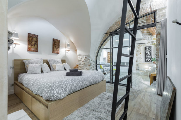
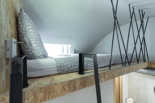
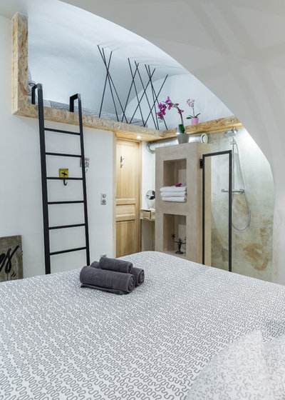
The designer therefore decided to build a mezzanine to connect the window to the room and maximise the brightness. The 5-square-metre surface of the mezzanine is not really intended to be usable, though it does accommodate an extra bed.
The mezzanine also allows a break in the volume of the room. The unfinished wood frame slightly protrudes from the wall to create depth, and the railing is composed of steel bars that give a graphic look to the whole composition.
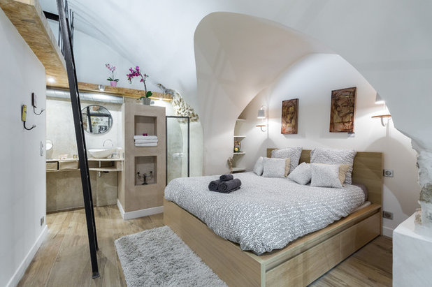
“The arch above the bed was not pleasant to look at. We modernised it while maintaining its irregular appearance so as not to lose space in the room,” says Lefèvre. The bed under the arch is highlighted and framed by two wall lamps that serve as bedside lamps.
On each side of the bed, there are two niches which house the dressing room that has storage shelves on one side and a closet on the other. Two hangers adorn the wall of the mezzanine. “I came across them at a furniture supplier and thought they were nice.”
Bed: Ikea; bedside lamp: Habitat
On each side of the bed, there are two niches which house the dressing room that has storage shelves on one side and a closet on the other. Two hangers adorn the wall of the mezzanine. “I came across them at a furniture supplier and thought they were nice.”
Bed: Ikea; bedside lamp: Habitat
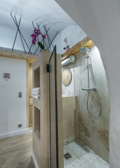
Opening to the bedroom, the bathroom has a large shower of 90 x 120 centimetres, the frame of which was made by the same artisan metalworker who made the glass wall. Visually, its boundaries are marked by a niche in waxed concrete, which includes storage space for the towels. The tile looks like natural stone and continues the theme of natural materials. On the wall, there is only one large tile which enhances the illusion and gives a feeling of seamlessness.
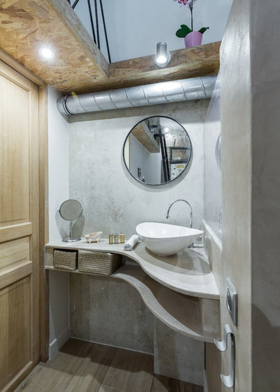
Across from the shower, the sink stands on a custom-made wood and waxed concrete bench. The curve follows the shape of the wall and optimises space so that the toilet room door may be opened despite the narrow corner. Also, the mirror has been custom made for this space.
Sink: Leroy Merlin
Sink: Leroy Merlin
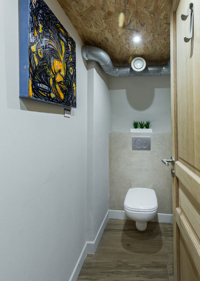
The powder room behind the door has an industrial feel with an exposed double-flow ventilation duct, which continues above the washbasin and the unfinished wooden structure of the ceiling. The right-hand wall includes a space for the washing machine and a closet for all the technical and maintenance items.
All the rooms in the apartment have been redesigned to restore the original elements as the main feature of the space, and to encourage the use of natural materials. Such rendering blends the comfort of a modern apartment with the character of the old days.
TELL US
What do you like best about this subterranean abode? Share your thoughts in the Comments below.

Related Stories

Houzz Tours
Houzz Tour: A Midcentury Home With a Strong Indoor-outdoor Link
By Becky Harris
A nature-inspired renovation has given this ranch house a relaxed mood and a connection to the outdoors from most rooms
Full Story
Kitchens
10 Smart Storage Tips for Your Kitchen Bins
Keep kitchen rubbish stylishly tucked away with these clever solutions
Full Story

More Rooms
The 5 Most Popular Laundry Rooms on Houzz Right Now
Get decorating ideas for your laundry or utility room from these most-saved photos on Houzz
Full Story
Gardens
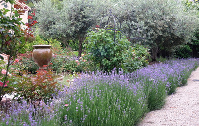
How Do I Create a Drought-tolerant Garden?
By Kate Burt
As summers heat up, plants that need less water are increasingly desirable. Luckily, there are lots of beautiful options
Full Story

Houzz Tours
Houzz Tour: Warm Tones and Luxurious Surfaces in a City Townhouse
An earthy colour palette, hidden storage and well-placed texture add character and practicality to this London home
Full Story
Gardens
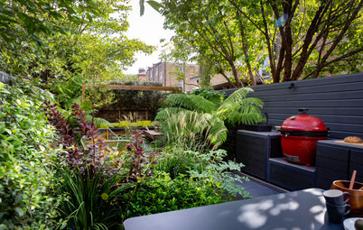
5 Inspiring Before and After Garden Transformations
Check out what a difference designers have made to these once dull plots, visually expanding spaces and creating privacy
Full Story

Houzz Tours
Kitchen Tour: A Gorgeous Extension With a Leafy Glasshouse Feel
By Kate Burt
When the owners of this terraced house extended, they were keen to retain its period feel and highlight the garden
Full Story

Gardens
How to Disguise Rubbish and Recycling Bins Outside Your Home
Need to hide unsightly bins in your garden or driveway? Take a look at these clever ideas for inspiration
Full Story
Renovating
21 Ways Designers Are Incorporating Arches Into Homes
By Kate Burt
Everywhere we look on Houzz right now, a cheeky arch pops up. How would you add this timeless architectural feature?
Full Story
Lifestyle
How to Improve the Air Quality in Your Home
Want to ensure your home environment is clean and healthy? Start by assessing the quality of your air
Full Story
For only $41K THIS IS SPECTACULAR!
Very inviting. I too would like to have seen the (before). 41,000!!!! Amazing.
I’m back. Looking at it again (it’s an incredibly stunning, and creative space). I can’t believe that you did all of this, on such a small budget. The glass walls, and doors alone.....
You made me laugh, when you mentioned people, who primped themselves, in front of the doors, not realizing that you could see them. I also wonder, if people wander into your house when the front doors are open to the street? I would think it was a boutique, or restaurant, and make myself at home :-).