


Houzz Tour: Extending and Updating a Victorian Home in West London
Geometric prints and shots of colour sit beside antiques and moody greys in this inspiring family home

When Emma Pocock first saw the house in west London she shares with her husband and daughter, she didn’t love it. ‘It hadn’t been touched since the 1990s,’ says Emma. ‘It wasn’t a wreck, but there was a lot of brown and peach everywhere, which was faintly depressing!’ Luckily, as a founder of interior design company Turner Pocock, Emma has a well-trained eye and spotted room for improvement. ‘The house was a good size,’ she says. ‘I thought I could make it fun.’
A six-month build opened up the layout – two reception rooms were knocked through to create a large living space – and increased its size. ‘We dug down a metre in the kitchen, as it had low ceilings, and extended into the return,’ Emma explains. The loft was also converted to a bedroom and bathroom. When it came to decorating, Emma used her favourite mix of geometric prints and patterns with pops of bright accent colour to create a home that’s invigorating, original and fun.
Houzz at a Glance
Who lives here Interior designer Emma Pocock with her husband and daughter
Location West London
Size 4 bedrooms, 3 bathrooms
Designer Turner Pocock
‘Hallways in Victorian houses are often dark and tend to get ignored,’ says Emma. ‘But you don’t spend lots of time in the hall, so you can afford to be bold. This yellow Manuel Canovas Trellis paper is the colourful backbone running up through the house. It’s like Miami in here!’
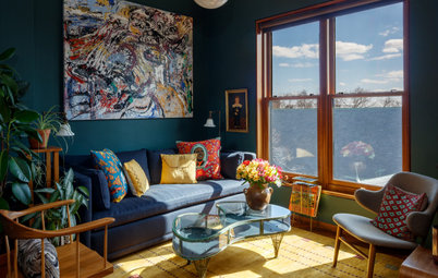
A statement rug, made by Amy Kent to Emma’s design, injects pattern and colour into the living room. It is balanced by the black shelves and grey walls, which add a grown-up note to the scheme. ‘Colour works best in pops,’ says Emma. ‘Strong shades tend to lose their sophistication if you use them everywhere.’
‘Using pattern and colour is my natural style,’ says Emma. A sofa, made bespoke and covered with lush blue velvet from sofa.com, sits on the geometric-print rug. Picture shelves above allow Emma to display some of her many prints and photographs. ‘You can move them around and vary the display easily,’ she says. The walls are painted in Bagdad Grey by Sanderson to create a neutral backdrop.
Browse more statement rugs
Browse more statement rugs
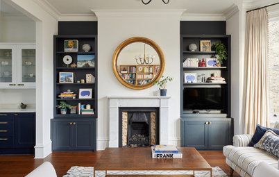
Emma built into the alcoves on either side of the fireplace, but avoided the traditional design of cupboards below and shelves above. ‘That feels a bit dated,’ she says. Instead, shelves painted with Farrow & Ball’s Blue Black Estate Eggshell stretch floor to ceiling, creating a discreet space for the TV. Emma designed the shelves to sit proud of the fireplace. ‘It means you get good deep storage and they frame the fireplace beautifully, too,’ she says.
Emma chose soft grey for the walls in the newly opened up living space. ‘The hallway has bright yellow paper, so you have to be careful with what you have coming off it,’ she says. White painted floorboards reflect light and keep the space feeling airy. Emma has furnished her home with a mix of antiques, including this desk, and newly acquired pieces. ‘If everything is brand-new in a house, it can look soulless,’ she explains.
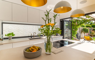
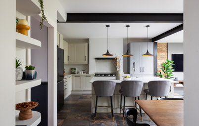
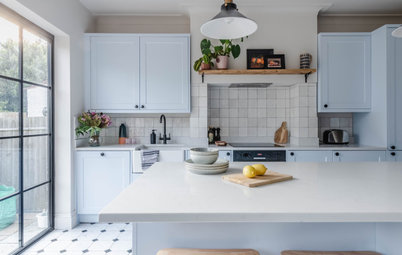
Before the renovations, the kitchen was small, with a low ceiling. Digging down increased the space vertically, while extending into the side return boosted its footprint. Skylights above allow plenty of light to flow in, while glass doors at the back give access to the garden. Rather than box in the supporting beam, Emma painted it yellow. ‘It was more fun to make a feature of it,’ she says.
Emma bought kitchen cupboards from Ikea then her builder constructed tongue-and-groove doors to front them. ‘It’s a great way to get the look you want inexpensively,’ she says. She topped the dark grey units with a white Corian worktop. The wooden table, from Soho Furnishings, adds just the right amount of warmth.
To help the small outside space feel like an extension of the kitchen, Emma painted the exterior walls in the same white as inside. ‘It’s not a big garden and it might have been a bit of an afterthought otherwise. Now it makes the kitchen feel bigger.’
‘I love to use dark colours on the walls in a bedroom,’ says Emma. ‘It feels cosy and warm. I particularly like the combination of dark blue and white.’ A buttoned ottoman and snowy fur throw add a luxurious touch.
Emma’s passion for bright colours is in evidence in the study. ‘I love coral!’ she says. ‘You have to be reasonably clever about where you use it, though, as it’s pretty strong.’ Here, a large noticeboard breaks up the painted wall, while white office furniture softens it further. Emma had the paint mixed at Papers & Paints.
The stairway up to the loft bedroom is quite tight, so Emma kept it as open as possible. ‘We fitted glass banisters and it’s made the staircase feel more light and airy,’ she says. The pictures are by Bernd and Hilla Becher, who famously photographed industrial buildings, including water towers. Emma ripped them from a book about the duo and framed them.
Check out ways to display your photographs
If you enjoyed this home, let us know in the comments below.
Check out ways to display your photographs
If you enjoyed this home, let us know in the comments below.


Sponsored

Sponsored