Houzz Tours

House Tours

Houzz Tour: Modern Coastal-farmhouse Style Rescues a 1980s House
Two professionals gave this beautifully built but uninspiring home the laid-back, stylish interior it deserved

Just a quick walk from Goose Rocks Beach in Maine, USA, sits a home that local architect John Buckley deemed “kind of an oddball house”. Not oddball in a bad way, though.
“I don’t know what you know about Maine, but it’s full of great old Yankee craftsmen [sic],” he says. “This house was kind of an oddball, because it’s built with true post-and-beam construction, complete with mortise-and-tenon joints [an age-old way of joining pieces of timber], but it was built in the 1980s.”
And along with its 1980s vintage came standard finishes that were of that era.
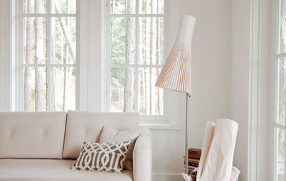
The main floor has an open-plan layout, with the staircase in the centre. The team replaced the existing flooring in the house with engineered white oak. John kept the geometry of the stairs, but changed the balustrade and used white oak on the treads. The front door can be seen behind the staircase.
John and Elizabeth also replaced an existing fireplace with a wood-burning stove that fitted within the space and installed a new slate hearth that’s flush with the floor.
John and Elizabeth also replaced an existing fireplace with a wood-burning stove that fitted within the space and installed a new slate hearth that’s flush with the floor.
The photographs of the living area show off the post-and-beam construction. “Because it was built in this old manner, it was not so easy to modify,” John says. “There was a clear structural grid and we had to stick within those parameters. We peeled back the layers to give it a more authentic look.”
John and Elizabeth did a lot of stripping and staining of the dark posts and beams. This allowed for contrast without making the structural elements too bold or distracting. “We wanted the structure to lie quietly in the background,” John says.
Ready to renovate? Find an architect near you, browse images of their projects on Houzz and read reviews from previous clients.
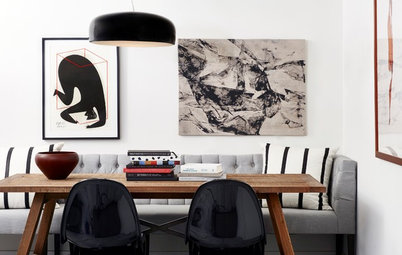
The interior designer mixed antiques and more modern pieces to make the home look as if it had evolved over time. The dining room chairs are a modern take on classic Windsor chairs, while the antique turquoise sideboard grabs the attention. The artwork has a vintage look, and the lighting mixes a traditional brass finish with contemporary style.
John replaced the windows as part of the renovation. “All the existing windows had really heavy grids before,” he says. The new windows are less busy, yet still have a traditional look.”
John replaced the windows as part of the renovation. “All the existing windows had really heavy grids before,” he says. The new windows are less busy, yet still have a traditional look.”
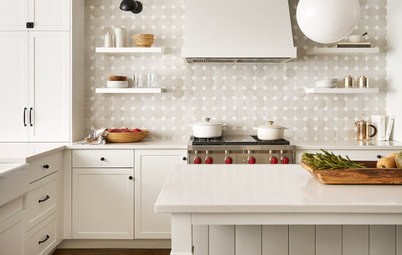
For the kitchen, John was inspired by the clean look of English kitchens. He designed the natural white oak cabinets himself, which have vertical board facings with slight reveals. “They were designed to be quiet and stand within the post-and-beam construction,” he says.
He also added shiplap cladding to the walls, an element he repeated throughout the house. This image also shows the ceiling, which appears to be covered with with tongue-and-groove panelling. However, as is typical with post-and beam-construction, these are actually the floorboards of the upstairs, which are 38mm thick. They’re visible because there’s no plasterboard hiding the post-and-beam structure of the home.
He also added shiplap cladding to the walls, an element he repeated throughout the house. This image also shows the ceiling, which appears to be covered with with tongue-and-groove panelling. However, as is typical with post-and beam-construction, these are actually the floorboards of the upstairs, which are 38mm thick. They’re visible because there’s no plasterboard hiding the post-and-beam structure of the home.
The kitchen island in the centre is open on one side so bar stools can be stowed underneath. “I like to make the legs [of the units] higher than usual to make the cabinetry read more like furniture,” John says.
“I can create a certain cadence when legs come down to the floor and break up a [kickboard],” he adds. “And they make the cabinets look as if they’re standing rather than floating.”
“I can create a certain cadence when legs come down to the floor and break up a [kickboard],” he adds. “And they make the cabinets look as if they’re standing rather than floating.”
At the opposite end of the kitchen, a dining area fits nicely into an existing bay. John designed a wraparound bench and Elizabeth selected a sturdy, utilitarian timber table with straight lines. It provides a nice farmhouse-style contrast to the all-white space around it.
More: 29 Lovely Dining Spots, Big and Small
More: 29 Lovely Dining Spots, Big and Small
Just beyond the dining nook is the boot room entrance. It has another entrance off it that leads to a separate apartment above the garage. The apartment has one bedroom, one bathroom and a kitchenette.
The floor tiles in the boot room are cement by Clé Tile, with grout that’s a perfect colour match.
New shiplap panelling wraps around the cloakroom’s walls.
The first floor houses the main bedroom and bathroom. There had previously been a bedroom and bathroom here, but John’s reconfiguration connected them as a suite.
More shiplap panelling adds a coastal look to the walls, and the posts and beams are painted a serene white.
More shiplap panelling adds a coastal look to the walls, and the posts and beams are painted a serene white.
Elizabeth and John worked together to reconfigure the main bathroom. Shiplap panelling and floral wallpaper lend vintage appeal. The flooring is comprised of marble mosaics.
Bowood wallpaper, Colefax and Fowler.
Bowood wallpaper, Colefax and Fowler.
“Elizabeth and I liked the idea of looking for found objects and turning them into vanity units,” John says. “In here, we were thinking of old farm tables, so the idea started with the idea of turned table legs.”
However, they quickly realised a table wouldn’t provide the storage the homeowners needed, so John designed a chest of drawers crafted from white oak and incorporated turned legs. “We wanted the vanity unit to look as if it had been around the block a little bit,” he says.
The worktop and low splashback are marble.
On the second floor, John and Elizabeth designed a large, multipurpose space. While he refers to this room as the library, it also serves as a TV room, playroom, home office and overflow bedroom.
Elizabeth enlivened the space with wallpaper and bold colours plucked from it. The wallpaper accents the vast height of the ceiling – had that wall been all white, the furniture would have looked awkwardly low and out of scale.
Elizabeth enlivened the space with wallpaper and bold colours plucked from it. The wallpaper accents the vast height of the ceiling – had that wall been all white, the furniture would have looked awkwardly low and out of scale.
New windows swing open to reveal a view of the dining room below. They were made by the homeowner’s brother-in-law, Wesley Martel of Martel Design & Fabrication. The windows share the natural light between spaces and also give the kids and parents a fun way to call to each other.
The bespoke ladder leads to a special spot. “Carpenter Derek Preble completed all the [woodwork] and custom items like this, and he did an amazing job,” John says.
The bespoke ladder leads to a special spot. “Carpenter Derek Preble completed all the [woodwork] and custom items like this, and he did an amazing job,” John says.
At the top of the ladder is a fun, mezzanine-style hideout. Previously, this space above the bathroom was unfinished.
The home has the popular holiday-house set-up that puts a group of siblings, cousins or friends in the same bedroom. This is the children’s bedroom, on the second floor. Elizabeth recommended a classic Arts and Crafts wallpaper, which dates back to 1892. Again, it brings an aesthetic of another layer added over time.
Blackthorn wallpaper, Morris & Co.
Blackthorn wallpaper, Morris & Co.
John designed bespoke bunk beds with adjacent shelves. They’re wrapped in shiplap cladding and each bunk has its own reading light and niche. The bunks also have a ladder (not pictured).
The upstairs bathroom sports a slate floor laid in a herringbone pattern. Paired with square porcelain tiles on the walls, the tile choices give the room a timeless look.
John and Elizabeth altered the layout of the bathroom to accommodate a roomy shower. And they repeated the found-object vanity unit idea, with John again custom-designing this piece. The turquoise chest of drawers adds to the timeless style of the room.
The bedroom on the second floor has a beautiful vaulted ceiling.
Elizabeth covered the walls in a wallpaper that represents a storm, yet has a serene feel. And as she did throughout the house, she added carefully curated touches of colour – here in the reading lamps and rug.
Tempest wallpaper, Quercus & Co.
Tempest wallpaper, Quercus & Co.
The separate apartment mentioned earlier is above the home’s connected two-car garage. It has a roof deck that serves as a private outdoor space.
This is the kitchenette. Painted cabinets paired with vintage-style knobs lend a part-farmhouse, part-coastal cottage feel. Open shelving makes it easy for guests to find dishes and glassware.
Tell us…
Which room in this home would you claim as yours? Tell us in the Comments, like this story and save the images.

Sponsored
Who lives here? A couple, who also rent the home out
Location Kennebunkport, Maine, USA
Size Four bedrooms and three bathrooms (279 sq m)
Designers John Buckley of John Buckley Architecture & Design (architecture) and Elizabeth Robinson of Mia Carta Design (interior design)
Builder: Bowley Builders
Photos by Maura McEvoy
Styling by Basha Burwell
The homeowners are a couple with grown-up children. Though they live in New Jersey, USA, most of the time, the husband is from the area and buying this property was a sort of homecoming for him. The couple planned to spend a significant amount of time here in summer and a few other weeks throughout the year and eventually retire here full-time.
They hired interior designer Elizabeth Robinson to complete a full renovation, and she brought in John Buckley, with whom she frequently collaborates, to help with reconfiguring the house and changing the finishes. This included lots of new timber work, all new windows and new flooring.
The result is a coastal-meets-farmhouse look in a home that has evolved over decades.