


How to Nail Bold Colour When Decorating Your Home
Keen to introduce colour but not sure how to do it? Read on to discover ways design pros have made vivid shades work
Amanda Pollard
6 December 2021
Senior Editor at Houzz UK and Ireland. Journalist and editor specialising in interiors and architecture.
Senior Editor at Houzz UK and Ireland. Journalist and editor specialising in interiors... More
A strong colour palette is a great way to add interest and personality to your home, but it can be tricky to know how to make it look balanced and cohesive. If you’re in need of some colour confidence to bring your space to life, take a look at these inspiring rooms to see the clever ways designers have created striking decorating schemes.
Emphasise a hue
Here’s a designer trick to make a bold colour look like a well-considered part of your whole scheme: introduce it again elsewhere, but with a slightly different twist.
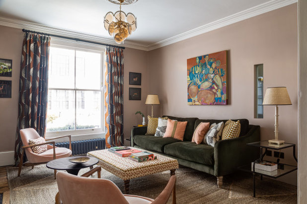
In this interior by Golden Design, burnt orange and blue have been teamed with moss green and pale plaster-coloured walls to bring a calm feel to the living room…
Here’s a designer trick to make a bold colour look like a well-considered part of your whole scheme: introduce it again elsewhere, but with a slightly different twist.
In this interior by Golden Design, burnt orange and blue have been teamed with moss green and pale plaster-coloured walls to bring a calm feel to the living room…
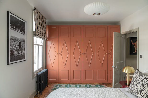
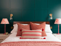
…while in the guest bedroom, the look is more vivid. A wall of cabinets is painted in a striking earthy tone to make a strong statement in the space.
The scheme is reminiscent of the living room’s hues, but the contrasting style adds an element of surprise.
See more of this Victorian house with a boutique hotel vibe.
The scheme is reminiscent of the living room’s hues, but the contrasting style adds an element of surprise.
See more of this Victorian house with a boutique hotel vibe.
Be inspired
Stuck for colour ideas? Seek inspiration from other objects around your home. This could be the shades in a favourite ornament or rug or, as in this project, a beautiful painting.
The owners of this kitchen-diner-living area, designed by Yoko Kloeden, had a lot of contemporary art. This piece held two of their favourite colours, orange and blue, so Yoko used it to inform the whole room scheme.
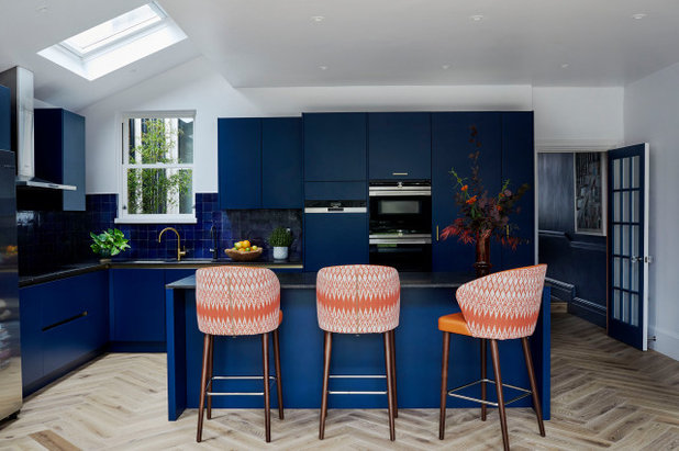
The two main tones of the artwork have been picked out and used confidently in the kitchen. The effect is striking, and contrasts with the soft, abstract brushstrokes on the painting in the dining area.
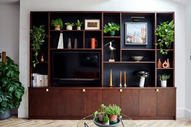
In the living area, the colours are still apparent, but the look is more subtle. Deep blue backgrounds highlight orange-toned display pieces, and the dark wood helps to bring the two shades together.
Take a peek around this rich-coloured room.
Take a peek around this rich-coloured room.
Create a journey
For a really creative look in your home, you could try introducing contrasting colours throughout.
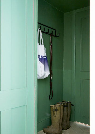
This project by A New Day is a good example of how to decorate with a range of different colours without the rooms feeling disjointed. The trick is to be abundant with each shade you choose and to subtly link the spaces. The boot room, for example, has been covered in floor-to-ceiling green.
For a really creative look in your home, you could try introducing contrasting colours throughout.
This project by A New Day is a good example of how to decorate with a range of different colours without the rooms feeling disjointed. The trick is to be abundant with each shade you choose and to subtly link the spaces. The boot room, for example, has been covered in floor-to-ceiling green.
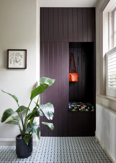
In the hallway, a storage and seating area is a strong shade of purple, with a green-leaved plant as a reminder of the nature-hued boot room.
Peep through to the living area and you’ll spot a purple chair, which forms a connection between that space and the hallway.
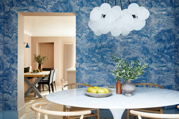
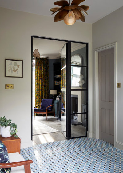
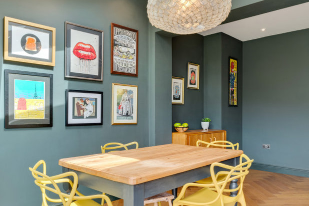
The trick works in the dining room and kitchen, too. A playful blue wallpaper frames the pale pink walls of the kitchen beyond…
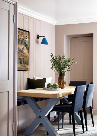
…while a blue wall light is perfectly positioned over the kitchen table for that all-important link.
Visit the rest of this Georgian house.
Visit the rest of this Georgian house.
Connect and disconnect
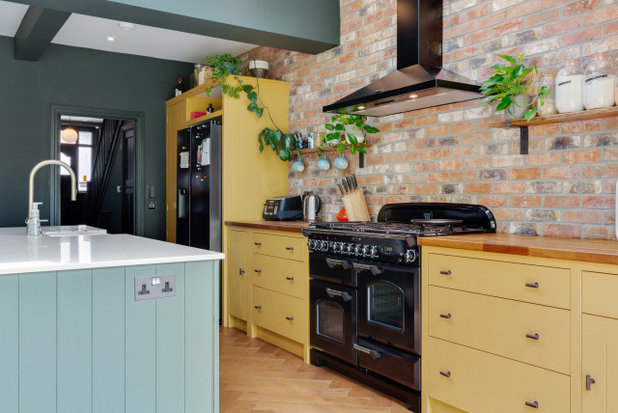
The couple who own this kitchen, designed by BetterPAD, wanted a patchwork feel with an eclectic mix of different objects, artworks, materials and colours. The challenge was how to achieve this mismatched look while ensuring it all worked as a cohesive space.
The blocks of bold colour are key to the finished look, as the wall of yellow units, the pale green island and the deep green walls add a solid framework that brings all the disparate elements together.
The limited yet vivid choice of palette has allowed the owners to add more bold colours in the artwork without losing the balanced, harmonious feel of their kitchen-diner.
See more of this 1930s kitchen extension.
See more of this 1930s kitchen extension.
Reference the past
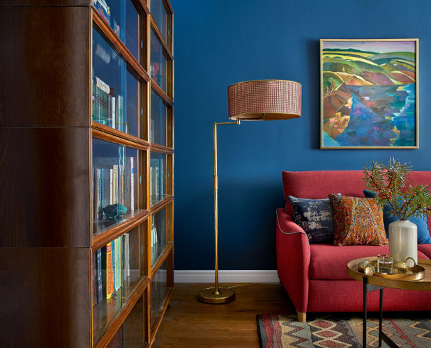
The striking colour scheme of this Russian apartment illustrates how to add bold shades while retaining the history of a property. The owners inherited the flat from a great-grandmother and wanted to preserve as much of the colour palette remembered from their childhood as possible.
Designer Svetlana Pakhomova sensitively referenced the shades of the original rooms while bringing the apartment up to date. This living room, for example, was originally a bedroom with striped blue walls. Svetlana kept the blue, but went for a more saturated tone with no pattern.
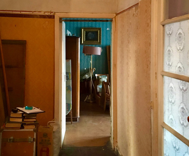
Here’s a view of the original room through its adjoining doorway.
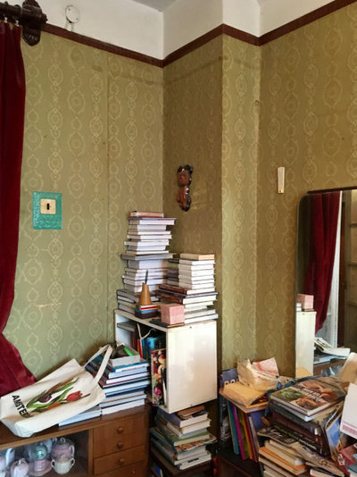
Similarly, the walls of what is now the dining room were covered with olive-yellow patterned wallpaper and complemented by burgundy curtains.
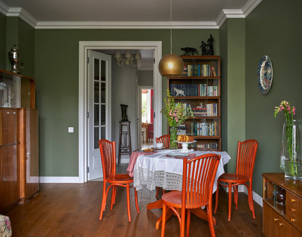
Svetlana kept the green walls, but went for a sage shade, and the red tones of the curtains have been referenced in the burnt orange dining chairs.
Find out more about this colourful flat.
Tell us…
Have you used bold colours in your home? Which of these schemes is your favourite? Share your thoughts and ideas in the Comments.
Find out more about this colourful flat.
Tell us…
Have you used bold colours in your home? Which of these schemes is your favourite? Share your thoughts and ideas in the Comments.


Related Stories

More Rooms
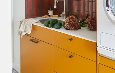
The 5 Most Popular Laundry Rooms on Houzz Right Now
Get decorating ideas for your laundry or utility room from these most-saved photos on Houzz
Full Story
Dining Rooms
The 5 Most Popular Dining Rooms on Houzz Right Now
By Kate Burt
Vintage furniture, great lighting and top tables – feast your eyes on dining room ideas collated from your own clicks
Full Story
Colour
8 Clever Ways to Use Strategic Colour Blocking in Your Home
By Kate Burt
Paint can do so much more than refresh your walls. Explore ways to highlight features, zone areas and trick the eye
Full Story
Utility Rooms
15 Richly Coloured Utility Rooms
The trend for strong, earthy tones has reached the utility room, with hues from plum to ochre to deep green adding depth
Full Story

Kitchens
Which Kitchen Worktop Colour Should You Choose?
By tidgboutique
Consider these popular colours and styles to get the look you want, no matter which material you use
Full Story
Colour
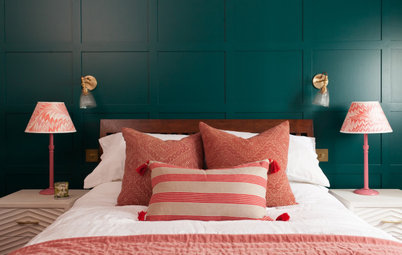
8 Ways to Work a Rust Red and Blue Palette in the Bedroom
By Kate Burt
We’re seeing variations of this combination all over Houzz right now. Check out these tips for trying it yourself
Full Story
Colour
Creative Ways to Make a Feature of Structural Beams
Turn your RSJ into something more than just functional with these clever ideas from our Houzz Tours
Full Story
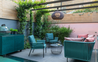
Gardens
9 Ways to Enjoy Colour in Your Garden All Year Round
By Kate Burt
However your garden grows, you can add colour with hardscaping, furniture and accessories
Full Story
Gardens
What Will We Want in Our Gardens in 2024?
Discover the gardening trends homeowners will be bringing into their outdoor spaces this spring and summer
Full Story
Kitchens
What to Expect at the Biggest Kitchen, Bedroom and Bathroom Show
Plan ahead with our rundown of what’s in store at the kbb Birmingham event this March
Full Story
What a great article, this will surely help clients when considering colour palettes.
Really good article. I realise how much I love colour in my home. I’ve opted for white walls for the moment with strong bursts of colour in pictures and furniture but would love to be bold with the walls.