Houzz Tours

Kitchen Tours
Kitchen Tour: A Country Kitchen is Stylishly Updated on a Budget
This rustic kitchen got an edgy, sustainable update when the budget for a brand-new design fell through

The original plan for this country kitchen in North Yorkshire was that it would be extended. The owners had even had plans drawn up for the new layout, to fit within the larger space, but planning complications and budget shrinkage put the whole thing on ice indefinitely. So the owners called on interior designer Karen Knox to work with what was already there instead.
Karen reconfigured the existing cabinets, painted the doors, replaced the worktops, updated lighting and generally waved her designer’s magic wand over a number of other issues – aesthetic and practical – to give the owners what feels like a totally new kitchen. The result works so well, the extension may never need to be built.
Karen reconfigured the existing cabinets, painted the doors, replaced the worktops, updated lighting and generally waved her designer’s magic wand over a number of other issues – aesthetic and practical – to give the owners what feels like a totally new kitchen. The result works so well, the extension may never need to be built.
The owner had already picked the new kitchen of her dreams when Karen was called in to revamp the dated design instead, so there was a good starting point for what she did/didn’t like or want. Karen went through the owner’s wishlist from that original design and managed to pull off an ingenious, thrifty and environmentally kinder version.
“The client wanted her kitchen to have more of an edge than she felt her old one had,” Karen explains of some of the striking details in the revamped space.
The wallpaper was a big transformative element and came about after Karen suggested removing the wall units as part of the reconfiguration. “The old kitchen had a timber extractor hood and wall cabinets, and they made the space feel really enclosed and heavy,” she says. This freed up the walls, allowing their new decorative surface to take centre stage.
The area of papered wall that runs behind the hob is half-clad in iron-free glass (so no blue-green tint to affect the wallpaper colour), meaning it can be wiped clean (see previous photo).
Karen also replaced all the worktops, since the original ones no longer fitted with the new cupboard configuration. They are now solid oak, stained with an antique finish.
The appliances were old and in bad condition, so Karen replaced all but the range cooker.
Great Ormond St wallpaper, Little Greene.
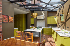
“The homeowner had always wanted a green kitchen,” Karen says, “but she was locked into the idea that she needed blue because of her Esse stove – the family’s pride and joy. But I said, ‘Nah – green and blue are great together!’”
Karen chose striking green metro tiles to showcase the range cooker. “We went for a classic brick formation. It didn’t feel trendy,” she says. “We also switched the convention – normally tiles are on the kitchen side and wallpaper is elsewhere in the room, but it really works. The tiles also reflect light from the window opposite. It’s a lovely wall.”
Karen also added the ribbed glass and aged brass wall light, along with several more of these around the room. “We had these shipped from the US – they were a bit of a splurge. We also added some downlights, as the low-ceilinged part of the kitchen was always really dark before.”
The porcelain, terracotta-effect floor tiles were already there. “Luckily, the cabinets sat on top of them, so we didn’t need to change them,” Karen says.
Antique brass adjustable arm wall mount shade, Edison Light Globes. Paintbox Avocado wall tiles, Mandarin Stone. Bench, H&M Home.
Karen also painted all the cabinets a rich, dark green to chime with the metro tiles, and did the woodwork throughout to match, from door frames to windows. “It’s an oil-based eggshell, so it has a bit of a sheen to it,” she says. “We wanted something really hardwearing.”
The kitchen was originally chopped in two by a peninsula unit, leaving only a small space for a dining table. Karen removed this to open up the room.
The slim cabinets either side of the hob and oven contain shelves, while the door next to this run leads to a utility room. By the sink there’s a bin and an integrated dishwasher. On the end of that run, a double unit has been turned sideways and now forms a breakfast area, with drawers and cupboards for storage and a decorative panel on the side facing the dining table.
“That unit was originally flipped around the other way,” Karen says. “Some pieces had to be adjusted, but only one complete panel had to be made by a joiner.”
Woodwork and cabinets painted in Stable Green, Paint & Paper Library. Reclaimed pine table, Peppermill Antiques.
Three of the many doors in this space are seen here before Karen got to work. “There are seven doors in this kitchen; it’s a room you have to walk through to get to lots of other bits of the house,” she says. “They were quite a challenge to work around!”
Read reviews of interior designers in your area on Houzz.
Read reviews of interior designers in your area on Houzz.
Wallpaper and dark green paintwork now highlight the timber doors. The one on the left leads to the garden room. The one directly in front leads to the pantry/cellar, where the family’s microwave and food and wine live. The doorway on the right leads upstairs to the bedrooms. On the far right, there’s a door to a storage cupboard, and to the right of that (out of shot) is the entrance to the living room (see floorplan at the end).
Karen hung the Victorian Fox Girl artwork because the colours work well and also to reflect the era of the house and the homeowner’s love of nature. “She’s never happier than when she’s outside,” Karen says. “It’s also always good to put something with a face on a wall; a portrait is really good for giving you something to focus on.”
Artwork, Redbubble.
The copper sink was another splurge. “The owner loves it. It has a handmade feel and will age beautifully over time.”
Eclectica Etienne copper kitchen sink, Sinks.co.uk. Old England Traditional copper single-lever kitchen sink mixer tap, Franke.
Eclectica Etienne copper kitchen sink, Sinks.co.uk. Old England Traditional copper single-lever kitchen sink mixer tap, Franke.
The stained oak shelves replace a chunky plate rack and help to open up the window area considerably. They wrap around the corner to continue into the breakfast zone.
Karen chose to keep the alcove to the left of the range cooker clear. “It’s very shallow and felt like anything we put there would be in the way, so instead, we wallpapered it,” she explains. “We also moved the wall light to make it more of a feature and provide symmetry with the light on the other side of the stove.”
The ‘before’ floorplan shows the peninsula unit dividing the space.
The ‘after’ floorplan.
Tell us…
What’s your favourite thing about this revamped kitchen? Share your thoughts in the Comments section.
Tell us…
What’s your favourite thing about this revamped kitchen? Share your thoughts in the Comments section.

Sponsored
Who lives here? A family with two teenage children, two dogs and lots of chickens, all called Barbara and collectively known as ‘The Barbaras’
Location North Yorkshire
Property A Victorian cottage attached to what was once an old forge
Room dimensions Around 6.1m x 4m
Designer Karen Knox of Making Spaces
Budget £7,500-£10,000
Photos by Karen Knox
The family who live in this house run a business from it, including the rental of a small holiday home in the grounds. This renovation and extension of the kitchen was intended to be part of a bigger, three-year project to turn the other outbuildings into holiday accommodation, too, and to upgrade a garden room that acts as the guest reception.
See how Karen transformed that room on a budget, too: Room Tour: An Unused, Chilly Garden Room Gets a Homely Makeover