


Kitchen Tour: A Dark Grey Shaker-style Kitchen in London
Rich grey paint used throughout this compact kitchen has transformed the Shaker units and created a space that’s both contemporary and cosy
Jo Simmons
29 July 2016
Houzz UK Contributor. I have been an interiors journalist since 1995, writing several books on design and numerous features for glossy homes mags over the years. For Houzz, I cover decorating ideas and trends and interview designers and professionals for their insights. My favourite pieces to write, though, are Houzz Tours, as I love exploring and learning about real homes. Call me curious — or nosy!
Houzz UK Contributor. I have been an interiors journalist since 1995, writing several... More
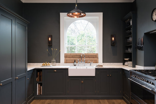
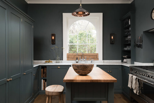
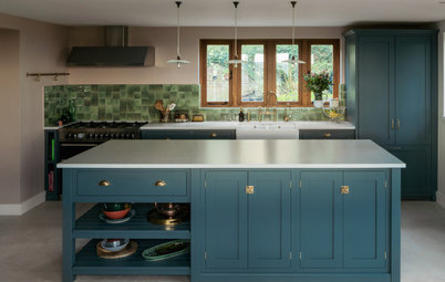
Colour has a huge effect on the atmosphere of a space, and this beautiful kitchen in a Georgian terraced house in London proves that, sometimes, it pays to be bold. It’s fitted with classic Shaker cabinets, but wears a striking shade of flinty grey on the walls, units and shelves, punctuated by a pale marble worktop. “It’s a very warm, atmospheric space,” says Emily Rumble of deVOL, who designed the kitchen. “It’s a small room, but the colour really makes it feel cosy and inviting.”
Kitchen at a Glance
Who lives here A couple with a young child
Location Bloomsbury, London
Size 3m 80cm x 3m 80cm; part of a Georgian terraced house
Designer Emily Rumble at deVOL Kitchens
The room is square and compact, with a chimney breast on one interior wall and a window overlooking the leafy square at the front of the house. These key features dictated where the cabinets and appliances could be installed.
Read expert advice on how to design the perfect U-shaped kitchen to suit your space
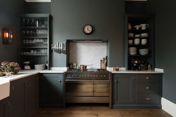
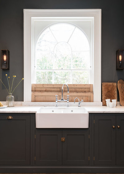
The owners didn’t want to take out the chimney breast. “There’s a similar one in the adjoining dining room, so it provides symmetry,” explains Rumble. “It can also be costly to remove a chimney breast.” So it made sense to slot the range within it and put the sink beneath the window.
“These initial parts of a design can be quite easy,” says Rumble. “It’s then fitting the other elements in that’s harder! It’s about making sure you still have symmetry and plenty of storage in a room that’s quite limited in space.”
“These initial parts of a design can be quite easy,” says Rumble. “It’s then fitting the other elements in that’s harder! It’s about making sure you still have symmetry and plenty of storage in a room that’s quite limited in space.”
“We were very focused on having something under the window to create symmetry,” says Rumble. “Then we wanted to maximise the rest of the space without making it look crowded.”
The wooden shutters are an intriguing original feature. They pull up to conceal the window and then fold down behind each other. “They bring some natural wood tones into the space,” says Rumble. “The wall and cabinet colour had to tie in with that.”
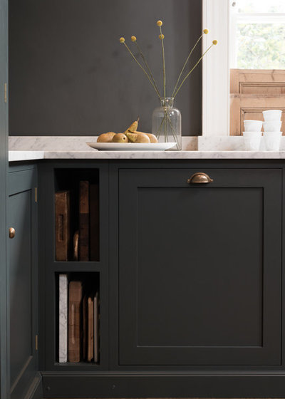
The owners chose a rich, dark grey for the cabinets and walls. “It’s the Flint colour from our bathroom range,” says Rumble. “It’s not a standard colour for our kitchens, but the owners were torn between a softer grey and a very dark blue and this seemed like a natural, in-between shade to go for.” Warm brass handles glow out softly from the dark backdrop.
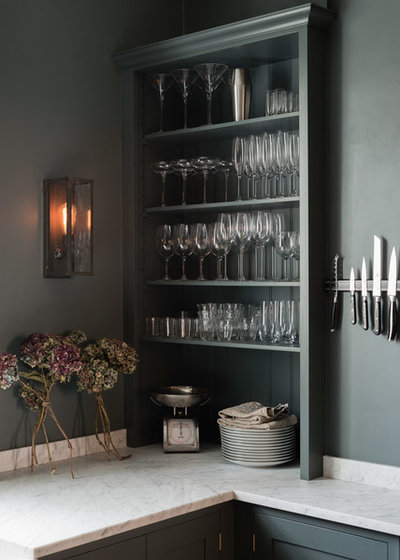
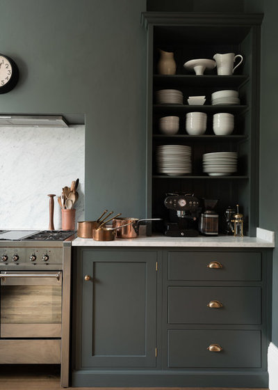
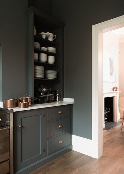
Open shelves were built in on either side of the chimney breast. “We wanted to make a grand feature of it,” says Rumble. The shelves were designed to be slightly higher than the run of cupboards on the opposite side. “Thanks to the dark colour, this difference in height is not noticeable and the vertical and horizontal lines are not so obvious.”

The worktop, range splashback and upstand are 30mm-thick marble. It has a honed rather than a polished finish, chosen by the owners for its matt appearance. “Marble is not quite as hard-wearing as a man-made composite or a stone such as granite,” says Rumble. “It’s a naturally porous material, so it can get scratched and stained, but it’s very beautiful.”
Opera A3 dual-cavity cooker, Smeg.
Opera A3 dual-cavity cooker, Smeg.
The cabinets are a classic Shaker design, made with ply carcasses and solid tulipwood fronts. A small open section next to the dishwasher provides storage for chopping boards and platters.
Shaker cabinets in Flint, deVOL.
Shaker cabinets in Flint, deVOL.
The kitchen opens onto a dining room next door, at the back of the house. Its pale walls make a fresh contrast to the kitchen’s dark tones.
A bespoke butcher’s block fulfils a range of functions. It’s fitted with wheels so it can be moved, and offers a space at which to perch with a coffee. It also contains bins and long drawers. “There aren’t a lot of drawers elsewhere in the kitchen,” says Rumble, “and there also wasn’t a very obvious space for the bins, so we fitted them in here, too.”
Discover how to make your kitchen table the heart of your home
Discover how to make your kitchen table the heart of your home
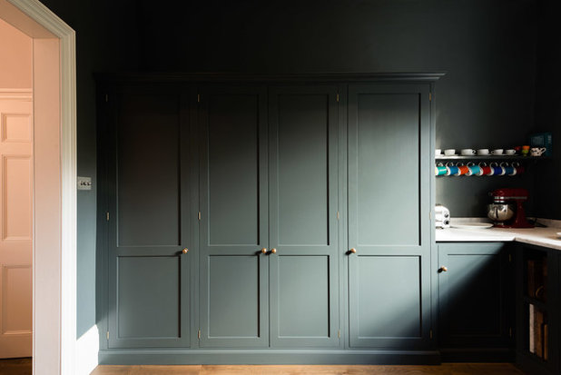
This run of cabinets contains a larder in the centre and a fridge and freezer on either side. “We worked hard to build in as much storage here while keeping it looking discreet and uniform,” said Rumble. Using the same dark shade on the cabinets and the walls helps them to melt into their backdrop and appear less noticeable.
To the side of the larder, a small section of worktop acts as a breakfast station. “We encourage people with larders to use this little return for their toaster and mugs and treat it as a tea and coffee area,” says Rumble. “Here, the owners didn’t need a kettle because they have a boiling-water tap.”
To the side of the larder, a small section of worktop acts as a breakfast station. “We encourage people with larders to use this little return for their toaster and mugs and treat it as a tea and coffee area,” says Rumble. “Here, the owners didn’t need a kettle because they have a boiling-water tap.”
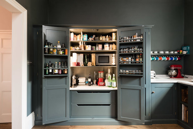
The spacious larder is lit internally and has sockets, so the microwave and other appliances can be plugged in permanently and used inside it.
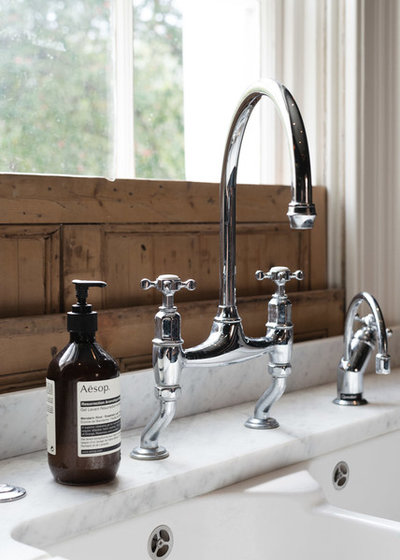
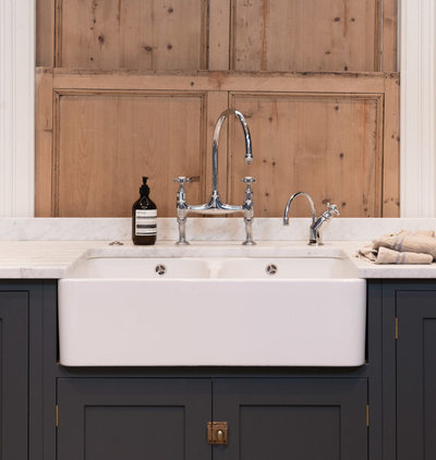
“When there’s a beautiful central window, it’s nice to fit a sink under there,” says Rumble. The window gives views over the garden square at the front of the house.
Ionian mixer tap in chrome, Perrin & Rowe. Pro3 Classic boiling-water tap, Quooker. Sink, Villeroy & Boch.
TELL US…
What do you like about this dark and stylish kitchen? Share your thoughts in the Comments below.
Ionian mixer tap in chrome, Perrin & Rowe. Pro3 Classic boiling-water tap, Quooker. Sink, Villeroy & Boch.
TELL US…
What do you like about this dark and stylish kitchen? Share your thoughts in the Comments below.

Related Stories

House Tours
Houzz Tour: Warm Tones and Luxurious Surfaces in a City Townhouse
An earthy colour palette, hidden storage and well-placed texture add character and practicality to this London home
Full Story

Room Tours
Kitchen Tour: A Gorgeous Extension With a Leafy Glasshouse Feel
By Kate Burt
When the owners of this terraced house extended, they were keen to retain its period feel and highlight the garden
Full Story

Gardens
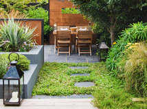
Garden Tour: A Bare Roof Terrace Becomes a Pretty, Sociable Space
By Kate Burt
A retired couple got help transforming their large rooftop into a gorgeous, welcoming, multi-functional retreat
Full Story

House Tours
Houzz Tour: A Smart Layout and Genius Storage in a Victorian Home
Flipping the standard layout and carving out excellent storage have turned this tired house into a brilliant family home
Full Story

House Tours
Houzz Tour: A Victorian House Brought Impressively Up to Date
By Jo Simmons
A cohesive layout and warm colours combined with energy-efficiency measures thoroughly modernise this terraced home
Full Story

Kitchen Tours
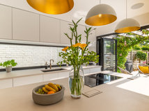
Kitchen Tour: An Open, Airy Space Made for Entertaining
Combining two separate rooms has improved flow and created a sociable open-plan kitchen, dining and seating space
Full Story

House Tours
Houzz Tour: A Family Home Inspired by its Seaside Location
Coastal colours and practical design combine to create a house that will adapt as the family grows
Full Story

Kitchens
5 Inspiring Before and After Kitchen Transformations
Whether you want to boost storage, incorporate original features or maximise your space, take ideas from these designs
Full Story

House Tours
Houzz Tour: An Airy, Scandi Finish for a Tall Victorian House
By Kate Burt
From a tricky inherited bath to a sticky-out staircase, on-site problem-solving led to a seamless update for an old home
Full Story
House Tours
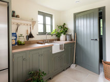
Houzz Tour: A 17th Century Cottage Gains Warmth and Character
The clever use of colour and pattern has revived this old building while creating a 21st century family home
Full Story
Very elegant and stylish, but I would say they won't spend a lot of time in there, too dark. If it was in California or had many many windows this colour might be ok. As it is I'd bet there will be no kids cooking lessons or homework done in this kitchen!
Must be just me as everyone else seems to like this kitchen. The darkness and the knives on the wall give me the heebie-jeebies.