


Kitchen Tour: A Redesign Creates a Roomy Space Without Extending
Smart planning and clever storage ideas gave a growing family a more spacious kitchen-diner on the original footprint
Sarah Alcroft
9 February 2021
Houzz UK Editorial Team
With two growing children, the couple who own this 1940s house in Sheffield were keen to have a kitchen-diner where the whole family could congregate and get on with homework and meal prep together. Suggestions had been made by an architect for an extension, but before going ahead, the couple decided to approach Sheffield Sustainable Kitchens and ask whether they could make the current space work instead.
Kitchen at a Glance
Who lives here? A couple with two young children
Location Ecclesall, Sheffield
Property A 1940s detached house with four bedrooms
Kitchen dimensions 21 sq m
Designer Kirsty Harpham of Sheffield Sustainable Kitchens
Photos by Dug Wilders Photography
Who lives here? A couple with two young children
Location Ecclesall, Sheffield
Property A 1940s detached house with four bedrooms
Kitchen dimensions 21 sq m
Designer Kirsty Harpham of Sheffield Sustainable Kitchens
Photos by Dug Wilders Photography
Before Photo
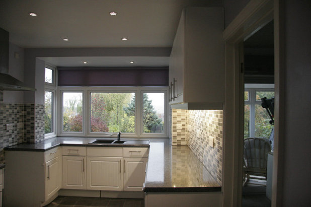
The young family needed a better-functioning kitchen and more storage. Due to lockdown, the children had spent most of the year in the adjacent dining room completing their schoolwork, but having the two rooms separated made life tricky, and a lack of storage meant the kids’ toys were taking over.
The couple didn’t really want the extra cost and disruption of extending, but luckily designer Kirsty Harpham was able to suggest ways to make the existing space function better.
The couple didn’t really want the extra cost and disruption of extending, but luckily designer Kirsty Harpham was able to suggest ways to make the existing space function better.
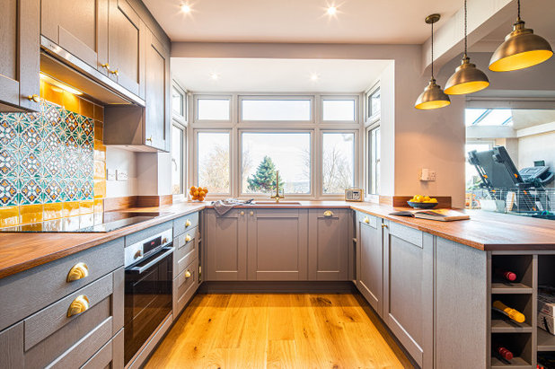
Kirsty started by removing the wall between the two rooms to create one large space. Having lost the wall cabinets, however, her challenge was to incorporate enough storage to keep the space tidy. She found some ingenious ways to give the family all the cupboard space they needed while at the same time keeping costs to a minimum.
The sink and hob were fitted in the same places as the previous ones. “If all the plumbing, gas pipes and electricity points are where they need to be, that cuts down on labour,” she says.
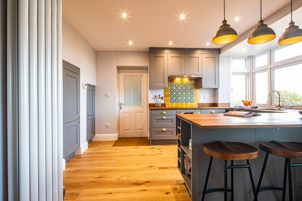
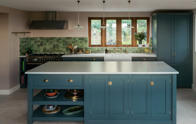
The wall units extend up to the ceiling to maximise useful space. The floor units are in a U shape, with the peninsula adding an extra length of worktop as well as three cabinets, one of which, at the sink end, is a dishwasher.
The sink and hob were fitted in the same places as the previous ones. “If all the plumbing, gas pipes and electricity points are where they need to be, that cuts down on labour,” she says.
The wall units extend up to the ceiling to maximise useful space. The floor units are in a U shape, with the peninsula adding an extra length of worktop as well as three cabinets, one of which, at the sink end, is a dishwasher.
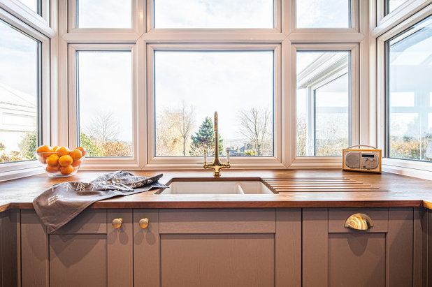
The windowsill is pretty chunky, so, to fit in useful cabinets, this area is quite deep, resulting in plenty of worktop space around the sink. The pull-out door on the right is a bin.
The company aims to be as sustainable as possible, so the bespoke cabinets are made from a special particleboard composed entirely of recycled timber.
The worktops are solid iroko, reclaimed from old school laboratory benches, with the graffiti sanded away to reveal the grain. “Iroko is one of the most robust timbers,” Kirsty says. “It’s naturally water-resistant, so it’s good if you’re having an inset sink, for example.” She does, however, advise that a worktop like this should be re-oiled roughly once a year, depending on usage.
Cabinets, Sheffield Sustainable Kitchens; painted in Dust Grey. Kitchen handles, Crofts & Assinder.
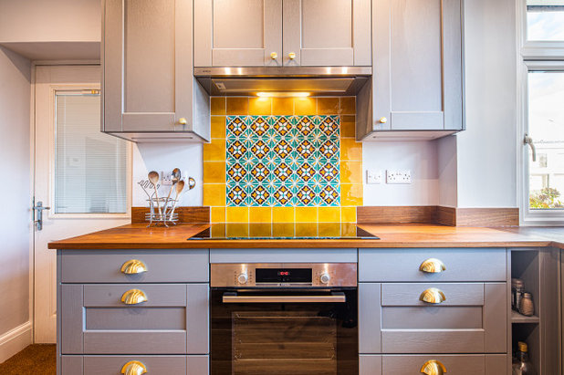
The owners chose decorative tiles for the splashback behind the hob to create a striking focal point in the otherwise neutral room. The rich yellow colour tones nicely with the brass handles and warm wood. Along the rest of the worktops, there’s just a simple iroko upstand, so nothing fights with the bold design.
As the windowsill protrudes too much for corner cupboards, Kirsty slotted in slim storage at either side of the sink run. “It’s nice to have a bit of a feature there for spices, oils or whatever,” she says.
Handmade ceramic tiles, Portuguese Treasures.
As the windowsill protrudes too much for corner cupboards, Kirsty slotted in slim storage at either side of the sink run. “It’s nice to have a bit of a feature there for spices, oils or whatever,” she says.
Handmade ceramic tiles, Portuguese Treasures.
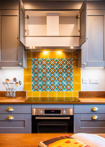
Kirsty fitted a much neater extractor fan than the original one, which freed up room for wall units either side. And, as the cupboards run up to the ceiling, there’s useful storage space above the extractor casing.
Before Photo
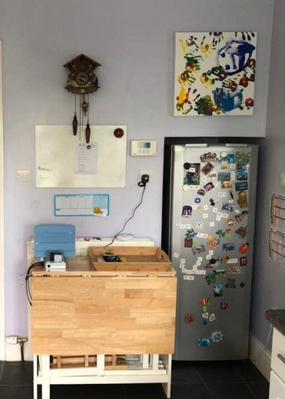
The wall opposite the sink originally had a fridge-freezer slotted into a nook.
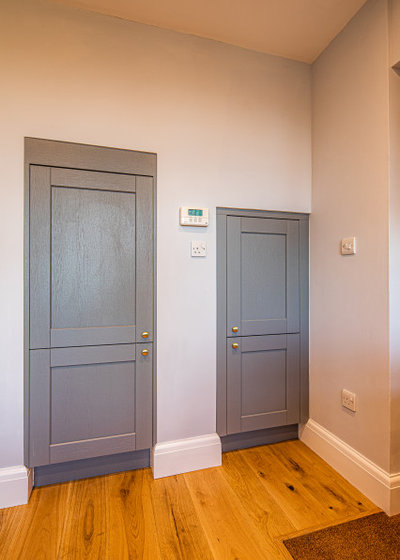
Now, two doors matching the other cabinets have created a neat area. This wall has a staircase on the other side, beneath which is an understairs cupboard, originally accessed from the hall. Kirsty made use of the cupboard by blocking up the hallway door and creating the taller opening seen here in the kitchen. She then slotted in an integrated fridge-freezer.
The shorter, former fridge alcove now contains…
The shorter, former fridge alcove now contains…
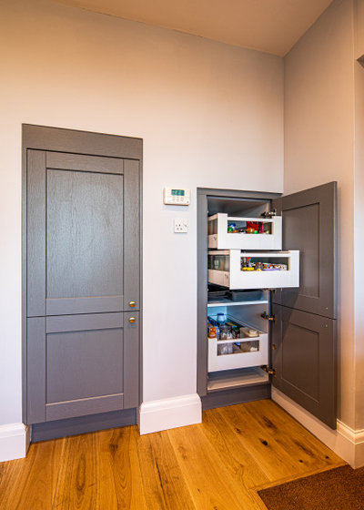
…a larder drawer system. “We fitted it with a Space Tower shelving unit,” Kirsty says. “It’s a really deep space, so we had [the system] made bespoke to be deeper – 680mm rather than 500mm.”
Space Tower shelving unit, Blum. Engineered wood flooring, Eric Gilbert Carpets.
Space Tower shelving unit, Blum. Engineered wood flooring, Eric Gilbert Carpets.
The white door opens onto a covered walkway that leads to a small building housing the washing machine and laundry paraphernalia.
Before Photo
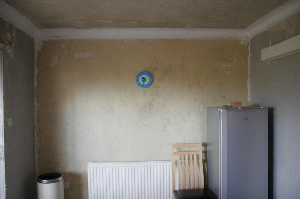
The dining room was stripped out ready for the renovation. This wall is opposite the kitchen.
Now there are two roomy cupboards on the end wall. “The original dining space was a bit like a toy storeroom, so we thought these big larder cabinets would be really useful for hiding away the kids’ stuff,” Kirsty says. They run up to the ceiling to avoid a dust trap, as well as to maximise storage.
The cabinets are deliberately in the same style as the kitchen units and worktops. “By having the same cabinet colour and the reclaimed iroko desk and shelves, they help the dining space integrate with the kitchen,” Kirsty says.
The cabinets are deliberately in the same style as the kitchen units and worktops. “By having the same cabinet colour and the reclaimed iroko desk and shelves, they help the dining space integrate with the kitchen,” Kirsty says.
There are simple adjustable shelves in each cupboard.
The desk is a homework station, and the parents are now able to keep an eye on the children doing their schoolwork while they prepare meals.
The desk is a homework station, and the parents are now able to keep an eye on the children doing their schoolwork while they prepare meals.
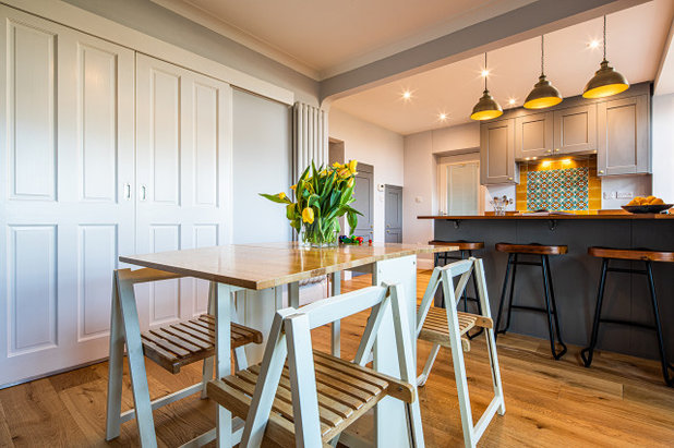
The sliding doors open into the living room, which creates a great space when friends come round. The table and chairs fold up, so the area can be cleared when necessary.
The living room side of the right-hand tall cabinet is slightly thicker to allow the sliding door to open.
Table and chairs from a UK sustainable supplier on eBay.
The living room side of the right-hand tall cabinet is slightly thicker to allow the sliding door to open.
Table and chairs from a UK sustainable supplier on eBay.
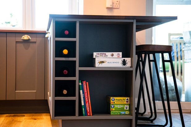
The peninsula unit creates a nice divide between the two spaces without impeding the flow of the room. Kirsty left the end section open for more book and game storage, as well as incorporating dedicated wine slots.
There’s also a breakfast bar on the dining room side. “We did start off by not having seating at the peninsula, as we had some [additional] cabinets on that side, but once the tall larder cupboards in the dining room were in, the owner felt she had enough storage, so that enabled us to put seating here,” Kirsty says.
There’s also a breakfast bar on the dining room side. “We did start off by not having seating at the peninsula, as we had some [additional] cabinets on that side, but once the tall larder cupboards in the dining room were in, the owner felt she had enough storage, so that enabled us to put seating here,” Kirsty says.
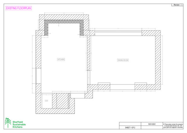
The floorplan before works, showing the two separate rooms and the original fridge nook.
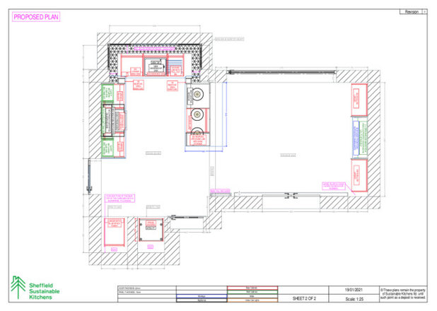
The floorplan now. The kitchen is in the same position, but open to the dining area, and Kirsty has made more use of the space under the stairs.
Layout-wise, little has changed, with the kitchen and dining area still in their original positions, but the open room and elegantly incorporated additional storage has resulted in a space that’s easy to keep tidy and which the whole family can enjoy using.
Would Kirsty say the owners are happy with the design? “They’re absolutely overjoyed!” she says.
Tell us…
What do you like about this reworked kitchen and dining space? Share your thoughts in the Comments.
Would Kirsty say the owners are happy with the design? “They’re absolutely overjoyed!” she says.
Tell us…
What do you like about this reworked kitchen and dining space? Share your thoughts in the Comments.


Related Stories

House Tours
Houzz Tour: Warm Tones and Luxurious Surfaces in a City Townhouse
An earthy colour palette, hidden storage and well-placed texture add character and practicality to this London home
Full Story

Room Tours
Kitchen Tour: A Gorgeous Extension With a Leafy Glasshouse Feel
By Kate Burt
When the owners of this terraced house extended, they were keen to retain its period feel and highlight the garden
Full Story

Gardens
Garden Tour: A Bare Roof Terrace Becomes a Pretty, Sociable Space
By Kate Burt
A retired couple got help transforming their large rooftop into a gorgeous, welcoming, multi-functional retreat
Full Story

House Tours
Houzz Tour: A Smart Layout and Genius Storage in a Victorian Home
Flipping the standard layout and carving out excellent storage have turned this tired house into a brilliant family home
Full Story

House Tours
Houzz Tour: A Victorian House Brought Impressively Up to Date
By Jo Simmons
A cohesive layout and warm colours combined with energy-efficiency measures thoroughly modernise this terraced home
Full Story

Kitchen Tours
Kitchen Tour: An Open, Airy Space Made for Entertaining
Combining two separate rooms has improved flow and created a sociable open-plan kitchen, dining and seating space
Full Story

House Tours
Houzz Tour: A Family Home Inspired by its Seaside Location
Coastal colours and practical design combine to create a house that will adapt as the family grows
Full Story

Kitchens
5 Inspiring Before and After Kitchen Transformations
Whether you want to boost storage, incorporate original features or maximise your space, take ideas from these designs
Full Story

House Tours
Houzz Tour: An Airy, Scandi Finish for a Tall Victorian House
By Kate Burt
From a tricky inherited bath to a sticky-out staircase, on-site problem-solving led to a seamless update for an old home
Full Story
House Tours
Houzz Tour: A 17th Century Cottage Gains Warmth and Character
The clever use of colour and pattern has revived this old building while creating a 21st century family home
Full Story
How refreshing to see a design which reworks what is already in place, rather than automatically going for an extension (some of which are greatly out of proportion to the rest of the property) ! Care and creative thought go a long way towards achieving better flow. A limited budget does not necessarily mean limited ideas ! (Depending on the size of the original understairs cupboard, there may have been space in the hallway left over from the installation of the new fridge-freezer, into which a pull-out arrangement could be fitted for shoes, out of season scarves/gloves/boots etc ?)
In our own renovation, we went for larder drawers rather than shelves, and don't regret it at all !
I, too, wondered about heating - but noticed that in Photo 10 there is a large, white, vertical radiator, mounted on the wall between the 2 rooms, just beyond where one of the sliding doors to the living room reaches. I hope that's enough to heat quite a bit space !
It really is lovely. I particularly like the yellow tiles, despite not liking yellow too much! I don’t think though that it was done on a budget. For some reasons I have £30k in my head. I don’t know where I picked that figure up from. Am I correct? Am I out of touch. Is that the going rate?
I'd like to see the covered walkway. I'm intrigued.