Houzz Tours

Kitchen Tours
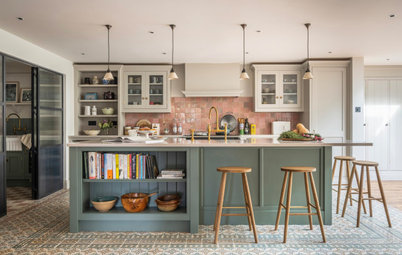
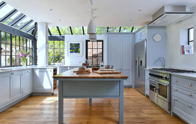
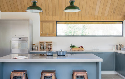
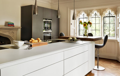
South East Kitchen
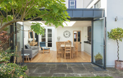
Kitchen Tour: A Rural Cottage Gains a Sensitive New Extension
A gentle addition to the footprint of a rustic, Victorian home has created more space and better function – seamlessly

“It was a pretty tight budget for the space we created,” says NK Living’s Natalie McHugh of the stunning oak-framed kitchen extension she designed for this characterful, rustic cottage in West Sussex. The owners contacted her after seeing the design and build company’s profile on Houzz and spotting Natalie’s passion for modernising old houses without stripping away their period charm.
“The whole project was about expanding the space while keeping as much of the original stuff as possible,” she says. There was a lot of upcycling and reuse involved, as well as trips to the local antiques fair and some savvy decisions that helped to enhance the appearance of affordable choices. “It looks like an expensive designer kitchen, but it isn’t,” she says.
“The whole project was about expanding the space while keeping as much of the original stuff as possible,” she says. There was a lot of upcycling and reuse involved, as well as trips to the local antiques fair and some savvy decisions that helped to enhance the appearance of affordable choices. “It looks like an expensive designer kitchen, but it isn’t,” she says.
While the upstairs was working fine, the downstairs felt cramped. NK Living were enlisted to help the owners increase the living area, better connect the back of the house to the garden, and create a more practical entrance, particularly as they use the back door as the main way in and out of the house.
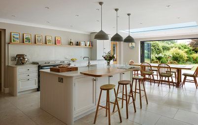
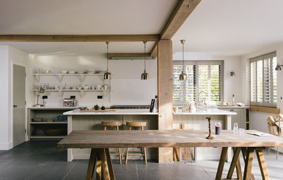
Natalie’s solution was to add 15 square metres to the house in the form of this appropriately rustic and airy extension, which contains a dining area as well as room to add armchairs or even a sofa. She also reconfigured the ground floor layout, making space for a new cloakroom and a utility/boot room.
The windows and doors in the extension have black aluminium frames, which tie in with various features around the house and kitchen, including dark, wrought-iron handles and shelf brackets.
The windows and doors in the extension have black aluminium frames, which tie in with various features around the house and kitchen, including dark, wrought-iron handles and shelf brackets.
The oak stands out beautifully against the white walls. “It’s nice that the depth of the oakwork is less than that of the wall, as it’s created a window ledge for books, candles and so on,” Natalie says.
The floor in here and throughout is an antiqued, engineered oak, which is both in keeping and robust. “With three boys, they needed something that could withstand a lot of wear,” Natalie says.
She’s pleased with the little details, too, such as the ogee skirting boards (which have a sweeping curve at the top). “The details are important. I always think skirtings look better deeper – it gives them more presence. And because it’s ogee, it has a nice period feel to it.”
The wall lights were added in case the owners want to create a reading nook with an armchair on this side. On the other side, the already generous amount of natural light is boosted by a skylight.
The vintage trestle table was a restoration project for Natalie. She had the tabletop and bench seats repaired then painted to lighten them up.
Vintage glass vases; bierkeller-style table and benches, all Ardingly Antiques Fair; benches and table tops painted in Cornforth White, Farrow & Ball.
The old kitchen was in need of an update. “These windows were the only light [source for] the room, so it was very dark,” Natalie says.
Search the Houzz Professionals Directory for reviewed design and build professionals in your area.
Search the Houzz Professionals Directory for reviewed design and build professionals in your area.
The remains of what used to be the back wall can be seen next to the fridge-freezer. To increase not only the light but also the sense of space, the pitched extension roof is vaulted, adding welcome height at the far end of the space.
“We chose a pitched roof, as it felt in keeping with the period of the property, but also, because the existing ceiling is low, we felt it was important to lift the extension. “It gives the clients a light, bright and airy living space/dining area,” Natalie explains.
Walls and ceilings painted in Strong White; cabinets painted in Railings, both Farrow & Ball.
Natalie extended the oak beams from the extension into the kitchen to help connect the old and new areas.
Oak worktops further tie the extension to the kitchen and are finished in Danish oil, to keep the natural grain visible. Next to the traditional-style butler’s sink, the worktop is quartz. “We felt the oak next to the sink might not have survived a busy kitchen,” Natalie says.
Pendant lights, DeVOL. Wall lights, Garden Trading. Fridge-freezer, Samsung.
There’s more oak detailing in the shelves, for which Natalie chose wrought-iron brackets to echo door handles elsewhere in the house.
Money was saved on the plumbing by installing the butler’s sink in the same position as the old sink. There’s an integrated dishwasher in the adjacent cupboard.
Taps, Perrin & Rowe.
Taps, Perrin & Rowe.
The huge, white-painted beam is original to the house. “We had to factor in wrapping the kitchen around this without losing any of its original, rustic charm,” Natalie says.
The worktops are lit by vintage-style industrial wall lamps and lights in the extractor hood.
This ‘work in progress’ photo shows the original beam, now painted white, and a built-in wooden dresser, which was also retained.
Natalie deliberately avoided wall cabinets to keep the kitchen from feeling cramped. “Shelves give a more open feel,” she says.
There’s plenty of storage elsewhere: the island has drawers on the cooker side and cupboards on the other. There’s also the lovely dresser seen in the previous photo.
There’s additional cupboard space elsewhere, including in a little overspill area at the edge of the room, shown in the next photo.
There’s plenty of storage elsewhere: the island has drawers on the cooker side and cupboards on the other. There’s also the lovely dresser seen in the previous photo.
There’s additional cupboard space elsewhere, including in a little overspill area at the edge of the room, shown in the next photo.
This view shows the only wall cabinet, which has glass doors and sits above a base unit – the dry foods pantry – topped with quartz and designed as a breakfast-making spot. “Having this area extends the size of the kitchen and helps everyone not to get on top of each other,” Natalie says.
From here, you get a good view of that original dresser, next to a door that leads straight into the living room. To the left of the dresser is the new utility/boot room Natalie also created.
This photo was taken just to the left of that view, showing the dilapidated space as it originally looked.
Previously, the space had been a sort of outhouse with a broken toilet in it. The family used it for bike storage.
Natalie connected the space to the kitchen, turning it into a brilliantly useful area, flooded with daylight thanks to a new skylight. It now houses the washing machine and associated storage space, and has hooks at the end for coats, plus a little cupboard for the boys’ shoes.
The hanging rail was made out of one of the kitchen’s original floorboards, which Natalie had limewashed.
The darker door on the right leads to a basement room, where the family can stash boots, coats and the children’s sports equipment. The door on the left, which leads to the garden, is used as the main entrance.
A new stud wall provides space for a clothes airer and, behind this, Natalie added a cloakroom, the door to which you can just see on the right.
At the end of the garden, the family have some additional space for drying laundry in an outbuilding.
At the end of the garden, the family have some additional space for drying laundry in an outbuilding.
The cloakroom is small but characterful.
The brick wall is the original external wall to the main house; Natalie’s team simply restored it.
Tell us…
What’s your favourite detail in this characterful Victorian cottage kitchen? Let us know your thoughts in the Comments.
Tell us…
What’s your favourite detail in this characterful Victorian cottage kitchen? Let us know your thoughts in the Comments.


Sponsored
Who lives here? A couple with three young boys
Location Worth, West Sussex
Property A Victorian terraced cottage with four bedrooms and two bathrooms
Room dimensions Around 35 sq m
Designer Natalie McHugh at NK Living
Budget £70,000, which included the kitchen, the finish, the glazing and the flooring
Photos by Chris Snook
Natalie’s clients had been living in their home for around five years, liked the area and didn’t want to move. They’d had more children since buying the house and their needs for the space had shifted. This shows the back of their home before Natalie and the team got to work.