Houzz Tours

Kitchen Tours
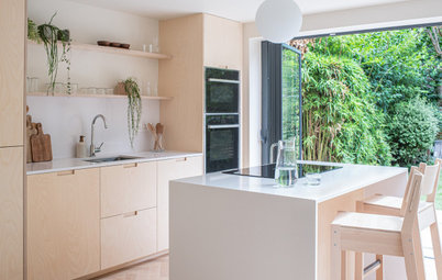
London Kitchen

Kitchen Tour: An Old Lean-to Becomes a Clean, Fresh Kitchen-diner
Showcasing beautiful materials, this light-filled extension has given a busy family a calm space connected to the garden

As many an architect will attest, the simpler the space, the more every surface has to be beautiful. So when the young couple who own this post-war home asked architect Lizzie Ruinard of neighbourhood studio for a fresh, minimal kitchen-diner, she knew paying attention to the details would be key.
“If you’re exposing all the finishes, there’s nowhere to hide,” she says. “You can’t just disguise everything with plasterboard.” Cue perfectly mortar-washed brick, polished concrete and exquisite joinery.
“If you’re exposing all the finishes, there’s nowhere to hide,” she says. “You can’t just disguise everything with plasterboard.” Cue perfectly mortar-washed brick, polished concrete and exquisite joinery.
The owners of the house, who are from New Zealand, were keen to have something that looked fresh and was easy to maintain.
Lizzie chose brick, concrete and oak as the main materials. “I wanted to keep them natural and we treated them as little as possible,” she says. “We also kept the palette quite small and simple.
Lizzie chose brick, concrete and oak as the main materials. “I wanted to keep them natural and we treated them as little as possible,” she says. “We also kept the palette quite small and simple.
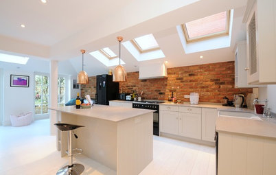
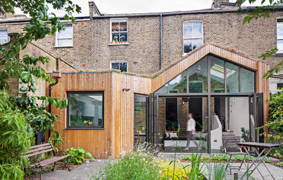
The new kitchen-diner replaced a grotty lean-to conservatory. As the footprint was the same as the original kitchen and lean-to, the work could be done under Permitted Development, saving time and money by not having to apply for Planning Permission.
Behind the splashback wall is a slim utility room. Sacrificing some of the kitchen for it made sense.
“If we’d taken the kitchen all the way back, it would have been quite dark and cavernous,” Lizzie says. “I pushed the skylight as far back as I could, flush with the house, so we could bring in as much light as possible, because that area is quite a long way from the window.”
In addition, of course, diners are spared the sound of the washing machine on full spin.
The plans show the utility room, and how deep the kitchen-diner would have been if it hadn’t been sectioned off to form the separate space.
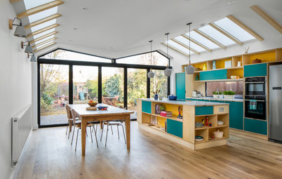
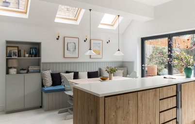
The beams that form the ceiling from the skylight to the garden wall add texture. “The rest of the finishes are quite hard and the owners wanted the kitchen cabinets to be clean and white, so it was nice to introduce some warmth,” Lizzie says.
The floor also adds subtle interest. “The concrete has been ground more than normal to expose the aggregate,” Lizzie says. “It’s called a salt and pepper effect.”
The floor also adds subtle interest. “The concrete has been ground more than normal to expose the aggregate,” Lizzie says. “It’s called a salt and pepper effect.”
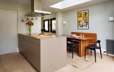
The couple are big foodies, so there are a couple of ovens and a large fridge-freezer in the side wall. The tall cupboard to the left of the fridge is a pull-out larder.
Appliances, Fisher & Paykel.
Appliances, Fisher & Paykel.
The matt white kitchen units were made by cabinet-makers Alex Findlater. The doors all have push-to-open catches to keep the sleek, minimal look the couple were after. The one handle you can see on the left is for the dishwasher.
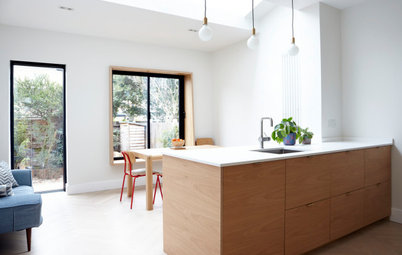
The inset oak shelf unit at the end adds a nice detail. “Because we were rebuilding that wall, we had the opportunity to slot something in, and we thought it would be nice to have the oak, as the rest of the kitchen is so white,” Lizzie says.
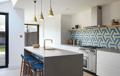
“The splashback tiles are zellige, which catch the light and bring in another bit of texture,” she adds. The worktop is robust Silestone.
The inset oak shelf unit at the end adds a nice detail. “Because we were rebuilding that wall, we had the opportunity to slot something in, and we thought it would be nice to have the oak, as the rest of the kitchen is so white,” Lizzie says.
“The splashback tiles are zellige, which catch the light and bring in another bit of texture,” she adds. The worktop is robust Silestone.
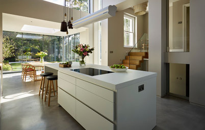
The worktop on the peninsula is extra wide. “We went for a 1200mm-deep breakfast bar, which is bigger than normal, but as we were quite restricted on the back units and there isn’t much prep space there, we wanted a more luxurious peninsula with a generous surface,” Lizzie explains.
The small square you can see in the middle of the worktop is a pop-up socket block.
The small square you can see in the middle of the worktop is a pop-up socket block.
The sideboard, again built by the cabinet-makers, drops down into a bench seat. “The top of the bench lifts up so the kids’ toys can be stored inside,” Lizzie says.
The back of the bench is angled slightly for comfort. “It’s a nice spot to read a book or listen to music,” she says.
The back of the bench is angled slightly for comfort. “It’s a nice spot to read a book or listen to music,” she says.
The lean-to conservatory wasn’t fit for purpose and didn’t maximise the link to the garden.
The new structure is understated. “We wanted to use toned-down bricks,” Lizzie says. “Originally, we were going to mortar-wash them, but in the end we liked the look, so left them as they were,”
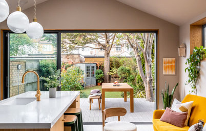
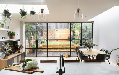
Two large sliding doors mean there’s a mostly uninterrupted view of the garden. “I always recommend sliding doors, as bifolds have more divisions,” Lizzie says. “In this case, it looked quite neat to have one line down the middle.”
Two large sliding doors mean there’s a mostly uninterrupted view of the garden. “I always recommend sliding doors, as bifolds have more divisions,” Lizzie says. “In this case, it looked quite neat to have one line down the middle.”
Inside, the brickwork had a thin layer of mortar sponged over it. “It’s a specific mix of silver sand, white cement, lime and plasticiser, all watered down,” Lizzie says. “We did lots of experiments on the walls and figured out a consistency and a finish we were happy with.”
When the plants establish, the outlook from the kitchen will be leafy and lush. Lizzie toyed with the idea of having cobbles in the back section, but, she says, “As the couple have little kids, they wanted a patch of grass.”
The pendant lights over the peninsula and the dining table are terracotta. “They fit with the palette and pure materials, carrying on the room’s look in the lighting,” she says.
Large terracotta pendant light (over table); Rigatoni pendant lights (over peninsula); white Gooseberry wall light, all Hand & Eye Studio.
The husband was keen to have a professional barbecue. “The unit underneath provides space for barbecue stuff and garden tools,” Lizzie says.
The wood slats on the doors keep the unit ventilated and match the fencing, and they also subtly echo the beams indoors. That, and having the same concrete flooring inside and out, means the spaces merge beautifully when the doors are open.
On the other side of the patio is a brick bench. “I wanted to break up the space with seat-height brickwork, so it wasn’t just a flat surface then a wall,” Lizzie says. “The owners can add interest with a few pots and put cushions out there in the summer.”
The couple already owned the dining chairs, but Alex Findlater made the table from oak to tie in with the rest of the scheme.
Tell us…
What do you like about this fresh, modern space? Share your thoughts in the Comments section.
Tell us…
What do you like about this fresh, modern space? Share your thoughts in the Comments section.

Sponsored
Who lives here? A couple with two young children
Location Kensal Rise, west London
Property A post-war infill terrace
Room dimensions 30 sq m
Architect Lizzie Ruinard of neighbourhood studio
Cabinet-makers Alex Findlater
Photos by Peter Landers