


Kitchen Tour: Clever Design Kept a Stylish Extension on Budget
Thoughtful planning and material choices were key when it came to designing this cool kitchen extension
Amanda Pollard
8 October 2019
Senior Editor at Houzz UK and Ireland. Journalist and editor specialising in interiors and architecture.
Senior Editor at Houzz UK and Ireland. Journalist and editor specialising in interiors... More
When architect Richard Andrews and his wife Kristina moved into their Victorian terrace, they knew they needed to adapt the house, but they were determined that any renovation would fit well into the surrounding neighbourhood. “I wanted to set a high standard for the local area and show that you could do this without a huge budget,” he says.
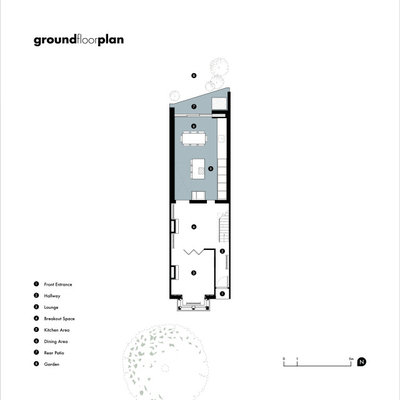
Kitchen at a Glance
Who lives here? Architect Richard Andrews, make-up artist Kristina Andrews, and their dog, Baloo
Location South-east London
Property A Victorian terraced house
Kitchen dimensions 7 x 4.2m
Budget £85,000, including kitchen appliances and all fixtures and fittings
Architectural designer Richard Andrews of Richard John Andrews
Photos by Chris Snook
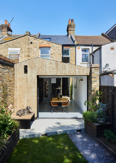
The ground floor kitchen extension at the rear of Richard Andrews’ home was designed with the rest of the street in mind. “We wanted to be sympathetic to the area and not impact the neighbours too much,” he says. “So this influenced the form of the building and the materials we chose.”
The gabled roof, for example, has its highest point further away from the neighbour’s side return to reduce the impact on light levels, and the slope falls at the same angle as the second storey roof to help it blend in from the outside.
Who lives here? Architect Richard Andrews, make-up artist Kristina Andrews, and their dog, Baloo
Location South-east London
Property A Victorian terraced house
Kitchen dimensions 7 x 4.2m
Budget £85,000, including kitchen appliances and all fixtures and fittings
Architectural designer Richard Andrews of Richard John Andrews
Photos by Chris Snook
The ground floor kitchen extension at the rear of Richard Andrews’ home was designed with the rest of the street in mind. “We wanted to be sympathetic to the area and not impact the neighbours too much,” he says. “So this influenced the form of the building and the materials we chose.”
The gabled roof, for example, has its highest point further away from the neighbour’s side return to reduce the impact on light levels, and the slope falls at the same angle as the second storey roof to help it blend in from the outside.
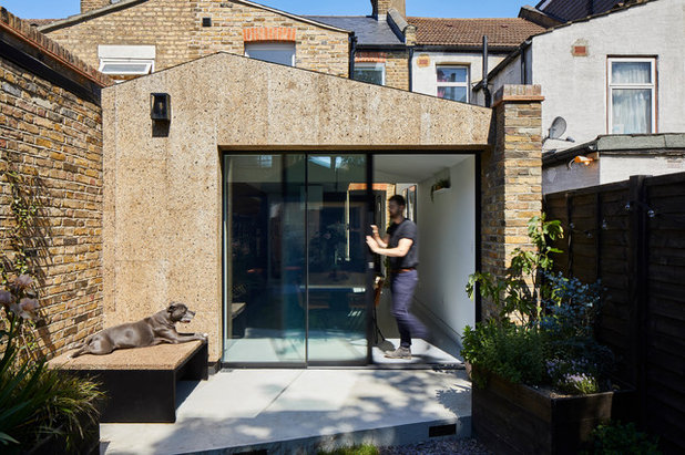
The decision to clad the extension with cork was influenced by a number of factors, including its aesthetic appeal, durability and thermal performance.
“It works well with the London stock brick, and it’s also water-resistant,” Richard says. “Cork repels insects, too, so there’s no need to apply a chemical treatment or use an insect mesh beneath the façade to prevent nests.”
“It works well with the London stock brick, and it’s also water-resistant,” Richard says. “Cork repels insects, too, so there’s no need to apply a chemical treatment or use an insect mesh beneath the façade to prevent nests.”
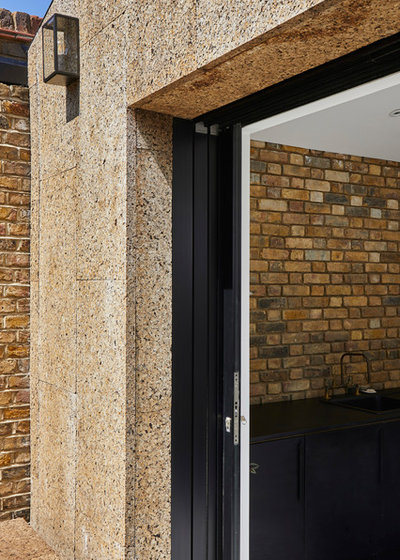
Richard chose a sliding pocket door for the opening to the garden, as the stacked design of a bifold would have taken up too much space when open. The cork cladding was useful here, as the pocket door fits into a gap between two thin walls, so any cladding needed to have good thermal performance.
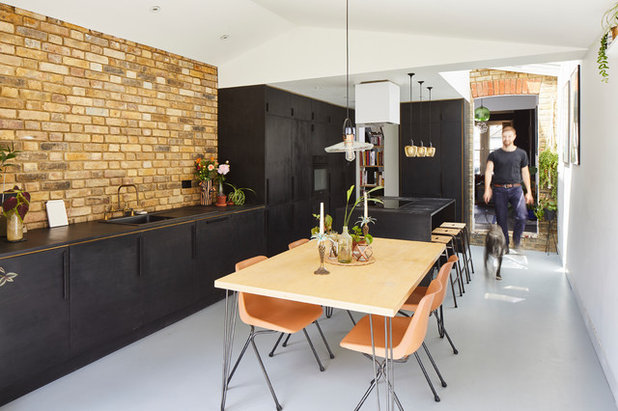
The garden wall was rebuilt in traditional bricks, and Richard carried this through on the party wall inside. “Whether you’re inside or out, you have a reference to the London stock brickwork,” he explains.
Find an architect in your area to help bring your project to life.
The garden wall was rebuilt in traditional bricks, and Richard carried this through on the party wall inside. “Whether you’re inside or out, you have a reference to the London stock brickwork,” he explains.
Find an architect in your area to help bring your project to life.
Richard built the extension and kitchen himself as a way to explore how to keep costs down and to use as a showcase for his architectural practice.
“I used my knowledge of construction to work out if there were cost-effective ways to create the kitchen on a tight budget,” he says. “I wanted to experiment with how we could finish it to look more expensive than it was to create. My clients often want to push the boundaries, so that means you need to be a bit clever.”
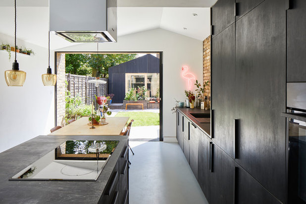
The carcasses were made from moisture-resistant MDF, while the doors and worktops are birch ply stained with Indian ink. “I wanted to keep the texture and grain of the plywood, but with a slicker, more fine-tuned finish,” he says. “We used a harder oil for the worktop, which makes it very hardy. It weathers and patinates where you use it, which looks great.”
Oil used on doors and worktops, Osmo.
“I used my knowledge of construction to work out if there were cost-effective ways to create the kitchen on a tight budget,” he says. “I wanted to experiment with how we could finish it to look more expensive than it was to create. My clients often want to push the boundaries, so that means you need to be a bit clever.”
The carcasses were made from moisture-resistant MDF, while the doors and worktops are birch ply stained with Indian ink. “I wanted to keep the texture and grain of the plywood, but with a slicker, more fine-tuned finish,” he says. “We used a harder oil for the worktop, which makes it very hardy. It weathers and patinates where you use it, which looks great.”
Oil used on doors and worktops, Osmo.
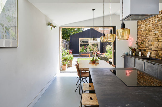
The sliding door at the rear frames the studio at the end of the garden. “It creates a picture perfect view and illustrates the fact the two spaces were designed together,” Richard says.
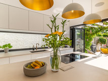
The kitchen has a linear design to enable the couple to eat, cook and socialise while enjoying a connection to the garden.
The extractor fan Richard chose would usually be hung from a high ceiling with two-metre tension cables. “We took the components out and fixed it directly to the ceiling, with a 25mm gap around the top of the cube to create a separation,” he says. “It’s a recycling extractor, so there was no need to have a duct.”
Extractor, KKT Kolbe.
There’s plenty of storage in the kitchen, including a tall pantry cupboard and an integrated fridge-freezer on the wall opposite the back door.
At the far end of the side wall are integrated ovens with surrounding storage, alongside base units for a washing machine, dishwasher, pull-out bins and undersink cupboard. There are also pan drawers and a pull-out drawer for spices and oils in the island.
In the left-hand corner, where the original opening used to be, there’s a set of plywood shelves with concealed aluminium brackets. “You can see through to the room behind,” Richard says. “When friends come over, their kids can play in the room next door while staying connected to us in the kitchen.
“We used plywood for the dining table, as we wanted to be consistent with materials throughout,” he says. “The Robin Day dining chairs were from a school that had been closed locally and each one cost just £6. The bar stools were also from the school clearance.”
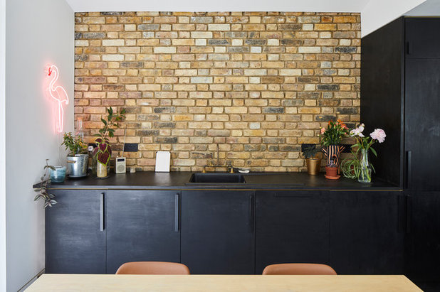
Richard designed the units with a slight shadow gap beneath the worktop to give them an interesting look, and used recycled Ikea plastic handles on the doors.
A matt black composite sink and drainer ties in with the stained birch ply. The copper taps were designed by Richard and his team. “We set ourselves the challenge of coming up with a simple design for here and the bathroom upstairs,” he explains. “They’re made from standard copper and treated to ensure they remain untarnished.”
Sink, Franke.
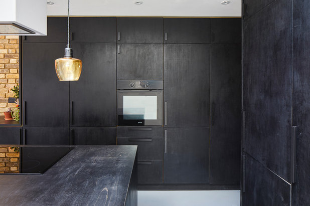
“One of our challenges was to find a supplier of matt black appliances without brushed steel elements,” Richard says. “We found these, which are great quality and were a reasonable price.”
Oven, Gorenje.
Oven, Gorenje.
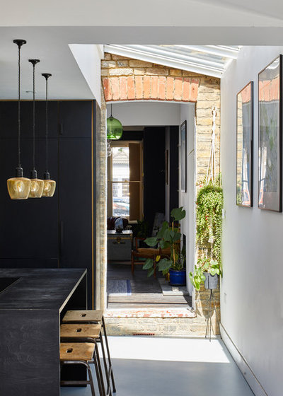
A series of rooflights lead from the internal doorway to the back door, and the original rear brick wall is on show.
“By referencing the brickwork here and along the party wall, it makes the room look as if it’s been inserted into the corner between the two walls,” Richard says.
Kristina took on the task of sourcing lighting, and found these 1950s glass lampshades on eBay. “They were probably used [in a cluster] for a bedside light, but we split them into three and attached new fittings,” Richard says. “The delicate yellow glass looks great over the island.”
Richard also installed a few recessed, directional downlights to illuminate the brickwork. “They’re purely functional and as invisible as possible,” he says.
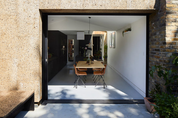
“As we have a dog, we needed easy-to-clean, durable flooring,” Richard explains. “This vinyl is great, as you could draw all over it and wipe it off – and everyone thinks it polished concrete.”
Vinyl flooring, The Colour Flooring Company.
Vinyl flooring, The Colour Flooring Company.
Tell us…
What do you like about this cool kitchen extension? Do you have experience of using cork in your home? Share your thoughts in the Comments section.
What do you like about this cool kitchen extension? Do you have experience of using cork in your home? Share your thoughts in the Comments section.

What are you working on?


Related Stories

House Tours
Houzz Tour: A Midcentury Home With a Strong Indoor-outdoor Link
By Becky Harris
A nature-inspired renovation has given this ranch house a relaxed mood and a connection to the outdoors from most rooms
Full Story

House Tours
Houzz Tour: Warm Tones and Luxurious Surfaces in a City Townhouse
An earthy colour palette, hidden storage and well-placed texture add character and practicality to this London home
Full Story

Room Tours
Kitchen Tour: A Gorgeous Extension With a Leafy Glasshouse Feel
By Kate Burt
When the owners of this terraced house extended, they were keen to retain its period feel and highlight the garden
Full Story

Gardens
Garden Tour: A Bare Roof Terrace Becomes a Pretty, Sociable Space
By Kate Burt
A retired couple got help transforming their large rooftop into a gorgeous, welcoming, multi-functional retreat
Full Story

House Tours
Houzz Tour: A Smart Layout and Genius Storage in a Victorian Home
Flipping the standard layout and carving out excellent storage have turned this tired house into a brilliant family home
Full Story

House Tours
Houzz Tour: A Victorian House Brought Impressively Up to Date
By Jo Simmons
A cohesive layout and warm colours combined with energy-efficiency measures thoroughly modernise this terraced home
Full Story

Kitchen Tours
Kitchen Tour: An Open, Airy Space Made for Entertaining
Combining two separate rooms has improved flow and created a sociable open-plan kitchen, dining and seating space
Full Story

House Tours
Houzz Tour: A Family Home Inspired by its Seaside Location
Coastal colours and practical design combine to create a house that will adapt as the family grows
Full Story

Kitchens
5 Inspiring Before and After Kitchen Transformations
Whether you want to boost storage, incorporate original features or maximise your space, take ideas from these designs
Full Story

House Tours
Houzz Tour: An Airy, Scandi Finish for a Tall Victorian House
By Kate Burt
From a tricky inherited bath to a sticky-out staircase, on-site problem-solving led to a seamless update for an old home
Full Story
What brand is your sink.. it’s such a nice simple shape without twiddly grooves etc!
Ai licket your worck
Amazing kitchen