Mumbai Houzz: A 760-Sq-Ft Home Reveals Its Space-Boosting Secrets
Far from feeling small and confined, this abode exhibits clever visual tricks that give it a seamless, spacious look
Aditi Sharma Maheshwari
13 November 2017
Blogger, dog mom
Necessity is the mother of invention, right? Right. Small homes come with their own share of challenges and are ripe for smart ideas and clever design strategies to make more out of less. Within their 70-square-metre Mumbai apartment, the homeowners hoped to maximise on the square footage available and revel in beautiful interiors. They invited Somalika Tiwari of The Svelte Designs to help them achieve their dream. “Inspired by the European style of design, the couple wanted their abode to be very minimalistic and modern, at the same time functional. Although space was a constraint, we envisioned an elegant design scheme abounding in neutral colour tones and sparse furniture,” Somalika Tiwari says.
Houzz at a Glance
Who lives here: A couple
Location: Mumbai
Year built: 2015
Size: 70 square metres (760 square feet); 2 bedrooms; 2 bathrooms
Interior design: Somalika Tiwari, founder & interior designer, The Svelte Designs
Photos by Anil Singh
Houzz at a Glance
Who lives here: A couple
Location: Mumbai
Year built: 2015
Size: 70 square metres (760 square feet); 2 bedrooms; 2 bathrooms
Interior design: Somalika Tiwari, founder & interior designer, The Svelte Designs
Photos by Anil Singh
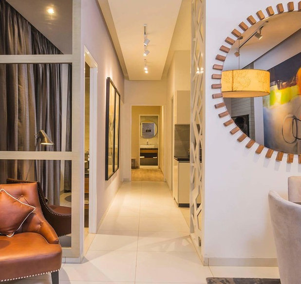
The two bedroom home in an 11th floor apartment of a township in Mumbai is permeated with soft hues and plush seating. Plenty of art adorns its walls. The case of limited space gets masked by use of a restricted palette, an open plan and clever, custom furniture design. “The owners wanted a Scandinavian style in the home – each space, therefore, shows a pulled back, minimal look,” Tiwari says.
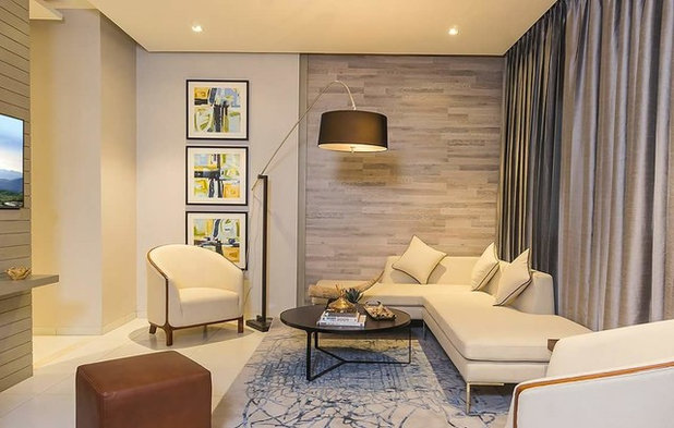
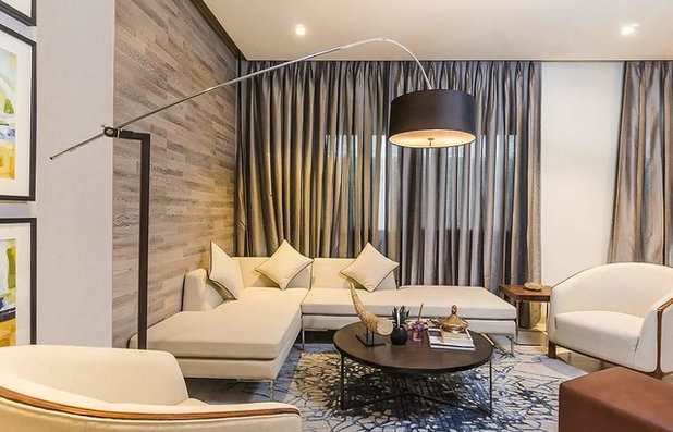
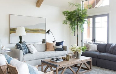
The entrance foyer leads into the living-cum-dining room. The area has an L-shaped seater and sofa chairs. “We designed a low seater in a curving pattern to create the impression of more width in the room and to ensure that it doesn’t block the large window that overlooks lush hills. We also chose to upholster it in white so its bulkiness is visually reduced, ensuring that the room doesn’t look cramped,” Tiwari says. Against the beige walls, white sofas and wooden panelling, the three paintings and the floor lamp stand out.
“We did not want to use darker shades on the upholstery. There were two reasons for this: one, the couple could not decide on a common colour scheme that they both liked and white was the only hue they agreed on. Secondly, the home does not receive any direct sunlight – so we decided not to play with too many dark colours as they tend to absorb light and do not reflect it back, thereby making the room look smaller,” Tiwari says.
Lamp: Gleaming Lights; walls: Asian Paints; upholstery: D’Decor
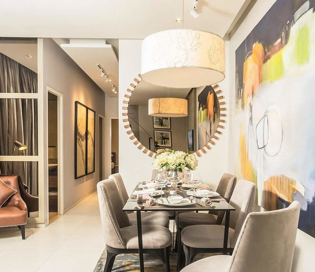
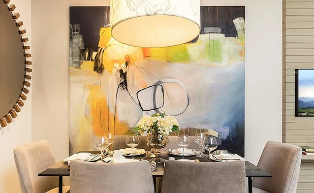
As space was at a premium, Tiwari decided to divide the living room into two spaces – the seating and the dining areas. This section, with a six-seater custom dining table in beige, gets a lift with a large, colourful artwork and a round mirror that helps create a space-boosting illusion. “Since it’s mostly just the couple dining at home, to create more space to move around, we pushed the table closer to the wall, leaving some chairs inaccessible, as these are hardly used. When guests arrive, the table can be pulled out,” Tiwari says.
Check out these 25 tricks to make a small home seem bigger
Check out these 25 tricks to make a small home seem bigger
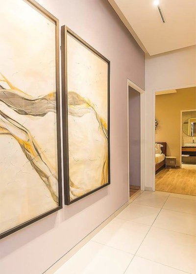
A passage behind the living-cum-dining room opens, from right to left, to the kitchen (which is open to the passage), the master bedroom and bathroom, the guest bedroom (straight ahead) and the guest bathroom. The wall along this space is awash in ash grey. To accentuate the passageway and to give it an illusion of height, two large framed prints hang side by side. The subtle illumination by spotlights creates a calm, subdued ambience in this area.
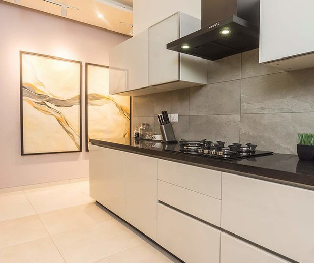
“Continuing with the neutral colour theme of the home, we used grey tiles on the kitchen walls. This room initially had a wall with a very narrow opening – we decided to take down the wall and convert the kitchen into an open space, thereby making it seem larger. The clients wanted a clean, modern, functional cook room, so we didn’t crowd it with too many cabinets,” Tiwari says.
Kitchen fixtures: Hettich
Kitchen fixtures: Hettich
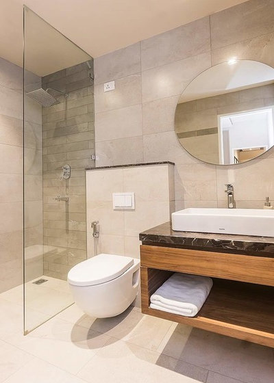
The guest bathroom behind the grey wall with the prints has a beige shell and a clean look. “We added a floating storage unit for the towels and a sleek, round mirror. The open shelf takes up no floor space and the room does not look cramped,” Tiwari says.
The couple’s parents visit once in a while, so the guest bedroom was specially designed for them. This room too has minimalistic tone. To maintain a clutter-free look, no extra features or panelling was added on the walls. “We chose different shades of yellow in the room, so the walls are painted in cappuccino and the curtains are golden. We used the soft-toned oakwood flooring here to keep the room light and airy,” Tiwari says.
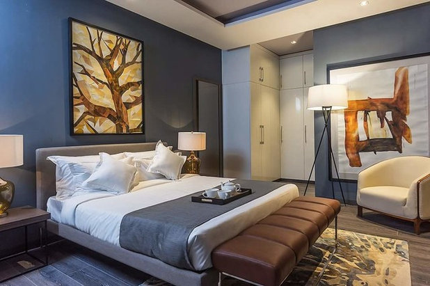
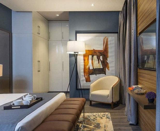
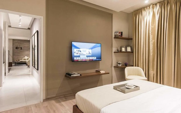
The master bedroom has colour and vibrancy. “The husband was very clear – since there was too much white in the whole house and in the room (the ceiling and cupboards), he wanted to bring some nice hues into the master bedroom. He likes darker tones and his wife, yellows and oranges. To bring their starkly opposed interests together, we painted the walls deep blue, while the water-based artwork behind the chair and the canvas oil painting behind the bed show plenty of yellow,” Tiwari says. The wall in front of the bed was especially panelled inwood as a setting for the TV. It helps balance the blues and yellows of the room, too.
Find out why blue is an ideal colour for the bedroom
Read more:
Houzz Tour: This Noida Home Gives a Crash Course in Space Management
Tell us:
What did you like the most about this home? Tell us in Comments below.
Find out why blue is an ideal colour for the bedroom
Read more:
Houzz Tour: This Noida Home Gives a Crash Course in Space Management
Tell us:
What did you like the most about this home? Tell us in Comments below.


Related Stories

Houzz Tours
Houzz Tour: A Midcentury Home With a Strong Indoor-outdoor Link
By Becky Harris
A nature-inspired renovation has given this ranch house a relaxed mood and a connection to the outdoors from most rooms
Full Story
Kitchens
10 Smart Storage Tips for Your Kitchen Bins
Keep kitchen rubbish stylishly tucked away with these clever solutions
Full Story

More Rooms
The 5 Most Popular Laundry Rooms on Houzz Right Now
Get decorating ideas for your laundry or utility room from these most-saved photos on Houzz
Full Story
Gardens
How Do I Create a Drought-tolerant Garden?
By Kate Burt
As summers heat up, plants that need less water are increasingly desirable. Luckily, there are lots of beautiful options
Full Story

Houzz Tours
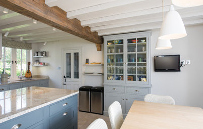
Houzz Tour: Warm Tones and Luxurious Surfaces in a City Townhouse
An earthy colour palette, hidden storage and well-placed texture add character and practicality to this London home
Full Story
Gardens
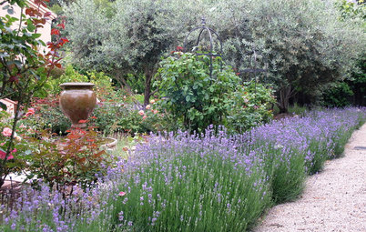
5 Inspiring Before and After Garden Transformations
Check out what a difference designers have made to these once dull plots, visually expanding spaces and creating privacy
Full Story

Houzz Tours
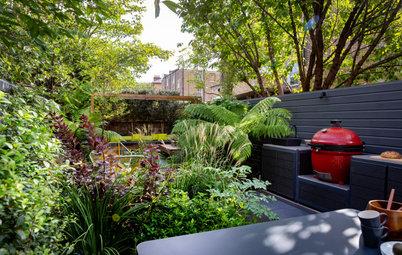
Kitchen Tour: A Gorgeous Extension With a Leafy Glasshouse Feel
By Kate Burt
When the owners of this terraced house extended, they were keen to retain its period feel and highlight the garden
Full Story

Gardens
How to Disguise Rubbish and Recycling Bins Outside Your Home
Need to hide unsightly bins in your garden or driveway? Take a look at these clever ideas for inspiration
Full Story
Renovating
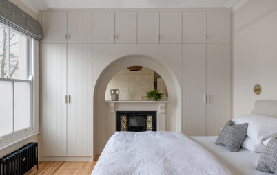
21 Ways Designers Are Incorporating Arches Into Homes
By Kate Burt
Everywhere we look on Houzz right now, a cheeky arch pops up. How would you add this timeless architectural feature?
Full Story
Lifestyle
How to Improve the Air Quality in Your Home
Want to ensure your home environment is clean and healthy? Start by assessing the quality of your air
Full Story
I find this is an non intervening wall house/flat of posh construction where in much utility of available additionalspace with no wall construction is made use of. As a civil engineer i will say that a square area and equal length outer wall on all 4 sides will reduce the cost even with interim walls that reduce roof slab thickness and allied works.My house has a 23.5 ft square profile with load bearing foundation less inner walls by a special technique that saved 40 percent of cost of conventional building.
Please mention the dimensions of all tha rooms and passages,and it will be better to understand if u post the video of the full house
It's good but the home is too clinical and does not reflect warmth of an Indian home..