


My Houzz: A Rented Home Gets a Pale and Pretty Scandi Makeover
Creative low-cost solutions and carefully selected furniture were the key to this 100-year-old apartment's face-lift
Núria Moreras
24 May 2017
Not wanting to invest too much in a rented apartment, Jordi Martín, owner of the interior design shop Nordicthink, and his partner Cristina Pons, an interior designer, had to come up with some clever decorating solutions. They managed to pull off a renovation in record time, turning this apartment into a dream home for themselves and their two daughters. Here they reveal how they did it.
Houzz at a Glance
Who lives here Jordi Martín, his partner Cristina Pons, and their two daughters, Lola, 12, and Simona, 8
Location Eixample, a central district of Barcelona, Spain
Size About 140 sq m
That’s interesting Spanish speakers can hear Martín and Pons say more about their home and design in this video by Houzz Spain.
Photos by Jordi Folch, video Júlia de Balle
It wasn’t exactly love at first sight with this apartment. Martín had rented it before Pons had even seen it and when she finally did see it, it was a shock. The apartment was old and dirty, and the floors were worn. However, Pons no longer regrets her partner’s choice.
It was crucial for them to not to have to carry out a huge renovation – no wall removal or space redistribution – as they did not want to invest so much into a space they didn’t own. Thankfully, the layout was already functional. A big advantage was that the social areas overlook the street, while the bedrooms face the inner courtyard.
The interior is decorated in pure Scandinavian style and 99 per cent of the furniture is from Martín’s shop Nordicthink (as if it could have been any other way!).
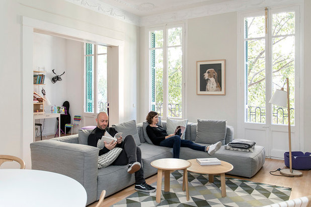
“The most important thing about this renovation is that, with resourcefulness and imagination, we have managed to create comfortable spaces. Each room has its own style, yet still feels connected to the other areas,” Martín says.
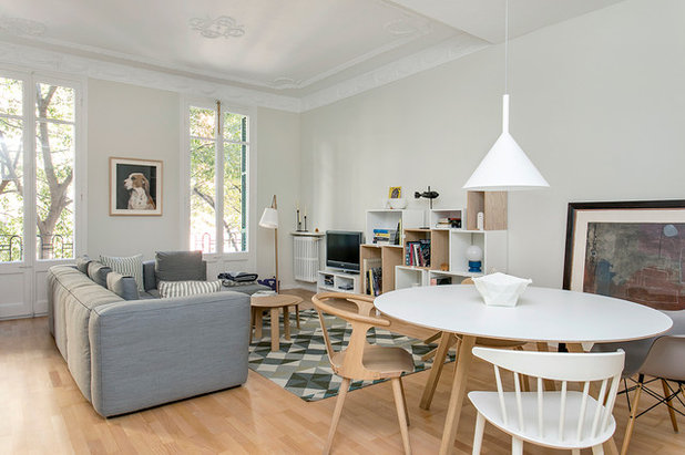
The apartment is a clear example of how it is possible to change any space, even without major renovations. For example, the living/dining room walls have been painted light grey to enhance the original moulding; the only place in the house where it’s preserved. The skirting boards have also been painted to give the illusion of height.
Another key tip is to rely on strategically placed lighting. “Lighting is one of the main design problems, not only in this apartment but in general. I think there is always an overexposure, an excess of light,” Martín says.
The pendant is the Funnel by the Slovenian company Vertigo Bird. In the background, the Pull lamp with an oak stand is from Muuto – it’s one of the company’s bestsellers and is designed by the Swedish studio WhatsWhat.
Want more makeover ideas? Find out the other clever details designers use to upgrade interiors

The very well-thought-out furniture selection brings added value to the décor. “A few well-selected pieces against a good background: that was the basic design rule for this apartment,” Martín says. All the decisions were made as a family though. “Our girls also participated in everything.”
The chromatic colour scheme is based on the grey of the walls, as well as the white and pale wood. The use of light colours and the prominence of white spruce are distinctive features of Scandinavian interiors, which the family love.
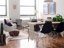
The dining chairs are all different models: the plastic DAW chair by Vitra (one of the few pieces they did not buy at Nordicthink); J104 by Hay; In Between by the Finnish designer Sami Kallio for &Tradition; and Visu by Mika Tolvanen for Muuto. The idea was to introduce variation in form to balance out the minimal and uniform colour palette.
Mags sofa, Hay. CPH dining table by Ronan and Erwan Bouroullec, Hay. Rug, Gan.
Alle coffee table, Hem.
The chromatic colour scheme is based on the grey of the walls, as well as the white and pale wood. The use of light colours and the prominence of white spruce are distinctive features of Scandinavian interiors, which the family love.
The dining chairs are all different models: the plastic DAW chair by Vitra (one of the few pieces they did not buy at Nordicthink); J104 by Hay; In Between by the Finnish designer Sami Kallio for &Tradition; and Visu by Mika Tolvanen for Muuto. The idea was to introduce variation in form to balance out the minimal and uniform colour palette.
Mags sofa, Hay. CPH dining table by Ronan and Erwan Bouroullec, Hay. Rug, Gan.
Alle coffee table, Hem.
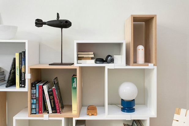
The only concession to bright colour is this blue lamp, a memento of Martín’s family. “It used to be in my grandmother’s home in the room where I used to sleep, so it has been with me for many years,” Martín says.
The bookcase in the living room is made up of cubes of three different sizes, which can be arranged in multiple combinations. It’s the Stacked Shelf System collection by Muuto in ash wood and white MDF.
The bookcase in the living room is made up of cubes of three different sizes, which can be arranged in multiple combinations. It’s the Stacked Shelf System collection by Muuto in ash wood and white MDF.
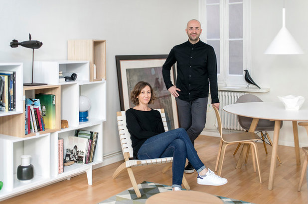
Here we see Pons sitting in Carl Hansen’s Cuba chair. This folding chair with its solid oak frame and strong white webbing is an icon of Scandinavian design, created by Morten Gøttler in 1997. Martín leans on the Visu chair designed by the Mika Tolvanen for Muuto.
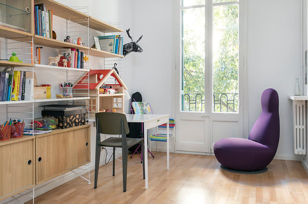
This is Pons and Martín’s office, part of which serves as a play corner for their youngest daughter. Only one of the girls gets to lay claim to this space, to make up for some of the disadvantages of ther room. “This way, we compensate for the fact that our older daughter has a bigger room with more light and a desk,” Pons says. Simona plays and does her homework here, and it’s also where she spends time practising her cello.
The couple kept the original table and shelves in the work area, but repainted them white. The Fiber chair stands out. It is coated in an innovative material made of recycled plastic and wood fibres. It’s a piece by Muuto and was purchased from Nordicthink, as was the iconic Wood lamp, made in pine and designed by TAF Arkitektur.
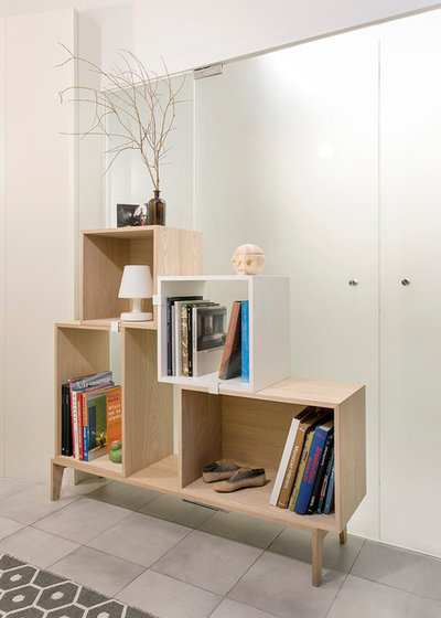
In the hallway, there is another shelving unit like the one in the living room. On this light and minimalistic module stands a wooden skull, which Martín found in Stockholm. It was designed and created by Acne JR. There is also a unique Edison rechargeable lamp by Fatboy.
The couple didn’t like the floor of this enlarged hall, so they decided to cover it with a reversible plastic rug by Pappelina. They display its brighter side in the summer months and the darker one in the autumn and winter.
The couple didn’t like the floor of this enlarged hall, so they decided to cover it with a reversible plastic rug by Pappelina. They display its brighter side in the summer months and the darker one in the autumn and winter.
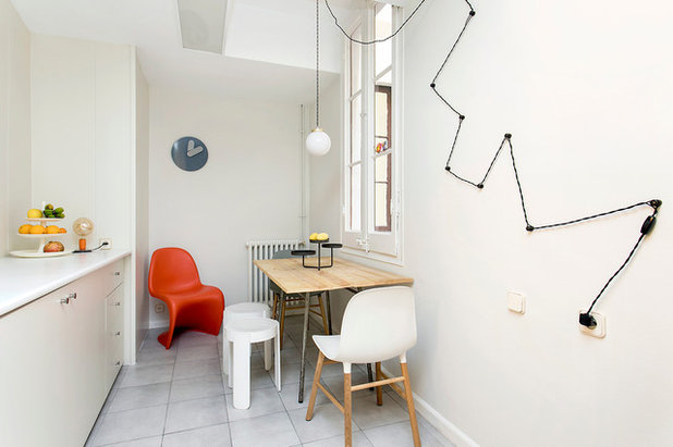
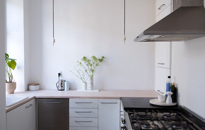
The table in the kitchen is made purely of recycled material: the tabletop is made of recycled boards and the legs were taken from another table. In the background, we see a Panton chair by Verner Panton for Vitra and the Bold clock by Normann Copenhagen.
Painting was the main trick Martín and Pons used to bring about a low-cost face-lift for this 100-year-old apartment. “In each room, paint was used in a different way and it’s not just the colour you choose, but the way you use it.”
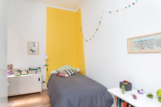
In Simona’s bedroom, which faces the courtyard, yellow paint brings warmth and more brightness. “We used this trick only for the headboard, as a focal point that illuminates the bed,” Pons says. The skull picture is from Inventory Barcelona.
In Simona’s bedroom, which faces the courtyard, yellow paint brings warmth and more brightness. “We used this trick only for the headboard, as a focal point that illuminates the bed,” Pons says. The skull picture is from Inventory Barcelona.
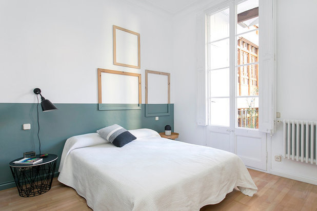
The main bedroom has a large balcony. “Here, taking advantage of the natural light, we have painted a dark-green ‘wainscotting’”, says Pons.
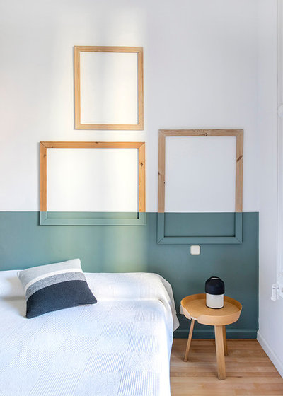
Nordic style generally – and Martín and Pons’ version in particular – flees from total symmetry. Hence, the frames are in an asymmetrical arrangement and the bedside tables are disparate. In this image, we see the Around model from Muuto.
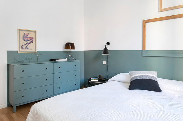
Pons and Martín customised this Ikea chest of drawers. They repainted it the same color as the wall to integrate it into the design of the room to the point of near-concealment and then drilled holes where the handles used to be.
8 other reasons to blend your woodwork paint with your walls
8 other reasons to blend your woodwork paint with your walls
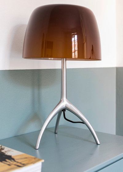
The Lumiere 05 lamp is by Foscarini. The lampshade is made of amber crystal.
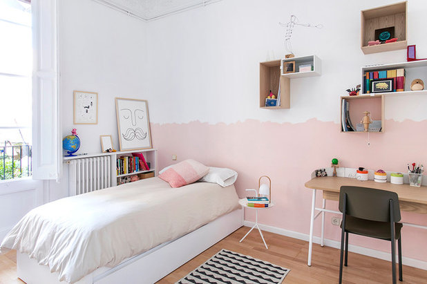
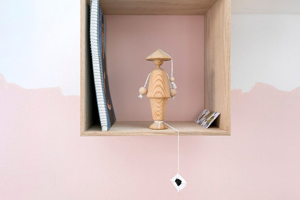
The main bedroom is in front of Lola’s room, which was painted with a fun unfinished effect. It was a little difficult to find the right shade of pink as many of the colours they tested had a bit of a salmon hue, which Martín and Pons didn’t like.
Cat painting, Inventory Barcelona. Limited-edition serigraph (silk screen print) for the fifth anniversary of Nordicthink by Emil Kozak. Cushion, Oyoy. DLM side table, Hay.
Cat painting, Inventory Barcelona. Limited-edition serigraph (silk screen print) for the fifth anniversary of Nordicthink by Emil Kozak. Cushion, Oyoy. DLM side table, Hay.
The family has gained a lot by moving into their new home: Lola has easy access to her high school, there are many supermarkets and shops around, and Martín’s commute to his shop is just five minutes. And they are surrounded by beauty thanks to a little paint, well-chosen furniture and a lot of creative thinking.
What do you think of this chic Scandi-style apartment? Share your thoughts in the Comments below.
What do you think of this chic Scandi-style apartment? Share your thoughts in the Comments below.

Related Stories

Houzz Tours
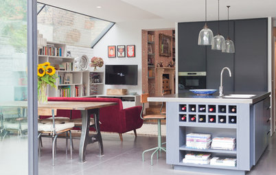
My Houzz: A Masterclass in Renovating a Ruin Beautifully
This couple restored a derelict property in the French countryside with historical sensitivity and a modern touch
Full Story
Houzz Tours
My Houzz: White Simplicity Offers Peace in a City Centre Flat
This fashion blogger’s job involves a constant riot of pattern and colour, so she made her home a calm white sanctuary
Full Story

Houzz Tours
My Houzz: Pretty Pinks and Neutrals in a Boho-chic Loft Apartment
By Faith Towers
Macramé blends with midcentury cool in this couple’s converted 1887 warehouse home
Full Story
Houzz Tours
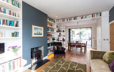
My Houzz: Ingenious Space Planning Updates a Family’s 1930s Home
Thoughtful design added a downstairs cloakroom, a utility cupboard and some rather clever loft storage
Full Story
Houzz Tours
My Houzz: From Boring Brick to Hamptons Chic on a Budget
Crisp white décor and space-smart bespoke storage turned this house into a bright, uncluttered family home
Full Story
Houzz Tours
My Houzz: A Small Space Cleverly Reinvented as a Light, Cosy Home
By Paolo Fusco
A former dental practice has been transformed into a welcoming flat with upcycled furniture and beautiful design details
Full Story
Houzz Tours
My Room: An Extension Gives a Period Home a Relaxed Family Space
Building out at the back of this Victorian house created a ground-floor kitchen-diner and living space to suit all ages
Full Story
Houzz Tours
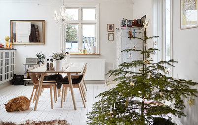
My Houzz: A Scandi-chic Home Simply Decorated for Christmas
By Helle Sindal
Natural winter decorations embellish a white-and-wood Scandi palette in this revamped Danish home
Full Story
Houzz Tours
My Houzz: A Revamped Post-war Home Full of Light, Colour and Character
A creative couple transformed their post-war house into an airy, modern home packed with warmth, light and family memories
Full Story
Houzz Tours
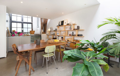
My Houzz: A Light-filled Live-work Space in a Former Factory
By Giulia Zappa
A design duo have cleverly magicked a beautiful home and an inspiring studio out of one empty factory building
Full Story
I love the blue color in the master bedroom! Could you tell me the paint name and brand you used?
Hi Jodie. It was an specific mix we did with the painter. I'm sorry but we can't help you with any color code. Anyway, it's more green than blue ;)
@Jodie Marshall Many paint stores will work with you to match a custom colour. Take a download shot of the photograph in which you like the paint in the master bedroom. Remember, colours will change according to the light. I've had custom mixes taken from a colour of a tennis shoe I have which was sorta a blue-green mintish looking colour. And I got it matched. It worked nicely on a friend's bathroom. But it did reflect a bit differently due to differences in light through out the day and in the evening. She just fell in love with my tennies! LOL