


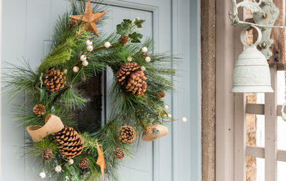
My Houzz: An Interior Designer's 1970s House Gets a Bold Makeover
Taking advantage of the surrounding countryside's glorious views was the crux of this 1970s property's overhaul

When interior designer Jeanette Seabrook moved into this 1970s property, top of her wish list was to harness the fabulous views of the South Downs. As a design expert, she had masses of ideas for the job, and set about creating a bright and welcoming family home that enhanced the vistas of hills outside and the simple 1970s style inside. “I wanted to create an open-plan space suitable for a family, make the most of the stunning views and add a slight midcentury modern feel inside to complement the 1970s architecture,” she says.
Originally, the house had a small kitchen tagged on to the end of the house, separate from the main living space. Now it is open-plan to the main family room – accessed via a few steps to add interest and enhance the views.
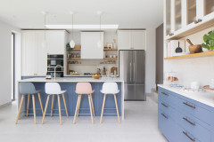
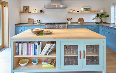
“I wanted a large open-plan space to accommodate family life and entertaining,” says Seabrook. “Friends always gravitate to the bar stools around the island.”
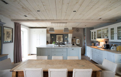
Seabrook opted for a fuss-free, modern look, so the kitchen was handmade using simple, streamlined cupboard doors.
“I chose a rich colour for the units as it’s a big space – it would have felt soulless and clinical if I had painted them white,” she adds, “but the doors are made from wood so I can repaint them if I decide to change the colour.”
Kitchen made by North Road Timber in Brighton. Cupboards painted in Down Pipe, Farrow & Ball. Blue tiles, Fired Earth.
“I wanted a large open-plan space to accommodate family life and entertaining,” says Seabrook. “Friends always gravitate to the bar stools around the island.”
Seabrook opted for a fuss-free, modern look, so the kitchen was handmade using simple, streamlined cupboard doors.
“I chose a rich colour for the units as it’s a big space – it would have felt soulless and clinical if I had painted them white,” she adds, “but the doors are made from wood so I can repaint them if I decide to change the colour.”
Kitchen made by North Road Timber in Brighton. Cupboards painted in Down Pipe, Farrow & Ball. Blue tiles, Fired Earth.
The back wall of windows is made up of sliding glass doors, while the shorter return has bifold doors.
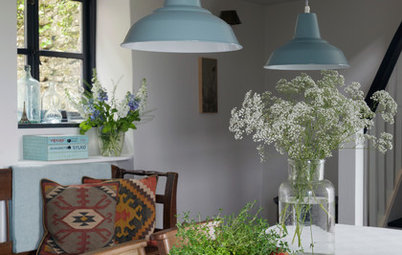
A cluster of bold, black-and-white striped, bone china pendant lights adds to the subtle midcentury modern feel that Seabrook wished for.
Circle Line pendants, Original BTC.
A cluster of bold, black-and-white striped, bone china pendant lights adds to the subtle midcentury modern feel that Seabrook wished for.
Circle Line pendants, Original BTC.
A bold velvet chair, positioned just on the corner of the kitchen, adds a shot of colour against the rich grey walls.
The split-level floor between the kitchen and living space was a conscious design move to add interest to the large room and enhance the views.
“I’d love to collect art if I could afford to!” says Seabrook. “My collection is small, but means a lot to me. The painting above the yellow chair is by a local artist and close friend called Vanessa Worrall.”
Chair, John Lewis. Walls painted in Down Pipe, Farrow & Ball.
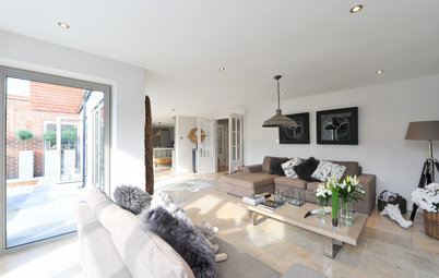
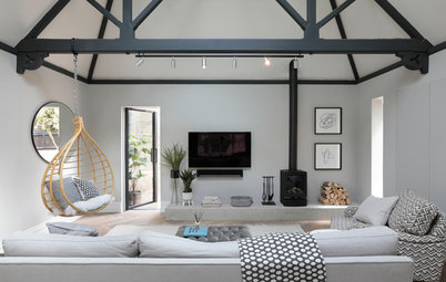
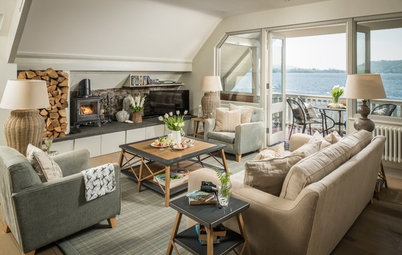
The TV and seating area with L-shaped sofa is part of the downstairs all-in-one kitchen-living space at the back of the house.
“This was once a double-aspect living room, which was too long with a very dated conservatory connected to it,” says Seabrook. “We divided it up and extended the house at the front to create a living room and playroom.”
The space is colourful and inviting with subtle retro influences. The huge L-shaped sofa (made by a local upholsterer) is perfect for family time.
Large concrete-look floor tiles sweep across the living and dining areas, and contrast with the rich wood tones in the kitchen.
“With glass walls, a wooden floor would have inevitably faded,” says Seabrook. “Also, coming in from the garden, the tiles are easier to clean. I would have loved poured concrete, but the budget wouldn’t stretch to it, so concrete-effect tiles did the trick.”
Find midcentury modern living rooms we love on Houzz
Rugged slate wall tiles create a feature backdrop to the corner wood-burner. “I was inspired after a visit to Cornwall,” says Seabrook.
The retro-look chairs were picked up on eBay.
Slate wall tiles, Topps Tiles.
The retro-look chairs were picked up on eBay.
Slate wall tiles, Topps Tiles.
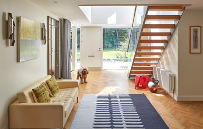
The large entrance hall was also rejigged. “The hall was always long, widthways, but had no depth,” explains Seabrook. “It was enlarged, so the house felt more balanced and in proportion with the new living space.”
Lampshade, Abode.
Lampshade, Abode.
The now bright and spacious hallway, peppered with interesting artwork and accent colours, sets the tempo for the rest of the house.
The downstairs cloakroom opens up to a riot of retro-print wallpaper.
“I loved the muted colour and the slight retro feel of the pattern,” says Seabrook. “It’s perfect for a downstairs loo, where you only look at it for a small amount of time.”
Dandelion Mobile wallpaper, MissPrint.
“I loved the muted colour and the slight retro feel of the pattern,” says Seabrook. “It’s perfect for a downstairs loo, where you only look at it for a small amount of time.”
Dandelion Mobile wallpaper, MissPrint.
The vanity unit is made from a table that Seabrook bought at the Ardingly International Antiques & Collectors Fair. “I had my builders chop a hole in it, so it could accommodate the plumbing,” she says.
Bright, busy and functional, the playroom at the front of the house is kitted out with lots of storage and comfy seating.
Storage unit, Ikea. Walls painted in Lead, Paint & Paper Library.
Storage unit, Ikea. Walls painted in Lead, Paint & Paper Library.
A striking palette of charcoal and golden yellow in the separate living-cum-cinema room at the front of the house lends a sophisticated touch.
“I wanted to create a dark and cosy room with the feeling of a gentlemen’s club,” says Seabrook.
Sofa, Designers Guild. Lamp, vintage buy from eBay. Walls painted in Mahogany, Farrow & Ball.
“I wanted to create a dark and cosy room with the feeling of a gentlemen’s club,” says Seabrook.
Sofa, Designers Guild. Lamp, vintage buy from eBay. Walls painted in Mahogany, Farrow & Ball.
Skylights on the landing ensure the space is filled with natural light. “We reduced the size of the windows here, as they were enormous,” explains Seabrook, “and added skylights to compensate.”
Light fitting, Marks & Spencer.
Light fitting, Marks & Spencer.
With views over the countryside, the master bedroom is a cool, calm and collected space.
“It’s quite a contrast to the rest of the house, and it’s the only room with white walls,” says Seabrook.
Lampshade, Graham and Green.
“It’s quite a contrast to the rest of the house, and it’s the only room with white walls,” says Seabrook.
Lampshade, Graham and Green.
Two small rooms and a bathroom were knocked together and extended to create a master suite.
The bed is behind a dividing wall, looking out to the garden. “In order to fit in a dressing room, I needed to create another wall to position the bed against,” explains Seabrook. “It’s not full-height as I wanted the light to access the whole room and I didn’t want the bed area to feel entirely separate.”
The bed is behind a dividing wall, looking out to the garden. “In order to fit in a dressing room, I needed to create another wall to position the bed against,” explains Seabrook. “It’s not full-height as I wanted the light to access the whole room and I didn’t want the bed area to feel entirely separate.”
This is the entrance to the master bedroom suite, which also serves as a dressing area, with the bed (not seen) tucked in behind the dividing wall. The doorway to the dressing area’s closet is to the right of the chest of drawers.
The closet that forms part of the dressing area of the master suite.
The en-suite shower room was once a separate bathroom, entered via the upstairs landing; it was remodelled, so the door leads off the master bedroom suite instead.
The other bedrooms were evened out in size – they originally ranged from huge to tiny – so the house feels more balanced.
Seabrook wanted a rich and cosy ambience in this guest bedroom. “It’s a north-facing room, so doesn’t get much light,” she explains. “I wanted to warm it up by adding a rich colour.”
Walls painted in Hague Blue, Farrow & Ball. Bedside lamp, John Lewis. Headboard, The Headboard Workshop.
Seabrook wanted a rich and cosy ambience in this guest bedroom. “It’s a north-facing room, so doesn’t get much light,” she explains. “I wanted to warm it up by adding a rich colour.”
Walls painted in Hague Blue, Farrow & Ball. Bedside lamp, John Lewis. Headboard, The Headboard Workshop.
An en suite was added to the guest room as part of the space reconfiguration.
A backdrop of olive-painted walls in Seabrook’s daughter’s room offers an earthy, neutral base for pink bedding and pretty floral wall decals.
Blue and grey hues balance stripes and checks in her son’s bedroom.
Discover more ideas for kids’ rooms
Discover more ideas for kids’ rooms
The family bathroom is a blend of subtle grey and bold sunflower yellow.
“The yellow Metro tiles in the shower add a splash of colour,” says Seabrook. “I didn’t want it to be a bland, beige bathroom.”
“The yellow Metro tiles in the shower add a splash of colour,” says Seabrook. “I didn’t want it to be a bland, beige bathroom.”
Tones of lilac and classic, simple furniture create a home office that is relaxed.
What do you think of this 1970s house with great views? Share your thoughts in the Comments section.
What do you think of this 1970s house with great views? Share your thoughts in the Comments section.


Sponsored
Who lives here Jeanette Seabrook, interior designer, and her 13-year-old son and 11-year-old daughter
Location A Sussex village near the South Downs
Property Late 1960s/early1970s detached house
Size 5 bedrooms, 3 bathrooms and 1 cloakroom
Designer Jeanette Seabrook of Sea Change Interiors
Photographs by Jonathan Gooch
Interior designer Jeanette Seabrook had something of an epiphany when she set about upgrading and reconfiguring her 1970s home.
“The biggest challenge was working out where to put the kitchen,” says Seabrook. “The idea eventually came to me that we needed to have a glass wall facing the South Downs to take advantage of the view. Once that was decided the rest fell into place.”
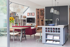
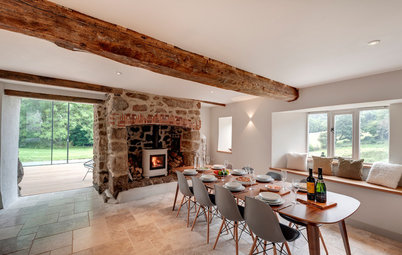
The project was a big one, nothing short of taking off the entire back of the house, repositioning the kitchen to the centre of the property and installing glass walls angled to run parallel with the South Downs so the eye is drawn to the view. The result is a huge downstairs open-plan kitchen and family room with a dining space and TV area.
Dining table, Quirky Interiors. Dining chairs, John Lewis.