Houzz Tours

House Tours


My Houzz: Classic Meets Contemporary in a San Francisco Apartment
A designer transforms a dated 1930s apartment into a stylish, contemporary home for herself and her fiancé

Catherine Kwong’s personal and professional life were undergoing major changes: she had moved back to San Francisco from New York City, she was preparing to launch her own interior design business, she had purchased her first home, and she and her boyfriend were on the cusp of getting engaged. With change in the air, she dove into the renovation of a flat that started as a place of her own but, near the end of the project, morphed into a soon-to-be-newlywed nest.
Houzz at a Glance
Who lives here Interior designer Catherine Kwong and Brian Kwong
Location San Francisco
Size 2 bedrooms, 2 bathrooms
Houzz at a Glance
Who lives here Interior designer Catherine Kwong and Brian Kwong
Location San Francisco
Size 2 bedrooms, 2 bathrooms
Kwong used as inspiration the Brooklyn home of Jenna Lyons (she’s the creative director of J Crew, and she plays the mean corporate boss on the television show Girls). ‘I was trying to do the San Francisco version of that home,’ the designer says of Lyons’ glam but casual, elegant yet rustic space, often seen in published photos.
She started with the fireplace, which used to be a simple tile-surrounded affair. ‘I designed the new mantel myself,’ Kwong says. ‘Because it was the focal point, I wanted it to be special. Although I wanted it to be white and clean, I also wanted it to have some sort of ornamentation.’
The carved mantel is juxtaposed with a sculptural woodbox, also custom designed by Kwong. ‘I loved the idea of a tall element made of cold-rolled steel against the more classic mantel,’ she says. Kwong notes that making it tall was essential. ‘The footprint of the home is small, but the ceilings are double height,’ she says. ‘This tall piece draws the eye up.’
The narrow galley kitchen was very dated. Kwong swapped them for grey Shaker-style cabinets. ‘I wanted the space to feel cosy,’ she says.
In this room, space is at a premium, but that doesn’t mean Kwong had to sacrifice amenities. She made room for elements such as a wine refrigerator and a farmhouse sink by choosing the slimmest models of appliances she could find. ‘I decided on what was most important to me, such as a big farmhouse sink, and included it,’ Kwong says. ‘After that it was a game of inches.’
‘Cabinet space is also important, and it seems as if there’s never enough,’ she says. ‘To make the most of them, I outfitted as many cabinets as possible with pullouts.’
View more fabulous farmhouse sinks
Because space is limited, Kwong makes utilitarian items serve a decorative purpose. ‘Packaging matters when something is on display,’ she says of her Murchinson-Hume dishwashing liquid.
One distinctive feature of many flats in this development is an angled glass ceiling. In Kwong’s flat, it’s in the dining room, located next to the kitchen. ‘When I first looked at this home, they had it styled as an office,’ she says. ‘My first reaction was that it should be a dining room, but I thought it was too small.’
In truth the room only felt small. By installing deconstructed riddling racks (old wooden racks used to store wine bottles), she made the room seem more expansive. ‘I think large gestures make a room look bigger,’ she says. The panels float on brackets away from the wall, allowing bottles that will be opened in the near future to rest there.
The table is an off-the-shelf item from Blu Dot, but Kwong made it her own by applying gold leaf to the legs. ‘For my own house, I spent more on the finishes and curtains, which I believe define the character of a room,’ she says.
She applied the same rule to the master bedroom, where the furnishings are from retail sources, but the curtains are custom-made from high-end fabric.
Bed: Crate & Barrel
Bed: Crate & Barrel
‘In the public parts of the house, the walls are white,’ says Kwong. ‘But in the other rooms, I used colour.’ In the master bedroom, she opted for a soothing palette of greys and taupes.
The colour palette continues into the master bathroom, with its taupe- and purple-toned wallpaper.
Taps: Waterworks; sconces: The Urban Electric Company; wallpaper: Osborne & Little
Taps: Waterworks; sconces: The Urban Electric Company; wallpaper: Osborne & Little
A darker colour cloaks Brian’s study. The couple got engaged near the end of the project, and this room was the last one to be completed. ‘My husband is an emergency room physician, and he keeps odd hours,’ Kwong says. ‘He needed a dark room where he could sleep during the day if he needs to.’ In addition to the dark walls, she installed blackout shades on the windows.
The art wall contains photos they both love and mementos of their lives.
Discover more reasons to go dark
The art wall contains photos they both love and mementos of their lives.
Discover more reasons to go dark
Decorating her first home has been a great personal exercise for Kwong, seen here. ‘I tried to create a place that was classic and not too trendy, and I think it is,’ she says. ‘This is a real sanctuary for me.’
Liked this? Share your thoughts in the Comments below.
Liked this? Share your thoughts in the Comments below.


Sponsored
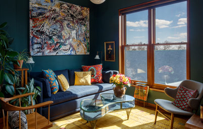
Excited about the upcoming changes, Kwong decided to modify the look of the space without altering the architecture. With paint and furnishings, she updated the look to the present.
She started in the living room, where a crisp palette of white and indigo enlivens the space. The rounded lines of the mirror, sofa, chair and a carved wooden bracket (an Indonesian piece found at a salvage yard and seen in the upper left) soften the angular lines of the architecture.
Photos by Bess Friday