Houzz Tours

Room Tours
London Room Tour
Room of the Week: A Kitchen-diner and Library for a 1920s Home
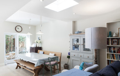
A wall of books adds unique personality to this kitchen-diner in a smart and spacious ground-floor extension

“Every client brings different requirements,” says Trevor Brown, who designed the extension on this 1920s home in London for owners Peter and Jelena Sanfey. “Peter said, ‘I need to work on my library!’ and Jelena knew she wanted this range cooker. So we fitted these key elements in and made them work.”
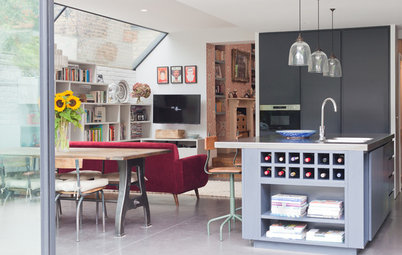
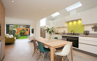
Now, a wall of library shelving crammed with books and a handsome Falcon range sit opposite one another in this spacious kitchen-diner, their colours picked out in the lighting, seating and cabinets to create a room that’s beautifully harmonious without feeling uniform or monochrome.
Now, a wall of library shelving crammed with books and a handsome Falcon range sit opposite one another in this spacious kitchen-diner, their colours picked out in the lighting, seating and cabinets to create a room that’s beautifully harmonious without feeling uniform or monochrome.
Key to the success of this room was moving much of the storage and utility appliances out. “We sacrificed the middle room and it now works really hard for the property,” says Brown. “It meant the extension could be more spacious.”
He admits it was a challenge to convince the owners that this was a good move. “I was asking them to lose a room they’d used for dining to create storage space,” he says. “It’s quite a difficult conversation! But with every project there’s a trick to it and, once you pull it off, the rest falls into place.”
Reconfiguring the ground floor layout and creating a utility room meant there was space for owner Peter’s longed-for library. Brown designed it to be stepped in slightly at the top and bottom, “so it doesn’t feel too massive”. This indented line follows around the room and matches the upper line around the top of the cabinets.
Walls above kitchen cupboards painted in Pointing; walls, ceiling and library shelving painted in Wimborne White; walls in hall corridor painted in Ammonite; all Farrow & Ball.
The middle of the house has been converted for storage. There’s a utility room measuring 1.6m x 2.4m between the extension and the living area at the front of the house. It contains a stacked washing machine and tumble drier with utility storage in a 1.2m-wide cupboard. There’s also cloakroom storage in an adjacent 1.2m-wide cupboard and high-level storage above.
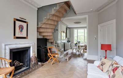
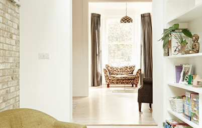
See 10 brilliant ways to use wasted space in the hallway
See 10 brilliant ways to use wasted space in the hallway
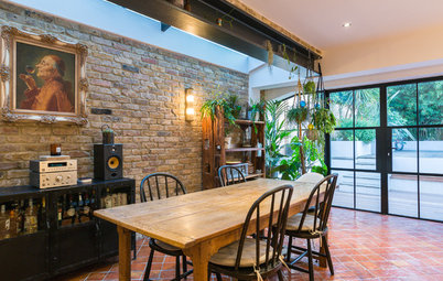
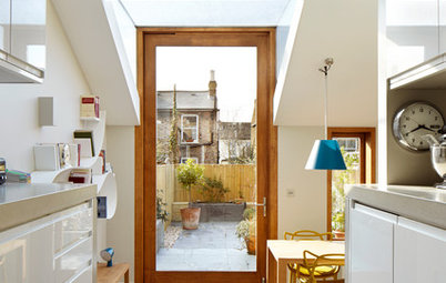
The back of the existing house extended as far as the new roof light – the line of black pendant lights marks it out. The extension replaces a poky kitchen and separate dining room.
“One of the nicest characteristics of this new space is that it has a completely different scale to the rooms in the rest of the property, but it still feels very much part of it,” says Brown. “When you make these extensions at the back, they can feel out of kilter with the rest of the house and a bit alien. Here, though, the room feels in proportion with the house and, because we dropped the floor level, there’s a good ceiling height, rather than it being low and narrow.”
“One of the nicest characteristics of this new space is that it has a completely different scale to the rooms in the rest of the property, but it still feels very much part of it,” says Brown. “When you make these extensions at the back, they can feel out of kilter with the rest of the house and a bit alien. Here, though, the room feels in proportion with the house and, because we dropped the floor level, there’s a good ceiling height, rather than it being low and narrow.”
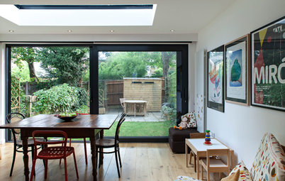
As the extension is lower than the rest of the house, it’s accessed via steps that drop down through a quarter turn from the corner, with a simple white balustrade in place to prevent anyone tumbling down. The higher level is an extension of the hall, with the same timber flooring running right onto the steps to meet the wood-effect porcelain tiles on the kitchen floor.
Plank W timber-effect tiles, Swedecor. Old Boathouse Oak flooring, Direct Wood Flooring.
Plank W timber-effect tiles, Swedecor. Old Boathouse Oak flooring, Direct Wood Flooring.
Peter originally considered floor-to-ceiling shelves, but Brown added storage cupboards along the bottom “for all that life admin you don’t really want to see”. These cupboards are designed to reflect the kitchen cabinets.
The shelves are exactly what Peter had hoped for. “He spent most of the first weekend once these were up arranging his books,” says Brown. “There’s an order to them – I’m not sure what it is, but there is!”
The shelves are exactly what Peter had hoped for. “He spent most of the first weekend once these were up arranging his books,” says Brown. “There’s an order to them – I’m not sure what it is, but there is!”
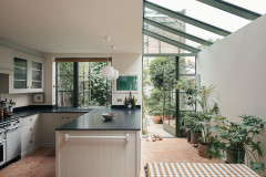
Wide glass doors let plenty of daylight in and offer a seamless connection with the outside, while a full-width rooflight inside draws light deep into the space. The doors don’t stretch across the entire width of the extension so the library shelves and kitchen cabinets can extend right up to the rear wall. “They suit the internal configuration,” says Brown.
Pendant lights help to zone the space. The large black designs over the island tie in nicely with the black range, while the smoky tones of the glass pendants reference the mottled mirror splashback beautifully. “They are just little tricks to tie everything together,” says Brown.
Glass pendant by Normann Copenhagen, Made In Design. Ginestra 7456 black pendant lights, Astro, available from Easy Lighting.
Glass pendant by Normann Copenhagen, Made In Design. Ginestra 7456 black pendant lights, Astro, available from Easy Lighting.
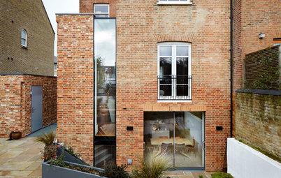
Rather than what he calls “a goalpost of brick” around the rear doors, Brown designed low sections made from angled bricks. “It felt really nice to have plinths at either side,” he says. “The rear wall of brick would have felt very tall otherwise.”
Brown and his team played with various ideas for weaving in interest, then settled on simply setting the bricks at an angle. “It gives enough distinction between top and bottom and they catch the light differently and create nice shadows,” he says. “It was actually quite easy to do, but I just had to encourage the brick layer to do it this way first of all!”
Brown and his team played with various ideas for weaving in interest, then settled on simply setting the bricks at an angle. “It gives enough distinction between top and bottom and they catch the light differently and create nice shadows,” he says. “It was actually quite easy to do, but I just had to encourage the brick layer to do it this way first of all!”
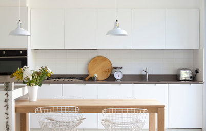
Brown sourced the kitchen cabinets from a trade supplier then added worktops from a local store. There are three distinct but complementary areas within the kitchen. A Carrara marble work surface and crackle-glaze tile splashback surround the sink, while the island is topped with a single piece of white resin worktop. On the wall that includes the range, there’s a dark marble and antiqued glass splashback. “We chose black here to tie in with the range,” says Brown. “It’s quite a dark, demanding piece in the room, so we wanted to link in with it.”
Kitchen in Tewkesbury Framed Stone (island) and Tewkesbury Framed Antique White (cabinets), all Howdens. Worktop around sink, Carrara marble; around hob, Nero Zimbabwe; on island, White Quartz; all Baltic Natural Stone.
Kitchen in Tewkesbury Framed Stone (island) and Tewkesbury Framed Antique White (cabinets), all Howdens. Worktop around sink, Carrara marble; around hob, Nero Zimbabwe; on island, White Quartz; all Baltic Natural Stone.
Brown chose different paint colours for the shelves, cabinets and island to reflect the colours in the bookshelves and to give each area a sense of identity. “It’s a bit of simple variation to reference the colours on the books,” he says. “It gives the space some independence. The sink area has a different worktop to the island, for instance. They are separate pieces, but all tie together, to prevent the space feeling too uniform.”
Masters chairs, Philippe Starck for Kartell from John Lewis. Low vintage chairs, Little Paris.
Get ideas for adding colour to your white kitchen
Masters chairs, Philippe Starck for Kartell from John Lewis. Low vintage chairs, Little Paris.
Get ideas for adding colour to your white kitchen
The range had to be positioned against a wall, so the cook will sometimes have his or her back to the room. “It was a tricky thing, finding the right place for it, but it has to go against the wall,” says Brown. “It can’t really be fitted into an island.”
To help make anyone cooking at the range feel more involved in the room, it has a splashback in antiqued mirror glass. “It’s better than regular mirrored glass, which shows every splash quickly, and it also gives great depth to the space,” says Brown. “You can talk to people in the reflection; maybe not a whole conversation with your back to them, but…!”
Antiqued mirror splashback, Mirror By Design.
Antiqued mirror splashback, Mirror By Design.
Jelena chose a bold artwork for the entrance to the space, and its black and white colours tie in beautifully with the cabinets and range. The painting is Portrait of a Thinking Man by Vladimir Djuranovic, an artist from Montenegro, and is one of a series of portraits and figures.
Impressed by this lovely kitchen, dining and library space? Let us know in the Comments below.
Impressed by this lovely kitchen, dining and library space? Let us know in the Comments below.

Sponsored
Who lives here Peter and Jelena Sanfey with their son, Gregor, aged 10
Location Alexandra Palace, north London
Room dimensions 6.1m x 5.2m; part of a 1920s terraced house with 4 bedrooms
Architect Trevor Brown at Trevor Brown Architect
Photos by Adelina lliev
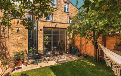
The house has a generous garden, but it was much lower than the rear of the building. “It was about 1.5m below the back of the house,” explains architect Trevor Brown. “We suggested dropping the floor level in the extension to create a better connection with the garden.”