
Room Tour: A Dated Space Becomes a Calm Retreat
The design of this fresh, serene bathroom focuses on the four elements of nature to create an oasis for busy parents

The parents of two who own this home wanted to update their bedroom and bathroom suite in their 1970s ranch house in Minneapolis, USA. The space had a great asset: a two-sided fireplace shared by the rooms. But the bathroom was chopped up by a large tub surround and a clunky shower enclosure.
Interior designer Victoria Sass helped the couple create the calming retreat they craved with a warm, neutral colour scheme and a thoughtful layout with a more open feel.
Interior designer Victoria Sass helped the couple create the calming retreat they craved with a warm, neutral colour scheme and a thoughtful layout with a more open feel.
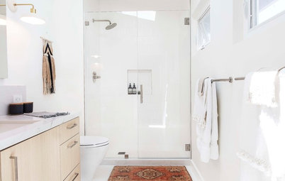
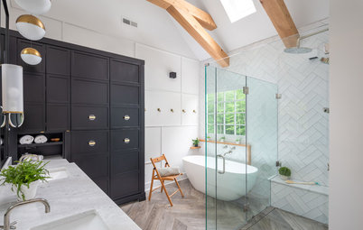
Victoria separated the tub and shower by choosing a sculptural, freestanding bath. This made the room feel more open and serene. She placed the bath and shower on top of a platform for several reasons. First, it helped to delineate the bath and shower area from the fireplace area. (The fireplace is just out of frame on the right.) “The platform grounded the tub and shower area and helped to define circulation space in front of the fireplace,” Victoria says.
Second, the platform gave her a chance to add some contrasting tiles. On the floor, she used 30cm sq white terrazzo tiles to create a glossy grid. On the platform, she used matt metro tiles that have subtle peach undertones. “These are slightly larger than standard [metro] tiles,” Victoria says.
Finally, installing a platform made it possible to fit a walk-in shower. With a walk-in design, the floor needs to slope slightly towards the drain to contain the water within the cubicle. The platform added enough height beneath the shower floor to allow for the slope.
“We chose matt black for the hardware and [taps] because the room needed some contrast,” Victoria says. “It was inspired by the black on the fireplace.” She used brass on these towel hooks and the lighting to add warmth to the room.
The dark and busy stone tile fireplace surround in the original bathroom wasn’t contributing to the concept of calm retreat.
The earthy look of cellular concrete masonry building blocks with round holes inspired Victoria to design these custom-made tiles. “It all began with these tiles,” she says. A project in Majorca that used the building blocks in a decorative way had captured her imagination. “We wanted to recreate the look of this architectural material as a handmade tile for the fireplace,” she says. Grout fills the holes in the tiles.
The earthy hues in the building blocks she’d admired also inspired the colour palette in the room. Victoria worked with Clay Squared to Infinity, a local handmade tile studio, to create the tiles. During the process, they crafted mock-ups to get the proportions just right. They also created a custom glaze: warm beige with peach undertones. Victoria repeated this colour in the platform and shower tiles.
The earthy hues in the building blocks she’d admired also inspired the colour palette in the room. Victoria worked with Clay Squared to Infinity, a local handmade tile studio, to create the tiles. During the process, they crafted mock-ups to get the proportions just right. They also created a custom glaze: warm beige with peach undertones. Victoria repeated this colour in the platform and shower tiles.
With a half wall, tiles, ledges, glass and framing, the original shower cubicle had too much going on, leaving the eye without a calm place to land.
Victoria continued the tiles from the platform up the shower wall to meet the vaulted ceiling. She used a vertical running bond pattern for the tile layout.
“Laying out these tiles was quite the mental exercise, because we had to figure out exactly how it would run around corners and wrap the wall,” Victoria says. “The key was to avoid little slivers of tile that threw off the proportions. We didn’t want any of those awkward slivers in key spots, such as where the wall tiles meets the platform.”
You might also like 12 Ways With Clay Pink Bathroom Tiles.
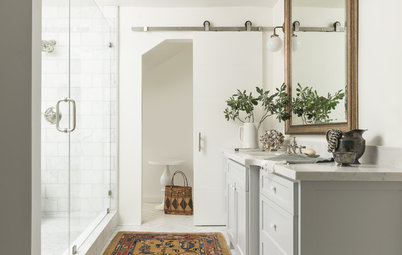
The layout of this bathroom is unusual. The master bedroom is at the top of the floorplan. The fireplace ("FP") is located along the wall between the bedroom and bathroom, across from the bath and shower. A wall divides the bath and shower area on the left from the vanity unit and toilet room on the right.
The door from the bedroom is on the left, and the glass on the right is the side of the shower. The hand towel past the shower on the right hangs from a towel bar attached to the vanity unit.
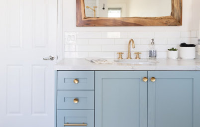
The bespoke cabinet is made of white oak lightened with a product called Rubio Monocoat in Mist. Caning adds soft texture on its doors. This tall cabinet adds a lot of storage space to the room. “It’s part linen closet, part medicine cabinet,” Victoria says.
The bespoke cabinet is made of white oak lightened with a product called Rubio Monocoat in Mist. Caning adds soft texture on its doors. This tall cabinet adds a lot of storage space to the room. “It’s part linen closet, part medicine cabinet,” Victoria says.
The old vanity unit needed updating.
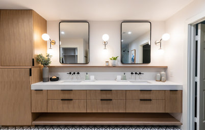
Victoria designed this bespoke vanity unit with drawers that store bathroom products more efficiently than one with doors would have. A shelf on the bottom provides room for extra towels.
It’s made from white oak, carefully positioned so the grain pattern of the wood continues seamlessly. Victoria repeated the use of matt black on the taps and hardware in this part of the bathroom.
It’s made from white oak, carefully positioned so the grain pattern of the wood continues seamlessly. Victoria repeated the use of matt black on the taps and hardware in this part of the bathroom.
The 15cm-high tiles determined the placement of the bespoke mirror. Victoria specified white oak for the frame to match the vanity unit. The counter is Calacatta Gold marble.

Need a pro for your home renovation project?
Let Houzz find the best pros for you
Let Houzz find the best pros for you
Victoria continued the tiles up to the vaulted ceiling, just as she did in the shower.
Finding the right lighting was tricky, because the pendants had to be mounted on the sloping ceiling at different heights. The design of these long brass-and-glass pendants made it possible for them to hang at the same level. The way they hang in front of the mirror adds dimension, and the reflection increases the amount of light they bring into the room.
Finding the right lighting was tricky, because the pendants had to be mounted on the sloping ceiling at different heights. The design of these long brass-and-glass pendants made it possible for them to hang at the same level. The way they hang in front of the mirror adds dimension, and the reflection increases the amount of light they bring into the room.
The couple’s bedroom was also part of the renovation, and Victoria used a similar calming colour palette for it. The bath and shower area can be seen through the fireplace.
Tell us…
What do you like about this stylish and practical bathroom? Share your thoughts in the Comments.
Tell us…
What do you like about this stylish and practical bathroom? Share your thoughts in the Comments.

Sponsored
Who lives here? A couple, who are both graphic designers, and their two sons
Location Minneapolis, USA
Size 16 sq m
Designer Victoria Sass of Prospect Refuge Studio
‘After’ photos by Amanda Marie Studio
As you can see in this ‘before’ photo, the dark bathroom had a built-in tub, a framed-in shower and a dated look. The tub deck and shower enclosure butted together along this wall. The fireplace was centred on the opposite wall.
Both of the owners have backgrounds in graphic design. “They have great taste,” Victoria says. “Initially, we talked about the concept in terms of what they wanted the feeling to be as soon as they walked into the room. They wanted it to feel like a calm retreat where they could escape their busy days. While we wanted to give them an updated fresh and modern look, we also wanted it to fit in with the existing architecture of the home.”
The goal of a calming retreat inspired the concept of “elemental oasis” – a room finished in beautifully simple and neutral finishes that highlighted the four elements of earth, air, fire and water. With the fireplace and plumbing, they had the elements of fire and water. The windows, uncluttered layout and pale colour palette create an airy feeling. And the ceramic tiles with subtle peach undertones add the earthy element.