


Room Tour: A Flexible Layout Maximises a Modest Extension
The dream was a proper home office without sacrificing too much kitchen space. Check out the deceptively simple solution
Sarah Alcroft
2 October 2021
Houzz UK Editorial Team
With a third child on the way and (in common with many of us) much more working from home, the owners of this Victorian terrace realised their ground floor set-up wasn’t ideal for the growing family. The kitchen was a smallish space with a view of the unlovely side return, while the room they used as an office had a prime spot near the garden, but wasn’t big enough to be made into a relaxing area they could all enjoy.
Step forward Tomasz Artymowicz of Active Builders London. His clever design uses the space more effectively by creating a flexible layout that accommodates a kitchen-diner and a good-sized home office, as well as a new bathroom in place of a cloakroom.
Step forward Tomasz Artymowicz of Active Builders London. His clever design uses the space more effectively by creating a flexible layout that accommodates a kitchen-diner and a good-sized home office, as well as a new bathroom in place of a cloakroom.
Extension at a Glance
Who lives here? A family of five (their third child was imminent when the project got underway)
Location Putney, south-west London
Property A Victorian terraced house
Extension dimensions Around 4m x 5m
Designer Tomasz Artymowicz of Active Builders London
Photos by Dimitar Hristov
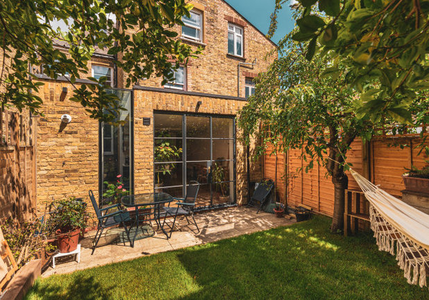
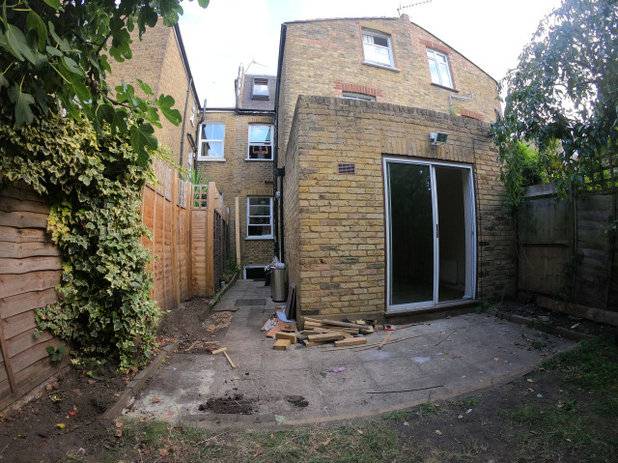
The house originally had a single-storey extension on the outrigger (see next photo). The new design stretches the full width of the property, adding only a modest amount of space internally, but making all the difference.
Tomasz didn’t go for a classic wall of glazing across the back, but instead designed a combination of an up-and-over slice of glass and Crittall windows incorporating a door, all encased in honey-coloured brick. “The owners wanted to keep the look outside traditional, so we used London Stock brick,” he says.
The configuration also gave it a different twist. “It looks more interesting and exciting – not like a traditional square extension,” he says.
Who lives here? A family of five (their third child was imminent when the project got underway)
Location Putney, south-west London
Property A Victorian terraced house
Extension dimensions Around 4m x 5m
Designer Tomasz Artymowicz of Active Builders London
Photos by Dimitar Hristov
The house originally had a single-storey extension on the outrigger (see next photo). The new design stretches the full width of the property, adding only a modest amount of space internally, but making all the difference.
Tomasz didn’t go for a classic wall of glazing across the back, but instead designed a combination of an up-and-over slice of glass and Crittall windows incorporating a door, all encased in honey-coloured brick. “The owners wanted to keep the look outside traditional, so we used London Stock brick,” he says.
The configuration also gave it a different twist. “It looks more interesting and exciting – not like a traditional square extension,” he says.
The room in the original extension was being used as an office.
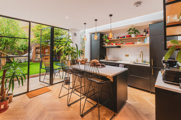
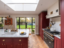
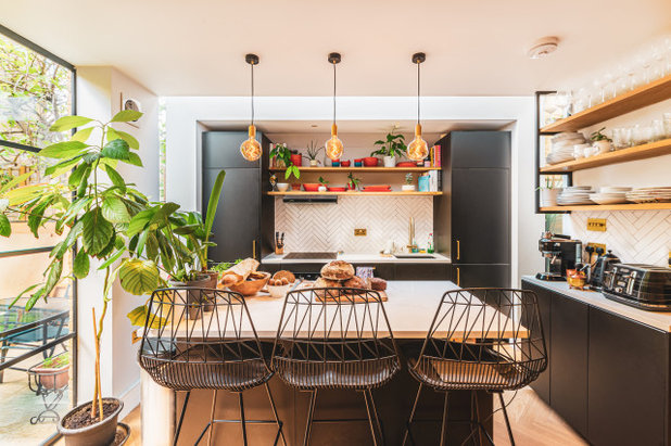
The new extension now houses the kitchen-diner. The scheme in here is strong but unfussy, with black cabinets, which echo the steel-framed Crittall doors, highlighted by the white worktops, splashback and walls. The wooden parquet floor and brass fittings, including the elegant pendant lights, add warmth.
“Apart from the pendants, we just fitted downlights hidden in the ceiling to keep the look clean and tidy,” Tomasz says.
Everything the couple need has been squeezed into the space, including a washing machine integrated in the tall unit on the left and a fridge-freezer in the corresponding unit on the right. There’s also a dishwasher to the left of the sink.
To the rear of the island, there’s room for a dining table.
Engineered wood floor, Havwoods. Kitchen units, Ikea. Worktops, Corian.
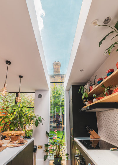
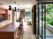
To bring light into the back of the kitchen, Tomasz fitted a glazed panel that runs up, over, and back down the other side, slicing open the room.
“As well as letting in more natural light, it gives a connection with the garden when the owners are cooking,” Tomasz says.
The couple were keen to have open shelving, both to keep the feel at eye level light and to provide display space for attractive crockery and plants. The shelves throughout the kitchen and office were made from oak by Tomasz’s team.
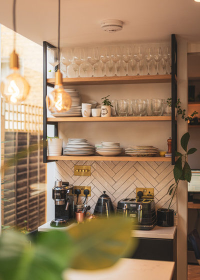
Tomasz has made good use of the short section of wall between the glazing and the doorway by creating a drinks station. It’s handily close to the office behind…
Despite the light, open feel, the unit also adds three cupboards and three good-sized shelves to the kitchen storage.
Despite the light, open feel, the unit also adds three cupboards and three good-sized shelves to the kitchen storage.
When Tomasz expanded the extension, he left the original side return behind it intact. This created a courtyard next to the office (more of which shortly).
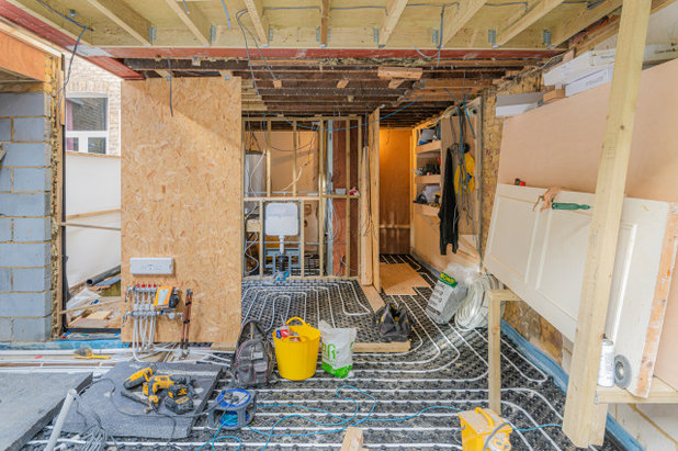
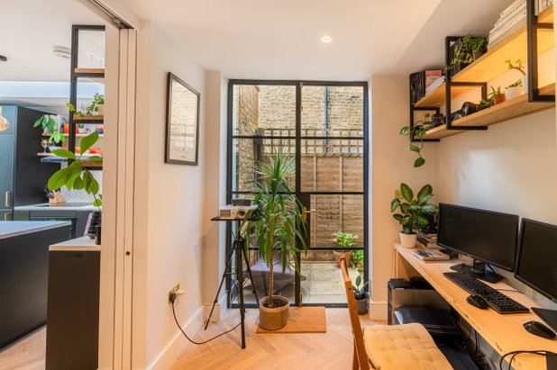
You can see in this image of the project underway how the home office slots in behind the kitchen space. Tomasz fitted the corner with two sliding pocket doors, so the room can be part of the kitchen or closed up to create a quiet space. “The pocket doors mean it doesn’t look too cramped,” he says.
The former cloakroom was behind what is now the office. Tomasz borrowed a little space from the office to expand the cloakroom slightly and create a full bathroom.
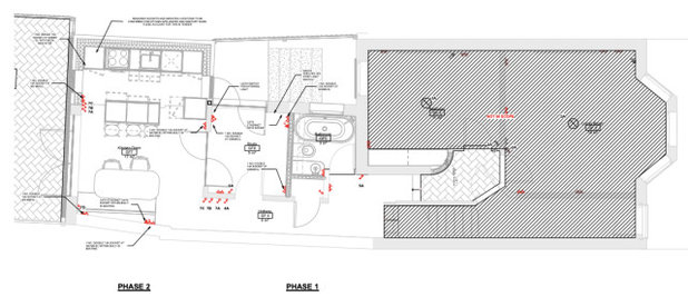
The new floorplan shows how the office can significantly extend the kitchen-diner when required, and how borrowing a little extra space allowed the creation of a bathroom and a hallway cupboard.
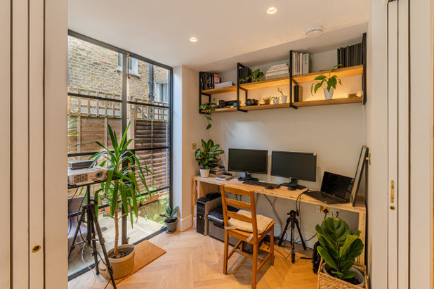
The office space was formerly the kitchen, but Tomasz has transformed it with the addition of glazed Crittall doors, a herringbone wood floor and a bespoke oak desk and shelving made by the team.
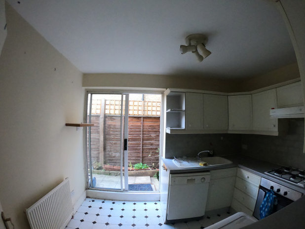
This is how the old kitchen looked before.
Find reviewed local architects to help with your project on Houzz.
Find reviewed local architects to help with your project on Houzz.
Not expanding into the side return has benefited this room as well as the kitchen, with the resulting courtyard bringing in extra light. Once plants are added, it will also offer a green view.
Keeping the office paraphernalia along one wall means most of the room can instantly become part of the kitchen if friends or family come round simply by sliding back the two pocket doors.
You might also enjoy Everything You Need to Know About Pocket Doors.
Keeping the office paraphernalia along one wall means most of the room can instantly become part of the kitchen if friends or family come round simply by sliding back the two pocket doors.
You might also enjoy Everything You Need to Know About Pocket Doors.
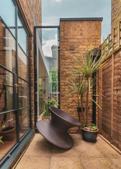
A giant spinning top sculpture makes more of a feature of the courtyard.
You can see from this image just how much light can now flood into the kitchen through that glazed slice.
You can see from this image just how much light can now flood into the kitchen through that glazed slice.
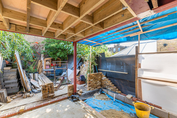
Though modest in size, the construction was quite challenging. “We had to support not only the rear of the building, but the side as well,” Tomasz says. The space itself also made it tricky, with materials having to be brought through the house. “There was no side alley,” he says.
The results were worth it, though. “The owners are really happy with the outcome,” Tomasz says. “Everything they need has been fitted into the kitchen, the bathroom is useful, and they managed to keep a good-sized office, which was important.”
Tell us…
What do you think of this kitchen-diner and office? Share your thoughts in the Comments.
Tell us…
What do you think of this kitchen-diner and office? Share your thoughts in the Comments.


Related Stories

House Tours
Houzz Tour: A Midcentury Home With a Strong Indoor-outdoor Link
By Becky Harris
A nature-inspired renovation has given this ranch house a relaxed mood and a connection to the outdoors from most rooms
Full Story

House Tours
Houzz Tour: Warm Tones and Luxurious Surfaces in a City Townhouse
An earthy colour palette, hidden storage and well-placed texture add character and practicality to this London home
Full Story

Room Tours
Kitchen Tour: A Gorgeous Extension With a Leafy Glasshouse Feel
By Kate Burt
When the owners of this terraced house extended, they were keen to retain its period feel and highlight the garden
Full Story

Gardens
Garden Tour: A Bare Roof Terrace Becomes a Pretty, Sociable Space
By Kate Burt
A retired couple got help transforming their large rooftop into a gorgeous, welcoming, multi-functional retreat
Full Story

House Tours
Houzz Tour: A Smart Layout and Genius Storage in a Victorian Home
Flipping the standard layout and carving out excellent storage have turned this tired house into a brilliant family home
Full Story

House Tours
Houzz Tour: A Victorian House Brought Impressively Up to Date
By Jo Simmons
A cohesive layout and warm colours combined with energy-efficiency measures thoroughly modernise this terraced home
Full Story

Kitchen Tours
Kitchen Tour: An Open, Airy Space Made for Entertaining
Combining two separate rooms has improved flow and created a sociable open-plan kitchen, dining and seating space
Full Story

House Tours
Houzz Tour: A Family Home Inspired by its Seaside Location
Coastal colours and practical design combine to create a house that will adapt as the family grows
Full Story

Kitchens
5 Inspiring Before and After Kitchen Transformations
Whether you want to boost storage, incorporate original features or maximise your space, take ideas from these designs
Full Story

House Tours
Houzz Tour: An Airy, Scandi Finish for a Tall Victorian House
By Kate Burt
From a tricky inherited bath to a sticky-out staircase, on-site problem-solving led to a seamless update for an old home
Full Story
The "Slice" is absolute genius, I love it. A great job of rethinking everything and so nice that not all of the side return was lost into the extension. Excellent work!
Beautiful project - thank you for sharing with us!
Stunning and beautiful design