


Room Tour: A Hint of Victorian Style Softens a New Extension
Steel-framed glazing, London stock bricks and a parquet floor bring character to this lovely kitchen and living room
Kate Burt
5 July 2022
Houzz UK. I'm a journalist and editor, previously for the Independent, Guardian and various magazines. I'm now excited to part of the editorial team at Houzz UK & Ireland, bringing the best of British and Irish design, interiors and architecture to Houzz.com.
Houzz UK. I'm a journalist and editor, previously for the Independent, Guardian and... More
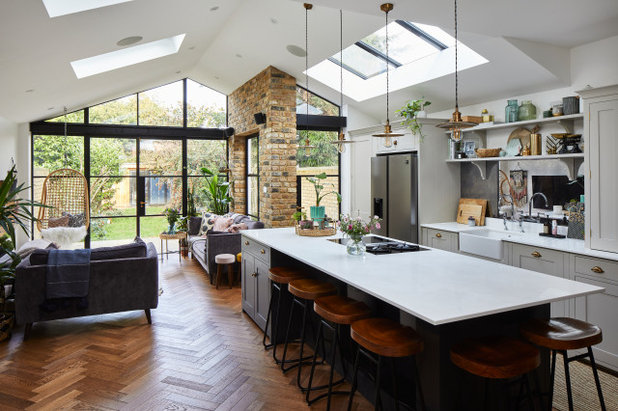
The unusual shape of this era-sensitive extension to a Victorian property in north London came down to what the architects could get through the local authority’s planning department. An initial plan for a full-width extension was not approved, so a ‘step-back’ was introduced, making the structure shallower on the kitchen side.
What started as a compromise, however, has become a feature the owners particularly like, as the living space and kitchen now have a slight separation that really works for family life.
What started as a compromise, however, has become a feature the owners particularly like, as the living space and kitchen now have a slight separation that really works for family life.
Room at a Glance
Who lives here? A couple and their three sons
Location North London
Property A Victorian terrace with four bedrooms and two bathrooms
Architect Fatimah Ishmael of MODEL Projects
Interior designer Aysha Interiors
Photos by Chris Snook
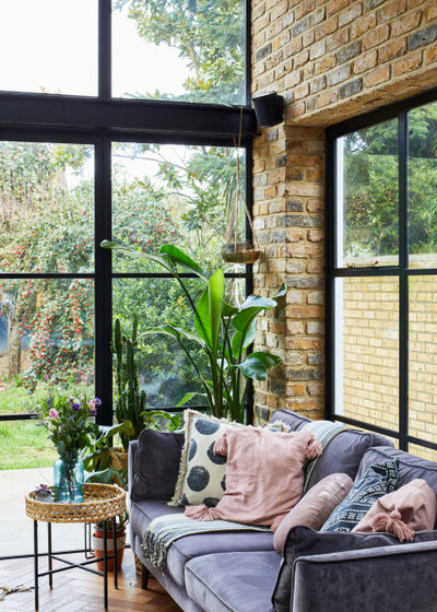
The owners had gathered lots of images to show architectural designer Fatimah Ishmael what they had in mind. “The wife is an avid Houzz user,” Fatimah says, explaining that seeing photos of steel-framed doors gave her the idea for what was to become one of the project’s key features.
“That was the first decision and the interior would revolve around them. Then, as we were going for a traditional look with these, I proposed exposed brick, too, for the wall that touches all three sets of windows.”
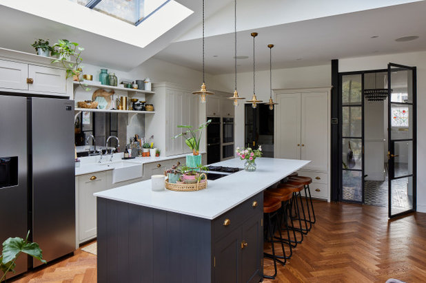
In terms of the layout for the newly extended space, Fatimah explains, “The kitchen was a major thing. The owners cook a lot and like to spend time in the kitchen, which had previously been quite small and dark. They also wanted a utility room – really valuable, as they have three kids – and a snug area, to keep the family together when the parents are cooking.”
Steel-framed doors, Fabco.
Who lives here? A couple and their three sons
Location North London
Property A Victorian terrace with four bedrooms and two bathrooms
Architect Fatimah Ishmael of MODEL Projects
Interior designer Aysha Interiors
Photos by Chris Snook
The owners had gathered lots of images to show architectural designer Fatimah Ishmael what they had in mind. “The wife is an avid Houzz user,” Fatimah says, explaining that seeing photos of steel-framed doors gave her the idea for what was to become one of the project’s key features.
“That was the first decision and the interior would revolve around them. Then, as we were going for a traditional look with these, I proposed exposed brick, too, for the wall that touches all three sets of windows.”
In terms of the layout for the newly extended space, Fatimah explains, “The kitchen was a major thing. The owners cook a lot and like to spend time in the kitchen, which had previously been quite small and dark. They also wanted a utility room – really valuable, as they have three kids – and a snug area, to keep the family together when the parents are cooking.”
Steel-framed doors, Fabco.
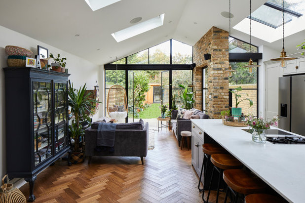
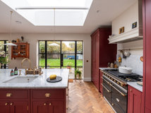
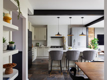
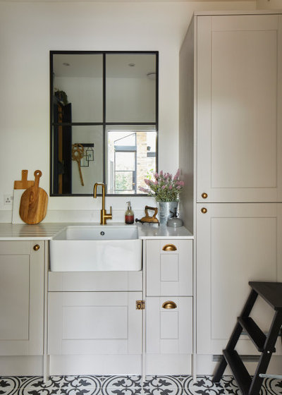
The London stock brick wall looks as though it was part of the original house – a happy coincidence.
“The owners were keen to have a feature wall. Initially, this was going to be the wall on the left, but I suggested putting the brick here,” Fatimah says. “Now it’s what you see when you enter the kitchen. It’s functional as well as decorative, as it hides a beam over the window and a column.”
“The owners were keen to have a feature wall. Initially, this was going to be the wall on the left, but I suggested putting the brick here,” Fatimah says. “Now it’s what you see when you enter the kitchen. It’s functional as well as decorative, as it hides a beam over the window and a column.”
“The large, freestanding cabinet on the left was something the wife already owned,” Fatimah says. “We designed the room to ensure there was a good space in which to stand it.”
The owners were keen for a very large island and Fatimah worked with the kitchen designers to position it so it was in the centre of the room.
Inside, there’s storage space for pots, pans and plates spread between drawers and cupboards. The design of the island allows for seating on two sides, making it a very family-friendly and sociable place to sit.
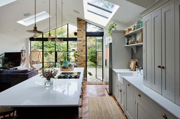
The induction/gas combination hob features a built-in extractor, freeing up the ceiling for four pendant lights.
The flooring is engineered timber laid in a parquet formation. It has underfloor heating.
A combination of a roof light (over the kitchen) and openable Velux windows (on the left-hand side of the space) brings plenty of light deep into the extension.
Inside, there’s storage space for pots, pans and plates spread between drawers and cupboards. The design of the island allows for seating on two sides, making it a very family-friendly and sociable place to sit.
The induction/gas combination hob features a built-in extractor, freeing up the ceiling for four pendant lights.
The flooring is engineered timber laid in a parquet formation. It has underfloor heating.
A combination of a roof light (over the kitchen) and openable Velux windows (on the left-hand side of the space) brings plenty of light deep into the extension.

In the kitchen, the tall unit by the doors is a pantry. “The family needed plenty of storage,” Fatimah says. “With three boys, there’s a lot of grocery shopping!”
Next to the pantry, there’s housing for the fridge-freezer with two cupboards above.
There’s already plenty of storage, so some open shelving over the sink breaks up the units and allows space for displaying favourite items. An antique mirror splashback boosts light and makes the room look wider.
On either side of the sink there’s a dishwasher (right) and more cabinet space and then, above the worktop, there’s a breakfast cupboard with a microwave and coffee machine, toaster and kettle. The rest of the units are general cupboard storage space.
Kitchen cabinets, Neptune. Perimeter units painted in Driftwood; island unit painted in Charcoal, both Neptune own-brand. Fridge-freezer; hob; pendant lights, all sourced by the owners.
The step-back that makes the extension shorter on the kitchen side offered the chance to create a cosy living space tucked behind the brick wall. The window looks out over the side return.
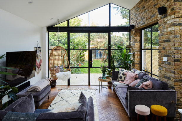
“The owners wanted to be able to see all the greenery in their garden and feel as if they were outside when indoors,” Fatimah says.
The joist had to be doubled at the point where the hanging chair is fixed to make the seat secure.
The joist had to be doubled at the point where the hanging chair is fixed to make the seat secure.
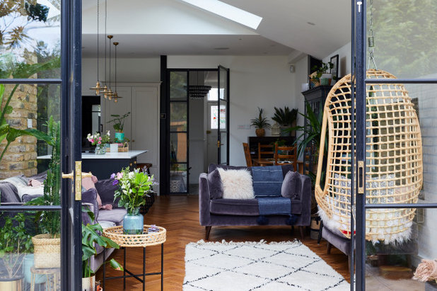
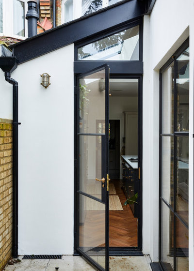
The door on the right leads to the hallway. “The doors had to be steel, not aluminium, so they were fire-rated,” Fatimah explains. “That’s because the house already had a loft conversion.”
The door on the left leads into the utility room. The room behind the door runs up to the black structural column to the left of the glazed doors. “The column was originally going to be hidden,” Fatimah explains, “but the owners liked how it looked, so we painted it in fire-rated black paint to go with the windows and doors.”
The tall cabinet provides more kitchen storage.
Worktops, The Marble Group.
The tall cabinet provides more kitchen storage.
Worktops, The Marble Group.
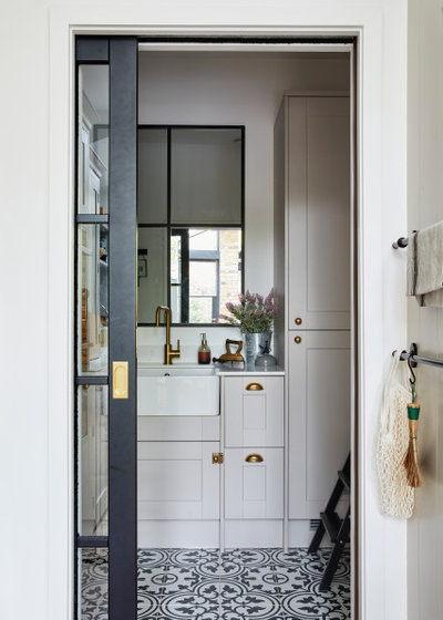
A sliding pocket door sections off the utility room. The fire-rated door is timber, but painted black and glazed to tie in with the steel doors.
The tiles in the utility room are new, but chosen to reference the original hallway floor.
The room has no window, but the clever positioning of a mirror in the same style as the doors and windows elsewhere gives the sense of there being one.
Cabinetry, painted in Cashmere, Howdens. Tiles, Fired Earth.
The room has no window, but the clever positioning of a mirror in the same style as the doors and windows elsewhere gives the sense of there being one.
Cabinetry, painted in Cashmere, Howdens. Tiles, Fired Earth.
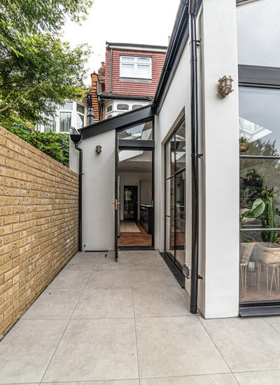
This image shows the step-back from the outside.
After some discussion, the owners opted for a door rather than just a window here, figuring that they wouldn’t always want to have to open the big doors to access the garden, which they use a lot.
The render is painted white to complement the London stock brick wall and black doors. “It’s a simple palette that allows these details to stand out,” Fatimah says.
The render is painted white to complement the London stock brick wall and black doors. “It’s a simple palette that allows these details to stand out,” Fatimah says.
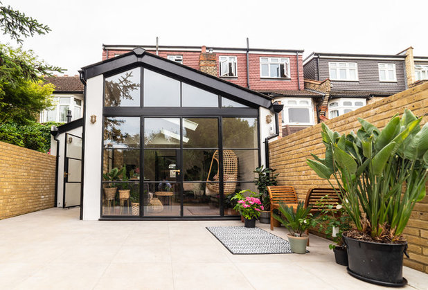
The pitch of the roof was considered more in keeping by the planners than a flat roof. It also allows for more height in the centre of the room compared to a flat roof.
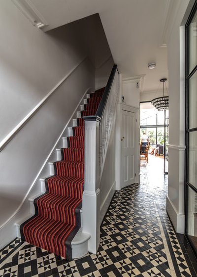
This shows the view into the space from the front door. The tiles are original.
A door on the left goes down to the cellar and originally this is where the tiles stopped, as there used to be a wall here. Careful repair work allowed these to be recreated and to continue right up to the new opening to the kitchen, which the extension had pushed back.
The team replaced the timber door to the living room, just seen on the right, to bring in more light and chime with the steel doors at the back.
Tell us…
What’s your favourite detail from this Victorian house extension? Let us know in the Comments.


Related Stories

House Tours
Houzz Tour: A Midcentury Home With a Strong Indoor-outdoor Link
By Becky Harris
A nature-inspired renovation has given this ranch house a relaxed mood and a connection to the outdoors from most rooms
Full Story

House Tours
Houzz Tour: Warm Tones and Luxurious Surfaces in a City Townhouse
An earthy colour palette, hidden storage and well-placed texture add character and practicality to this London home
Full Story

Room Tours
Kitchen Tour: A Gorgeous Extension With a Leafy Glasshouse Feel
By Kate Burt
When the owners of this terraced house extended, they were keen to retain its period feel and highlight the garden
Full Story

Gardens
Garden Tour: A Bare Roof Terrace Becomes a Pretty, Sociable Space
By Kate Burt
A retired couple got help transforming their large rooftop into a gorgeous, welcoming, multi-functional retreat
Full Story

House Tours
Houzz Tour: A Smart Layout and Genius Storage in a Victorian Home
Flipping the standard layout and carving out excellent storage have turned this tired house into a brilliant family home
Full Story

House Tours
Houzz Tour: A Victorian House Brought Impressively Up to Date
By Jo Simmons
A cohesive layout and warm colours combined with energy-efficiency measures thoroughly modernise this terraced home
Full Story

Kitchen Tours
Kitchen Tour: An Open, Airy Space Made for Entertaining
Combining two separate rooms has improved flow and created a sociable open-plan kitchen, dining and seating space
Full Story

House Tours
Houzz Tour: A Family Home Inspired by its Seaside Location
Coastal colours and practical design combine to create a house that will adapt as the family grows
Full Story

Kitchens
5 Inspiring Before and After Kitchen Transformations
Whether you want to boost storage, incorporate original features or maximise your space, take ideas from these designs
Full Story

House Tours
Houzz Tour: An Airy, Scandi Finish for a Tall Victorian House
By Kate Burt
From a tricky inherited bath to a sticky-out staircase, on-site problem-solving led to a seamless update for an old home
Full Story
The name of the interior designer is directly underneath the architects name right at the top of the article so I have no idea why the above comment was made. They have joint billing on the project. Its a stunning project. Equal credit to both and the owners exceptional taste.
Where is the kitchen/dining table? I can’t believe that this family can only eat at the kitchen island!
Can someone tell me what model the hob us please?