Houzz Tours

Room Tours
London Room Tour
Room Tour: A Modest Extension Transforms a Victorian Maisonette
By going for a smaller extension than originally considered, this architect and his family unlocked their ground floor

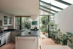
Architect Sam Cooper and his wife fell for their Victorian maisonette in east London because it had larger rooms than you’d normally find in this type of property. “The kitchen was actually quite small though,” Sam says.
The original galley kitchen also had a three-metre chimney breast in it, which meant there wasn’t enough width for a dining table and was limited worktop space. “We always thought we’d take out the chimney breast, but we knew that still wouldn’t give us what we needed,” he says. Read on to see the unusual idea he came up with after they’d lived in the flat for three years.
The original galley kitchen also had a three-metre chimney breast in it, which meant there wasn’t enough width for a dining table and was limited worktop space. “We always thought we’d take out the chimney breast, but we knew that still wouldn’t give us what we needed,” he says. Read on to see the unusual idea he came up with after they’d lived in the flat for three years.
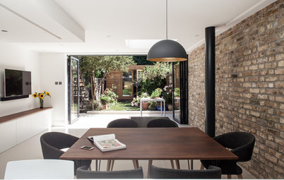
They eventually decided instead on a modest extension – only around three by four metres – to create a dining area for the kitchen. With the loss of the chimney breast, Sam calculated this would give them everything they needed.
“In the end, we got more by doing less,” he says. “We kept the bedroom and gained a dining room.”
Solid cone oak pendant lights, Terence Woodgate. Glazing, Sunvista. Rooflights, Glazing Vision.
“In the end, we got more by doing less,” he says. “We kept the bedroom and gained a dining room.”
Solid cone oak pendant lights, Terence Woodgate. Glazing, Sunvista. Rooflights, Glazing Vision.
The floorplans of the space before the extension was built show the lack of worktop space in the kitchen and the absence of anywhere to put a dining table.
Browse architects and building designers in your area using the Houzz Professionals Directory.
Browse architects and building designers in your area using the Houzz Professionals Directory.
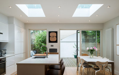
The new plans show the added dining area. “We toyed with the idea of trying to get an island in there, but we wouldn’t have had enough room to circulate around it and not as much storage,” Sam says, explaining their choice of a wide galley kitchen layout.
“We have 1800mm clear between the surfaces. Normally when designing a kitchen and island unit, you’d have 1200mm between surfaces,” he says. “What’s nice about this is that it’s wide enough for people to pass through without getting in the way, but [the two sides are] close enough to be practical when cooking.”
“We have 1800mm clear between the surfaces. Normally when designing a kitchen and island unit, you’d have 1200mm between surfaces,” he says. “What’s nice about this is that it’s wide enough for people to pass through without getting in the way, but [the two sides are] close enough to be practical when cooking.”
The units are handleless and the worktop is a slimline design in quartz. A open shelving unit above the sink is stepped inwards at the bottom, so as to allow more space directly above the sink and worktop area.
A particularly clever idea was to give the kitchen deeper-than-average worktops. “We made the surfaces 750mm deep rather than the standard 600mm,” Sam says. “This makes the two sides of the kitchen a little closer together and means you can have your kettle and appliances on the worktop and still have room at the front to work.”
One side-effect of this choice is that there’s a bigger-than-usual void behind the base units. “It’s wasted space,” Sam says, “so it’s kind of counter-intuitive, but you’ve sacrificed it for functionality.
“It does also allow more room for drainage and so on, which gave us more flexibility on how the kitchen was laid out and where we could put the sink and washing machine,” he says. “We have a drainage run behind the oven and fridge units, which would have been quite difficult otherwise.”
Quartz worktops in Windsor Grey, CRL Quartz. Illusion matt splashback tiles, Solus. Bespoke walnut laminate shelving, Connaught Kitchens.
Another benefit of the wide work surfaces is that the base units here were able to contain a standard washing machine and tumble dryer, rather than the available space dictating integrated versions.
Full-height units to the right contain a double oven with a slide-out drawer beneath and a storage cupboard above. Next to them is a pull-out larder with a cupboard above, and a fridge-freezer with a cupboard above.
The lighting in the ceiling is gimbal lighting, more usually seen in retail environments. Each rectangular black box contains three light fittings on gimbals (pivoted supports) that can be swivelled in any direction. There are also LED strips under the cabinets.
Lighting, Lumenpulse. Appliances, Siemens.
On the opposite wall, the run is divided into a cooking zone and a sink zone. These have been designed to be different sizes. “You want a bigger zone on either side of your hob than you need either side of your sink,” Sam says. “Removing that line of symmetry also means it doesn’t look monotonous and clinical.”
The wall units closest to the extension house the boiler and a drop-down, slide-out cooker hood inside a double cupboard. “Having an induction hob meant the hood could be fitted lower than usual,” Sam explains. “With a gas hob, you have to have 700mm or more clearance for fire regulations.”
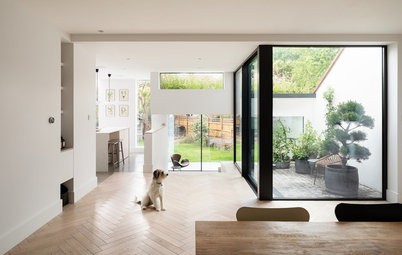
The living room can be seen at the back of this photo. It runs the full width of the property, with the kitchen-diner at half the width. “If you were to draw a big L on the floorplan, it would delineate three clear zones,” Sam says. “It’s a very successful arrangement for open-plan living and gets you away from the least successful arrangement, which is one big box with the functions swimming around in it.”
Flooring, Reeve Wood.
The wall units closest to the extension house the boiler and a drop-down, slide-out cooker hood inside a double cupboard. “Having an induction hob meant the hood could be fitted lower than usual,” Sam explains. “With a gas hob, you have to have 700mm or more clearance for fire regulations.”
The living room can be seen at the back of this photo. It runs the full width of the property, with the kitchen-diner at half the width. “If you were to draw a big L on the floorplan, it would delineate three clear zones,” Sam says. “It’s a very successful arrangement for open-plan living and gets you away from the least successful arrangement, which is one big box with the functions swimming around in it.”
Flooring, Reeve Wood.
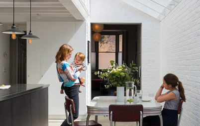
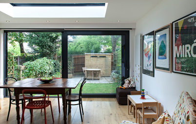
The newly created dining zone has built-in seating and tongue-and-groove cladding. “There wasn’t the available width to have a dining table with chairs on both sides,” Sam explains, “so we built a bench seat against the wall. It gives you just enough space to pass around the table on the other side.”
The bench has storage inside it for the children’s art supplies and some garden bits and pieces. There’s a tubular radiator beneath it and a shelf at the back for family photos and the children’s artwork. There are also speakers and an LED cove light at the junction with the ceiling.
Bench painted in Light Blue, Farrow & Ball.
The exterior as it was before the extension.
“We’re big on trying to reduce energy use,” Sam says. “So when we extend and refurbish, we always try to see how we can improve in this area.”
Here, lots of insulation was added, including beneath the entire ground floor, and new double glazed windows were fitted at the back. Also, the original, brick-built rear projection now has wood fibre insulation board and is covered externally by lime render, which allows moisture to escape, reducing the risk of damp.
Here, you can see how the new extension fits with the original layout. The room to the right of the dining area is the study/bedroom Sam mentioned, which was already there.
The area the new extension takes up was effectively dead space, so the construction has taken little away from the garden. Typically, extensions are square onto the garden, but this one creates a corner. “The dining area feels much more like a garden room, as you have garden on both sides, two aspects,” Sam says.
The garden had already been laid out and landscaped by the previous owners on a diagonal. The idea, Sam says, works well for a smaller garden. “The diagonal axis increases the sense of space and that diagonal axis going through the extension also increases its sense of space,” he explains.
In the summer, this is even more relevant. “By being able to open up the sliding glass doors, we don’t need a garden table,” Sam says. “If we’re having a barbecue, we eat at the dining table and we’re still outside, so to speak.”
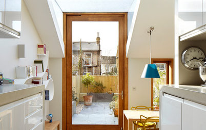
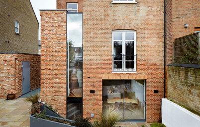
The right-hand door slides into a pocket. “There were quite a lot of structural gymnastics to avoid a column where the roof cantilevers out,” Sam recalls. “There’s a grid of steel in the roof that projects out into the walls.”
A projecting soffit here works hard. It controls solar gain to avoid the internal space overheating and it also provides some shelter beyond the threshold, “so you can have the windows open in the rain,” Sam says. “It also gives you somewhere to have external lighting, so that when it’s dark and you’re inside, you don’t feel as if you’re in a small black box.”
“It’s a very small room, particularly when you have 10 people sitting at the dining table,’ he says. “But just having that light stretching into the depth of field and pinging off the greenery is really nice.”
Tell us…
What do you like best about this modest extension? Let us know in the Comments section.
The area the new extension takes up was effectively dead space, so the construction has taken little away from the garden. Typically, extensions are square onto the garden, but this one creates a corner. “The dining area feels much more like a garden room, as you have garden on both sides, two aspects,” Sam says.
The garden had already been laid out and landscaped by the previous owners on a diagonal. The idea, Sam says, works well for a smaller garden. “The diagonal axis increases the sense of space and that diagonal axis going through the extension also increases its sense of space,” he explains.
In the summer, this is even more relevant. “By being able to open up the sliding glass doors, we don’t need a garden table,” Sam says. “If we’re having a barbecue, we eat at the dining table and we’re still outside, so to speak.”
The right-hand door slides into a pocket. “There were quite a lot of structural gymnastics to avoid a column where the roof cantilevers out,” Sam recalls. “There’s a grid of steel in the roof that projects out into the walls.”
A projecting soffit here works hard. It controls solar gain to avoid the internal space overheating and it also provides some shelter beyond the threshold, “so you can have the windows open in the rain,” Sam says. “It also gives you somewhere to have external lighting, so that when it’s dark and you’re inside, you don’t feel as if you’re in a small black box.”
“It’s a very small room, particularly when you have 10 people sitting at the dining table,’ he says. “But just having that light stretching into the depth of field and pinging off the greenery is really nice.”
Tell us…
What do you like best about this modest extension? Let us know in the Comments section.

Sponsored

Sponsored
Who lives here? Sam Cooper, his wife and their 4-year-old twins
Location East London
Property A split-level ground floor flat in a Victorian end-of-terrace house
Extension dimensions 3.2 x 4. 5m
Designer Sam Cooper at E2 Architecture + Interiors
Builders Harpers Construction
Photos by Darren Chung
“We looked at doing a full-width extension across the back,” Sam explains. However, the house had a slightly unusual layout for its era. “Like most Victorian houses, it had a rear projection,” he continues, “but this was quite small and had a study/bedroom in it. If we’d gone full width, we’d have lost this room, which we didn’t want to do.”
Leicht kitchen with Carré-FS matt lacquer units in Petrol and Ceres laminate units in Platinum, Connaught Kitchens.