Search results for "L-shaped house" in Home Design Ideas
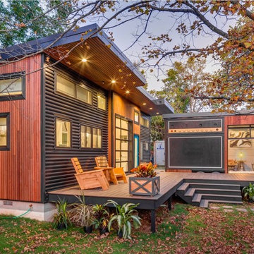
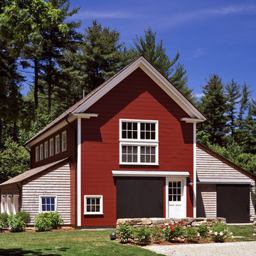
Who lives there: Asha Mevlana and her Havanese dog named Bali
Location: Fayetteville, Arkansas
Size: Main house (400 sq ft), Trailer (160 sq ft.), 1 loft bedroom, 1 bath
What sets your home apart: The home was designed specifically for my lifestyle.
My inspiration: After reading the book, "The Life Changing Magic of Tidying," I got inspired to just live with things that bring me joy which meant scaling down on everything and getting rid of most of my possessions and all of the things that I had accumulated over the years. I also travel quite a bit and wanted to live with just what I needed.
About the house: The L-shaped house consists of two separate structures joined by a deck. The main house (400 sq ft), which rests on a solid foundation, features the kitchen, living room, bathroom and loft bedroom. To make the small area feel more spacious, it was designed with high ceilings, windows and two custom garage doors to let in more light. The L-shape of the deck mirrors the house and allows for the two separate structures to blend seamlessly together. The smaller "amplified" structure (160 sq ft) is built on wheels to allow for touring and transportation. This studio is soundproof using recycled denim, and acts as a recording studio/guest bedroom/practice area. But it doesn't just look like an amp, it actually is one -- just plug in your instrument and sound comes through the front marine speakers onto the expansive deck designed for concerts.
My favorite part of the home is the large kitchen and the expansive deck that makes the home feel even bigger. The deck also acts as a way to bring the community together where local musicians perform. I love having a the amp trailer as a separate space to practice music. But I especially love all the light with windows and garage doors throughout.
Design team: Brian Crabb (designer), Zack Giffin (builder, custom furniture) Vickery Construction (builder) 3 Volve Construction (builder)
Design dilemmas: Because the city wasn’t used to having tiny houses there were certain rules that didn’t quite make sense for a tiny house. I wasn’t allowed to have stairs leading up to the loft, only ladders were allowed. Since it was built, the city is beginning to revisit some of the old rules and hopefully things will be changing.
Photo cred: Don Shreve
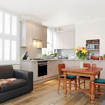
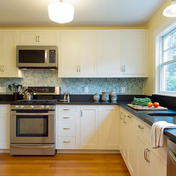
This is an example of a medium sized classic l-shaped kitchen/diner in London with no island and light hardwood flooring.
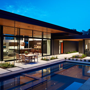
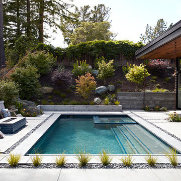
Klopf Architecture, Arterra Landscape Architects and Henry Calvert of Calvert Ventures Designed and built a new warm, modern, Eichler-inspired, open, indoor-outdoor home on a deeper-than-usual San Mateo Highlands property where an original Eichler house had burned to the ground.
The owners wanted multi-generational living and larger spaces than the original home offered, but all parties agreed that the house should respect the neighborhood and blend in stylistically with the other Eichlers. At first the Klopf team considered re-using what little was left of the original home and expanding on it. But after discussions with the owner and builder, all parties agreed that the last few remaining elements of the house were not practical to re-use, so Klopf Architecture designed a new home that pushes the Eichler approach in new directions.
One disadvantage of Eichler production homes is that the house designs were not optimized for each specific lot. A new custom home offered the team a chance to start over. In this case, a longer house that opens up sideways to the south fit the lot better than the original square-ish house that used to open to the rear (west). Accordingly, the Klopf team designed an L-shaped “bar” house with a large glass wall with large sliding glass doors that faces sideways instead of to the rear like a typical Eichler. This glass wall opens to a pool and landscaped yard designed by Arterra Landscape Architects.
Driving by the house, one might assume at first glance it is an Eichler because of the horizontality, the overhanging flat roof eaves, the dark gray vertical siding, and orange solid panel front door, but the house is designed for the 21st Century and is not meant to be a “Likeler.” You won't see any posts and beams in this home. Instead, the ceiling decking is a western red cedar that covers over all the beams. Like Eichlers, this cedar runs continuously from inside to out, enhancing the indoor / outdoor feeling of the house, but unlike Eichlers it conceals a cavity for lighting, wiring, and insulation. Ceilings are higher, rooms are larger and more open, the master bathroom is light-filled and more generous, with a separate tub and shower and a separate toilet compartment, and there is plenty of storage. The garage even easily fits two of today's vehicles with room to spare.
A massive 49-foot by 12-foot wall of glass and the continuity of materials from inside to outside enhance the inside-outside living concept, so the owners and their guests can flow freely from house to pool deck to BBQ to pool and back.
During construction in the rough framing stage, Klopf thought the front of the house appeared too tall even though the house had looked right in the design renderings (probably because the house is uphill from the street). So Klopf Architecture paid the framer to change the roofline from how we had designed it to be lower along the front, allowing the home to blend in better with the neighborhood. One project goal was for people driving up the street to pass the home without immediately noticing there is an "imposter" on this lot, and making that change was essential to achieve that goal.
This 2,606 square foot, 3 bedroom, 3 bathroom Eichler-inspired new house is located in San Mateo in the heart of the Silicon Valley.
Klopf Architecture Project Team: John Klopf, AIA, Klara Kevane
Landscape Architect: Arterra Landscape Architects
Contractor: Henry Calvert of Calvert Ventures
Photography ©2016 Mariko Reed
Location: San Mateo, CA
Year completed: 2016
Find the right local pro for your project
A 43” diameter heritage pecan guided the plan of this neighborhood-scaled, modestly-priced, single-story, L-shaped house. In Austin’s seemingly perpetual drought, the goal was to create a symbiotic relationship between house and tree: to complement, not combat each other. The roof’s east/west parallel ridges create a valley directly across from the base, where water is collected at a grate, nourishing the tree. The roof also maximizes south facing surfaces, elevated at 15 degrees for future solar collection. The open, public spaces of the home maximize the north-south light. The private zone of the bedrooms and bathrooms include a generous gallery; its angled walls and large sliding doors are faceted about the tree. The pecan becomes a central focus for indoor and outdoor living, participating in the house in both plan and section. The design welcomes and nurtures the tree as integral to its success. Photo Credit: Chris Diaz
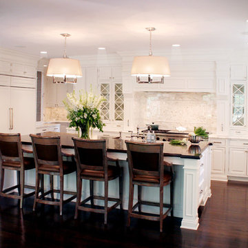
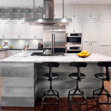
In the design stages many details were incorporated in this classic kitchen to give it dimension since the surround cabinets, counters and backsplash were white. Polished nickel plumbing, hardware and custom grilles on feature cabinets along with the island pendants add shine, while finer details such as inset doors, furniture kicks on non-working areas and lofty crown details add a layering effect in the millwork. Surround counters as well as 3" x 6" backsplash tile are Calacutta Gold stone, while island counter surface is walnut. Conveniences include a 60" Wolf range, a 36" Subzero refrigerator and freezer and two farmhouse sinks by Kallista. The kitchen also boasts two dishwashers (one in the island and one to the right of the sink cabinet under the window) and a coffee bar area with a built-in Miele. Photo by Pete Maric.
Klopf Architecture, Arterra Landscape Architects and Henry Calvert of Calvert Ventures Designed and built a new warm, modern, Eichler-inspired, open, indoor-outdoor home on a deeper-than-usual San Mateo Highlands property where an original Eichler house had burned to the ground.
The owners wanted multi-generational living and larger spaces than the original home offered, but all parties agreed that the house should respect the neighborhood and blend in stylistically with the other Eichlers. At first the Klopf team considered re-using what little was left of the original home and expanding on it. But after discussions with the owner and builder, all parties agreed that the last few remaining elements of the house were not practical to re-use, so Klopf Architecture designed a new home that pushes the Eichler approach in new directions.
One disadvantage of Eichler production homes is that the house designs were not optimized for each specific lot. A new custom home offered the team a chance to start over. In this case, a longer house that opens up sideways to the south fit the lot better than the original square-ish house that used to open to the rear (west). Accordingly, the Klopf team designed an L-shaped “bar” house with a large glass wall with large sliding glass doors that faces sideways instead of to the rear like a typical Eichler. This glass wall opens to a pool and landscaped yard designed by Arterra Landscape Architects.
Driving by the house, one might assume at first glance it is an Eichler because of the horizontality, the overhanging flat roof eaves, the dark gray vertical siding, and orange solid panel front door, but the house is designed for the 21st Century and is not meant to be a “Likeler.” You won't see any posts and beams in this home. Instead, the ceiling decking is a western red cedar that covers over all the beams. Like Eichlers, this cedar runs continuously from inside to out, enhancing the indoor / outdoor feeling of the house, but unlike Eichlers it conceals a cavity for lighting, wiring, and insulation. Ceilings are higher, rooms are larger and more open, the master bathroom is light-filled and more generous, with a separate tub and shower and a separate toilet compartment, and there is plenty of storage. The garage even easily fits two of today's vehicles with room to spare.
A massive 49-foot by 12-foot wall of glass and the continuity of materials from inside to outside enhance the inside-outside living concept, so the owners and their guests can flow freely from house to pool deck to BBQ to pool and back.
During construction in the rough framing stage, Klopf thought the front of the house appeared too tall even though the house had looked right in the design renderings (probably because the house is uphill from the street). So Klopf Architecture paid the framer to change the roofline from how we had designed it to be lower along the front, allowing the home to blend in better with the neighborhood. One project goal was for people driving up the street to pass the home without immediately noticing there is an "imposter" on this lot, and making that change was essential to achieve that goal.
This 2,606 square foot, 3 bedroom, 3 bathroom Eichler-inspired new house is located in San Mateo in the heart of the Silicon Valley.
Klopf Architecture Project Team: John Klopf, AIA, Klara Kevane
Landscape Architect: Arterra Landscape Architects
Contractor: Henry Calvert of Calvert Ventures
Photography ©2016 Mariko Reed
Location: San Mateo, CA
Year completed: 2016
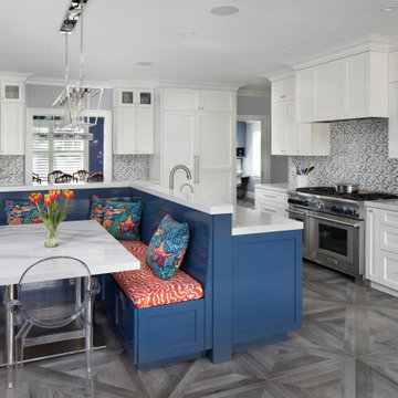
A modern farmhouse style kitchen & family room in a updated Colonial Revival house. Kitchen with L shaped island and banquette that opens up to family room opening up with accorrdian doors to outdoor kitchen deck. Area includes porcelain plank wood flooring, matching marble backsplash, walk-in pantry and appliances such as full-height wine refrigerator, 54 inch refrigerator-freezer, built-in coffee machine, microwaver drawer, 48 inch range, and dishwasher with farm sink.

Reload the page to not see this specific ad anymore
Klopf Architecture, Arterra Landscape Architects and Henry Calvert of Calvert Ventures Designed and built a new warm, modern, Eichler-inspired, open, indoor-outdoor home on a deeper-than-usual San Mateo Highlands property where an original Eichler house had burned to the ground.
The owners wanted multi-generational living and larger spaces than the original home offered, but all parties agreed that the house should respect the neighborhood and blend in stylistically with the other Eichlers. At first the Klopf team considered re-using what little was left of the original home and expanding on it. But after discussions with the owner and builder, all parties agreed that the last few remaining elements of the house were not practical to re-use, so Klopf Architecture designed a new home that pushes the Eichler approach in new directions.
One disadvantage of Eichler production homes is that the house designs were not optimized for each specific lot. A new custom home offered the team a chance to start over. In this case, a longer house that opens up sideways to the south fit the lot better than the original square-ish house that used to open to the rear (west). Accordingly, the Klopf team designed an L-shaped “bar” house with a large glass wall with large sliding glass doors that faces sideways instead of to the rear like a typical Eichler. This glass wall opens to a pool and landscaped yard designed by Arterra Landscape Architects.
Driving by the house, one might assume at first glance it is an Eichler because of the horizontality, the overhanging flat roof eaves, the dark gray vertical siding, and orange solid panel front door, but the house is designed for the 21st Century and is not meant to be a “Likeler.” You won't see any posts and beams in this home. Instead, the ceiling decking is a western red cedar that covers over all the beams. Like Eichlers, this cedar runs continuously from inside to out, enhancing the indoor / outdoor feeling of the house, but unlike Eichlers it conceals a cavity for lighting, wiring, and insulation. Ceilings are higher, rooms are larger and more open, the master bathroom is light-filled and more generous, with a separate tub and shower and a separate toilet compartment, and there is plenty of storage. The garage even easily fits two of today's vehicles with room to spare.
A massive 49-foot by 12-foot wall of glass and the continuity of materials from inside to outside enhance the inside-outside living concept, so the owners and their guests can flow freely from house to pool deck to BBQ to pool and back.
During construction in the rough framing stage, Klopf thought the front of the house appeared too tall even though the house had looked right in the design renderings (probably because the house is uphill from the street). So Klopf Architecture paid the framer to change the roofline from how we had designed it to be lower along the front, allowing the home to blend in better with the neighborhood. One project goal was for people driving up the street to pass the home without immediately noticing there is an "imposter" on this lot, and making that change was essential to achieve that goal.
This 2,606 square foot, 3 bedroom, 3 bathroom Eichler-inspired new house is located in San Mateo in the heart of the Silicon Valley.
Klopf Architecture Project Team: John Klopf, AIA, Klara Kevane
Landscape Architect: Arterra Landscape Architects
Contractor: Henry Calvert of Calvert Ventures
Photography ©2016 Mariko Reed
Location: San Mateo, CA
Year completed: 2016
The Myers Touch designed this transitional family kitchen which formed part of a substantial renovation project on a property based in Hampshire.
Working in collaboration with Adam Knibb Architects to ensure design continuity, the owners briefed The Myers Touch that they wanted a contemporary family kitchen/dining space with a classic edge that would include 'a place for everything'. The design would also have to complement the rest of the home’s design scheme and make the most of the landscaped garden views to the rear of the property.
The owners wanted to keep the L-Shaped kitchen shape that had been conceptionally designed by the Architect, whilst making the best use of the property's feature high ceilings. The finished design had to be practical for their family needs, yet elegant and inviting and fully accessible.
The Myers Touch proposed a transitional kitchen design featuring a complimentary mix of both classic and contemporary cabinetry that would enhance the home fusions of these two styles. The design scheme was visually impactful and considered the homes environment and materials that can be seen throughout the property.
The inclusion of sleek marble effect stone worktops and a traditional Black AGA helped to provide a Classic look, whilst the flat sleek SieMatic SLX cabinetry and large central island created a modern contemporary edge to link the scheme together. The period high ceilings also allowed The Myers Touch to include vital storage with attractive high level glass cabinets.
Careful planning of the back L-shape wall was considered particularly in the corner. To maximise the space, The Myers Touch designed a niche to house the toaster, and smaller appliances that could be tucked away and were slightly hidden from view. On the back wall, The Myers Touch designed storage drawers to perfectly line up with the statement AGA. The use of glass and the reflective Bronze mirror also provided eye-catching elegance to the space, as the eye is drawn up to the ceiling, giving the illusion of space. The space also looks particularly inviting at night when the cabinetry lights are lit to provide a beautiful glow & warmth.
The custom-made extractor was designed to sit flush between the wall units either side of the AGA and features high performance twin motors and a Zinc Clad finish to provide an element of drama and connectivity of the furniture choices. Sleek 20mm Silestone ex-gloss stone in Yukon were chosen for the worktops and a statement splashback gives a soft reflection and a warming marble effect.
Continuing around the rest of the L-shaped room, the return wall displays Miele Cooking & Refrigeration Appliances that are housed in the same cabinetry that join the back run all the way to the end of the Island to fit around the architecture of the room. The kitchen furniture on these two walls use SieMatic’s SC/SE SC10 collection but Keith replaced the doors with a bespoke painted solid oak shaker style frame with stylish Buster & Punch handles in Smoked Bronze which were chosen by the client and Interior Designer.
Special display items were housed in the glass display units situated high into the ceiling. For access to those, The Myers Touch designed a functional ladder rail which can be stored in a a niche space around the corner when not in use.
To provide a softer and contrasting look in the room, Keith added a Dresser Unit to cover an old doorway which also acts as a transitional point between the kitchen and the dining space. For continuity the soft shaker style furniture is used at the bottom doors with open shelving that sit neatly into the dresser walls.
The contemporary central Island was designed using SieMatic’s SLX Cabinetry with a modern Smoked Oak Veneer finish. The angled handle profile sits on top of the units, and underneath the worktop to provide a beautiful haptic feeling that continues all the way round to provide the illusion of the 20mm Dekton worktop 'floating together'. Since the Island's plinth is set back that also provides a similar "floating off the floor" illusion.
The ease of use when preparing food and cooking, the front of the island houses the bin, sink, dishwasher and drawer storage. The other side contains storage for food mixers, freestanding baking accessories and overflow crockery. There is plenty of space to the back of the island for bar stool seating which is conveniently situated between cupboards that house oven-to table type items such as everyday crockery, place mats, condiments and napkins.
The owners also requested a large Dining Table in the space, so The Myers Touch designed one using a seamless 12mm Dekton worktop in Bergen that sits on top of a custom made steel framed table support and legs that cohesively bring the kitchen, dining & entertaining scheme together.
Photography by Paul Craig - image reproduction by request only joy@bakerpr.co.uk
Overlooking the river down a sweep of lawn and pasture, this is a big house that looks like a collection of small houses.
The approach is orchestrated so that the view of the river is hidden from the driveway. You arrive in a courtyard defined on two sides by the pavilions of the house, which are arranged in an L-shape, and on a third side by the barn
The living room and family room pavilions are clad in painted flush boards, with bold details in the spirit of the Greek Revival houses which abound in New England. The attached garage and free-standing barn are interpretations of the New England barn vernacular. The connecting wings between the pavilions are shingled, and distinct in materials and flavor from the pavilions themselves.
All the rooms are oriented towards the river. A combined kitchen/family room occupies the ground floor of the corner pavilion. The eating area is like a pavilion within a pavilion, an elliptical space half in and half out of the house. The ceiling is like a shallow tented canopy that reinforces the specialness of this space.
Photography by Robert Benson
The Porch House located just west of Springfield, Missouri, presented Hufft Projects with a unique challenge. The clients desired a residence that referenced the traditional forms of farmhouses but also spoke to something distinctly modern. A hybrid building emerged and the Porch House greets visitors with its namesake – a large east and south facing ten foot cantilevering canopy that provides dramatic cover.
The residence also commands a view of the expansive river valley to the south. L-shaped in plan, the house’s master suite is located in the western leg and is isolated away from other functions allowing privacy. The living room, dining room, and kitchen anchor the southern, more traditional wing of the house with its spacious vaulted ceilings. A chimney punctuates this area and features a granite clad fireplace on the interior and an exterior fireplace expressing split face concrete block. Photo Credit: Mike Sinclair
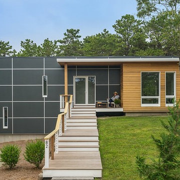
This modern green home offers both a vacation destination on Cape Cod near local family members and an opportunity for rental income.
FAMILY ROOTS. A West Coast couple living in the San Francisco Bay Area sought a permanent East Coast vacation home near family members living on Cape Cod. As academic professionals focused on sustainability, they sought a green, energy efficient home that was well-aligned with their values. With no green homes available for sale on Cape Cod, they decided to purchase land near their family and build their own.
SLOPED SITE. Comprised of a 3/4 acre lot nestled in the pines, the steeply sloping terrain called for a plan that embraced and took advantage of the slope. Of equal priority was optimizing solar exposure, preserving privacy from abutters, and creating outdoor living space. The design accomplished these goals with a simple, rectilinear form, offering living space on the both entry and lower/basement levels. The stepped foundation allows for a walk-out basement level with light-filled living space on the down-hill side of the home. The traditional basement on the eastern, up-hill side houses mechanical equipment and a home gym. The house welcomes natural light throughout, captures views of the forest, and delivers entertainment space that connects indoor living space to outdoor deck and dining patio.
MODERN VISION. The clean building form and uncomplicated finishes pay homage to the modern architectural legacy on the outer Cape. Durable and economical fiber cement panels, fixed with aluminum channels, clad the primary form. Cedar clapboards provide a visual accent at the south-facing living room, which extends a single roof plane to cover the entry porch.
SMART USE OF SPACE. On the entry level, the “L”-shaped living, dining, and kitchen space connects to the exterior living, dining, and grilling spaces to effectively double the home’s summertime entertainment area. Placed at the western end of the entry level (where it can retain privacy but still claim expansive downhill views) is the master suite with a built-in study. The lower level has two guest bedrooms, a second full bathroom, and laundry. The flexibility of the space—crucial in a house with a modest footprint—emerges in one of the guest bedrooms, which doubles as home office by opening the barn-style double doors to connect it to the bright, airy open stair leading up to the entry level. Thoughtful design, generous ceiling heights and large windows transform the modest 1,100 sf* footprint into a well-lit, spacious home. *(total finished space is 1800 sf)
RENTAL INCOME. The property works for its owners by netting rental income when the owners are home in San Francisco. The house especially caters to vacationers bound for nearby Mayo Beach and includes an outdoor shower adjacent to the lower level entry door. In contrast to the bare bones cottages that are typically available on the Cape, this home offers prospective tenants a modern aesthetic, paired with luxurious and green features. Durable finishes inside and out will ensure longevity with the heavier use that comes with a rental property.
COMFORT YEAR-ROUND. The home is super-insulated and air-tight, with mechanical ventilation to provide continuous fresh air from the outside. High performance triple-paned windows complement the building enclosure and maximize passive solar gain while ensuring a warm, draft-free winter, even when sitting close to the glass. A properly sized air source heat pump offers efficient heating & cooling, and includes a carefully designed the duct distribution system to provide even comfort throughout the house. The super-insulated envelope allows us to significantly reduce the equipment capacity, duct size, and airflow quantities, while maintaining unparalleled thermal comfort.
ENERGY EFFICIENT. The building’s shell and mechanical systems play instrumental roles in the home’s exceptional performance. The building enclosure reduces the most significant energy glutton: heating. Continuous super-insulation, thorough air sealing, triple-pane windows, and passive solar gain work together to yield a miniscule heating load. All active energy consumers are extremely efficient: an air source heat pump for heating and cooling, a heat pump hot water heater, LED lighting, energy recovery ventilation (ERV), and high efficiency appliances. The result is a home that uses 70% less energy than a similar new home built to code requirements.
OVERALL. The home embodies the owners’ goals and values while comprehensively enabling thermal comfort, energy efficiency, a vacation respite, and supplementary income.
PROJECT TEAM
ZeroEnergy Design - Architect & Mechanical Designer
A.F. Hultin & Co. - Contractor
Pamet Valley Landscape Design - Landscape & Masonry
Lisa Finch - Original Artwork
European Architectural Supply - Windows
Eric Roth Photography - Photography
Overlooking the river down a sweep of lawn and pasture, this is a big house that looks like a collection of small houses.
The approach is orchestrated so that the view of the river is hidden from the driveway. You arrive in a courtyard defined on two sides by the pavilions of the house, which are arranged in an L-shape, and on a third side by the barn
The living room and family room pavilions are clad in painted flush boards, with bold details in the spirit of the Greek Revival houses which abound in New England. The attached garage and free-standing barn are interpretations of the New England barn vernacular. The connecting wings between the pavilions are shingled, and distinct in materials and flavor from the pavilions themselves.
All the rooms are oriented towards the river. A combined kitchen/family room occupies the ground floor of the corner pavilion. The eating area is like a pavilion within a pavilion, an elliptical space half in and half out of the house. The ceiling is like a shallow tented canopy that reinforces the specialness of this space.
Photography by Robert Benson
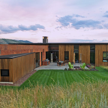
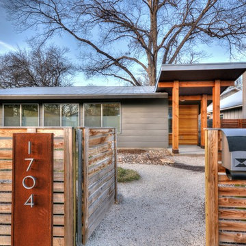
Extensive valley and mountain views inspired the siting of this simple L-shaped house that is anchored into the landscape. This shape forms an intimate courtyard with the sweeping views to the south. Looking back through the entry, glass walls frame the view of a significant mountain peak justifying the plan skew.
The circulation is arranged along the courtyard in order that all the major spaces have access to the extensive valley views. A generous eight-foot overhang along the southern portion of the house allows for sun shading in the summer and passive solar gain during the harshest winter months. The open plan and generous window placement showcase views throughout the house. The living room is located in the southeast corner of the house and cantilevers into the landscape affording stunning panoramic views.
Project Year: 2012
The Porch House located just west of Springfield, Missouri, presented Hufft Projects with a unique challenge. The clients desired a residence that referenced the traditional forms of farmhouses but also spoke to something distinctly modern. A hybrid building emerged and the Porch House greets visitors with its namesake – a large east and south facing ten foot cantilevering canopy that provides dramatic cover.
The residence also commands a view of the expansive river valley to the south. L-shaped in plan, the house’s master suite is located in the western leg and is isolated away from other functions allowing privacy. The living room, dining room, and kitchen anchor the southern, more traditional wing of the house with its spacious vaulted ceilings. A chimney punctuates this area and features a granite clad fireplace on the interior and an exterior fireplace expressing split face concrete block. Photo Credit: Mike Sinclair
This shaker style kitchen with an opaque lacquer finish shows a "L" shaped layout with an island. Storage space is the main concern in this room. Undeniably, the designer has focused on maximizing the amount of space available by having the cabinets installed up to the ceiling. An entire wall is dedicated to storage and kitchen organization. Glass doors with stainless steel framing bring lightness and refinement while reminding us of the appliances and hood’s finish. This kitchen has an eclectic style, but one that remains sober. The monochromatic color palette allows all components to be well integrated with each other and make this room an interesting and pleasant place to live in. Several classic elements like shaker doors and a "subway" style backsplash are diminished by the industrial aspect that bring the concrete island, the massive stainless steel hood and the black steel stools. Tiled windows remind us of the windows of largeMontreal’s factories in the early 30s, and therefore add to the more industrial look. The central element and a major focal point of this kitchen is unquestionably the concrete island. It gives this room a lot of texture and interest while remaining sober and harmonious. Black steel stools contribute to this urban and industrial aspect thanks to their minimalist and quaint design. A white porcelain farmhouse sink is integrated impeccably with the cabinets while remaining discreet. Its specific shape adds character to the kitchen of thisWestmount’s house, built in 1927. Finally, the wood floor just brightens up and warms the atmosphere by creating a sustained contrast with the rest of the kitchen. In the dining room, a gorgeous antique solid wood table is also warming up the space and the upholstered chairs add comfort and contribute to a comfortable and welcoming ambience.
The large, L-shaped kitchen accommodates the frequent gathering of friends and family.
Photo: Brian Tetrault Productions
Builder: C&J Hunt Construction
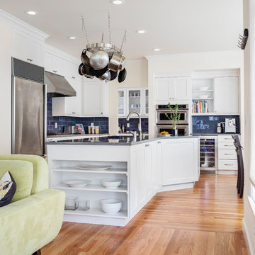
L-shaped kitchen with open shelving, hanging pot rack and blue backsplash © Cindy Apple Photography
Inspiration for a medium sized traditional l-shaped open plan kitchen in Seattle with a submerged sink, shaker cabinets, white cabinets, engineered stone countertops, blue splashback, ceramic splashback, stainless steel appliances, medium hardwood flooring, an island, grey worktops and brown floors.
Inspiration for a medium sized traditional l-shaped open plan kitchen in Seattle with a submerged sink, shaker cabinets, white cabinets, engineered stone countertops, blue splashback, ceramic splashback, stainless steel appliances, medium hardwood flooring, an island, grey worktops and brown floors.
Search results for L-Shaped House in Home Photos
The existing 3000 square foot colonial home was expanded to more than double its original size.
The end result was an open floor plan with high ceilings, perfect for entertaining, bathroom for every bedroom, closet space, mudroom, and unique details ~ all of which were high priorities for the homeowner.
Photos-Peter Rymwid Photography
The Mazama house is located in the Methow Valley of Washington State, a secluded mountain valley on the eastern edge of the North Cascades, about 200 miles northeast of Seattle.
The house has been carefully placed in a copse of trees at the easterly end of a large meadow. Two major building volumes indicate the house organization. A grounded 2-story bedroom wing anchors a raised living pavilion that is lifted off the ground by a series of exposed steel columns. Seen from the access road, the large meadow in front of the house continues right under the main living space, making the living pavilion into a kind of bridge structure spanning over the meadow grass, with the house touching the ground lightly on six steel columns. The raised floor level provides enhanced views as well as keeping the main living level well above the 3-4 feet of winter snow accumulation that is typical for the upper Methow Valley.
To further emphasize the idea of lightness, the exposed wood structure of the living pavilion roof changes pitch along its length, so the roof warps upward at each end. The interior exposed wood beams appear like an unfolding fan as the roof pitch changes. The main interior bearing columns are steel with a tapered “V”-shape, recalling the lightness of a dancer.
The house reflects the continuing FINNE investigation into the idea of crafted modernism, with cast bronze inserts at the front door, variegated laser-cut steel railing panels, a curvilinear cast-glass kitchen counter, waterjet-cut aluminum light fixtures, and many custom furniture pieces. The house interior has been designed to be completely integral with the exterior. The living pavilion contains more than twelve pieces of custom furniture and lighting, creating a totality of the designed environment that recalls the idea of Gesamtkunstverk, as seen in the work of Josef Hoffman and the Viennese Secessionist movement in the early 20th century.
The house has been designed from the start as a sustainable structure, with 40% higher insulation values than required by code, radiant concrete slab heating, efficient natural ventilation, large amounts of natural lighting, water-conserving plumbing fixtures, and locally sourced materials. Windows have high-performance LowE insulated glazing and are equipped with concealed shades. A radiant hydronic heat system with exposed concrete floors allows lower operating temperatures and higher occupant comfort levels. The concrete slabs conserve heat and provide great warmth and comfort for the feet.
Deep roof overhangs, built-in shades and high operating clerestory windows are used to reduce heat gain in summer months. During the winter, the lower sun angle is able to penetrate into living spaces and passively warm the exposed concrete floor. Low VOC paints and stains have been used throughout the house. The high level of craft evident in the house reflects another key principle of sustainable design: build it well and make it last for many years!
Photo by Benjamin Benschneider
1