Houzz Logo Print
kathy129

Dining room wall? Mirror?

5 years ago
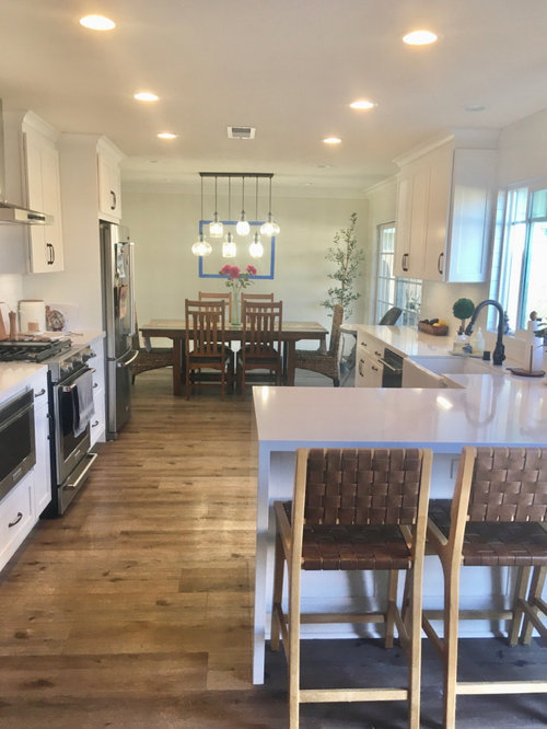
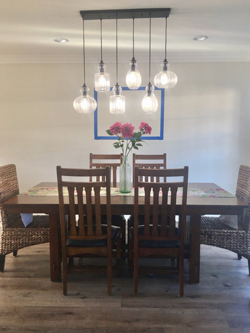
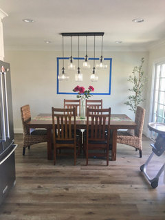
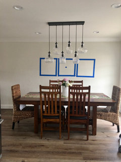
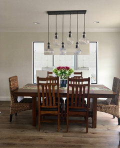
I just finished a kitchen remodel and trying to decide how to decorate the wall behind the dining room table. I wanted a China hutch there but there was not enough room with my table.
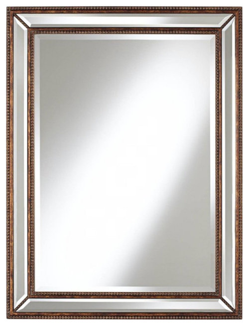
I am looking at large 30”x40” bronze beveled mirrors but not sure if that is the best design. I blue taped the size to see how it would look.
Suggestions?
Thank you

Comments (45)

  • 5 years ago
    Looks like the mirror wont reflect anything but the light fixture


    china displays can be quite narrow


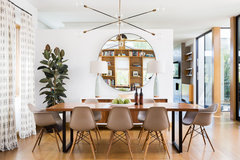
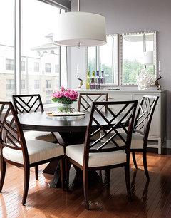
    Villanova Residence - dining room · More Info


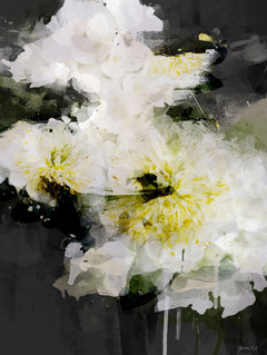
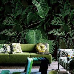
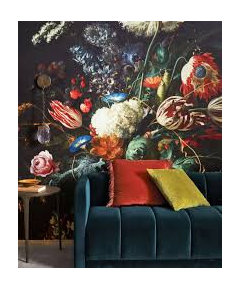
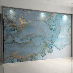
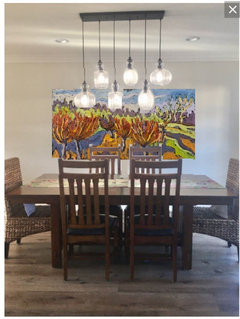
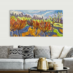
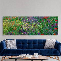
    Rather than a mirror a color field abstact art or a knock out framed wallpaper might be nice


  • 5 years ago
    ?


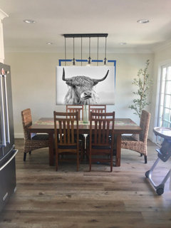
    Deep Down, Murals That Stick, 54x72 · More Info

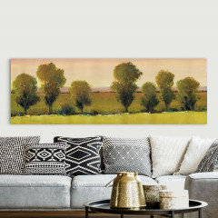
    it is big and comed in other styles and colors

  • Related Discussions

    Dining room walls

    Q

    Comments (3)
    Mine is the other idea and not neutral! Your cabinet looks oriental? If you spray the cabinet with black lacquer it would be nice to have a yellow and black oriental theme. The yellow can be bright or pale lemon. Paint the walls in a very light grey. Sit the table on a grey and white geometric rug, one of the trellis style ones which are oriental would be ideal. Add the mirror over the fire. Create 3 large black diy picture frames for the long wall and add yellow chinoiserie paper. Add a big yellow pendant over the table and something for the fireplace. Unfortunately I can't save down the image I wanted to post.
    ...See More

    wall in dining room

    Q

    Comments (8)
    I would suggest a white shelf about the width of the sofa where you can put a mix of framed photos and vases, souvenirs, or other things that you treasure.
    ...See More

    Suggestions for walls in a north facing dining room

    Q

    Comments (6)
    Hi jc3135rc, I love the colour in the table mats and the lamp on the back unit so I would go for something to compliment that for the walls to give a sophisticated, warm and more modern look. A lovely mirror about the unit as you suggested will help bring light and the feeling of space into the room as well as keeping with the contemporary touch. If you want to keep some colour, the pretty picture on the wall and colourful fruit bowl could stay as your accent colour which will add a real pop! If you want more of a statement wall I would loose the pop of colour and for a textured paper. It really depends on your person tastes and use of the space. Could you add a pendent style light? I offer very reasonable by room design package with 3D render if you wanted to drop me a message for more information or a quick chat. All the best, Gina
    ...See More

    Needing help designing a dining room wall - plain white, no windows

    Q

    Comments (6)
    I'd go for a lovely big artwork. If it were me I’d go for something quite colourful, geometric and simple to enhance your minimal and monochrome kitchen design. Not a gallery wall as I think that would be too busy.
    ...See More
  • 5 years ago
    Very pretty kitchen and dining room! I think framed art (maybe just a tad larger than your outline) would look much better than a mirror.

  • 5 years ago
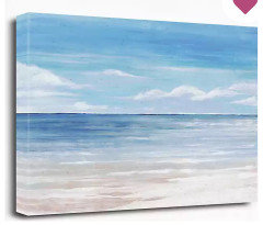
    This one is 40” x 60”? What do o u you oh think?

  • 5 years ago
    last modified: 5 years ago
    i think it works

    . double check with painters tape on wall

    see if you can find a few more photos of it online for color trueness

  • 5 years ago
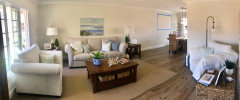
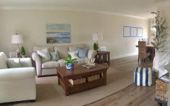
    Here is the taping for the beach picture 40”x60” and a panoramic of my living room into my dining room.

  • 5 years ago
    I like the idea of a mirror over the table, which will reflect your light fixture at night and the light from the large adjacent window during the day. But get a larger mirror. The size you have for the larger piece of art is much better for the space. Get the 40x60 art to use over your sofa, and move your current sofa art to the wall behind your large chair.

  • 5 years ago
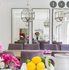
    If you decide to go with a mirror, I think it should be bigger than your original blue outline.

  • 5 years ago
    I don't think a mirror would go well in that space.

    Mirrors look better in a more formal dining area.

    What would look wonderful on that wall would be art, although not one single piece.

    I would do two pieces that are appropriately sized and related to each other thematically and in colorway. Actually, three is better than two, two is a snooze in decorating. Odd numbers are almost always better in decorating and a triptych here is better. (and you are also decorating that wall for the enjoyment of diners at your counter.)

    Together their width needs to be substantial, no skinny minis here, except for you as Wallis SImpson would have said :)

    You could also take one very large piece such as a mural or a piece of wallpaper, or a wall paper mural and cut it into three and frame them separately.

    Or you can be marvelously brave and get a wallpaper mural and do the entire wall in whatever type of mural you like.


  • 5 years ago

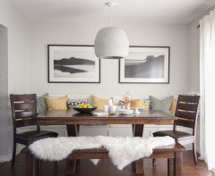
    Mirrors don't have to look formal.

    Jacon Way · More Info


    Plaza Project · More Info


  • 5 years ago

    Mirrors are best placed where they reflect something worth seeing — a view out a window for example. A mirror where you have the blue tape will reflect your kitchen - especially to the person sitting at the table facing the mirror. May not be the reflection you want.

  • 5 years ago
    last modified: 5 years ago

    I like the larger size, but lower it a bit. You're too close to the ceiling.

    56"-60" from the floor to the MIDDLE of the picture.

    and I think it should be art, not a mirror. what are you reflecting if you mount a mirror? your kitchen?

    The wall is a prominent focal point. put something worth looking at!


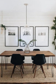
    I always use this guy because it's the perfect dimensions.


    or two pieces


    sconces are a nice addition. (you dont' have room for a buffet, right?)


  • 5 years ago

    I think you need a colorful piece of art instead.

  • PRO
    5 years ago
    last modified: 5 years ago

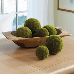
    Geez, no mirror for this space. It's devoid of color and texture. And anything you select for the tabletop should be linear and low.
    Your chairs are tall. The artwork will be hung with some of it hidden behind the chair back. Don't hang anything too high.


  • 5 years ago

    I do not have room for a buffet.
    My table is 80”
    What size should I do the set of pictures or one picture?

  • 5 years ago

    Remember a mirror will also reflect the people eating. so always seat your most attractve and mannerly guests facing the mirror. 😊

  • 5 years ago

    Mirrors are generally mounted higher, just like artwork, so when you're seated at table you are not looking directly in the mirror.

  • 5 years ago

    @BeverlyFLADeziner showed you a perfect size for one peice of art. You can also use two or three peices mounted close together to take up about the same amount of space in relation to the table. The specific art you choose should be based on your interests and preferences for color and subject matter.

  • 5 years ago

    Since both walls can be seen at the same time, lower the dining room piece so it is centered 5' above the floor. I prefer art. A mirror is going to double not only the light fixture, but the kitchen as well. Art will inspire more conversation; making the kitchen the center of interest will make you wish for doors so you could close it off. The people facing it will see and those with their backs to it will too.

  • 5 years ago

    Be sure and blue tape the sizes of the 3 frames. You don't want to go too small.

  • 5 years ago

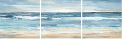
    I found this picture set of 3.
    24” x 24”
    Taped it out to visualize.
    What do you think?

  • 5 years ago

    You could go larger, but the set of three also works.

  • 5 years ago

    Like your triptych, although it is very similar to the one hanging in the living room. Check out beach landscapes on allposter.com.

  • 5 years ago

    Beverly had best idea, I believe. Artwork- colorful- something to make you happy .. not reflect the kitchen or your guests. Also I think the mirrors and the lights would just make for a really glaring look.
    Look how nicely her suggestion shows off that beautiful lighting fixture too.

    I think one large piece in the middle and two narrower ones on each side would also be interesting - a continuous artwork but divided in threes are complementary. I’m in a Co-op gallery up in Weston called Northland gallery. We’re open today. And We have many wonderful artists that you would like. Also they can paint another piece or two to coordinate. .

    We’re just 3-4 doors down from the church on Main, before you get to Tin Kitchen. 519 Main St
    Www.Northlandartists.com
    Good luck!

  • 5 years ago

    I like the large painting, adds color but not too busy. Agree it's too high, space it equaling between the the top of the table and the bottom of the crown molding.

  • 5 years ago
    last modified: 5 years ago

    I vote "no" on the mirror also. Your dining area is more casual, as it opens from the kitchen and your guests would get a great view of your kitchen or each other. I prefer artwork, as interesting art pieces can always be conversation starters. Recollections of a trip, or that you actually met the artist. Select by what pleases you and what you find interesting, rather than what fits in a certain place. Your kitchen/dining is all natural/neutral tones. A grouping of odd numbers of smaller pieces might be easier to obtain rather than 1 large piece. Browse your local art galleries, and try to select original art rather that the many reproductions that are out there. Selecting an artwork reproduction because it's a certain size or in a certain color range is not the most original solution here. Make the art personal to reflect your taste.

  • 5 years ago

    That's a wonderfully long wall, so great place for lots of art - not just 1 piece centered over the table. Google photos of gallery walls - many art pieces make a room more welcoming, and will make your dining area into a gathering spot. One reproduction piece, centered, is too formal and does not work. Form your collection over time - don't feel like you have to have this wall "decorated" all at once. Even small pieces work, and include a framed photo enlargement here and there.

  • 5 years ago

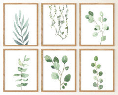
    I agree with others-- art is much preferable to a mirror. That's a big expanse of wall-- gotta think BIG! However, if it's one painting, it needs to be wider across-- try for something that's close to the length of your table in the photo, similar to what Beverly shows. Or if you go with three pictures, space them a bit farther apart than the taped up version you show-- too close feels cramped. (Note that the photo of the 3 pictures you submitted has more wall space between the framed pictures.) You could even get a set of 6 pictures/framed prints and arrange them in 2 rows. Botanical prints would be pretty-- there are lots on Etsy. Go for something with a lighter wood frame to avoid a cluttered look (not black or dark wood frames).

    +++But I disagree with others who advise you to hang the art much lower. You have tall chairs-- you don't want guests bumping into the art when they back up their chairs, right? And seeing the chairs overlapping the art is VERY unattractive.


  • 5 years ago

    No mirror. A mirror should always reflect something pretty or interesting when used as part of a decor. A print/picture no smaller than the 40x60” taped sample. Whatever you choose, ask yourself if it makes you feel good when you look at it.

  • 5 years ago
    last modified: 5 years ago

    Have you tried turning the table the other way? Maybe a corner cabinet ? What about 3 barn board style raw edge shelves?


  • PRO
    5 years ago

    Stop hanging your art too high on the walls.

    This is 36 x 72 from GreatBigCanvas.com

    On canvas it's $322 however if you sign up your email, it's likely they will send you a coupon for 50% off your first order. https://www.greatbigcanvas.com/view/dancing-willows-2007,1049918/?product=1


    The panoramic images below are 30 x 90


  • 5 years ago

    I love the image with three dark framed art pieces! Just the right scale for table. Light fixture won't be as obvious, cause your gaze would fall on the art trio.

  • 5 years ago

    Show us a photo of what you finally do Kathy. Although I think there are many options that would look nice, I fall into the fan club of one big piece of art that makes a statement.

  • 5 years ago

    My daughter collected old, very cheap frames from thrift stores, bought a big remnant of an upholstery fabric with a random ginkgo leaf print and put the fabric inside the frames and made a gallery wall. I loved it! And when she switched to real art (framed preschool and various collected pieces) I got the ginkgo art which now hangs on a gallery wall in my garage. I don’t think the whole project cost about $100 but it was interesting and calming at the same time. You could probably find a fabric reminiscent of ocean waves if you’re inclined to that kind of art.

  • PRO
    5 years ago
    last modified: 5 years ago

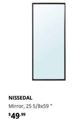
    I like the mirror idea for your dining room however you need something that will give an impact and make the area look larger such as shown in the picture below, 3 rectangular mirrors ( ex. the one shown below from Ikea):


    The black mirrors would pick-up on your black pendants.


  • 5 years ago

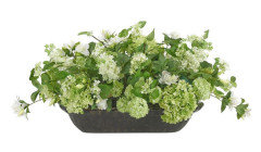
    I think that the light fixture is the art in the room. It blocks any view of artwork. I would consider going without artwork on that wall altogether, and using an accent paint color, or textured wall covering instead, and just letting the light fixture be the focal point. I'd also get rid of the tall floral, and use a shorter one.

  • 5 years ago
    last modified: 5 years ago

    A can of paint, a roller and make a statement...with COLOR! Go light! Go darker! What is your favorite color! Make your White Kitchen POP! Or do with statement wallpaper...for me the light fixture over the table will hang in the way of however many pieces of artwork you hang. Good Luck!

  • 5 years ago

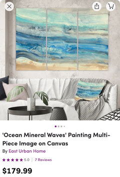
    I am thinking of this set of 3 pictures! Just to make it more luxurious!
    I don’t want a boring room!

  • 5 years ago

    If the size is right, it can work over the table. But choosing deeper colors or a different subject matter than the art in the living area on the same wall would make the space more interesting. Or move the art over the sofa to the wall over the chair, and get something different, and also larger, to use behind the sofa.

  • 5 years ago

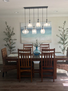
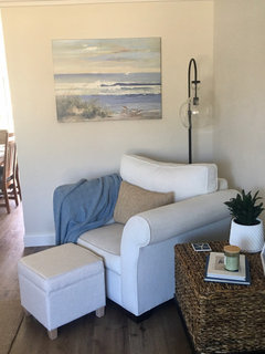
    I put up this picture today and moved the 2 other pictures in my living room. Thank you all for your suggestions! Now I will start looking for a new picture to go over my sofa!

  • 5 years ago

    Great job! You might want to think about framing the art by the corner chair.

  • 5 years ago

    Looks great, Kathy! I agree about framing the art by the chair.

  • 5 years ago

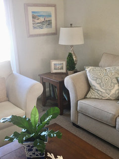
    Try to find a different subject matter for over the sofa - a landscape without the water, something with foliage, or a different subject altogether.

Sponsored