zara_decor

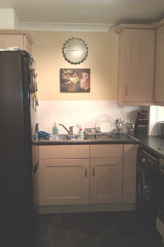
Colour ideas for a kitchen

zara_decor
11 years ago
Hi Guys, I'm moving into a place soon and the kitchen has no windows, it is modern though & not a very big kitchen but not small either, any ideas on what colour I should tile/paint the walls to brighten it? The units are a light beach colour, and the walls at present are an off white colour at present.

Comments (62)

  • PRO
    Chroma Design
    11 years ago
    Your first post ended up in your idea book, I don't know how. I see it here now.

    With the patio door dominating that wall, I suggest you use the wall paper on the two adjacent walls. In the pic, the wall behind the sofa and wall behind the child's mini play oven. Paint the other two walls a bit darker in a coordinating color.

    I don't know what's readily available in England other than Farrow and Ball. So, I did some on line research and like some offerings from Little Greene. I have never seen their products in person and computer screen can not accurately show color to real life. So my suggestions, color wise, come with a caution.

    I like LG Lauderdale in color chateau. It has more of a mediterranean feel while still being traditional. For the color on the other walls, look at their French Gray number 113 and French Gray Dark number 163. Let me know what you think!
  • zara_decor
    Original Author
    11 years ago
    I might be wrong but I think Homebase has more variety? http://www.homebase.co.uk/webapp/wcs/stores/servlet/Browse?storeId=10151&langId=110&c_1=1|category_root|Decorating|16849219 usually used in England. The colours you suggested are okay but I'm not sure if the grayish would go with my brown furniture?
  • Related Discussions

    Colour for kitchen walls and blind ideas?

    Q

    Comments (26)
    Hi Liz I had a look at the images you posted, and I think a lovely green would be great on your kitchen walls! There is a great one, called Persian Green from Colourtrend, i think it has been discontinued on their current colour charts, but is still available to buy, its a lovely warm natural green and would be fab, looking out onto your garden from inside. The blue appears to make the room look slightly cool...so maybe stay away from blues and greys! Defo change the handles, and just plain white roller blinds, with a side winder, no frills, let the light in, clean and fresh too! Hope this helps ;)
    ...See More

    Colour ideas for kitchen walls

    Q

    Comments (6)
    Hi Dee. What are dimensions of the dining area? It does look a little tricky. I assume the doors into the living room open inwards so maybe a round table would suit? Try cutting out paper templates and putting them on the floor to see how they feel
    ...See More

    kitchen cabinet and wall colours ideas

    Q

    Comments (6)
    hello we are decoration factory located in china we have a modern and classic and wwe have a new catalogue for the new year be free to contact us 008613282012713 its our whatsapp account and hndoumoulayzein@yahoo.com iits our email adress can contact us any time we havee a good price with a good quality
    ...See More

    Kitchen colour ideas

    Q

    Comments (2)
    I think you could transition to white and have achieve a white with grey/black accents in the bench and fittings.  If you need color, then splashes in bright fruit bowl, kettle, utensils - could be multicolored but might be better to stay consistent with one. The empty wall space could be home to a simple black frame with a print in the same colorway you use in the accessories. The breakfast bar does not really seem to have a purpose. You might be better served by removing. I take it that the big items (washer? fridge? freezer?) are on the wall opposite? Enclosing them in a similar bench might keep that area tidy. I know you aren't thinking about a kitchen redo, but it appears that the wall opposite the sink might be better as the oven, fridge, washer in a full wall unit, or partial wall but full height, thereby freeing up the light from the window to the rest of the room. The current lay out strikes me as enclosing the room rather than building on the window. More bench space could be located from the sink to the wall end.
    ...See More
  • PRO
    Chroma Design
    11 years ago
    Yes, Homebase has more variety. Ultimately, the right paper is based on the mood and style you want for the room. My suggestion was based on your traditional Mediterranean preference. From Homebase I like the Graham and Brown Desire in taupe.
    Grays would be fine with your brown furniture. Your accessories would add to the color palette.
  • zara_decor
    Original Author
    11 years ago
    I have never come across Little Green, the Lauderdale is a nice range of wallpaper though. I was thinking more the Lauderdale Hammock but then not sure if that shade would then just blend into my furniture, instead of contrasting with it.
  • PRO
    Chroma Design
    11 years ago
    I liked the Hammock color too. I don't think it would blend into your furniture. I just preferred the gray, it has a sophisticaled modernity.
  • zara_decor
    Original Author
    11 years ago
    I actually had that Graham & Brown (Taupe) in mind for a few months now, but wasn't sure what colour paint would go along with it.
  • PRO
    Chroma Design
    11 years ago
    For the Graham and Brown, I would do a color that pulls from the darker element in the paper. It is hard for me to get an exact read on this paper but try Fallow and Ball London Stone number 6.
  • PRO
    Shannon Ggem Design
    11 years ago
    I love the mirror idea for the kitchen, we installed some mirror tile as a range backsplash recently, by a company called Jockimo

    http://www.artworkinglass.com/products/antique-mirrors/mirrorunique

    Love the product. Bouncing light arid in there with mirrors and perhaps paint with a sheen will help a lot. Chroma is giving you so much good info! Good luck!
  • PRO
    Shannon Ggem Design
    11 years ago
    Used the beveled subway- here they are:
    uptown country kitchen photo: Mike P Kelley · More Info
  • zara_decor
    Original Author
    11 years ago
    Shannon your backsplash looks really nice and unusual. Yes Chroma's tips are great. I am thinking of taking the present door of the kitchen and adding a glazed/panelled door in order to bring in more light from the hallway etc, as I find a plain door will shut out any light from the other side when closed, what do you think? http://www.doorsworld.co/p/LPD_SA_Clear_Pine_Internal_Door.htm
  • PRO
    Shannon Ggem Design
    11 years ago
    Love it! Do you need a door at all?
  • PRO
    Chroma Design
    11 years ago
    The door is great and will definitely allow more light. I also question if you need one at all?
  • zara_decor
    Original Author
    11 years ago
    Yes, as I think without a door that room will look weird??? the rest of the rooms like the kitchen run off the hallway. Plus I think a door will guard in most of the cooking smells in the kitchen.
  • PRO
    Shannon Ggem Design
    11 years ago
    Ahhh. It's also kind of nice because you can make a big cooking mess in there and then just swing that thing shut while entertaining.
  • PRO
    Chroma Design
    11 years ago
    Great points Zara and Shannon. I'm on board with the door. If only I could hides all my messes so easily!!!
  • zara_decor
    Original Author
    11 years ago
    Yes that is exactly why :o)
  • zara_decor
    Original Author
    11 years ago
    Hey guys, i need ideas on what colour to paint my hallway, there are no windows & it's a small narrow hallways slight L-shaped. What colour would brighten it up and make it appear a bit bigger? It has white skirting boards and door frames (which I would like to remain as they are).
  • PRO
    Chroma Design
    11 years ago
    What did you decide for the living room? I want to factor that in for flow. Any pics?
  • zara_decor
    Original Author
    11 years ago
    Hi Chroma, the living room will be the colour idea that you suggested a few weeks ago (feature wallpaper in taupe & stone coloured paint), I don't have any pics of the hallway am afraid.
  • PRO
    Mint Design
    11 years ago
    I am attaching some photos to give you an idea of what a mirrored backsplash can do in a kitchen, Mirror is something I use more than anything else in all decor styles. Hope it gives you some ideas. Btw you can also incorporate mirror in refrigerator panels and cabinet doors. If you have unused wall space you may also want to hang a framed and paneled mirror to simulate a window. Good luck and keep us posted as you progress! :)
  • PRO
    Chroma Design
    11 years ago
    Ok, cool! I liked the graham and brown paper in taupe. As I said earlier, just check the London stone 6 for color accuracy. I'd feel more confident if I saw the wallpaper in person. Anyway, it's good to know the color family. Pics are not critical to have. There are no windows and you have white trim work. I would use the same strategy as the kitchen, a bright color. But definitely more subdued because as a hallway, your eyes are always just a few feet from the walls. I wouldn't suggest another yellow like the kitchen; I assume the hall is off the living area so I want it to better relate to that. And I'd stay away from a taupe since that might be bland. That leads me to Lime White number 1. Again, Farrow and Ball.
  • zara_decor
    Original Author
    11 years ago
    Sorry I forgot, the walls in the hallway are the same colour as the original wall colour in the living room pic. I like Farrow & Ball (Lime White) what about French Grey or would that make the hallway seem darker/smaller.
  • PRO
    Chroma Design
    11 years ago
    It would seem darker/smaller. I have used French gray 18. It is solidly a green. Not much of a gray factor to it. A beautiful color, but I'm not sure if it would go with your other spaces. I prefer hallways to lean toward neutral as that connect with so many other spaces.
  • PRO
    Shannon Ggem Design
    11 years ago
    I love F&B French Gray- the kitchen I posted above with the mirrored subway tile stove backsplash is french gray. As Chroma mentioned, it's absolutely green.
  • zara_decor
    Original Author
    11 years ago
    last modified: 11 years ago
    Hey Chroma, attached are the kitchen & hallway pics now painted with your colour recommendations Farrow & Ball (Dorset Cream) for the Kitchen & (Lime White) in the hallway, looks great :O).
  • zara_decor
    Original Author
    11 years ago
    last modified: 11 years ago
    I need some colour ideas for the bathroom wall now the area above the tiles (current colour is a light blue) and I don't like it, as it seems cold. A colour that will go along with those tiles and warm up the bathroom slightly, also what colour should the floor tiles be? currently the floor has black & white lino.
  • zara_decor
    Original Author
    11 years ago
    Bathroom Floor
  • PRO
    Chroma Design
    11 years ago
    Hey Zara! The kitchen and hallway look great! Thanks for the update and posting pics. It's really great to see how projects turn out.
    I really like the picture you put above the sink. It's very cool and it gives me a better sense of who you are, design wise. The apt has a relaxed modern feel with a nice level of sophistication. Until you get to those bath wall tiles, ugh! Not too much you can do about those without a larger remodel. The previous owner's mistake was to pick up on the light blue/grey swirl in the tile and use it for the wall color. It does feel cold. I assume you want to use Lino again on the floor, it is the easiest to do. I looked up Lino flooring companies in the UK and found something I like. The design idea is to have the flooring and walls be the statement and let the wall tile visually recede. The overall look is sophisticated modern with a touch of "girlie" by use of wall color.
    Www.forbo-flooring.co.uk
    From their trend collection, product is Striato, color 5218 welsh moor.
    Just put 5218 into the search box to quickly find the product.
    Wall color, F&B Reverie 207.
    Let me know what you think!
  • zara_decor
    Original Author
    11 years ago
    Thanks Chroma, it's nice to share the end result of your suggestions with you. Thanks I like the kitchen too. Now with regards to the bathroom I would love to rip those wretched tiles off but they are right around and up to the ceiling by the shower/bath area, the other half is not that keen on ripping them off (as it will cost alot!!) so I thought to change the colour of the wall above the tiles to another colour for a warmer look, and of course get tiles laid on the floor (to open up the floor area & make it seem warmer) as I hate lino. So any suggestions will be really appreciated.
  • PRO
    Chroma Design
    11 years ago
    I will look into tile for the floor. If you have a brand in mind or a retailer with a website I can see, it would be rather helpful. Like the way we collaborated on the wallpaper.
    I assumed you would do Lino again for its ease of installation. With tile, you will need to take out the toilet then re seat it and lift the pedestal sink. Taking out the toilet is basically a must, with the pedestal sink you may be able to tile around it if you do so with extreme care but I don't really recommend it. The risk of raising the sink is that the plumbing may be off. Feed lines are often flex lines, so that's not a problem, but the drain line will have to be redone. The wall color I suggested was coordinated with the Lino. The Lino is a mod look, rich tones that resembled wood in that it has line variations similar to wood grain. The wall color played off those tones. Please look at the website for the Lino eventhough that's not the route you want to go. I'm looking for feedback to see if that was a style that appealed to you. And tell me how you liked the wall color together.
    Anything you can tell me about the preferences of your other half would help too.
    Again, please give me some leads on tile purveyors.
  • zara_decor
    Original Author
    11 years ago
    Hi Chroma, I will most probably go to Homebase - http://www.homebase.co.uk/webapp/wcs/stores/servlet/Browse?storeId=10151&langId=110&c_2=2|cat_16849237|Tiling|14259382&c_1=1|category_root|Flooring+and+Tiling|16849237&c_3=3|cat_14259382|Floor+Tiles|14258218
    the lino colour you suggested was nice, I can't find that Farrow & Ball call Reverie 207, I have searched for it like crazy, is there any other colour close ot it?
  • zara_decor
    Original Author
    11 years ago
    Hi Chroma, I was thinking these foor tiles (dark brown) http://www.webtiles.co.uk/rangecategory/floortilesformations/floortiles/0/ with maybe a very light lilac or mauve colour paint on the wall above the tiles, what do you think?
  • PRO
    Vikrant Sharma Homez
    11 years ago
    Your pad came out well . these tiles are smashing ! Cheers .
  • PRO
    Chroma Design
    11 years ago
    Hey Zara, oooh yes! I do like that tile. We are of the same mindset to do a darker brown tile. The one you linked is terrific in that it has just enough variation not to look flat, and not be too overpowering that it will look busy. That is important considering the wall tile.
    I think it is a great combination. I looked through the Homebase site and the rest of the Webtiles site as well and found nothing that I like as your selection.
    I contacted F&B, 207 Reverie is an archived color available as special order. A light lilac would be nice but my gut says go darker to add richness at eye level, otherwise the dark floor may have too much pull.. By the way, Reverie is a midtone lilac, so if you're able to go to a F&B showroom they might have a swatch to show you.
    A mauve would definitely work. Smoked trout number 60 ismy top mauve pick. But my overall favorite is London Stone number 6. It is a deep neutral just on the edge of the mauve family.
  • zara_decor
    Original Author
    11 years ago
    F&B Reverie is a mid tone lilac? yippee :O) I will look at that colour Smoked Trout (60) & London Stone (6).
  • zara_decor
    Original Author
    11 years ago
    HI Chroma, I like Smoked Trout (60) for the bathroom walls :O) you are right the mauve will be more suitable than the lilac. Will get the other half to start painting the next week end :O) I will post pics, once I get the tiles done too, will most likey be mid-end September.

    What finish is suitable for a bathroom estate emulsion, estate eggshell or modern emulsion??
  • PRO
    Chroma Design
    11 years ago
    Great, good luck with your project. I'm looking forward to seeing pics when you're done.
    Modern emulsion is better suited for bathroom.
  • zara_decor
    Original Author
    11 years ago
    Hi Chroma

    Attached are the pics of the bathroom after the makeover.
  • PRO
    Chroma Design
    11 years ago
    Hey Zara, that turned out great! It's amazing how much nicer the wall tiles look with the improvements you made. The floor tiles are cool. You and your other half did an excellent install. The room has a nice balance with the wall color too. The art work with white frames is a nice touch. I hope you're thrilled with the result. Enjoy!!
  • zara_decor
    Original Author
    11 years ago
    Thanks Chroma :O) it was difficult to imagine that a once ugly bathroom can look so nice & warm just by making a few changes, the pics with the white frames was my idea :O)
  • zara_decor
    Original Author
    11 years ago
    The Living Room is now complete, Chroma gain your expertise in colour suggestion was spot on. I've attached the before pic (1st pic) and the pic of the living room when we moved in too.

    Now my only dilemma is that the rug does not match the new decor so need a new rug and I'm lost on the colour, plain or patterned (persian, traditional etc) I was thinking red?? any suggestions anyone?
  • PRO
    Chroma Design
    11 years ago
    You are very kind and I'm so glad to help. That looks like the graham and brown, Desire wallpaper we collaborated on! It is stunning!! Side wall color supports it perfectly and it all looks great with your furniture. Your tastes always seem to fall on the cool and modern side of updated traditional. In the states, we call that transitional. An extension of that concept is what I call classic modern. I think you should continue the room in that vain so choose a modern/contemporary rug. I love Persian and traditional rugs, but these don't fit your decor.
    One thing that I have really enjoyed about working with you has been the excuse to see what's available across the pond. Found this UK online rug supplier with some great examples.

    Large pattern in mostly open background. Colors very harmonious.
    http://www.rugsdirect2u.co.uk/bargains/aspire-danube-cream-pink.html

    Deep colors ground the space yet relate to overall scheme. Has some red.
    Again, large pattern. I think a large pattern goes best with the scale do the damask. Also, I wouldn't go with anything more "floral" than this. A busy modern floral may compete with the damask.
    http://www.rugsdirect2u.co.uk/bargains/trance-anasia-owred-mulberry-red.html

    Not sure how much I like this one, but I like it enough to suggest it. It's another example of large scale floral but in serious reds. (You asked about red, and I think I definitely has a place either dominately or as accent.)
    http://www.rugsdirect2u.co.uk/bargains/trance-mia-red.html

    Tone on tone abstract makes a perfect complement to the room. This silver color ties in everything in the room and allows the wallpaper to remain the focus.
    http://www.rugsdirect2u.co.uk/contemporary/a-hedley-silver.html

    One color, cream. But the carved detail is interesting and modern
    http://www.rugsdirect2u.co.uk/contemporary/elements-el-20-cream.html

    The white on purple is bold and graphic. And this Pattern and repeat really speaks to your wallpaper.
    http://www.rugsdirect2u.co.uk/contemporary/harlequin-milano-ha10-044-purple-3.html
    Also in a beige color they call fawn.
    http://www.rugsdirect2u.co.uk/contemporary/harlequin-milano-ha10-046-fawn-3.html

    Purple and gray abstract. It's funky design would be an interesting contradiction to the wallpaper. http://www.rugsdirect2u.co.uk/contemporary/matrix-wave-ma09-946-purple-4.html

    Cowhide patchwork in ivory, sand, gold and gray. It's the ultimate in contradiction, yet works in an eclectic manner.
    http://www.rugsdirect2u.co.uk/contemporary/rodeo-metallic-ivory-2.html

    I hope some of these appeal to you and give you inspiration! Let me know what you think.
  • zara_decor
    Original Author
    11 years ago
    Hi Chroma

    Yes it is the Graham & Brown (Desire), a few friends have also asked where I got the wallpaper from so your suggestion is going very far indeed :O). From the rugs I like the below:

    http://www.rugsdirect2u.co.uk/bargains/aspire-danube-cream-pink.html

    and

    http://www.rugsdirect2u.co.uk/contemporary/harlequin-milano-ha10-046-fawn-3.html

    the other half isn't too keen on the harlequin milano in fawn as he thinks it being a light colour it will show up any mark or dirt very quickly, (I forgot to mention I have a 18month old cat and 6 month kitten) I have two red cusions on the dark brown sofa,so I think the aspire dunube cream pink would go well, the pink in that rug looks like it will pick up the colours from the cushions, what do you think?
  • zara_decor
    Original Author
    11 years ago
    The sofa corner of the living room
  • PRO
    Chroma Design
    11 years ago
    We're on the same wavelength. You picked two of my favorites. Before I saw your sofa, I would have said go with the harlequin fawn. But the aspire danube goes better. The rug appears to have some burgundy in the flowers which relates to the sofa and the red cushions will go nicely too :)
    You can mix in more red accents throughout the room to complete the look.
  • zara_decor
    Original Author
    11 years ago
    Hello Chroma & a happy new year.

    Attached is the pic of the living room with the rug, it looks lovely I must say.
  • zara_decor
    Original Author
    11 years ago
    I also need colour ideas on the kitchen floor, as I hate the present dark black lino on the floor and want to change it to brighten up and open up the floor area the kitchen does not have a window so there is no natural light, but am confused on what colour of floor linolium to get, does it have to match the dark worktops or the wall colour or both? (attached pic below)
  • PRO
    Chroma Design
    11 years ago
    Hi Zara. I apologize, I thought I had replied earlier but I must not have hit "submit."
    The rug looks great. I'm in love with your living room :)
    As for the kitchen floor, you have many color options . It can coordinate with the countertops, walls or cabinets. There is no wrong answer, just different approaches with different results. Here's my take on your room: Eventhough you don't like the black floor, it is successful in grounding your small room and making the black appliances blend. If you go much lighter, the contrast of the black appliances will be more noticable. It also has a nice harmony with the countertops. Therefore, I would go with a medium to dark color and have it relate to your cabinets, even in a small way by tone or wood grain.
    I remember for your bathroom you aren't a fan of Lino, so I looked up wood looking laminates on Homebase. Here are two to consider.
    http://www.homebase.co.uk/webapp/wcs/stores/servlet/ProductDisplay?langId=110&storeId=10151&partNumber=075330
    http://www.homebase.co.uk/webapp/wcs/stores/servlet/ProductDisplay?langId=110&storeId=10151&partNumber=074056

    And a third, because I wanted you to see a gray option.
    http://www.homebase.co.uk/webapp/wcs/stores/servlet/ProductDisplay?langId=110&storeId=10151&partNumber=074044
  • Julie Hartwell
    9 years ago
    zara_decor, Homebase and B&Q both do self-adhesive floor tiles in a range of patterns, including wood effect, marble, pebble mosaic: easier to lay than traditional Lino/cushion floor and look really effective.
United Kingdom
Tailor my experience with cookies

Houzz uses cookies and similar technologies to personalise my experience, serve me relevant content, and improve Houzz products and services. By clicking ‘Accept’ I agree to this, as further described in the Houzz Cookie Policy. I can reject non-essential cookies by clicking ‘Manage Preferences’.