

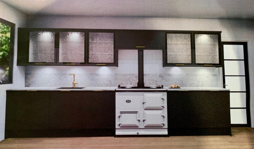
kitchen layout - which looks better ?
2 years ago
last modified: 2 years ago

Featured Answer
Sort by:Oldest
Comments (14)
 2 years ago
 2 years ago
Related Discussions
Which is better. Kitchen A or B?
Comments (15)Yes, i think my dad was either low on budgetz or... He wqs just too tired to build a toilet for that one house. Anyway, I agree the new flow is much more inviting & i the kitchen is mid size, coz if I were to create as the plan, it would be around a 14' by 10' kitchen. A big on the budget, but doable. I would not though have a big Living/lounge. So, I will just utilise one of the 180sqft bedroom as a living (we don't really have that much furniture to fill a 360sqft living room!) . The other Bedroom left as it is (storage since we don't have a storage area/room). Maybe in future i will expand on that. Maybe, I'll upload some pictures of the after someday! Thanks....See MoreKitchen diner layout – which way?
Comments (9)Thank you everyone. We would like to spend more time in the kitchen (something we don't do now). Though, I can probably make the same argument for the dining room which has become a bit of a dumping ground. The general layout of the house is a typical 1930’s 3 bed semi. In an ideal world I’d extend but I don’t want go through all of that and end up selling it in a couple of years. My main intuitive argument for the larger dining room is that I do want to be careful of losing too much space to relax in. The idea of having a log burner in the fireplace is also very appealing. Equally, I don't want to just end up replacing the current cramped kitchen with something which just presents the same problem. I’m hoping that once the space is opened up then I might have some kind of epiphany. Kind of feel like I’m making it up as I go along by trying to be open minded and adaptable – I’m not sure this is the best approach :-)...See MoreWhich plan do you like better? Narrow kitchen or no bathroom window?
Comments (5)See below the plan of the house as I bought it: Practically I have removed the partition walls as I wanted to open the space up and the wall between the bath and the kitchen as it was affected by damp. Here is how it looks now: I can play around only this space as the other walls are load bearing. One of the builders assured me we can chase the drain pipes without much hassle. The hallway would have some light through the kitchen door and its transom with the larger kitchen option. In case of the smaller kitchen, there would be plenty of light in the hallway from the bathroom and kitchen as I considered glass between kitchen and hallway. Thanks...See MoreWhich kitchen flooring is better for you?
Comments (4)Fab looks good, thanks for that … I was just going for the most popular floors surfaces we install or come across. Though we have fitted a couple of Karndean floors now and look really good. Also I think every flooring can have their issues, a bit like going through all the different worktops you can choose from....See More PRO2 years ago
 2 years ago
- 2 years ago
 2 years ago
 2 years ago
 2 years ago
- 2 years ago
- 2 years ago
- 2 years ago
 2 years ago


Sonia