

Fun with Colors!
6 months ago
last modified: 6 months ago
Featured Answer
Sort by:Oldest
Comments (22)
- PRO6 months ago
Related Discussions
Rectangular living room
Comments (14)Often we find when we move into a new home the furnishings we had purchased for the previous don't work for the new. If you are wanting to make this a duo functioning room with TV and fireplace as a focus than you may have to rethink the blue sofa. You can keep a petite style to the furnishings, no oversized anything. My first thought is to push the TV into the corner with all the wiring. Then add a small scale sectional that is really just a long sofa with a chaise at the window side, and long so that it stretches in front of the fireplace. This allows you to have both views, one when TV is the motive and one when relaxing in front of the fire is. On the side of the fireplace closer to the dining set I would place a smaller "pull-up" chair that hugs the fireplace but is angled towards the sofa. You can add cubes or a small upholstered cocktail ottoman on the TV side of the sofa. Then add a narrow rug that ties the grouping together. Match the curtains on the patio door to the curtains on the window and add some fun art above the fireplace. Accents can always come after you have your arrangement planned. Have fun!...See MoreUpcycling colour advice
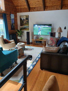
Comments (57)I though the Louis fireplace was the one you were removing. Ok so if you are just selling it I wouldn't do much more to it. It just needs warming up/livening up. I saw you had a plant but it's rather tall thin and spiky - not very tactile. This room is rather 'yang' ... cold colours, straight lines, sparsely decorated and feels like it needs more life. Best way to do this is colour, texture, pattern. Plants are actually alive so a few more, even small ones that are softer, rounder leaves etc. If you are changing the curtains I would go for a pattern that's more fluid with a number of colours in it. Same with the cushions. I found the pictures in your ideas book of other blue rooms quite cool too (and the gold clashes with the blue/white) although if you notice they have some older pieces of furniture which tend to have a warmer lived in feel, your cabinet as it is adds a lot to this. They also have softer plants (orchids, hydrangeas) look at their yellow rounded cushion. All those details make a difference. I big thing to consider is climate/geography. Navy and white are cold so if you live in a warm climate they may feel refreshing, on the UK I would feel cold in a navy and white room. We react to colours and they can change our experience of a room by 5-6C just by looking at them. (scientifically proven) Also people tend to think of blues, greens as cold and reds, yellows, oranges as warm whereas most colours have warm and cold versions. If you look at your flooring (cold) compared to your bi-fold doors (warm) you will see that not all browns are the same. tomato red for example has yellow in it so is warmer whereas dark cherry red has blue in it to is a cooler version of red. Once you paint the doors the room will feel even colder. Also the texture of the laminate floor is 'cold' as it is shiny and artificial looking. A big colourful rug (texture) would warm it up. With regards to wall colours ... I'd suggest not starting with the wall colour. Buy a gorgeous painting or rug or even a cushion and then be inspired by the colours in that for sofas etc and finally choose the wall colour after than. You mention black leather, again, a cold colour, heavy colour and shiny ... all very yang. If you want this then the setting you put it in will make a big difference ... personally I would step away from the black, just explore. What about a blue velvet sofa, since you like blue and do something different to the walls. Have a look at this article. It isn't my style, still too cold but can you see where she has added texture (fur, rugs, fabric curves), pattern, details (plants rounder), more personal loved items and being an older home with cornices etc it doesn't feel so cold and sharp. https://www.houzz.co.uk/magazine/houzz-tour-a-family-home-in-hamburg-with-a-touch-of-scandi-style-stsetivw-vs~48800571?utm_source=Houzz Cold is not just about temperature. E.g. older style furniture, esp make of wood tends to be warmer ... softer shapes and more substance (life lived), things like elaborate cornicing, whereas newer modern style furniture, often painted or white/straight lines etc feels cooler/fresher/lighter (younger) ... some of both in a room really makes it feel balanced. Think of it as a family (or any group) ... parents bring experience, wisdom and safety, children bring laughter, fun and lightness ... a good combination. Note: once you choose navy for your walls then it's hard to warm it up as cream will clash and I know you don't like it anyway. What about a different blue? More of a teal, this has a touch of yellow so you can add mustards, burnt orange, warm turquoise etc. Phew, that's lots from me ... most of all, put yourself in the room and it helps to look for inspiration out in the world rather than just other people's rooms. For me the cabinet with all your things in it & books is the best part of the room. I trust that all helps ......See MoreSplash back and wall color help!
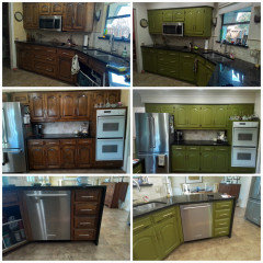
Comments (26)Personally I wouldn't go with a yellow splash back. Not because it wouldn't go but more that you already have enough of that accent colour around the room, over do it and it can look forced. There is a fine line between getting the balance right were it looks classy and going over board to the point it looks naff. Personally I would either go for a splash back that is colour matched to the walls or a smoked mirror. You are limited in some ways because it appears there wasn't any forward planning with regards to splash backs. Any splash backs would need to be confined to the width of the extractor because your curved wall units won't open otherwise. They would have to be packed off the wall if you wanted to go full width splash back. I would recommend a durable matt paint in the kitchen. Good quality ones will withstand washing without polishing up and showing tell tell marks where they've been washed. Little Greenes Intelligent Matt is perfect for this and is our choice of paint when not using any further splash backs above the granite upstands. I understand a colour matched glass splash back or smoked mirror may seem like the safe option and boring to some, but there is no point in being brave just for the sake of it. You've got plenty of other points of interest in the room with regards to colour without having to push it too far. Let the kitchen itself be a subtle canvas to show off other items rather than fight with them for attention would be my advice....See MorePlease help! - Advice needed on Hallway
Comments (22)have you considered a wallpaper... I know I often mention wallpapers but they are amazingly resillient if you get a good one. I have a paper in my own hall that has been up for 9 years and has outlived the paint by a long chalk. Wipeable, and strong, and there are so many that have a little bit of opalescence or metallics that will bounce a bit more light about. Doesn't have to be a pattern, could be a texture to keep in your colour palette. I agree with those who have suggested white for the woodwork , a slight off white that is. Unless your house is brand new or has been replastered perfectly brilliant whites will show off all the lumps and bumps. so stick to a milky/creamy whites for warmth or a grey white if you want a cool scheme. striped runners will make the hall seem longer if you want to give that impression and a large mirror in the narrowest part is helpful for illusionary width. ( also helpful for that last minute check theres no toothpaste round your mouth on the way out the door) don't put anthing like coat hooks along the narrow part or it'll be like navigating through the wardrobe to Narnia. but a high shelf might be useful...See More- PRO6 months ago
- PRO6 months ago
- PRO6 months ago






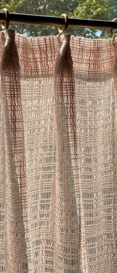
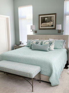
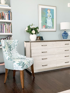
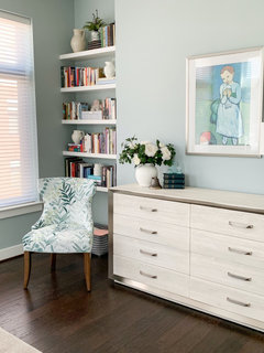


Allison0704