
Search results for "Https:" in Home Design Ideas
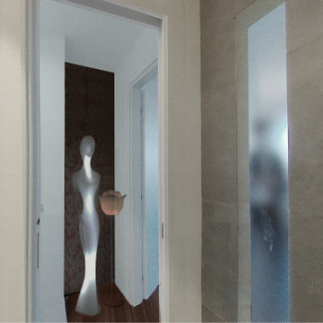
 altro_studio
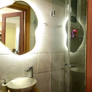
Inspiration for a medium sized modern shower room bathroom in Rome with open cabinets, grey cabinets, a double shower, a wall mounted toilet, grey tiles, porcelain tiles, grey walls, porcelain flooring, a vessel sink, wooden worktops, brown floors, a sliding door, beige worktops, a single sink, a floating vanity unit and a drop ceiling.
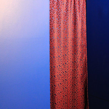
 Marielle Tesson Agence 5070
Rideau de porte rouge et bleu électrique, se détachant sur l'entrée en total look bleu Klein.
Small modern front door with blue walls, bamboo flooring and a blue front door.
Small modern front door with blue walls, bamboo flooring and a blue front door.

 baqua
baquaPhoto - Thomas Wiuf Schwartz www.thomaswiufschwartz.dk
baqua - www.baqua.de
Fliesen - Granitifiandre- www.granitifiandre.com
Fliesen -Kölking Wobbe www.koelking-wobbe.de
 Handmade Kitchen Co
We welcome you to our Loughton project, which brought us into a home that had already undergone an extension, but had never quite made the most of the space it created. Our client was still working around the original kitchen, with a peninsula of base cabinetry pushing awkwardly into the room and limiting both the worktop area and the flow of everyday life. They wanted to open the space up, make it more social, and finally give themselves a kitchen that matched the ambition of the extension around it.
Together, we set about reimagining the layout entirely, with generous worktops, room to gather, and a handful of standout features that would come to define the room, including a bespoke bar in a bi-fold larder cupboard and a beautifully considered booth seat attached to the island.
The cabinetry style takes its inspiration directly from our own showroom display, our Classic In-Frame Shaker. The beaded front frame gives the doors a fine, well-defined edge, while a deeper moulding sits within the door itself, adding shadow, depth and that unmistakable handmade character.
Every hinge throughout is soft close, so doors settle back into place with a quiet, satisfying weight rather than a bang. The end panels are kept smooth for a clean finish, and the cabinetry sits on a stepped and rounded skirting plinth that softens the base of the run beautifully. On the hob side of the island, this is swapped out for a recessed plinth instead, a subtle change that lets the island read as a piece of free-standing furniture and gives you that little bit of extra toe room where you stand to cook.
The layout is built around a generous central island, with cabinetry running along either side of it to create a beautifully balanced, symmetrical composition. How the island anchors the room is where the space has clear rhythm and a real sense of purpose as you move through it.
Within the island, this banquette is the spot the whole house will fight over. A gentle curve wraps softly around a solid base, drawing you in the moment you walk into the room, while a round table pulls up close to complete the picture. Breakfast, brunch or a catch-up over coffee, it is all sorted from the same considered corner. A padded, cushioned seat runs the length of it, generously proportioned and made to be settled into for hours rather than just perched on for a quick five minutes.
It is easily the best seat in the room for watching a glorious day unfold through the windows and doors, sunlight pouring across the worktop, the garden framed just beyond, and the rest of the kitchen humming quietly on around you.
Every cabinet and drawer is hand-painted in Rolling Fog Light by Little Greene, a warm, softly grounded neutral that suits the character of the home perfectly. It is one of those quietly clever colours, clever enough to keep the room feeling open and full of daylight, but with enough warmth in the undertone to stop it ever reading as cold or clinical.
The appliance placement has been carefully considered throughout, where each piece is positioned to work as hard as the space around it. On the main run, a Miele oven and microwave sit at eye-level, stacked neatly one above the other for a sleek, uncluttered look that keeps everything easy to reach and easy on the eye. Over on the island, the Siemens vented induction hob takes centre stage, letting the cook stand facing the open plan space and the garden beyond rather than turning their back on the room. It is a small change in orientation that makes a real difference in the art of cooking. Cooking becomes part of the conversation rather than a task carried out in isolation.
An integrated wine cooler tucks discreetly into the run, ready for the more social side of life, while the Siemens fridge freezer disappears entirely into the floor-to-ceiling cabinetry, keeping the lines of the room calm and unbroken.
One of the most beautiful moments in the whole kitchen is the sink area. An iconic Shaws ceramic sink takes centre stage, paired with a Quooker Classic Fusion Round tap in patinated brass and a matching Quooker soap dispenser, the warm brass tones sitting perfectly against the softness of the Rolling Fog Light cabinetry.
Above it, a bespoke mantle draws the eye upward, complete with traditional cornicing and a generous ledge, a lovely piece of made-to-measure joinery that gives the sink run real presence and turns it into a feature in its own right rather than something purely functional.
Behind the tap, a Nero antique mirror splashback catches the light. It quietly reflects the room to itself, softening the darker edge of the composition and adding a subtle sense of depth and glamour. It is a sink area designed to be seen as much as it is used, considered from every angle, and beautiful in every detail.
Two cabinets sat here doing two very different jobs, made to look like one considered composition. On one side sits a drinks cabinet, on the other a breakfast pantry, each hidden behind its own set of bi-fold doors that fold neatly away when in use and disappear again the moment they are closed.
The symmetry between the two is what makes the whole wall work so beautifully, identical frames mirrored either side for a genuine architectural feature. Open up either of them, and the shelving reveals itself as considered joinery, spaced perfectly for the contents each is designed to hold: glasses, bottles and barware on one side, coffee, everyday breakfast essentials and crockery on the other. It is a lovely reminder that the best kitchens are the ones where every cupboard is designed for exactly what will go inside it, not a shelf out of place.
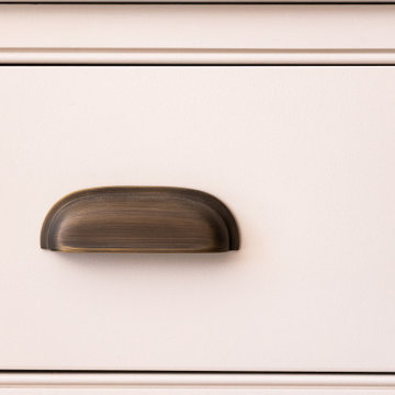
It is the final layer of details that brings the whole kitchen quietly to life. Xanthos quartz worktops run throughout, a beautifully consistent surface with just enough movement to feel natural without ever competing with the cabinetry around it. The handles are Armac Martin, Withenshaw cup pulls paired with Queslett knobs on rectangular back plates, a considered combination that gives every drawer and door a quiet, English confidence.
Discreet LED lighting strips are featured around the room, giving off a warm, atmospheric glow at any time of the day. Inside every drawer, bespoke storage components have been made to fit exactly what our client needed, including tailored cutlery trays and utensil trays, sized and divided so that everything has its own considered home. It is these small, largely unseen details that separate a handmade kitchen from anything mass-produced and make a space genuinely rewarding to live with year after year.
Step back and take in the room as a whole, and it is easy to see how far this Loughton kitchen has come from where it started. The space that once felt closed in by a peninsula of base cabinetry now flows generously from end to end, every element working together to make the room feel as social as it is beautiful.
Anchoring it all is a grand mirror placed on the back wall, positioned exactly where it needs to be to bounce daylight back into the room, mirroring the cabinetry, the island and the garden beyond, and opening the space up in a single elegant gesture. It is a kitchen that lives as beautifully as it looks, considered from every angle, hand-built to last, and ready to be at the heart of family life for many years to come.
 Marco Bajerski
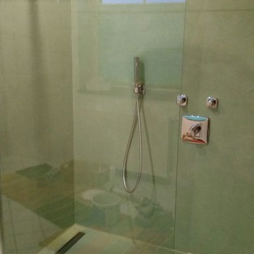
Fugenlose Dusche Projektort: Didderse
Material: Beton Ciré
This is an example of a large modern bathroom in Hanover.
This is an example of a large modern bathroom in Hanover.
 Holly Christian + Tom Munson | PLUCKED + STUFF LTD
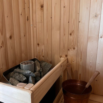
Bespoke Cedar clad sauna and matching vanity unit. Lusso Stone hardware. Glazed green porcelain wall tiles. Terrazzo effect porcelain tile floor. Lick Greige 01 on the walls and ceiling. Spark & Bell handmade ceramic wall light. Wetroom, walk in shower. 2 person sauna. Brushed Stainless Steel hardware.
 Hindley & Co Architecture & Interior Design
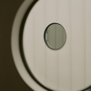
Porthole bedroom windows look out onto an internal terraced courtyard
Photo of a medium sized modern bedroom in Melbourne with white walls.
Photo of a medium sized modern bedroom in Melbourne with white walls.
 Decor Bespoke Kitchens & Bathrooms
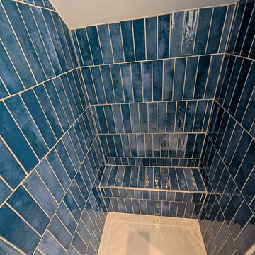
A fabulous en-suite bathroom featuring a stunning shower enclosure.
The Mojave Blue Gloss tiles draw you in with its aquatic warmth and varying colour tones. They flow through beautifully into the seating area which is perfect for placing bottles whilst you shower.
As you exit the shower enclosure, the ladder radiator in Night Blue not only warms the room, but also provides a cosy towel for you when you step out.
Facing the shower is the Utopia Qube freestanding fitted unit in Indigo Blue, complete with an All-In-One basin and worktop. This beautiful piece of bathroom furniture is available in six additional finishes: Sorrento Walnut, Matt Grey, Anthracite Strata, Wild Green, White Gloss and Matt White. You can choose from different handle options: Brushed Nickel (shown in this bathroom), Matt Black and Brushed Brass.
To complete the room is the luxurious Karndean flooring. The Canadian Urban Oak, with a herringbone finish, is ideal for smaller spaces. The zig zag pattern creates a sense of movement and depth, making the space appear more spacious. The Urban Oak has hints of deep blonde tones to enhance the natural light colouring. The lighter colours also make the room feel brighter and more open.
 Dimension 3 Architects
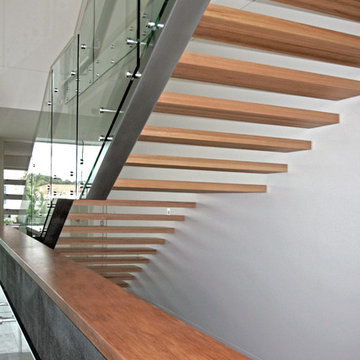
Inspiration for a large modern wood straight glass railing staircase in Gold Coast - Tweed with open risers.
 Oliver Talbot
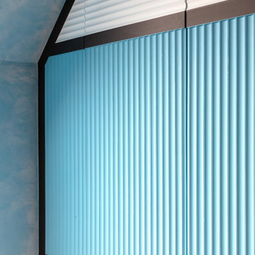
Geometric attic oasis with sloped ceilings meets wave-like panels in serene blues & greys. Sunlight streams through the skylight, dancing on minimalist magic.
 VIRGINIA TENTORI ARCHITETTO
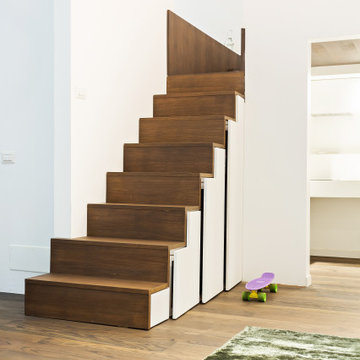
la scala che caratterizza l' elemento centrale nasconde un armadio nel sottoscala.
Small modern painted wood mezzanine and straight staircase in Milan with white walls, dark hardwood flooring, brown floors and painted wood risers.
Small modern painted wood mezzanine and straight staircase in Milan with white walls, dark hardwood flooring, brown floors and painted wood risers.

 fdMilano - Factory Design Milano
fdMilano
Inspiration for a medium sized modern enclosed living room in Milan with a reading nook, grey walls and porcelain flooring.
Inspiration for a medium sized modern enclosed living room in Milan with a reading nook, grey walls and porcelain flooring.
 Panoramic Properties Limited
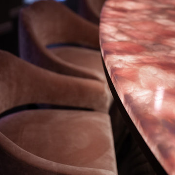
Tasked with creating a statement look that is both elegant and inviting, Panoramic Properties delivered a meticulously crafted space that strikes the perfect balance between sophistication and functionality.
The highlight is the stunning bespoke cabinetry that transforms a blank canvas into a glamorous bar and dining area, thoughtfully designed for a client who loves to entertain.

 Le Fil Rouge - Design
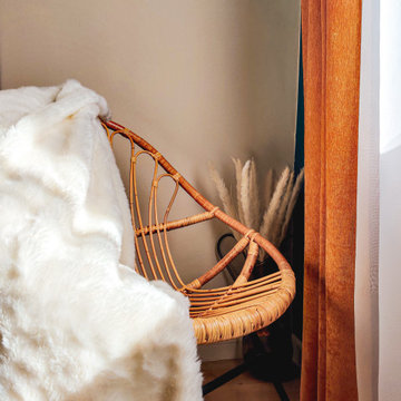
Mettre en valeur un élément qui au début était caché et en faire un point fort et la base même du concept de la pièce.
Cette ancienne chambre deviens désormais un espace dédié au repos, à la
lecture et à la relaxation avec les principes des ateliers de coutures d'antan.
Un lieu qui associera nostalgie et modernité et qui donnera une sensation réconfortante et enveloppante.
 micro interior design
Large modern open plan living room with beige walls, marble flooring, no fireplace and multi-coloured floors.
 Tasawer Abbas
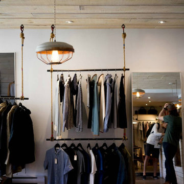
In retail design, the arrangement and presentation of clothing are pivotal to a customer’s shopping experience. The type and height of your retail clothing racks can play a significant role in how well your merchandise is showcased.
The Basics of Height Division for Clothing Racks
Clothing racks should be divided according to the height of different garments, the average customer’s height, and the purpose of the display. Proper height division ensures that all types of clothing, from dresses to shirts, are displayed most effectively.
1. Low-height racks for Easy Access
Low-height racks are often used for items that need to be accessed frequently, such as casual wear, t-shirts, or accessories. These racks are typically positioned at waist height or lower, making them easy for customers to browse through without bending down or stretching.
Advantages: Easy access for customers of all heights, especially in smaller spaces where quick access to products is needed. Low racks are also ideal for smaller garments like shirts or sweaters that don’t require a lot of hanging space.
Ideal Usage: Casual clothing, promotional items, accessories, and impulse-buy products.
2. Mid-height racks for Versatile Displays
Mid-height racks, positioned between the waist and eye level, are ideal for displaying a wide variety of clothing items. This height range is commonly used for items like pants, jackets, and blouses. By placing these garments at a medium height, you can create a functional and aesthetically balanced display that encourages browsing.
Advantages: These racks provide optimal visibility for most customers. Mid-height racks also help maximize space by allowing easy access to items without cluttering the store floor.
Ideal Usage: Shirts, blouses, jackets, and pants.
3. High-height racks for Statement Pieces
High racks are often used for long garments like dresses, coats, or formal wear. These racks are placed at or just above eye level, offering ample space for longer items without dragging on the floor or becoming wrinkled.
Advantages: High racks keep garments off the ground and allow long items to hang freely without touching the floor. They also help create a sense of vertical space in the store, adding a sophisticated and organized feel.
Ideal Usage: Long dresses, coats, gowns, and formal wear.
How to Choose the Right Height for Your Retail Clothing Racks
Choosing the right height for your retail clothing racks depends on a variety of factors, including the type of clothing you sell, the average customer height, and the amount of space available in your store. Here are some key considerations when selecting the height of your racks:
1. Customer Height and Accessibility
One of the most important factors when determining the height of your racks is the average height of your customers. A rack that is too high for your target demographic may lead to frustration or a lack of engagement with the products. On the other hand, racks that are too low might cause overcrowding or limit the amount of clothing you can display.
Standard Height Range: For the average customer, clothing racks should be set between 4. 5 to 5. 5 feet in height. This range accommodates the majority of customers, making items visible and accessible without too much effort.
Adjustable Heights: Some stores may benefit from adjustable racks, allowing you to set different heights based on customer needs, the size of the items, or specific display requirements.
2. Size and Type of Garment
The type of clothing you are displaying will influence the height of the rack you choose. For example, lightweight garments like t-shirts and sweaters do not need as much hanging space as longer items like dresses or coats.
Short Garments: For t-shirts, blouses, and other short items, racks positioned at waist to chest height (around 4.5 to 5 feet) work best.
Long Garments: Dresses, coats, and other long pieces should be hung on racks that are higher to prevent the garments from touching the ground and becoming damaged. These racks should be set around 5. 5 to 6 feet, depending on the length of the items.
3. Store Layout and Traffic Flow
Your store’s layout and the amount of traffic it experiences should also be considered when determining rack height. Smaller stores or boutiques with limited space may require more compact, lower racks to maximize floor space. Larger stores, on the other hand, may benefit from higher racks that allow for a greater variety of clothing to be displayed at once.
For Small Stores: Use low to mid-height racks to keep the store open and accessible. Low racks are ideal for smaller spaces as they offer easy access and allow customers to move freely around the store.
For Larger Stores: Higher racks can be used to create visual interest and help store layouts appear more organized. These racks can also help direct customer flow through the store, guiding them to different sections or featured products.
Organizing and Dividing Heights for Different Garments
Effective organization of clothing racks ensures that your store appears clean, organized, and visually appealing. By dividing your clothing racks by height, you can easily create sections that make it easier for customers to find what they’re looking for.
1. Feature Display Racks
Feature display racks are often positioned at eye level or slightly above. These racks are designed to showcase select items, such as new arrivals or promotional collections. These racks not only draw attention but also help highlight special merchandise.
Optimal Height: These racks are often placed between 5 and 6 feet to create a focal point that attracts customers’ attention and guides them to particular products.
Best Usage: Limited edition pieces, seasonal items, and high-demand products.
2. Grouping Similar Garments by Height
When dividing your clothing racks, it's important to group garments by type and height for better organization. For example, place jackets and coats on higher racks, while lighter tops and t-shirts should be placed on lower to mid-height racks. This allows customers to easily navigate the store and find clothing based on the type of garment they are seeking.
Vertical Display Sections: Consider dividing your clothing racks into sections based on garment type and size, with each section featuring a different height to optimize display space.
Seasonal Adjustments: You may also need to adjust rack heights based on the season or specific collections. For example, during the winter months, you might prioritize showcasing coats and jackets on higher racks, while summer collections could be placed on lower racks for easier access.
3. Avoiding Overcrowding and Overfilling
While it may seem tempting to maximize your retail space by cramming as much clothing onto your racks as possible, overcrowding can have negative consequences. Overfilled racks can make it difficult for customers to browse, and it may cause items to wrinkle or become damaged. Proper height division not only helps organize your racks but also prevents overcrowding by keeping clothing neatly displayed and easily accessible.
Balanced Display: Ensure there is enough space between garments for easy browsing. Aim to create a balanced look by allowing enough space for each item to be seen and handled.
Restocking and Rotation: Regularly restock or rotate items to ensure that racks do not become overstuffed. Consider using a smaller selection of items at a time to create a fresh display while preventing clutter.
In build your shops, incorporating different retail clothing rack heights based on garment type and store design can help maximize the potential of your retail space while ensuring that customers can easily browse your merchandise. Whether you choose low, mid, or high racks, proper height division is key to creating a store environment that encourages customers to shop and return.
 Eco German Kitchens
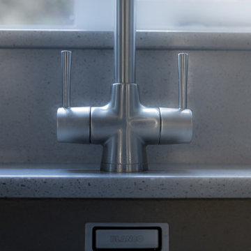
From the moment we walked into Eco German Kitchens the experience we had was excellent. Aggie's friendly welcome and her care in helping with the choice of design, appliances and colour schemes put us at ease and gave us real confidence. This was matched by Jeff's visits to our home, careful assessment and measuring of the space and suggestions that followed from that. The final stage was managed in the same friendly, non-pressured and personally tailored manner by Sabine, fine tuning and pointing out alternatives in the design. The installation of the kitchen by Dave was carried out to the highest standard and with meticulous care. The very few problems that arose (there are always one or two in such a big project) were handled sensitively and with the same personal touch. The kitchen looks terrific, our friends think it is wonderful (so do we) and one or two are following this up. Just go and try it for yourself. Alan and Gill.
80