

POLL: Colour schemes - blue & black or white & gold?
11 years ago
last modified: 11 years ago
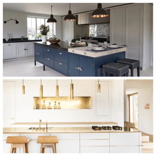

Blue & Black!

White & Gold
I don't like either and you're all crazy!
Featured Answer
Sort by:Oldest
Comments (10)
 11 years ago
Related Discussions
POLL: This or that: Dark walls vs white walls
Comments (25)Each works for different rooms. Dark colours can add luxury - as they did for our dramatic makeover of a bedroom. The charcoal colour is elegant and calming in both winter and summer due to south facing windows. Light / off-white colours add to a contemporary aesthetic - especially in a cohesive look and feel within an open plan scheme or where it is necessary to draw attention away from a relatively low ceiling as was the case in this dining room we designed in a duplex apartment in the South of France. The problem further solved by low-back dining chairs....See MorePOLL: Best bedroom colour schemes?
Comments (20)I love some lusciousness in my bedroom ... reds. pinks and oranges! (yes I also have lighter softer colours but like some fun thrown it too otherwise feels so boring). Am surprised that pink wasn't one of the choices! People talk a lot about serenity and seem to forget about other types of energy in the bedroom. It is said that the bedroom is mainly for 2 things both beginning with "S" and yet most people seem to only focus on the sleep bit....See MoreRose gold, blue and black in a bathroom?
Comments (5)We do bathrooms and kitchens, but we can also supply such rose-gold elements as splashbacks that you might like for your bathroom. This rose-gold, ice-cracked splashback is backlit, and it may be bespoke to fit your bathroom. Or, you might like some printed shower screens, we might put any design on it (we offer an unlimited free design with no obligations) And this is something you may love... Let me know if you like it. Send me raw sizes so I can give you a free quote :)...See Morecolour scheme advice - its getting complicated!
Comments (6)I would say blue, yellow, grey, dark wood and brass can go really well or not so much as it will depend on the exact tones you choose. Since you are keeping some existing items, they will be your starting point - for instance, what dark wood are we talking about? Cherry can be considered a dark wood but it's got sometimes a redder undertone - which won't look as nice with brass - whereas a walnut wood has a soft purple undertone and go well with warm and cool tones. Masstone is the main colour pigment you see (brown) and the undertone is the subtle "tint" mixed into it. You could place a primary colour next to it to help you identify what is the dominant undertone of that particular brown; red, yellow or blue. It would be helpful to do the same process with your rug, most likely than not all of the colours in that item will have a similar depth (the amount of white or black mixed into it) and a common undertone to all of them. It may sound a little too complicated but it is quite straight forward and once you have more clarity on these factors, it will be then much easier to make confident colour decisions for the remaining items. Keeping a consistent undertone is key to achieve a beautiful and cohesive look! Ah! As for the finishes, brass and black I'd recommend keeping a 1/3 - 2/3 ratio to be safe. Camila...See More 11 years ago
 11 years ago
 11 years ago
 11 years ago
 11 years ago
 PRO11 years ago
- 8 years ago
 PRO8 years ago







Daman of Witham