Hi all,
I have a colour theory question.
This has been bugging me for ages but even after research I can't figure out why. If you have some extra time to answer this small niggling question I'd be so grateful thanks!!
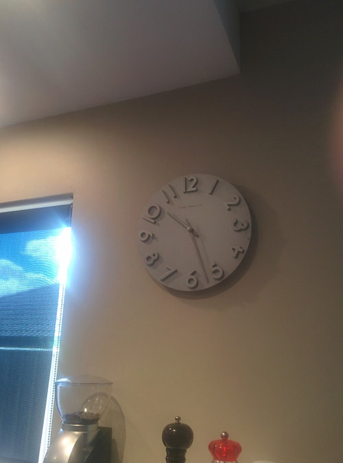
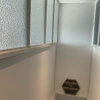
My walls are painted full strength Dulux Grand Piano (a neutral with green undertones apparently) and stainless steel always looks really "off" when put right beside the paint colour or on top of it, like this clock.
is it because the neutral is muddy/dirty while the stainless steel and metal is clean/pure colour?
Or maybe because they are too similar in value?
Do you think if the paint was a cleaner pale blue-green tint all would be solved?
It just looks so dingy in here! Maybe I'll try 1/2 strength Grand Piano as our house doesn't get direct sunlight?
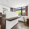
Our floors are yellow-orange wood.
thanks for your help :)





hortonhearsawho2013
Related Discussions
Carrara clash! Paint suggestions please
Q
Sofa on a rug ... design clash ?
Q
Clashing carpet colour
Q
Ideas to stop colour clash with cream kitchen units and white floor
Q