

Kitchen Tiling
10 years ago
Featured Answer
Sort by:Oldest
Comments (15)
 10 years ago
 10 years ago
Related Discussions
Kitchen tile stickers - any experience/advice?
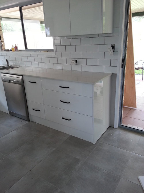
Comments (0)I have painted my kitchen cabinets and pondering what to do with the tiles. I could paint them but am a bit nervous about it as the grout lines are quite wide and I wonder how it will look. Also considering decent quality stickers with a glass spashback for the hob. Has anyone used tile stickers? How do they look? I can't afford to re-tile currently so looking for an interim solution. Photo is of the new colour units (not finished yet as you can see!) thank you!...See MoreKitchen Tiling Ideas
Comments (10)Hey Luke, So many options! One really helpful tool to narrowing down to what your naturally drawn to is checking out pinterest, and just google in generally. Search for Navy blue kitchens with white worktop (try different variations of your search), and take a look how others have paired their tiling and splashbacks. My natural personal tase is quite a classic/ contemprary style, and we've recently designed a lovely side return extension with a navy kitchen that looks just like this, with a white quartz worktop. There was wooden floor throughout the rest of the house, so we contrasted the open plan space with a 30 x 60 floor tile, styled in a herringbone pattern. We then carried a lip of the quartz worktop around the whole kitchen, and added the quarts as a splashback too. The rest if just then painted in line with the rest of the space. It's simple, but effective, and has allowed us to lift the space with additional contemprary accessories like a wall hung pole with hooks for decor as well as function. As I say - Pinterest is the one, and i'd rinse it for all it's worth to narrow down to what is calling to you. Hopefully thanks helpful :) Bryony Lane Valley Designs...See MoreHelp with kitchen tiles with awkward colour scheme
Comments (6)I love your worktop, I think it looks really classy and looks perfect with the cashmere. I would look at something like Skimming Stone as a wall colour and then it's sample time for tiles, lots of them. Avoid anything that looks pure white or creamy. Creamy tiles (yellow hue) will clash with the units, pure white will make the worktop look dirty. I would look if possible at tiles that come in a mix. Mandarin Stone Hoxton tiles might be worth trying as they are all slightly different colours and so you are less likely to get a 'clash'. The Hoxton Ivory doesn't look ivory at all but looks fairly cool so might be worth looking at. You would need more that one sample though as they are all different. They also do pink, and grey, might be worth trying. Zelige tiles are horribly expensive but really bounce light around. They look more like a 'texture' than tiles, this could also be an option. When you look at tiles, ask yourself are they blue-ish, green-ish, yellow-ish or pinkish? Avoid yellowish at all costs with cashmere, avoid greenish, try to avoid blue-ish and so taupe or pink (greyed shell colours) will possibly work. As an accent colour, amber looks really good....See MoreHow to make kitchen tiles/design look better?
Comments (6)I also like them. It’s easy to have a wobble when it’s half finished but I’m sure you will love it- especially if you add extra elements of similar colours….. such as a patterned blind or tea towels. You might also consider painting the walls- I suspect they are very white and with the cabinets also being white you will inevitably focus on the tiles....See More 10 years ago
- 10 years ago
 10 years ago
 PRO10 years ago
 PRO10 years ago
- 10 years ago
 PRO10 years ago
- 10 years ago
 PRO10 years ago
- 10 years ago
 PRO10 years ago
 10 years ago




MERRICK DESIGNS