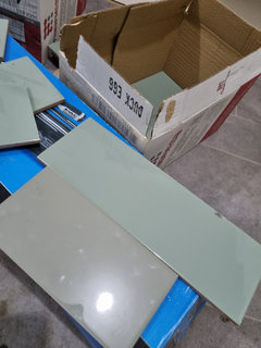
How to make kitchen tiles/design look better?
T
last year
last modified: last year
Featured Answer
Sort by:Oldest
Comments (6)

T
last yearT
last yearRelated Discussions
Ideas to hide / minimise / make a big ugly TV look better!
Comments (8)Mount it in a dark display cabinet the same colour as the sofa, that way it will blend into the background. It would be best to try and colour match to the sofa, so if you find a display cabinet that you like, you can paint it or get it painted to match. This will ensure that it sits perfectly in the room. You can also paint the wall behind it, up over the doors and down the otherside and have a lower unit, keeping the same dark colour....See MoreKitchen help - what can we do to make it look better?
Comments (65)Depending on how far you budget goes, I would look at adding traditional cornice and pelmet and replacing the plinth with a similar oyster colour. End panels for wall units could also be replaced / added. Some chessboard style tilling in 3 colours would also bring out the walls. It's hard to tell but is the oak surround also on the wall units? I haven't checked your location but this is something we can help with...See MoreHow can I make my kitchen design/layout more practical?
Comments (13)The design layout could do with changing if this is a two chef kitchen - as currently hob and sink share same floor standing space, the DW when open blocks the walkway - oven is danger to anyone opening door... The FF is not what you want - the list goes on !!! Difficult to help further with no sizes - I could guess from the doors - but no head on shot of the right wall so a bit tricky - this could be a 'very quick' job as a sketch consult on an hourly rate, if you want pro help - drop me an email ! If you were thinking of using ikea for example - you could buy and have installed the carcase's, drawers, worktop, sink and appliances and then add the facia fronts as and when you have spare cash - this would stretch your money a little further ... £4k is still a lot of money - invest it wisely !...See MoreHow to make this space look better?
Comments (27)Hello Sanaa, The dining table looks nice at the window.. I like the two chairs at the side too but equally you could place one either side of the window... Maybe a small picture just above the sockets.. This then frames the window with the table in the middle.. You could then illuminate the right hand corner with a floor lamp.. Not too far in the corner though.. The little table and lamp can then move a bit further along to join the sofa.. Can you move the sofa a bit further away from the dining area, so there is a bigger divide.... With the two sofas.. what about giving them a gap, so the rear sofa moves along to the right a bit more.. Possibly open them up as 2 chairs rather than try to make a sofa out of them.. See how that looks or what you prefer.. Add a few cushions to compliment the colours and an accent colour or two.. Grey like you have with silvers, creams, stone.. With the pouffes don't be afraid to partially place them on top of each other rather than set their place so they can be seen as occasional seating.. or relaxed on the floor watching tv kind of seat.. I see though you are trying to see how an armchair would look.. I think you could go for 1, but absolutely what you have works, so you don't need to rush to replace anything.. See how you feel with it.. There is room for coffee table too if you want it.. The console is nice where you have put it.. It works well with the picture.... It is a perfect entrance.. I would say the picture could go up a little bit.. 10 cm and see how that looks... You want to give it and your family pictures each their space.. Do you see how versatile your furnishings are and if you were to get different sofas you can then see how they can move around.. The chandelier lighting.. you may want to see if you can lower these slightly but if not, just an idea.. You could try the round mirror with the leather strap closer to the dining table.. Then the 3 pictures could then move along a bit and with a small gap between so they sit roughly behind the rear sofa.. Or are they all 1 piece.. A thought if you want to see how that works.. I think the mirror would really look good with the dining table.. Splendid, looking though Sanaa it's taken shape..... ; ))...See MoreT
last year
Sonia
last year


Jonathan