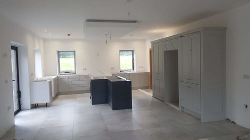
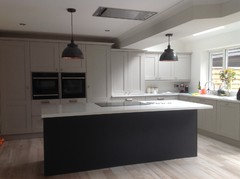
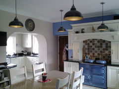
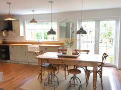
Kitchen accent colours
Michelle
7 years ago
Featured Answer
Sort by:Oldest
Comments (19)

Jenny Carter
7 years ago
Michelle
7 years agoRelated Discussions
ACCENT COLOURS? YAY OR NAY
Comments (14)Hi Kelly. It looks a great room. I would just add a textured throw over the arm of the sofa and some contrast and texture for the cushions and perhaps introduce another pattern. If you don't like colour then texture is fine but blush would be great. You could also add sheepskin seat pads (try Nordic house) for the chairs or just a sheepskin rug thrown over the back of one chair for a much cheaper option. I'd also change the glass fruit bowl for something else, maybe an old misshaped wooden bowl but something in a different material/texture. Personally I feel the tv and art is hung just a little too high but the TV might be fine for you! A couple of accessories would also be great. I've attached a pic of a dandelight which looks great under a cloche. In terms of faux plants and I always say this (!) but I love pussy willow and eucalyptus together and will work well in your room. I agree with Carolina re adding something on the left. You don't need this at all and may hate feature walls but I can see you like industrial so have found these wallpapers from rebel walls which I just thought I'd share! I agree with ggirl though, just let the room evolve a little more when you find things you love as it looks great already...See MoreAccent colour and soft furnishings for grey victorian lounge
Comments (29)You could add a number of things to help bring life to the room. You have chosen the perfect muted colour scheme that will complement lots of art work and colours. From your photos I would say you could add a large mirror above the fire place- you could go for something to complement the period of the property and fireplace or something slightly more industrial would work as it looks like you are already mixing contemporary and period with your choices of furniture and finishes. Art will be a huge help as well. Choose some large and smaller pieces to compliment the size of the room- you look like you enjoy your music and media (from the large tv and speakers) maybe some repro or original posters of favourite films? Or framed vinyl covers of you favourite albums. Pick things that you aesthetically connect with. Art is personal and should be something you enjoy every time you look at it, so pick pieces because you like them. It doesn’t need to be expensive. You could also think about a statement clock in the room as well. Lots of options I would say. Do not feel limited by a particular colour scheme with the art- go with things you enjoy looking at. For the sofa -with throws-mimic nature- stick to earthy tones grey browns you can pick up lots of cosy throws in these colours or animal Hyde type colours or actual Hyde’s...and once you have chosen your art- find cushions that are different sizes and textures (not leather) to help soften the look of the sofa and draw the eye away from its shape and on to the cushions! Or go with the nature theme and embrace the animal Hyde’s colours and it will all tie in with the leather. Of course these suggestions depend on personal preference but there are lots of ideas on houzz and pictures that can help with inspiration...hope my suggestions are of use!!...See MoreF&B Breakfast Room Green office - now what accent colours?
Comments (13)Understood. But don’t forget those colours you have selected ,belong to identifiable Hue Families. (indicated by the coloured segments on the wheels above) Wimborne White belongs to the Yellow Hue Family for example. But am not suggesting you need to pair it with a bright Yellow - but teaming it with other colours from the same Family would mean they have a colour connection. You can find blacks, whites, greys in each of those Families on the wheel. Choosing ones which have some connection to the colours you have already chosen, helps keep your palette tight. F&B All White + Little Greene Lamp Black both belong to the Green-Yellow Hue Family, just as Breakfast Room Green does. They share colour DNA....See Morewhat colour accents for Dove grey cabinets, marble tiles
Comments (2)The great thing about having a neutral background like this is that you can put almost any colour you like. For my bathrooms, I kept all the fixtures neutral* and just added colour with towels and small items. I like strong colour, so I have sets in petrol blue, burnt orange and strong green (these also link back to the bedrooms). Depending on how large the painted wall is, you could leave it neutral (maybe with a picture?) or go wild with wallpaper. I would tend to go with chrome for the various fixtures, since that is what you already have. For colours, perhaps something to make it feel warm, since it is north facing. Coral -> orange -> red shades, perhaps? It depends how strong a contrast you like. The best way is to either make up some paint samples to see what works, or get a couple of small items and see how well they go. You won't easily get a wide range of shades for bins, etc, so maybe keep those neutral. And remember that the same colour can look very different when it is shiny than when it is matte. If in doubt about an item, keep it neutral! * I had a tile shortage in one room, and added a deep strip of contrasting tiles in petrol blue. For an emergency decision, this has worked really well....See MoreJenny Carter
7 years ago
indiafrancis
7 years ago PRO
PROCreate Perfect
7 years agoUser
7 years ago
Mairead Moloney
7 years agoMairead Moloney
7 years ago PRO
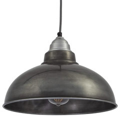
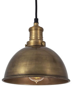
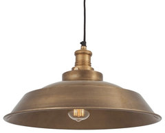
PROThe Lighting Company
7 years ago PRO
PROPeriod Property Store
7 years ago- PRO
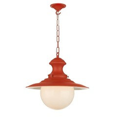
The Lighting Company
7 years ago  PRO
PROJ&G Design Studio Ltd
7 years ago PRO
PRORabbit and other stories
7 years agoKatie Wood
7 years agoMichelle
7 years agoSarah W
7 years agoKatie Wood
7 years agoKatie Wood
7 years ago


Markham Webber Design Ribble Valley