Houzz Logo Print
webuser_791999867

backsplash for my new granite

7 years ago
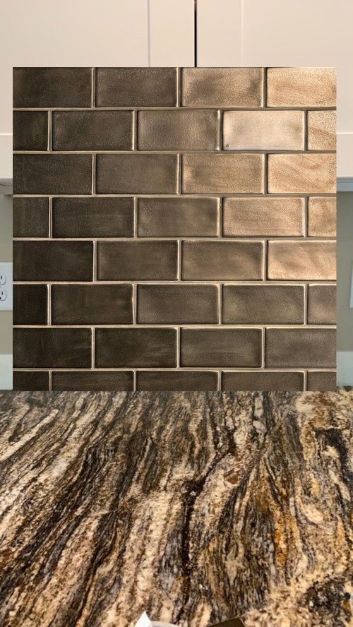
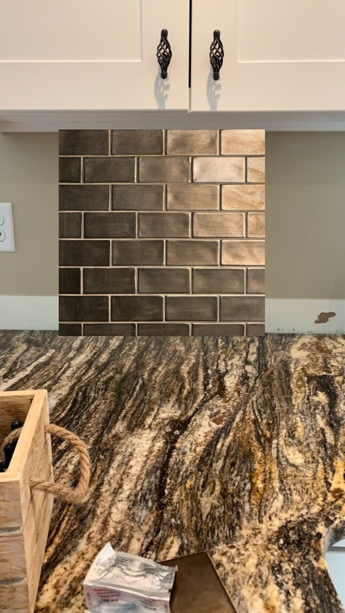
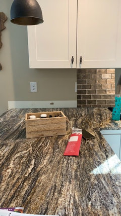
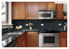
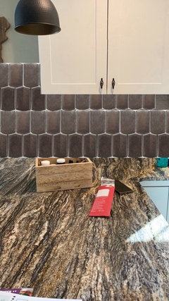
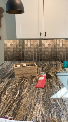
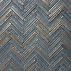
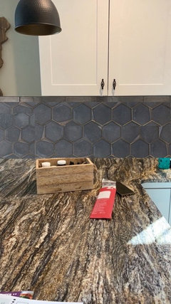
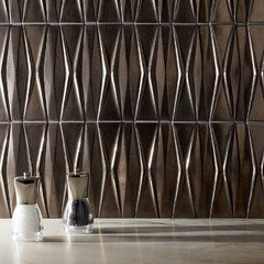
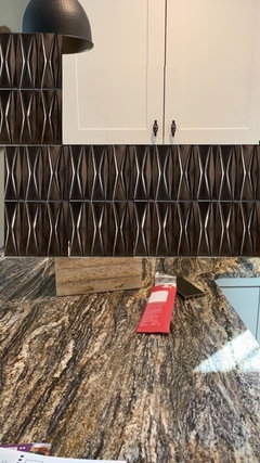
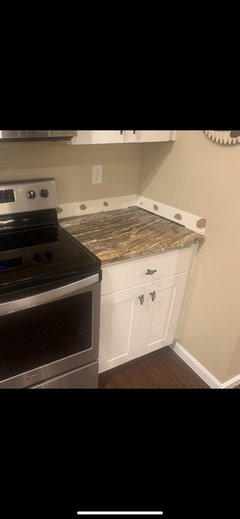
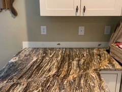
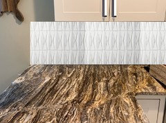
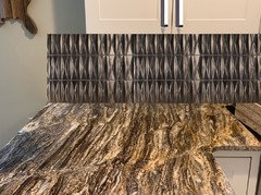
What do you guys think of this backsplash for my new granite?! It’s a Wayfair “view in room” photo!

Comments (49)

  • 7 years ago
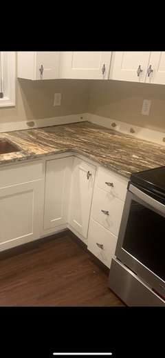
    What color are the cabinets?

  • 7 years ago
    They are white shaker cabinets! You can kind of see them in one of the photos I think :) not sure which one lol

  • Related Discussions

    Does this backsplash look off-scale?

    Q

    Comments (14)
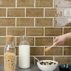
    Such a pity... your splashback is beautiful, but it looks out of place at the moment. There are a couple of things you could do: - cover the rest of the wall in a back-painted glass that matches the background colour (milky white?) of your splashback (similar to pic below) - you could have it on the left hand side wall (the one with microwave+oven) if you can give up the plugs there, re-sized, obviously; choose something else for the rest of the kitchen. - re-size and place it vertically in front of the hob. - use it somewhere else (bathroom?) and consider new splashback for kitchen. Good luck!
    ...See More

    kitchen backsplash

    Q

    Comments (11)
    Hi, A glass splashback in a neutral (or bold colour if you wish) would look lovely and tie in with the contemporary look you are after. They are easy to maintain and there's no grout lines to worry about. You could opt for a light neutral such as stone, light grey or pale blue or a more bolder orange/ teal or yellow. Alternatively, using the same worktop design as a splashback is also very effective in maintaining a modern, sleek look.
    ...See More

    Ceramic backsplash in the bathroom

    Q

    Comments (4)
    Maybe some of the mosaic tile used in the shower ? But what might have looked better would have been to have the mirrors going up from behind the taps, all the way up the wall, with no gap at the top, it would give a more finished and luxurious feel. I do understand that the mirrors you already have will probably have to stay now, which is why I have also suggested the mosaic tile.
    ...See More

    Kitchen backsplash

    Q

    Comments (2)
    There are tile stickers you could try. I wouldn’t think they are very durable to be honest. You could probably tile over the splashback with tiles to lighten the effect?
    ...See More
  • 7 years ago

    Here is a pic maybe you can see the cabinets better

  • 7 years ago

    For me, the counters make such a strong statement, not sure if you’re trying to add another texture or tone down the impact of the counter. The backsplash has a lot of texture and variation that competes. Have you tried something more matte, maybe a simple slate look? Like a flat dark charcoal?

  • 7 years ago
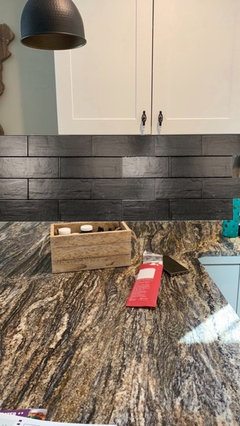
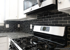
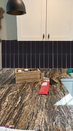
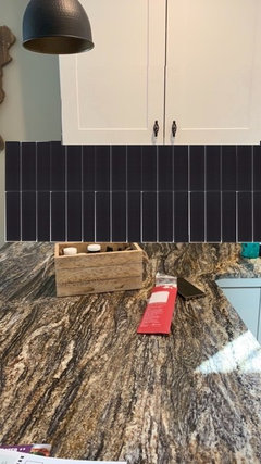
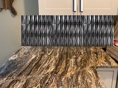
    I have actually!! Lol. What do you think about this?!

  • 7 years ago
    <?xml version="1.0" encoding="UTF-8"?><md>Sorry about my random pills on the counter
  • 7 years ago
    Thank you kk1000. I actually tried a lighter backsplash sample and did not like it at all.... I thought 10000% I was going to do a light/cream color backsplash but once I saw it, It just didn’t work for me!

  • 7 years ago

    Like the deep charcoal selection . The elongated shape is good w the linear pattern in the granite

  • 7 years ago

    I’d order actual samples. They’ll look different under the cabinets and with your under cab lights on. As shown, I like the first one.

  • 7 years ago

    Lighter and simpler would be good. Your granite has a lot of pattern so let it be the focus.

  • 7 years ago

    I would do something classically simple, light in color, to show off your granite instead of the backsplash.

  • 7 years ago

    If you don’t like the lighter tile, go with the first one. And definitely get a sample first, to ensure it’s what you think it is.

  • 7 years ago

    I think your first one looks terrific.

  • 7 years ago

    Can you get either tile in more of a matte finish? There is a lot of shine between the granite and the tiles....

  • 7 years ago

    The dark tile will work with dark grout. I assume you have goos under-cabinet lighting.

  • 7 years ago

    I usually don't like shimmery/sparkly tile, but I think both of your choices (the bronze and the charcoal) look fantastic with your granite. I slightly prefer the charcoal. Both are bold choices, which is refreshing to see.

    Definitely get some actual samples in your kitchen. Please post pics when you choose and have your tile installed.

  • 7 years ago

    Would they work vertically? I prefer the first one or a cream.

  • 7 years ago

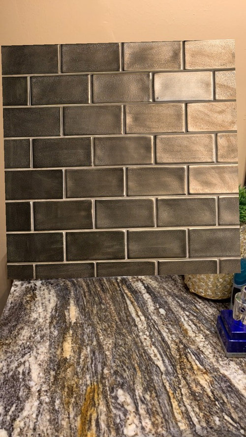
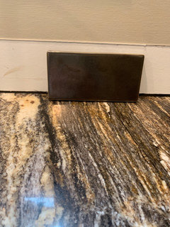
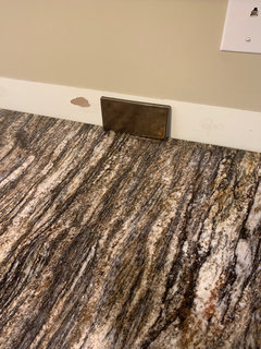
    Here is the bronze one (first photo) against my actual granite! I ordered a sample of the charcoal one so that should be here next week hopefully!

  • PRO
    7 years ago

    Perhaps consider a smaller size tile that doesn't compete with the pattern of your granite.


  • 7 years ago

    Another photo

  • 7 years ago

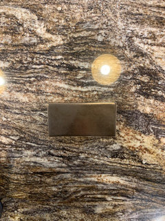
    On the actual granite

  • 7 years ago

    The first one looks great! My opinion though would be to use a grout color that is a touch lighter... Not too light mind you, just to see a little more contrast to tie in the cabinets and lighter tones from the counter.


    Nice to see a darker look with lighter cabinets! And never mind the comments about going lighter so that it won't compete with the granite. The darker doesn't compete either - they are just focusing on a different shade from the granite.

  • 7 years ago

    What impresses me is how well you’ve matched the tile color to one of the granite colors! Great job, it’s going to look fabulous!

  • 7 years ago

    I like the first option, because it's reflective and matches your granite very well.

  • 7 years ago

    I like the first option, but wondering if a darker grout to match the tile would look better and less busy with the granite.

  • PRO
    7 years ago

    I absolutely love this. I was hoping that the cabinets would be white cause otherwise the room would be too dark. I'm glad they are white. great choice. definitely stick with that.

  • 7 years ago

    I think the bronze tile looks fantastic with your counters and cabinets. The grout pictured in the online sample board would be perfect for you too -- light enough that it shows the tiles but dark enough that it doesn't give off a busy look.

  • 7 years ago

    Thank you all so very much!!!! I appreciate each and everyone’s opinions/comments!!! :) decorating is so fun

  • 7 years ago

    Bronze! Absolutely! But match the grout to it, neither lighter or darker as contrasting grout will make it visually busy which would be to much with the visually busy granite.

  • 7 years ago
    last modified: 7 years ago

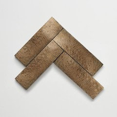
    Ann Sacks,,(I think it's called "hive" ) in the bronze

    And the Basalt I mentioned yesterday. 3x9 these are from Fireclay

    9" long, vertically, would give you about 2 tiles per row. visually less busier looking. I'd grout these w/a dark gray. light enough to see the tiles, but not enough to compete. this gives you your backsplash without competing w/your beautiful stone. It enhances it.

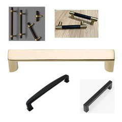
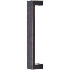
    I'd also switch out your hardware. those wire ones you have are too delicate looking.

    some other options

    Here's your original choice turned vertical. but see how the smaller size (these are 2x4 or 3x6??) and the offset, creates more visual competition?


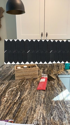
    elongated pickets in the Basalt (I mentioned this on the other post)

    notice the vertical placement of the tiles and how they 'flow' w/your granite veining. again, doing the tiles horizontally compete w/your stones movement.


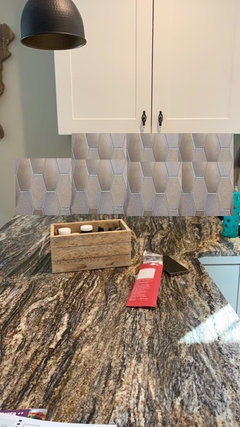
    encore ceramics, Hex-long-Luster Bronze


    These are the some of the other colors in the Metallic glaze on Encore. Just wanted you to see the colors close up.

    they're perfect w/your stone. they can do one color, or a blend of two or three. comes in many, many shapes and sizes. remember the Hex Kiss I showed you yesterday?

    these are 3.5" wide, so they aren't small mosaics. You figure 6 hexes, per row, vertically is what you'll get. With the 6" hex, you'll get 3 from top to bottom.


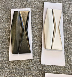
    my samples I got from Tilebar. these are the Nabi Harlequin. I love the dark one and the light one w/your stone. these are a little larger, so it wouldn't look like a busy mosaic. go on Tilebar and order some samples. you get 5 for $5. Go to their site to see pics of them installed.

    I actually like these (because they're elongated) and the Hive selection.


    Cle'Tile, Liberty Brick 2x8

    they have them in a matte black, Lennox


  • 7 years ago

    I'm not loving either selection, tbh. Of the 2 I prefer the bronze, but I think you can do better.

  • 7 years ago

    Thank you, Beth!!!! What are the color names of the nabi harlequin ones?? I am on tile bar now!

  • 7 years ago
    last modified: 7 years ago

    that is the name! https://tilebar.com/catalogsearch/result/?q=nabi%20harlequin

    metallic copper

    you need new handles!! look at some of my choices on the previous comment


    and look again at my comment, i made some edits to the photos. look at the second pic, the basalt tiles. I photo shopped them

  • 7 years ago

    Thank you so much, Beth!! What would I do in this case scenario. There are other areas of my kitchen that the vein pattern flows side to side. I’ll see if I can post a pic of my whole kitchen so you can see what I mean.

  • 7 years ago

    It flows a different direction in these spots

  • 7 years ago

    following

  • 7 years ago
    last modified: 7 years ago

    what is the majority? those small horizontal areas aren't very pronounced looking, and the last one is off to the end. When you look at the kitchen and the stone, what direction is most prominent at first look? (also, don't do the side wall. just paint there at the end)


    regardless, even the vertical stack will still look good w/the horizontal.

    or go w/the harlequin. did you see the mock up I did? looks good

  • 7 years ago

    I think the majority is like the first photo. Only small areas are horizontal. I just saw the harlequin!! Every time I refresh the page something new pops up lol!! It looks so nice what you did. How do you do that?? Photo shop backsplashes? Thank you!! You’re so fast and good at this lol. Would you be able to tell how the lighter harlequin one would look too?

  • 7 years ago
    last modified: 7 years ago

    post a pic of the area you want to see, dead on straight, remove stuff from countertop. (don't stand too close or too far back)

    I'm on mac. I cut and paste in Preview. it's rudimentary at best!

  • 7 years ago

    I love that first one!

  • 7 years ago

    Beth, does this work??

  • 7 years ago

    I like the bronze tiles. Very dynamic looking, please post finished look!

  • 7 years ago

    a few things. switch your light bulbs to a higher temp. say, 4000K. right now they're putting off a pink/yellow hue.

    here's the Natural White (and I gave you some new handles. don't like those woven ones. )


    here's the copper again, followed by the Gunmetal


    they also have this one

    https://tilebar.com/nabi-sea-wind-3x6-ceramic-tile.html


  • 7 years ago

    Thank you so much Beth!!!! I think it’s amazing that you can do all that so fast. I really appreciate all of the time you’ve put into helping me! So far, I like the copper nabi harlequin ones you have posted for me the best but the gunmetal looks neat too! You think way outside of the box hahaha which I am not capable of ;)

  • 7 years ago
    last modified: 7 years ago

    my pleasure. my problem is I see so many tiles and designs, that it makes it difficult for me to choose one for myself.

    I like the copper nabi, the stacked 3x9 basalt tiles (I really like that one a lot w/your stone) or the bronze hive. I'd stick w/the copper, bronze, or the matte blacks/charcoals. I think they look the best w/your stone.

    if you had dark cabinets, I'd say to go w/the lighter color. but against your white cabs, they just wash out.


    and the ORB or matte black handles or even some bigger knobs. the weave design actually competes a little w/your stone. and they're just too dainty looking.

  • 7 years ago

    I can totally see what you’re saying now with the knobs. I like the copper and charcoal/black backsplash too so good thing is i can’t afford it right now so I have time to choose which color one I want out of those. Although i prefer the bronze color one as of now!!! Thank you so much again!!!

  • 7 years ago

    Have you tried some grey tiles , not small size, something larger so it doesn’t have so much grout lines. I think the size is the problem not so much the dark colour. You could even use one slab of manufactured stone in one colour to match your stone , play with scale instead.

  • 7 years ago

    love the first one, the bronze, your second one is close. nothing anyone else posted even comes close to these two you picked yourself. the bronze is beautiful.