Houzz Logo Print
frecklefrog

What colour???

13 years ago
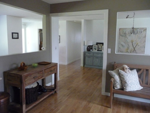
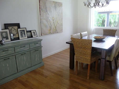
I have painted the walls in my living/dining room white and i can't decide what colour to do my kitchen. I could do a blue/grey to pick up the accent colours of my sideboard and picture or white or any other suggestions????

Comments (46)

  • 13 years ago
    Is the first picture part of your kitchen? If so, I'd leave the color as is. Beautiful!
  • 13 years ago
    last modified: 13 years ago
    Yes it is.....but I dont like the colour. Is it not too dark for the white? and to me it doesnt go with the floor!!!! Interesting isnt it different tastes? Lets see what other comments this gets...I also hate the light aarrrgghhh
  • PRO
    13 years ago
    If you like the white wall, you could just make simple color bands that surround the white wall. In this way, the blank remains the main color, but it will be noticed more surely. The color for the bands could be blue / gray as you said.
  • 13 years ago
    I would agree that the colour of the furniture and the flooring are warm tones and do not match the cool grey tones on the wall. A couple of pictures with both tones and some brighter colours would change the focus to the brighter colours in the pictures. Another idea is to find a picture that you just love and use the colours in the picture for your colours in your house. This will likely give you a palate of coordinating colours to use for paint colours, bedding, towels, curtains and accessories. Many paint supply places can scan a piece of paper, fabric etc and mix your paint a very close match to the colour of your sample. If you don't like the intensity of the colours in the picture, just get them to put in a quarter of the normal amount of tint for that colour. If it is too light or too dark then have them adjust the amount of tint added. Having said this some individuals are drawn to subtle neutrals so have a look at posters etc with those types of colour harmony as well

    I hope this helps and good luck.
  • PRO
    13 years ago
    We think the wall with white color could be OK in your kitchen,it is bright and warm.
  • 13 years ago
    It is so much about personal preference.... I always prefer lighter colors ...light greys or whites. Everything looks good to me! I would do what you like.
  • 13 years ago
    Thank you all for you comments. The problem is the cabinets in my kitchen are off white which is why I was leaning towards the idea of painting the walls blue/grey. Can't afford to change the kitchen. Any suggestions for the light above the dining room table?
  • 13 years ago
    I like the one you have there now. Is there a different style you prefer? Look at lighting showplaces to see what you like. The whole area looks minimalistic so you could really go anyway you want.
    Sorry... I am not much help...
  • 13 years ago
    I like the big mesh ball looking lights but I think one of those would block out my picture.
  • 13 years ago
    That is true... your picture is your focal point. Well, the one you have looks good and doesn't try to take over for attention.
  • 13 years ago
    How about the color sea salt by sherwin williams.
  • 13 years ago
    Or nibus blue by benjamin moore
  • 13 years ago
    Another option would be to go 3 shades lighter than your wall color shown in the connecting room.
  • 13 years ago
    if i were you i painted it with a light cream some thing which is set to your white kitchen & your furniture then draw some thing on the wall or some lines with a darker cream i think it make your home warmer & you can feel relax
  • 13 years ago
    last modified: 13 years ago
    Love the Nibus Blue ;)
  • 13 years ago
    My house is small which is why I wanted to paint it white. At night when all the lamps are on and throws are on the sofa it looks warm and cozy and the oak floors give it warmth
  • PRO
    13 years ago
    Hi, this is a very interesting web page and I have enjoyed reading many of the articles and posts contained on the website, keep up the good work and hope to read some more interesting content in the future. Thank you so much.
  • 13 years ago
    Go ahead and paint it white like the other walls. I think that would look great. If at some point you want to go back to colors, it will be a very easy job. But for now it will give you a very classy, integrated look!
  • 13 years ago
    last modified: 13 years ago
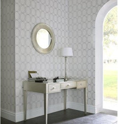
    I would recommend painting it white and wallpaper the long wall in Darcy from Graham and Brown. It would give the room elegance. Your spaces are beautiful.
  • 13 years ago
    Here is a sample
  • 13 years ago
    @ bastma.......Love the wallpaper. I live in a house full of Males, elegance isn't something I had thought about lol but this looks gorgeous.
  • 13 years ago
    We did grey horse in our kitchen. Revere pewter would be good as well.
  • 13 years ago
    an idea for your lighting, you have a lovely picture on the wall so why not look at getting a down light or a snazzy spot light and point it at the picture to make it more of a focal point.
  • 13 years ago
    It looks like the rest of the areas visible in the photo, are all painted white, except the front room which is grey/brown. So I would paint the rest white. I do like the grey/brown color though. The color is a good background for the earthy textures of the furniture, but it's too much brown and does not match the rest of the rooms. I agree to match the color of your cabinet or one of the grey/green tones of your painting in the dining room might work. Apply it to just one of the walls visible from the grey/brown room.
  • 13 years ago
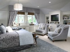
    first picture: tent of green and the second: white with some stikers
  • 13 years ago
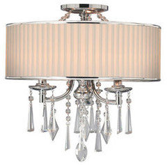
    @frecklefrog: The trend is ceiling mount lighting for your dining room, I would go with a nice stylish semi-mount ceiling chandelier like picture attached. You know, to go with your elegant wallpaper space. Can't wait to see updated pictures. Good luck!
  • 13 years ago
    Semi-mount light attached
  • 13 years ago
    love these rooms and color combo. Honestly wouldn't change it. The only element I'd consider adding or changing is a small rug here or there and a large thing or two on the console - getting rid of the little things on it.
  • 13 years ago
    @ Susan Shea Thank you for your kind comments. The console has a wooden basket for keys, a candle and a wooden plate for fruit which doesn't have any fruit on it in the picture. I have had several rugs but I have a very hairy dog and he just makes rugs dirty and likes to throw up on them for some reason aarrgghhh. I have to have the picture montage on the sideboard because I am a Brit living in Canada and I miss my family very much so need to have pictures of them and thought this was the most tasteful way to do it.
  • 13 years ago
    :) Me too. Very hairy dogs here. Your wood floors are gorgeous and I like your photo display too. Your space looks clean, light and calm. love it,
  • 13 years ago
    last modified: 13 years ago
    @frecklefrog:
    This is going to sound bizarre, but may I suggest a midnight snack for your dog? We had one with that particular habit each morning, and it turned out it was just from an empty tummy over night. One dog biscuit before bed and an early breakfast solved the problem.
    Okay, back to design issues.
  • 13 years ago
    @ feeny.....Like the top tip. He has a treat at 9pm and breakfast at 6.30 am. He hasn't been sick for about a year but I bet if I bought a new rug tomorrow and put it down he would be sick on it haha.....Anyhoo what colour should I paint my kitchen?????? LOL
  • 13 years ago
    Go for the Sea salt, a fresh grey blue. it will contrast nicely with the wood and match your console there. White is only successful if ALL is white otherwise it looks like no personality there.. Be brave and take the plunge. Is that your dog on top of the cushions? What a life!
  • 13 years ago
    last modified: 13 years ago
    I recently (last week) had my entire first floor painted "natural linen" by glidden. I love it! It is such a light airy color and it complements my cream trim well. My hard wood is a very similar color to yours and it looks great. I picked the swatch up at Lowes or Home Depot. Unfortunately, I had Revere Pewter (BM) painted in the office and it looked horrible with my cream trim, so I am going to have to repaint that room... Hope that helps.
    Tara
  • 13 years ago
    I love the picture of the light fixture batsma sent - it would look great in your dining area.
  • 13 years ago
    I am leaning towards the blue/greys. And yes tallykathy I too love the light picture bastma posted and I am going to go look for one tomorrow but one without the bling coz thats not my style....
  • 13 years ago
    I too love the kitchen color but if you want a lovely blue-gray try Ben. Moore Beach Glass to soften all the visual angles and lines going on in this area and it will compliment the off white cabinets. If you have the space, have you thought about swapping the dining room and kitchen credenzas and putting a taller lamp with COLOR in the dining room ? As far as the chandelier, check out this link lig http://www.shadesoflight.com/mesh-screen-shade-chandelier.html. Might be tough on the budget but the color of the fixture will bring interest to your ceiling. A nice driftwood chandelier would be pretty too.
  • 13 years ago
    BM Mount Ranier Grey is a beautiful blue grey that changes slightly with light.
  • 13 years ago
    Love love love Beach Glass....couldn't find Mount Ranier Grey???? sullenbj couldn't find chandelier???/
  • 13 years ago
    see if you can open from the attached file.........
  • 13 years ago
    BM mt. rainier gray, 2129-60
    Try that.
  • 13 years ago
    Hi Freckle Frog I really like what you've got going there. And I actually think the dining room light matches your art work -- the curved stems and the cup shape of the lights mimics a bunch of tulips.

    Colour wise, for your kitchen I think whites with your existing cabinets could be too tricky.

    The neutral, pale greys with a touch of green tones will pick up the colour of the dining room cabinet and blend beautifully with any type of cream kitchen cabinet.

    I would stay clear of blue grey -- unless there's lots of red brick and heavy timbers in the room, it is just too cold for too long up north of the 49th!

    I used Farrow and Ball's pale powder in my north facing office in Vancouver and it feels warm through the sleety winters and cool enough in the summer.

    *Bonus* Farrow and Ball paints are from Britain, and the colour palette reflects the colour schemes of Cotswold cottages and London townhouses. They have sample tins! Try skylight, light blue or pale powder. These may also satisfy your sense of nostalgia a bit.
  • 13 years ago
    washcoat....got it...love it. Tracy Penner I will look up Farrow and Ball thanks.
  • PRO
    11 years ago
    I would recommend looking at the Farrow & Ball colours. They have a beautiful finish and fantastic colour range