

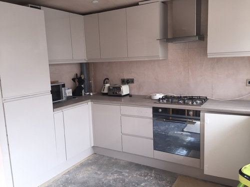
Splash back?
10 years ago
Featured Answer
Sort by:Oldest
Comments (11)
 PRO10 years agolast modified: 10 years ago
Related Discussions
Splash back and wall color help!
Comments (26)Personally I wouldn't go with a yellow splash back. Not because it wouldn't go but more that you already have enough of that accent colour around the room, over do it and it can look forced. There is a fine line between getting the balance right were it looks classy and going over board to the point it looks naff. Personally I would either go for a splash back that is colour matched to the walls or a smoked mirror. You are limited in some ways because it appears there wasn't any forward planning with regards to splash backs. Any splash backs would need to be confined to the width of the extractor because your curved wall units won't open otherwise. They would have to be packed off the wall if you wanted to go full width splash back. I would recommend a durable matt paint in the kitchen. Good quality ones will withstand washing without polishing up and showing tell tell marks where they've been washed. Little Greenes Intelligent Matt is perfect for this and is our choice of paint when not using any further splash backs above the granite upstands. I understand a colour matched glass splash back or smoked mirror may seem like the safe option and boring to some, but there is no point in being brave just for the sake of it. You've got plenty of other points of interest in the room with regards to colour without having to push it too far. Let the kitchen itself be a subtle canvas to show off other items rather than fight with them for attention would be my advice....See MoreKitchen glass splash back vs. tiles & colour?
Comments (18)My personal view is that tiles in a kitchen are a harbour for dirt and a pain to keep clean. Smooth, sleek surfaces are best. We went for granite upstands to match the worktop and a contrasting but neutral glass splashback....See Morekitchen splash back help!
Comments (3)Going bold is one option, however i see a very restfull, clean design. My thoughts immediately went towards continuing with that feel with a tile with only a soft hint of color, a tile with an uneven surface to create movement, or a tile with 'mother of pearl' finish on a soft white to be all color yet none.Your indoor plants will bring live color and not be overwhelmed on busy counter....See Moredove grey units need advice what colour splash back
Comments (14)Again it depends on the look you're going for and it's difficult to advise without samples of the kitchen unit and floor materials. Always plan the room as a whole rather than looking at elements in isolation. That said, a good dependable choice would be a satin white brick or square tile. You already have quite a trad kitchen so I would go for something a little more contemporary and steer clear of anything with a bevel. The balance between pale grey units, darker grey countertop (plain) and fresh white tiles should work well, particularly if you can find somewhere for some open shelving in a light wood tone to balance the floor. I've attached an image of a kitchen I refurbished in an Edwardian house I subsequently let - excuse the quality of the picture, it was for my info only not for marketing but it gives you an idea of how satin white tiles can work against a stronger neutral, greys and wood tones. That was a mix of two F&B shades but something like F&B Ammonite, Cornforth White or Purbeck Stone or FE Bone White would work with flooring, tiles and units. This is just a steer. It really is essential to do sample boards and look at how the shades work together. Keep the paint shade unsaturated and steer clear of DIY paints. The branded paints are much richer recipes. If the budget will stretch to it, get some accent lighting in - lighting is often neglected but can make or break a scheme....See More PRO10 years ago
 10 years ago
- 10 years ago
 PRO10 years ago
- 10 years ago
 PRO10 years ago
 PRO10 years agolast modified: 10 years ago
- 10 years ago
- 10 years ago



Sabbini & Co.