Houzz Logo Print
malcolmd01

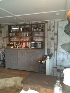
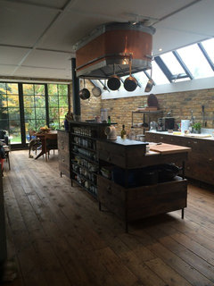
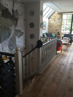
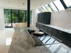
Before and After London Kitchen

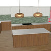
Malcolm Duffin Design were engaged to produce a dynamic and modern kitchen for this Victorian house in London. The clients' remit was to add the contemporary and practical requirements for a busy lifestyle and create a stunning environment for a large family.


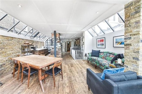
BEFORE

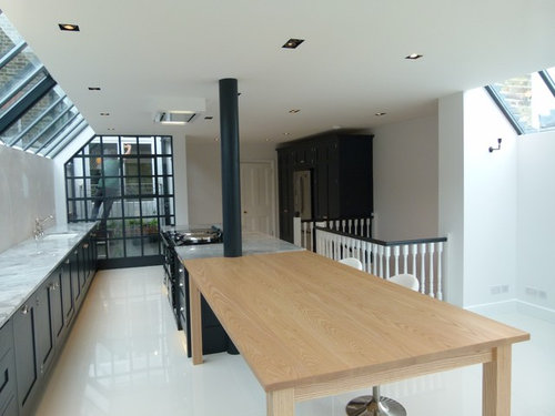
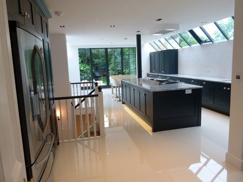
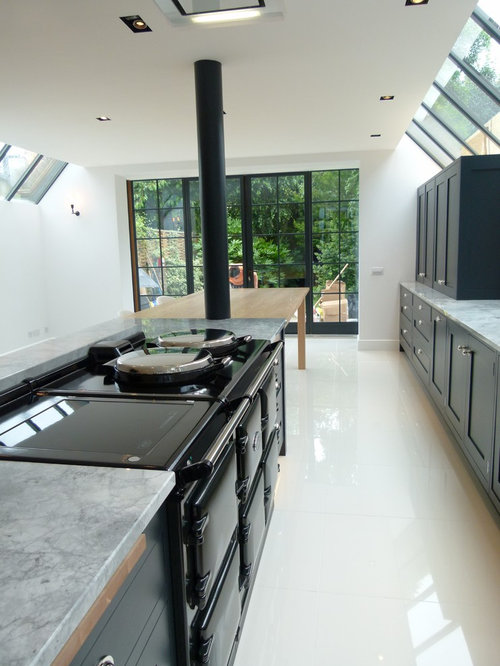
AFTERS


Comments (26)

  • 10 years ago

    I'm sorry, but the before pic is WAAAAAAAAAAY better. A truly charming character converted to an antiseptic space. :(

  • 10 years ago
    Would love to see more of the "before" photos.
  • PRO
    10 years ago
    In fairness to the designer the After photos are taken immediately after the fitout so there are no personal touches from the family in the photo.
    I think it looks like a more functional kitchen & will come alive when the clients put their own 'stamp' on it.
  • 10 years ago

    I have to agree! The before pictures were truly beautiful-Did they perhaps mislabel them? I love the exposed walls and the wood flooring. I suspect that even with personal touches it still looks very much like a hotel kitchen.

  • 10 years ago

    The new kitchen units and layout with the old stone walls and wood floor would have looked fab together

  • PRO
    10 years ago

    We totally understand that this could have been confusing, therefore as you can see the brick work and flooring were in a poor state / condition and walls and electrics too. Our client did not wish to maintain this Victorian retro feel as she has a young family and wanted a cleaner lighter and more hygienic feel. Whilst this might not be to everyone's taste, the end results did meet the brief. Naturally the personalisation and finishing touches are to be added as noted by Eily roe Interiors.

  • PRO
    10 years ago

    Really Fabulous! I love that Sofa, Great style.

  • 10 years ago

    I prefer the after - really love the clean look that is also sympathetic to the space. Well done.

    Malcolm Duffin Design thanked Amaya Lynx
  • 10 years ago
    the design styles are very different thus one can argue that choosing one over another is up to one's taste. however the after design emphasises the linearity of the space which made the space lose its previous micro zones (dining, sitting , kitchen). it became too linear and looks rigid.although materials look awesome and all looks sleek
    Malcolm Duffin Design thanked doodz
  • PRO
    10 years ago

    I don't really think you can compare the two. The Client's brief was obviously met explicitly and that's what matters. Everyone's taste is different. I do like the before, but for me personally, the lack of ability to clean the space and all that clutter would have driven me bonkers. The new design sits impeccably in the space, and makes it look both clean, tidy and I think has an industrial feel to it due to the use of the dark coloured units.

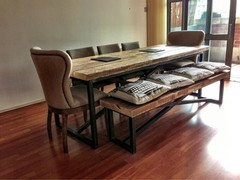
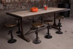
    I personally love it, the only thing i'd change is the table as it doesn't quite fit, looks a little cheap against the rest of it. Maybe something more like this:-

    Ties the stove pipe in and the window frames with the use of the black metal on display and thus makes the table more a part of the kitchen than a bit of a second thought. Maybe there just wasn't enough left in the budget!

    Good job done!

  • 10 years ago

    I do understand some of the comments as I love wood flooring and exposed brick (loved the island in the before too). However I think it's a stunning room. I agree with MATH, I would have gone for a reclaimed table for added texture/warmth and different bar stools but I suspect that wouldn't have met the clients brief. I certainly wouldn't say no to this kitchen (or the doors and windows but I'd have had a reclaimed parquet floor but each to their own:) )It would have been good to see the room once accessorised but fantastic job!

  • PRO
    10 years ago

    Hi Malcolm,

    Beautiful work, quality materials and wonderful clean lines.

    Once the artwork and personal touches are added this will be an amazing space.

    Martin: www.angel-martin.com


    Malcolm Duffin Design thanked User
  • 10 years ago

    two different styles, but both look beautiful to me!

  • PRO
    10 years ago

    Its difficult to spot really , but the extension ie room space was built in the 1980s and the reclaimed flooring was full of gaps and quite unhygienic , the bricks were fake and neither Victorian or original, client simply did not like them and I could understand this as having a young family she wanted safer/cleaner environment. Designer's MUST interpret their clients needs and hopefully exceed their expectations.

  • 10 years ago

    Gorgeous kitchen i agree the table could be better & with a few personal touches added it will be stunning. Cabinet & worktop colouring look great together.

  • PRO
    10 years ago
    I must say I do like the "after". Saying so, I quite like the "before". The before had a lot of character. Perhaps it would have been nice to leave that brick wall visible.

    Anyway, at the end of the day, it is what the client wants.
  • 10 years ago
    Absolutely love the transformation! The flooring and black accents are my favourite.
  • 10 years ago
    I'm another who appreciates the general character and style of the "before" versus "after" version.
    To me the latter represents the popular styling many are opting for at the moment. It feels a bit "me too" rather than individually-minded.
  • 10 years ago

    At first glance, I too was taken in by the romantic, classic space in the Before pic. But look closely. The brickwork is false, colourful and cheesy. The poor condition of floorboards are no fit state for a young family. The before picture gives a false sense of a large area with a living space. It's actually rather dark, busy and "heavy". Not attractive to children, not an enlightening space.

    It needs to be a functional, practical kitchen, with lots of traffic and use. It needed modernising, making safe, easy to clean and maintain - it seriously needed brightening up, and making it a "refreshing" place to be - where people young and old want to spend time.

    The After picture is stunning. I can see it would serve the needs of a young family perfectly. Good work! It is bright, clean and fresh, - but with dark cupboards that add depth and character - and complement the window fittings perfectly. Love it.
    Give it a week or two with the family living it, and it'll soon look homely too.
    Love it.

    Malcolm Duffin Design thanked Vanessa Ashworth
  • 10 years ago
    I understand that the designer met the brief and he gave the client what they wanted but I really must join the chorus of the anti-bland campaign and shout "Noooooooo!" The person who said it feels a bit "me too" really hit the nail on the head. The brick walls may not have been original and the floor perhaps unhygienic but I have young children too and the need for hygiene does not override every other prerogative, including your sense of style. This kitchen is over-fitted. It is bland because there is no room for personal touches. I understand the need for more concealed storage but now that is all there is. Nothing else. And I'm not sure how young children are compatible with bar stools.....
  • 10 years ago
    I get the quality and the style of the finished kitchen and once the owners have stamped their mark on it then it might soften a bit. I liked the character of the before shots and would have been happy just making a few alterations. The two things that I really don't like in modern kitchens is the clinical feel from the shiny large format floor tiles - I just don't get them and remind me of properties on the continent rather that a British home - and second thing that I just don't like or get is the run of cabinets without anything on the wall, reminds me of the science classrooms at high school. I expect to see a few Bunsen burners and glass beakers. Not my idea of a finished kitchen. In my opinion of course!
  • 10 years ago
    I love exposed brick work. However, if you look closely at the before picture it looks like the sort you find in a chain pub. Anyone visited a Harvester/Beefeater lately? ...Love the after picture. Top job!
    Malcolm Duffin Design thanked lottiefenwick
  • 10 years ago

    I originally preferred the before but now the designer's info about the brick not being original etc has changed my mind. It's a fabulous space and I'm sure the client loves it which is the main thing. Well done!

    Malcolm Duffin Design thanked S L
  • 10 years ago

    Funny I at first thought the before pic was fab - I do love scruffy rustic brick, but the after kitchen is incredibly stylish. I love the marble (I think) worktop. Lots of nice natural materials but used in a modern way. Very nice.


  • PRO
    10 years ago

    Great job. Amazing improvement. Bigger, brighter and long lasting unlike the poor quality redwood floors and nasty ceiling paneling.