

Kitchen Dilemma
9 years ago
Featured Answer
Sort by:Oldest
Comments (6)
 PRO9 years ago
 9 years ago
Related Discussions
Kitchen dilemma
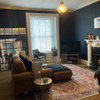
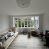
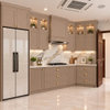
Comments (6)Hi katie. I think the biggest problem is the worktop and splashback/tiles but dear to replace. I know your dad likes the green ceiling but I personally think it's encroaching on the space making the room feel a little smaller and darker. Having it white or in a paler colour than the walls expands the space. Removing items from the windowsill that block light would help and a bit of a declutter. You could try painting both the units and walls white. If you don't want white and white (but look at images with dark worktops) then try a light colour with white. Adding cheap lighting under and over caninets etc will also help as will reflective surfaces and accessories but you already have the SS sink and chrome handles.. Ps if they are tiles and not a splashback then you can paint them...See MoreNavy or Two Tone kitchen dilemma!
Comments (16)I apologise if you’ve done this already but if you look on the Houzz photos section and select kitchens and then under area select “all Denmark” you will see lots of beautiful kitchens that I think capture the look you are trying to achieve. I’m going to have to agree with Jonathan and Sonia that very few of them are navy or grey. The Scandinavian look is about lightness and natural materials and so wood and white feature very strongly. I think that wood gives great warmth and interest in a kitchen and it is certainly on the way back but you can only really have wooden floor and units if there is a substantial difference in the colour tone. E.g a darker wood unit with a paler wood floor. Combined with white, it could look very timeless. If you did opt for a wood floor and some (maybe not all) white units, you could then go a bit darker with your worktops. Happy browsing!...See MoreCottage kitchen dilemma: Red quarry tiles & exposed stone
Comments (11)I would think about how to make best use of earthy materials, I'm not convinced the strong blue is the right thing. Is it possible to post lots of picture that show different views of the room? I agree about pale worktops, essential for reflecting light. The other thing to consider is that the floor tiles are quite a strong colour and therefore I wouldn't put too strong a blue in there, rather a duller dark blue/black or softer warm greys.The bottom image with warm greys and small amounts of dark blue/black is lovely. I like Sonia's images, they feel right for the materials you are working with. Here are some more....See Morenorth facing kitchen dilemma!
Comments (11)Hi, This space really does have so much potential. Turquoise is a hard colour to work in a kitchen as it can appear very bright and loud if that is not what your looking for. Both of these images are different shades of green that would work well. I would suggest whatever shade green you decided on, you keep the rest of the room light and this compliments the green well. The neutral colours and light woodwork make it an eye-catching statement. Accessorizing in black and gold is also a beautiful touch to add, also adding a statement as soon as you walk in. If you need anymore advice please get in contact....See More- PRO9 years ago
 PRO
PRO- 9 years ago

Treacle Row Interior Design