

6 Brilliant Before and After Bathrooms from Our Tours
These renovations illustrate how clever design can transform the dreariest of spaces into stylish, functional bathrooms

There’s nothing like a good transformation to stoke the inspiration – and if you’re planning a bathroom renovation, these before and after project photos tick the box.
From a cottage shower room with a sloping ceiling that’s gone from squished and dark to bright and elegant, to the separate rooms in a 1930s home combined to make space for a walk-in shower and freestanding bath, to an awkwardly angled room where the design cleverly maximises existing – and very limited – space, there are plenty of ideas to steal.
From a cottage shower room with a sloping ceiling that’s gone from squished and dark to bright and elegant, to the separate rooms in a 1930s home combined to make space for a walk-in shower and freestanding bath, to an awkwardly angled room where the design cleverly maximises existing – and very limited – space, there are plenty of ideas to steal.
…and only left space for a small shower. “This was the driving factor of the whole brief,” Adam says. “They were having to cram into this tiny shower and then it started to leak, so they thought, how do we get a bigger shower?”
Well, like this….
Well, like this….
By flipping the floor plan and putting the bath and a big walk-in shower on the window side of the room, Adam has made much better use of the available space.
Now, on the wall where the old bath used to be, there’s a double vanity unit with roomy drawers and, above, a light-boosting mirrored cabinet for stashing more bathroom bits.
On the wall facing the long side of the shower, Adam retained the existing cupboard storage, which is built into a chimney breast, but replaced the doors, and fitted elegant, tall black radiators on either side. Click on the story link below to see more photos of the project.
More: A Space-wasting Bathroom is Brilliantly Redesigned
2. The space-boosting tweak
This en suite on the first floor of a 17th century detached cottage in Kent was part of a whole house project, redesigned by Sara Ripamonti and Amit Malhotra of Aflux Designs. The duo worked wonders on this skinny shower space, making clever, transformative tweaks to the layout to create a more spacious-feeling room.
This en suite on the first floor of a 17th century detached cottage in Kent was part of a whole house project, redesigned by Sara Ripamonti and Amit Malhotra of Aflux Designs. The duo worked wonders on this skinny shower space, making clever, transformative tweaks to the layout to create a more spacious-feeling room.
A key change in the smart ‘after’ version of the room is that Amit and Sara removed the nib wall on the right of the shower. They also replaced the curtain with a glass screen.
Not only is the walk-in wash space now bigger and brighter, but the newly straight right-hand wall and flush, continuous flooring make for a significant visual shift, too.
The team also moved the basin across to the same side as the toilet, removing a pinch point and making the room feel much less cramped.
The shower has been clad in beautiful green tiles, the colour variations giving the space real depth. Sara has chosen pale tiles for the floor and remaining walls. “They loved the green, but it would have been too much to have it everywhere,” she says. “You choose what you want to be a feature in a room.”
More: A 17th Century Cottage Gains Warmth and Character
3. The wall demolition
When interior designer Julia May Yong of York House Designs suggested the owners of this bathroom combined their separate loo and adjacent bathroom, they were hesitant.
“It comes up a lot with 1930s houses,” Julia says, “and people can be daunted by knocking down walls, as they often can’t decide whether having a separate loo is valuable or not.” Julia says that it almost always does prove to be more valuable – it has also allowed for a stunning bathroom in this home in south-west London.
More: A Small Bathroom in a 1930s House Gets a Spacious Redo
This is the moment when the two rooms became one and Julia stole a little extra space from the landing.
The new room is beautifully bright now it has two windows. The scheme, too, adds to the mood, incorporating vibrant colour set against a calming neutral backdrop.
The redesign not only allowed room for this sleek, contemporary freestanding bath, there’s also a generously proportioned walk-in shower, too.
More: A Small Bathroom in a 1930s House Gets a Spacious Redo
The redesign not only allowed room for this sleek, contemporary freestanding bath, there’s also a generously proportioned walk-in shower, too.
More: A Small Bathroom in a 1930s House Gets a Spacious Redo
4. The smart space optimisation
This shiny, monochrome bathroom in a 1980s-built Parisian apartment is a tricky shape, with an awkwardly angled wall on the left.
Rather than trying to make huge changes or alter the layout of the room, designer Anne Chemineau, optimised what was already there.
This shiny, monochrome bathroom in a 1980s-built Parisian apartment is a tricky shape, with an awkwardly angled wall on the left.
Rather than trying to make huge changes or alter the layout of the room, designer Anne Chemineau, optimised what was already there.
Now, despite incorporating more storage, the room somehow feels bigger. The matt finishes, soft neutrals and warm textures go a long way to making the space feel calmer, as artificial light no longer bounces harshly off bright white, glossy surfaces.
Extending the vanity unit has removed the unsettling sharp corner in the previous arrangement, as well as providing more surface space. And open storage in the corner and drawers beneath the basin are a much gentler option than the eye-level cabinet that previously closed in the room.
More: From One Bedroom to Three in 70 Square Metres
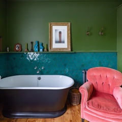
5. The serene simplification
This large bathroom in Minneapolis, USA, previously had way too much going on. The big shower cubicle had a half wall, tiles, ledges, glass and framing, leaving the eye without a calm place to land.
This large bathroom in Minneapolis, USA, previously had way too much going on. The big shower cubicle had a half wall, tiles, ledges, glass and framing, leaving the eye without a calm place to land.
Similarly, the built-in bath, with its fussy panelling, contrasting polished ledge and taps on the outside edge, created a lot of visual clutter.
Designer Victoria Sass of Prospect Refuge Studio fulfilled the homeowners’ brief. “They wanted it to feel like a calm retreat where they could escape their busy days,” she explains. “We wanted to give them an updated fresh and modern look.”
Designer Victoria Sass of Prospect Refuge Studio fulfilled the homeowners’ brief. “They wanted it to feel like a calm retreat where they could escape their busy days,” she explains. “We wanted to give them an updated fresh and modern look.”
And here’s the result. It’s almost unrecognisable, right?
Victoria turned the bath around, giving it a stronger connection to the bigger of the two windows. She also separated it from the shower by choosing a sculptural, freestanding bath. This made the room feel more open and serene.
More: 8 Questions to Ask Your Tiler
Victoria turned the bath around, giving it a stronger connection to the bigger of the two windows. She also separated it from the shower by choosing a sculptural, freestanding bath. This made the room feel more open and serene.
More: 8 Questions to Ask Your Tiler
The new shower is pale, simple and open, with a frameless screen and discreet storage niches tiled to blend in with the walls.
The room’s newly prominent windows, uncluttered layout and pale colour palette create just the airy feeling the owners had asked for.
More: A Dated Space Becomes a Calm Retreat
Tell us…
Which is your favourite transformation and what ideas has it given you for your own bathroom? Let us know in the Comments.

Sponsored
When designer Adam Wollerton of Bathroom Eleven first saw this family bathroom in a Georgian house on the outskirts of west London, what struck him was the space-wasting layout.
The bath jutting out into the middle of the room created a pinch point with the basin…