

Houzz Tour: A Midcentury Home With a Strong Indoor-outdoor Link
A nature-inspired renovation has given this ranch house a relaxed mood and a connection to the outdoors from most rooms

When landscape architect Travis Gramberg and his wife, Aubree, bought their 1960 ranch house in California, they had a strong vision for making it a home that would encourage indoor-outdoor living, but they knew they had a lot of work ahead of them to achieve that. Travis searched for an architect who would share their vision and be open to a close collaboration. From his first conversation with architect Craig O’Connell, he knew he’d found a like-minded designer who could help bring that vision to life.
Craig worked closely with the couple, collaborating on the site planning and exterior architecture, shepherding the down-to-the-studs renovation plans and designing a new primary suite extension. Here’s a look inside the house, where forging strong connections between indoors and out was a priority.
Craig worked closely with the couple, collaborating on the site planning and exterior architecture, shepherding the down-to-the-studs renovation plans and designing a new primary suite extension. Here’s a look inside the house, where forging strong connections between indoors and out was a priority.
“Having a highly open, more modern feeling was important to Travis and Aubree,” Craig says. He took the house (seen here before works) down to the studs to create a better flow. This meant putting all the rooms on the same level, removing walls and raising some of the ceilings for an airier feel.
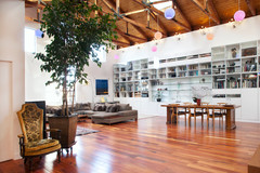
In this view of the home’s interior, the front door can be seen on the left. It remained in the same place, though it was replaced by a stable (split) door, which was on the couple’s wish list. The living room is in the foreground, with the dining area and kitchen at the back. Because the living room had been converted from an old garage during a previous renovation, it was on a different level to the kitchen-diner.
Find a local architect on Houzz.
Craig used new floor framing to bring the living room up to the same level as the kitchen and dining area. “For Travis and Aubree, a [vaulted] ceiling in the living room was an important part of creating a more open, modern space,” he says. The ceiling required new support joists and a new beam to strengthen the structure.
The kitchen has an island containing the sink and a peninsula with seating. The former creates a nice boundary between the kitchen and dining area, and the latter creates delineation between the kitchen and living room.
The kitchen has an island containing the sink and a peninsula with seating. The former creates a nice boundary between the kitchen and dining area, and the latter creates delineation between the kitchen and living room.
The original kitchen had a lower ceiling than the dining area.
Look to the window wall to understand how this photo compares with the previous one. Craig removed the partial walls to completely open up the kitchen, dining room and living room to one another. He brought the kitchen ceiling up to the dining area’s ceiling height for a seamless, fully open feel.
Aubree completed the interior design, and the kitchen is a good example of her refined organic style. For example, the fluting on the island and peninsula bases, as well as the waterfall worktops, elevate the look. “The fluting adds a beautiful texture,” Craig says.
The island worktop is American Mist granite with a brushed finish. The perimeter worktops are Calacatta Neolith. Neolith is an engineered stone that is Greenguard (ensuring low chemical emissions) and Zero Waste certified.
Flush-mounted ceiling lights over the island provide a more minimalist, less cluttered look than pendant lights would have. Flat-front cabinetry, a simple plaster extractor hood and a gridded tile splashback lend a modern vibe.
Cabinets painted in Midnight Spruce, Dunn-Edwards.
Hire a kitchen designer on Houzz.
In the dining room, the chandelier has a strong presence and creates a cosy feel at the dining table. The abstract botanical painting over the sideboard creates another indoor-outdoor connection. And the furniture’s midcentury flair is true to the soul of the 1960 ranch.
The utility room is located behind the fridge wall in the kitchen. It contains additional storage and a sink. The splashback tiling adds a lovely natural element, while the cabinet paint provides dark contrast that works well with the dark appliances.
Cabinets painted in Lunar Eclipse, Dunn-Edwards.
Cabinets painted in Lunar Eclipse, Dunn-Edwards.
In the living room, Craig created a focal point with a new gas fireplace flanked by built-in units for storage and display. The built-ins stand up to the scale of the new vaulted ceiling and are versatile – the left side can be set up as a home bar for entertaining. Vertical slats on the lower cabinets play off the fluted details in the kitchen.
All the windows and doors in the house are new, including these doors that open up the room to a reimagined covered courtyard.
All the windows and doors in the house are new, including these doors that open up the room to a reimagined covered courtyard.
Here’s a look back through those doors from the covered courtyard. Travis added the sideboard, a ready-made piece he sells that contains stainless-steel sealed storage. This protects media equipment, garden toys and even food from the elements. “It also means no spiders get inside,” Travis says.
The garden was originally dominated by this very long covered patio. Craig and Travis agreed to try to work with it for the sake of efficiency, creativity and sustainability. They ended up cutting about 4.5m off the porch roof toward the back of this photo to make room for the new master suite extension.
The exterior of the home has now been painted in Dunn-Edwards’ Black Pool. “Aubree found this colour and it changes with the light throughout the day. Sometimes it’s green, sometimes it’s grey,” Craig says.
Alterations to the existing porch roof included covering it in plywood with battens covering the seams, which was Craig’s idea. Travis came up with the idea to cover the posts in Texas limestone to match other features in the landscape. He wanted to use Italian limestone pavers as the project’s big splurge. “I always tell my clients to invest in the spaces that they’ll use the most, which is what I did here,” Travis says. Aubree pitched in with the furniture layout. The covered patio transformation is a great example of the collaborative design process.
Beyond the porch is the new master suite, connected by a glass breezeway. With the new extension’s design, Craig gave the home an L-shape, which gives the garden a courtyard feel. The extension runs along the other street-facing side of the corner plot, so its placement also provides privacy from the street.
Here’s the view down the new glass breezeway towards the new main bedroom. Aubree flanked the outside of the breezeway with a pair of Jonathan Adler Dora Maar planters. They add an eclectic touch, while Furcraea macdougalii plants, native to Mexico, provide dramatic verticality.
Here’s the view through the breezeway, from the back garden to the side garden, which contains a fire pit, dining area and Travis’s vegetable garden. Large sliding glass doors open to both sides. The portion over the doors conceals ductwork for heating and cooling.
“The glass hallway was Craig’s idea,” Travis says. “It came from me wanting easy access to my vegetable garden from the house. He was always willing to see where the project took us, coming up with ideas and providing his expertise. It was the best kind of collaboration.”
“The glass hallway was Craig’s idea,” Travis says. “It came from me wanting easy access to my vegetable garden from the house. He was always willing to see where the project took us, coming up with ideas and providing his expertise. It was the best kind of collaboration.”
The original house didn’t have a bathroom connected to the main bedroom. Nor did it have a bath tub, something the young, growing family would need. The new master suite extension contains a bedroom, a bathroom containing a bath, a walk-in wardrobe and Aubree’s office. It added 87 sq m of living space to the home.
The addition provides strong connections to the outdoors via the glass breezeway and the bedroom’s French windows, which open to the courtyard deck. The pitched ceiling also contributes to the room’s light and airy feel. Aubree chose a sculptural bed with a scale that matches the soaring height of the room.
While Craig originally designed a large sliding door to separate the bedroom from the bathroom, the couple wound up leaving it open, in a boutique hotel kind of way. There is a separate toilet room within the bathroom that does have a door.
This cedar hot tub is located just through the bedroom’s French windows. This photo also shows how the raised deck’s steps can serve as extra seating when the Grambergs entertain a large group.
Here’s a peek inside Aubree’s new office, which gets lots of natural light. Travis has an office located in the detached garage. Travis’s mother hung all the wallpaper in the house. “She’s a real Jack-of-all-trades and an artist,” he says.
The new bathroom has a pitched ceiling with a skylight. The refined organic look continues in here, with elegant graphic floor tiles, a bubble chandelier and aged brass fixtures. “The floor tiles Aubree found are beautiful. They have an X-shaped brass inlay,” Craig says.
The deep green tiles and wood vanity units feel connected to nature.
The deep green tiles and wood vanity units feel connected to nature.
Aubree came up with the idea for the neon sign in the cloakroom. “It’s sort of an inside joke – often when a client calls to figure out what’s wrong with a plant, I’ll jokingly ask, ‘Well, have you been talking to it?’ before I get to more specific questions,” Travis says. “It became the overarching theme of this house.”
“Travis is so talented and creative, and this was probably the best collaborative experience I’ve ever had,” Craig says. “It was such a great melding of the site planning, the architecture and the landscape architecture – it came together with such a beautiful indoor-outdoor flow.”
In the time since the initial planning began, Travis and Aubree’s family has grown by two – Aubree was expecting their first child early in the design process and, since moving in, they’ve welcomed their second child.
Tell us…
What do you love about this home transformation? Share your thoughts in the Comments.
Who lives here? Travis and Aubree Gramberg with their two young children and two dogs
Location Costa Mesa, California, USA
Size Four bedrooms and two bathrooms; 260 sq m
Architect Craig O’Connell Architecture
Landscape architect Koheid Design
“After” photos by David Duncan Livingston; photo styling by Dorothea Coelho
The original house was 173 sq m, with three bedrooms, one bathroom – which didn’t contain a bath – and a cloakroom. The house sits on a corner plot, and the project included a down-to-the-studs interior renovation, a main suite extension, and a reworking of the landscape. The priority was to forge stronger indoor-outdoor connections.
Travis was impressed by Craig’s collaborative approach and sensed they had similar architectural philosophies and a shared vision for creating synergy between the house and its surroundings.
Craig and Aubree worked well together, too, as she had a strong vision for the interiors and selected the finishes.