


Recent Activity


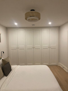
I would paint the shelving unit the same color as the walls.

The appearance of the shelving unit will depend on what kind of containers you put in it. Do you already have those containers or will you be buying new ones? If you want to keep the cards from collecting dust and possibly fading, using closed door storage units like Ikea Pax could work better than open shelving.
https://www.ikea.com/us/en/cat/pax-system-19086/


With some better tile brands you can order some tile pieces that also come finished/glazed on the long edge, short edge or both. You use these as the last tile on the run.
You have to lay this out first or you might end up with some weird cuts in the corners or outer edges.
I'm guessing those two windows are on either side of the french door. Why don't you view them as a set of three and do one curtain panel over each one hung high up to emphasize the height of the ceiling and mimic the height of the french door.
I would change the light fixture to something that does not hang as far down. Use "regal" colors to go with your brown sofa. Wine red/burgandy, navy blues, dark greens, etc.
If you want curtains I was able to do it in my bedroom and hall with a similar setup and a rad! it is not perfect but it looks ok in my opinion.
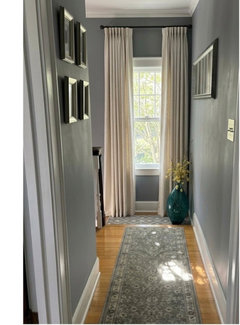
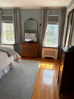

This 1928 room has so much character! I'm a total design newbie from California, but I absolutely love the minimalist vibe you're going for here.
For the 9' ceilings, a smaller brass chandelier would look incredible. It keeps that classic 1920s soul without eating up the personal space like the old giant bronze one. Glass could work too, but brass warmer tones would pair so well with that beautiful vintage chair in the corner!
As for the windows, with that tight 4” space on one side, traditional heavy curtains might look a bit choked and messy. Since you like minimalism, maybe skip the curtains and stick with high-quality blinds or a sleek inside-mount Roman shade? It keeps things clean and balanced.
Can't wait to see how this turns out!
Shirley
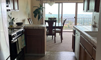
A cart would be a good solution but there isn’t room for one in my small kitchen. When I was meeting with my cabinet designer she commented that she liked working on kitchens like mine because it involved problem solving.
You would keep it here - white circle or on the opposite side.

Many, Many to choose from. Just a suggestion but might not work for you.
Lots to chew on. Thanks to everyone for their advice - much appreciated.

@ed ollie just read through all the comments quickly and wish I had seen this post sooner. What an amazing job you have done to preserve, maintain, and update this treasure. If only everyone viewed home ownership as a responsibility like you do. I also appreciate your use of color in the rooms instead of everything being some version of cream.

Yes. We already have some, but the dining room foyer/landing and guest bedroom remain.
A little mulching and weeding at dusk.
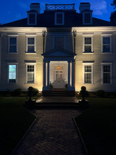

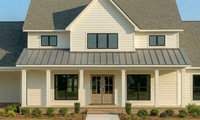
With two gray body tones plus a black metal porch roof, Charcoal tends to tie the blacks together; Pewter Gray keeps the whole house lighter. If the metal porch is truly black, Charcoal usually looks intentional rather than mismatched. Pin a few shingles under the porch edge and step back 20–30 feet — that’s where the blend either works or fights. We’ve run a lot of gray-on-gray roofs at Roofing4US; Charcoal + black metal is the combo people keep once they see it in person.


Update: Thanks so much everyone! Progress update. Before: Blue door, Current: Black. The temps are changing quickly here (I’m close to Toronto). So may not get to rest of painting but happy with progress!


I like the new garage & front door colors. The garage is nothing you want to look at necessarily so let disappear into the background.
ps: I did go read see your previous post and understand why you would make a new one regarding the same topic. That was no longer about you but a pissing contest between some posters. good job

Would you consider replacing the garage door with a wood carriage door? IMHO that would compliment the Tudor revival style of your home.
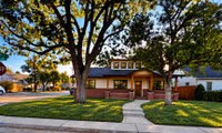

New landscaping as illustrated above combined with a brick and wrought iron fencing solution would protect your property.
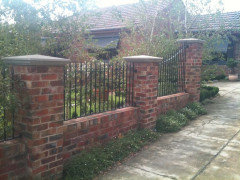

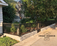

Have you checked with the city to see what the required setbacks are for a fence or landscaping?
I think you need a fence or a hedge but I have no idea about rules where you live. We lived on a corner and there were hedge height restrictions because traffic needed visual . The fence you did looks like there is very little space from fence to house , that could be camera angle ???? Corner lots are ticky often so make sure you check about setbacks etc.


Both the art and the chest are lovely, but the vignette as a whole doesn’t give either of them credit. Is there another place near the dining room (or in dining room) where the art will be more appreciated and you could enhance further by framing and even adding a light.
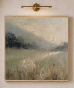
Below is an example of good proportions/balance and the chest will pop. Testing different items is the best way to find the right combination

Maybe use dark accessories to relate to the floors and stairs and to leave the distinctive chest the lighter focal point of the vignette?

As others have said, perhaps the art can find a home in the dining room?

Less is more, Perhaps a bowl on the middle too for keys. Use an accent lamp as the art. Make it blue if you dont want it gold.

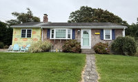

You won't get that authentic New England cottage look with Hardie. I'd go for treated cedar shingles which have a pretty good long-term track record on the Cape. I'd also swap what appears to be a bargain basement housewrap for 15# asphalt-impregnated felt as the underlayment.
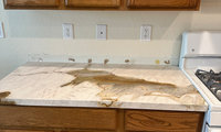

bring home some tile samples.
have you looked at Bedrosians? type in subway tiles. order samples.
this is their Marin in Sand Dollar
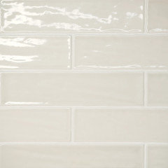
next one is Tilebar, Lancaster
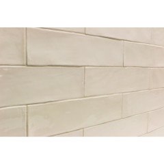
white or cream would work, so would earthy tones. CleTile
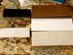
what about hardware? your cabs would benefit immensely w/some pulls.
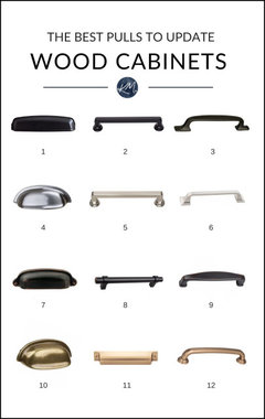
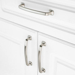
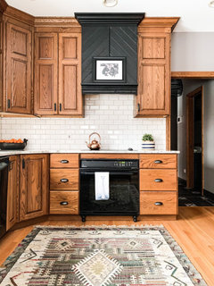
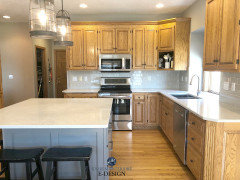
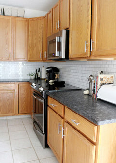
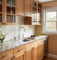
I’ve decided on 3x12 Craft II tiles in Bone. Should I do polished or matte?
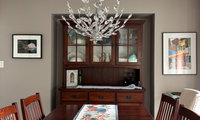
This is a pretty light fixture from Pottery Barn. Might not be shown accurately sized in the picture but you get a good idea of the style with your room. It has shades to reduce the glare you’re experiencing with the current fixture.
I also played around with the wall color.

Has anyone suggested, in addition to other ideas, pinting the inside of the niche a lighter tone of the wall colour?
Jane

@ Susan Rayne Rule #1: never break up a set.
Who is making the rules?
I agree with others that the hutch portion is making the space too heavy. I am not a big fan of mirrors, prefer art, but that is a personal preference - not a rule.
I would add some lighting to the space - like the sconces, but might consider a painting and lighting from above that highlights the art.
Got ChatGPT to create an image with art and lighting - not the art I would have chosen, but good enough for getting an idea of what it would/could look like


I really see no issues with your original chair placement.
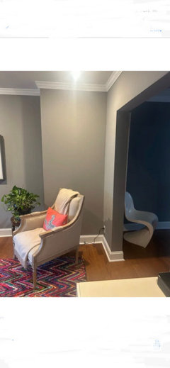
It makes total sense in the space. So it is up to you. You can do it either way... with a lamp behind the chair, or a lamp to the left of the chair and adjacent to the art.

The height you're after is already on that wall above the chair. One vertical 18x24, hung so the bottom sits about 8 inches above the top of the wingback, pulls the eye up toward the crown molding without adding anything to the floor. In a small room, a view with distance in it, like water or a long trail, opens the corner up; the ceramic flowers would add more things to look at. If you want, send me a photo of that wall straight on and I'll tell you the one print and size I'd hang there.
It's hard to see the whole entire place visually without a floorplan. If you can, take a full shot wide angle photo from the front door, turn your phone sideways and hit zoom out (ultra wide) so we can see the left and right sides of the main stairs.
Deciding what to put in the corner or anywhere else depends on how the surrounding looks.
Is it too late to talk you out of the black windows?
House faces east. Plans are finalized, I'm currently in the process of choosing colors. I'm going for a traditional farmhouse look. This is the original inspo picture but I have since decided to do a wood stain front door instead of red.
The all metal roof will put me over budget so I have no choice but to do shingle and only accent with metal.