

Recent Activity
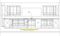


Remove both. Neither mirror reflects anything worth looking at. If you want more light, improve the lighting.


End it where the uppers end, that's what my very experienced tilesetter recommends.
And I wouldn't install the tile vertically. They look to be 2x8 tiles, which is going to be awkward if the space between the upper cabinets and the counter is the standard 18". You'll have little cuts left over at the top, which are going to look bad.


As I commmented earlier up stream, "There is enough wrong about this bathroom design that . . . " I do not feel confident that the rest of the house's design is good and the OP should be open to starting over with a local competent design professional. That being said, in the vacuum the bathroom is presented I offer this concept.


Of the two pendant lights that you show, I like this one the best. It’s a nice choice.
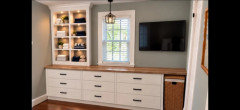
To tell you the truth, though - I, too, am having a hard time wrapping my head around the pendant light idea. I think it does look a bit kitchen-like. I agree that a table lamp there might give you nice light, as well as a nice look. So, it’s another option for you.
If you didn’t have an available outlet, there are battery operated lamps, also.

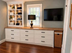
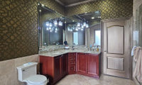

This all comes down to the inches you have. What is the overall length of each leg? Try using blue tape and layout over your current mirror 2 scenarios based on actual product you find - select a medicine cabinet (you need the storage) and a mirror (the mirror would assume a corner tower because again you need the storage). I personally don’t like corner towers for what they do in terms of compartmentalizing your 2 sides. It will make each side feel smaller. Open shelves just look cluttered but you will find that by going with 2 smaller mirrors or medicine cabinets that the corner will feel ‘bare’. Emily’s image shows a large floral arrangement to try to counter this but is that something you would actually do? Try the blue tape to get a feel for it. Jehanz you haven’t mentioned if you are open to going down to one sink? You’ve ruled this out? This bathroom I worked on years ago had a limited footprint so the client went with a trough type sink with 2 faucets and a large medicine cabinet. However, this overall length was about 58-60”. Again, it all comes down to the inches you have. Try the blue tape which will help you visualize it.
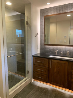
Note: The above scenario was custom (in order to make that particular sink work with maximized drawer space). Also, this particular client could not do sconces or lighted mirrors due to eye issues so the custom solution was to hide tape light behind a custom wood frame detail surrounding the triple medicine cabinet. Since the vanity was sandwiched between 2 walls one would never see the sides….I’m not suggesting this medicine cabinet / light detail for you - just to show you that you could significantly increase your storage and maybe still have 2 faucets if you think outside the box of what you currently have.

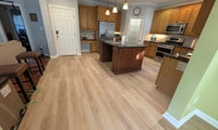

I like the green that Emily has selected in her rendition but will suggest that you also paint the island the same color as the rest of the cabinetry. That will help eliminate the difference between cabinetry and flooring altogether.
Emily’s AI image removed the cherry toned wood floors in the adjacent area. I think it’s going to look like 2 different homes unless you either continue the same flooring like Emily’s image or you keep some cherry toned wood in the kitchen. Either way, it’s not ideal to have fake wood floor right next to real wood.


I have sprinklers running through there also that need capping
thank you.. what about 40 inch
That works as well!

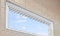

Most of that wood, is the window stops and the sash by all appearances and that cannot be changed out. If something fdifferent you need to show us exactly what your speaking about. Only real option is replacing the window in its entirety.
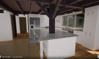
These people are crazy - that island is amazing and I love the character. I definitly would not go down on the size. I love how it creates separation from the cooking area and the dining area, so I could see when you have people over lining up food or drinks there - very useful. If you ever want to post a finished photo I'd love to see it! I came across this because I am trying to decide on a post size for my kitchen as well. The style I always gravitate to for islands is a lighter, more furiniture feel, I am not a fan of the solid wall type ends to an island that makes the whole thing look like a big heavy block. Also, from a practical perspectinve, with a leg there is a lot more versatility for someone to pull up a stool on the end since it's more open, but with a wall, it just wastes the end space. When you have lots of people over or kids around, someone always pulls up a stool to the "unintended" side and they either crush their knees against a solid wall, or have it open with a post... I would definnitly choose a post!
Pine tree this was from 2 years ago
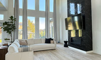

I like Emily’s warm wood direction. The one thing I’d watch with art here is the hanging height. That little window draws your eye way up, but the picture will feel more connected to the entry if it sits closer to the console. You can leave plenty of empty wall above it.
I’d try one vertical piece with a thin dark frame to pick up the black fireplace. Something with warm ivory and a little charcoal or muted green could work with your floor without making the entry feel too stark.
Before ordering, tape out the size on that wall and look at it both from the front door and from the living room. I’d choose the console first, then size the art around it. Do you know the width of that wall section?
Photo did not post - you can reply in the comments here with a photo. Best for us to know what your floor and vanity is in order to help with a paint recommendation.
Also post a picture of the room the way it is now too.
It is very common to use plywood of the same thickness in the center of rooms (where an area rug would cover it) and the finished wood around the perimeter.
Just make sure the rugs fully cover the plywood area by at least 6”. The technique is called a Yankee floor.
If you're selling the home next year, then install a good quality wall to wall carpet in the two bedrooms. Do you really want to spend all that time and money, not to mention the mess, of replacing the floor?
More info relating to using unfinished engineered upstairs. Bona DriDast Stain line has 26 blendable colors to match your existing floor. Then absolutely use their Natural sealer, sand to knock down the grain raised from water borne product and two coats of Traffic HD. Here's Matt doing this.`
.
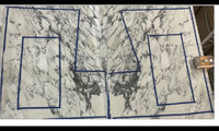
I’m imagining you have more than those two slabs for your project? Are the counters the same material? I personally don’t like the look of the butterfly pelvis but that’s me. Just wondering if you have options…

Beautiful stone. Glad your not going with a pot filler.
@chispa I see a pelvis too.
Do you really want to cook in front of a giant pelvis?
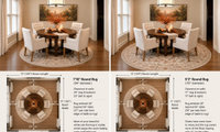
I do think a rug would be nice for your room - and definitely the 9’ dia one.
And my suggestion would be to pivot the table so the chairs are placed like an x in the room (backs to the 4 corners not backs to the walls). It is a much better look.
How about a 9x9 square rug?
If you decide on no rug, this looks like a perfect spot for a pretty color on the walls….on a nice day with the windows uncovered …the room soul could have a pretty. glow ..when you enter the house glow
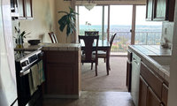
If you have room to shift the dining about 2’ closer to the living area you could continue the kitchen counter and overheads all the way to the screen door wall. Nice spot for a coffee station or a buffet when entertaining and what nice storage.
@thinkdesignlive: That's a great idea, but I would recommend a beautiful wide sideboard rather than a continuation of cabinets--just to add more elegance to the dining end.
Lots to chew on. Thanks to everyone for their advice - much appreciated.
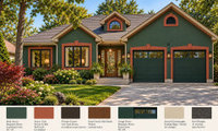
Are you changing out all your windows to black? Are your existing white ones actually paintable?
Interesting!!
I prefer the color scheme presented by @Diana Bier Interiors, LLC if I understand the doorway area can be a contrasting wood to provide contrast and draw attention to the home entrance as your focal point. I like the multiple shades of green and black(?) windows. They give depth and interest even better than contrasting trim. I don't like the beige with this at all. Green/black/charcoal look great but not the beige. A midtone cool-grey roof and not a greige roof will look very sharp and put-together with the greens. The best way to view something like this is in late winter when the landscaping looks awful. If the house colors look good then, you have a winner. All this added AI landscaping could make a cattle shelter look good.
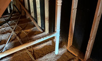
Licensed plumber here (Rim Country Plumbing Co., Payson AZ) — gurgling plus sewer odor in a house with AAVs everywhere and no open vent through the roof is a textbook venting problem. AAVs let air IN when water drains, but they don't let air OUT, so positive pressure from a flushing toilet or a pumping ejector has nowhere to go except back through your trap seals. That bubbling is air pushing through the water in your traps, and once a trap gets blown or siphoned dry, sewer gas follows.
A few things I'd check in this order:
- Confirm there really is no open vent through the roof. Most codes require at least one vent terminating outdoors — a house vented entirely on AAVs is usually a sign of unpermitted work.
- That basement sump is likely a sewage ejector. If its check valve is failing, the basin fills with wastewater, the pump short-cycles, and it burps gas back through the drains. If the gurgling gets worse when the pump runs, that's your culprit.
- Don't skip the simple stuff: a rocking toilet with a failed wax ring will seep odor too.
Honestly this is a call-a-licensed-plumber situation — a smoke test pinpoints exactly where the gas is getting in, and adding one proper through-roof vent often fixes the whole house. Not a DIY fix, and this isn't one to let ride, since sewer gas isn't just smelly.

What if you design this new section on the left to have 2 refrigerator drawers for your items you’d like to have on hand for everyday and then design a large refrigerator/freezer in the pantry? Also, the upper cabinets in this option seem to compete the least with the 3 transom windows:
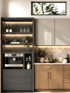
Note that AI placed the built-in coffee machine in your rendering too low to be used comfortably/safely ... unless you want small kids to have access to hot liquids.
What don't you like about the current location of the fridge?
I agree with the others - I would hate having a fridge that far out of the kitchen.
The thing that first strikes me about your upper cabinets is how high they are. I'm short, and I am not confident I could even reach into them. I would remove the uppers and the shelves in a hot minute. Unfortunately I don't have any great ideas on what color would be appropriate.
I'm curious - what does that wall look like from the outside? Isn't it weird having the range hood vent sticking out right under the middle window?
Have you ever used the pot filler?


The OP wrote "Favorite colors: olive/dark green and rusty/dried leaves orange colors."
Have you considered buying your bedding first, then picking a paint color from the bedding colors?
Edited to add: Here's an example of a lively orange autumn print that gives you several color options for paint:
https://www.overstock.com/Bedding-Bath/Picadilly-Queen-Quilt-4-pc-Set/18684346
I would not do that stone on your sink wall. It doesn’t look ‘architectural’ but rather decorative and with the pass through cut out it will be a very awkward look.
Not to mention very busy looking knowing you have glass fronted cabinets. What was the plan for the range wall? What will your floors be?
I wouldn't do it.
If you are going to do it anyway, then make sure you pull your base cabinets forwards a few inches so you have a slightly deeper counter to allow enough space for your kitchen faucet with the thicker backsplash material behind it.
I have a similar sink/ window wall and I pulled my lower cabinets forwards 3". I wish I had added a few more inches. I have a marble mosaic backsplash, but I put the 3 cm Taj Mahal quartzite counter material under the window.
Personally I would do the same backsplash you are doing behind the stove and have more cabinets around your sink.