

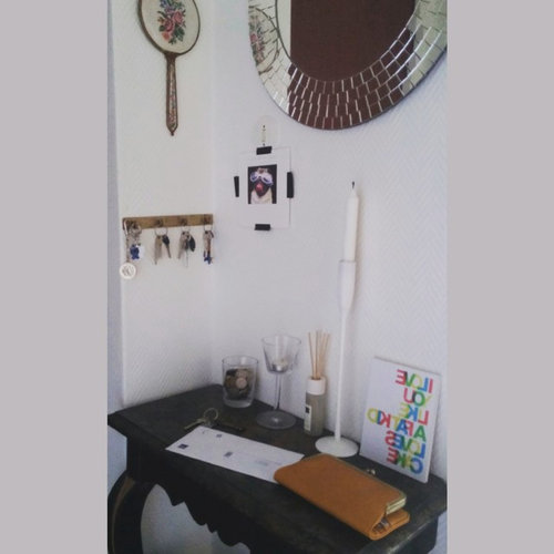
help with hallway
11 years ago
Featured Answer
Sort by:Oldest
Comments (8)
 11 years ago
- 11 years ago
Related Discussions
Help - Hallway, Stairs and Landing Ideas
Comments (29)If you like sage green, use sage green! The hall looks a little dark in places and all the wisdom from designers is that if it is dark, it is dark and no amount of bright colours will change it; they will look less bright in the dark - which equals dark. Go with it and use your favourite green or an even darker shade. Green is about to be very big; be ahead of the curve! It's also really hard to imagine it not being dark but as soon as you have some furniture in there, and some pictures or other things on the walls, it will look interesting and have a bit of a visual lift. Put up a couple of mirrors, too, to reflect the light which will make it seem lighter - you could have one on the right of the stairs so it reflects a little from the window and one on the wall in the main section near the front door. Have a bit of fun with it. It's where everyone arrives - cosy is very welcoming all year round....See MoreHelp with hall/stairs/landing
Comments (3)I'd go for option B. I think you need some hint of another colour, but I can understand your dislike of coloured walls and wallpaper (you're not alone in the wallpaper loathing!) Other than a greig colour, have you though of something a bit like F&B Dimity? which will give you the contrast between your white woodwork and the walls, whilst still keeping it pale and neutral, but adding a bit of warmth to counter of the lack of natural light. I think it will also compliment your new travertine...See MoreHelp decorating hallway
Comments (2)Hi Jenny, Great hooks! Sure, they will fit perfectly well while opposite. The weight of 17.5kg is okay, you should use adequate plugs. Good luck! Paintforme...See MoreHelp with hallway
Comments (20)What a terrifically interesting hall. I assume from the side table that you’re in Britain. I have a good sized L-shaped hall with a northern aspect on the larger side of the L. I’ve recently painted the whole, including above the picture rails and ceiling, with F&B Pavilion Blue, a pale cool colour that makes the whole lighter and delightfully open. It’s more a colour I’d describe as very very pale aqua, actually, and doesn’t strike me as a blue. My doors are painted F&B Green Blue, which is a lovely velvety looking middle tone colour, in gloss, and looks great with the wall colour. My floor is a medium tone Karndean LVT Honey Oak planking, and I have a very old, faded rusty tones floor runner. My ceilings are 11 feet high, but the pale colour works really well, especially as the picture rails and foot high skirtings almost exactly match the walls. They’re done in Dulux gloss from the archived Georgian Heritage range, in Georgian 19. I really like how open it all seems, and my narrow mahogany cabinet and side table look wonderful against it all. Colour is such a personal thing, and it does take courage to make radical changes. I’d advise looking at colours you already favour when you see others’ homes, and then look at the aspect of those homes, and how much light they have, etc. As to the curtains, they do rather spoil the line of the walls, so perhaps blinds in a fabric picking up the colour of your walls/ceiling/paintwork in the pattern, would look good. And paler colours throughout would show up your beautiful hall furniture, too. But good luck, as it’s actually quite a tedious business making decisions that have to last years for most of us. I’m already fed up with it all, having done two areas, and with several more to go, it being 20 years since we last did it all…so it’s pretty shabby!...See More- 11 years ago
- 11 years ago
- 11 years ago
 11 years ago
 11 years ago


Rise Art