hawleyjulie

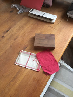
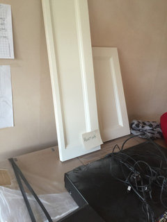
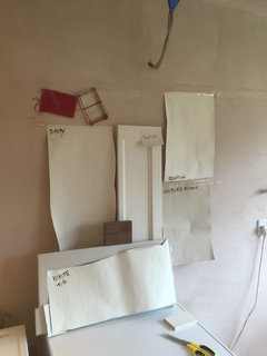
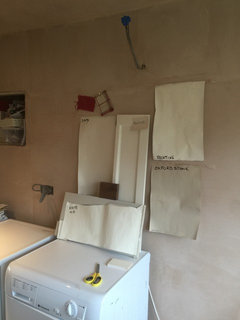
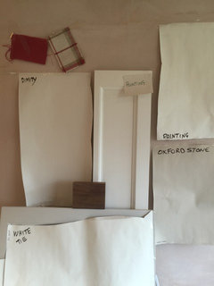
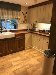
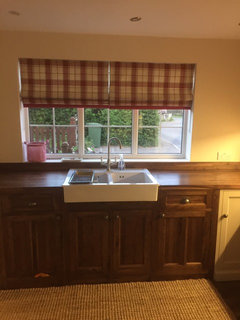
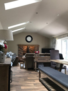
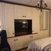
Help with kitchen please

hawleyjulie
8 years ago
After lots of tester pots with farrow and ball we have decided to go ( I think!) with one of these
Pointing, skimming stone or Joas White although we seem to keep going back to pointing!
We will have walnut worktops and a similar floor
I need advice on what colours/ accessories to create a country kitchen as the house is a cottage/ farm
The lounge which is the nearest room is decorated in LAURA Ashley (cranberry accents) would like it to flow if possible
Really stuck on this need some inspiration
Any advice gratefully welcome
I've attached some pics
The sketch is of one wall in kitchen where range is going (black)

Comments (33)

  • Najeebah
    8 years ago
    hello. of the paints, I like joas white the most, with pointing a close second. I love the table, and think all flooring choices you've displayed would work well. Will the units around the range be wood/ painted? are you able to post any pictures of the lounge? If you've not yet decided on seating in the kitchen, that is one area you can 'tie in' the kithen and lounge decor/ furniture. depending on the window covering you're using in the lounge, you may be able to use a similar one in the kitchen. how closely situated are the spaces?
  • hawleyjulie
    Original Author
    8 years ago
    Thank you
    Was worried Joas White looked too pinky in different lights
    Was looking at the pointing as I may have better colour choice in future
    Just not sure what to put with it
    Red sounds a bit in your face ?
    I will need blinds rather than curtains I think for practicality so maybe bring colour in there
    Not got many pics as house being renovated but will try to pop on what I can
    Wallpaper is LAURA Ashley
    The room is next to kitchen seperate with stairs which will be again LAURA Ashley pussy willow dove grey/ off white
    Sounds terrible when it's written down
  • Related Discussions

    Need help with my kitchen please

    Q

    Comments (2)
    I can't see a link to the kitchen but a pale blue would work if you don't like bright colours, and want something on trend. Cottage colours I.e warm pastels could work but it depends on the kitchen style I.e contemporary or modern/traditional.
    ...See More

    Help with kitchen ideas please

    Q

    Comments (4)
    If you have granite work top or you having an upstand around the counter so you will not need tiles around the splash back. Keep the floor tiles neutral as these are a big expense and not easily changed. You can then add colour with paint & possibly a feature wall, these are much less expensive to change & you can easily create a wow factor. Good luck
    ...See More

    help with my kitchen please

    Q

    Comments (12)
    Hi. I think I'd go for a green with the wood and floor, perhaps a pistachio, Apple or cool sage. I like Carolins runner idea as you're a little limited as to what you can add in the space and be left with counter space. Is there space over the window for a vintage sign? Perhaps a small vase of flowers where the butter dish is. Can you put hooks over the pipes and add a couple of colourful colanders to detract from the boiler? Maybe some cake tins etc on top of the wall units? Do you have a ceiling light at all? What does the inside of the wall cupboard look like? You might be able to take off the doors of one (and store!) and add lots of vintage accessories
    ...See More

    Help with kitchen lighting please

    Q

    Comments (4)
    https://www.houzz.co.uk/magazine/11-ideas-to-help-you-choose-your-kitchen-lighting-stsetivw-vs~108993245 https://www.houzz.co.uk/magazine/kitchen-planning-how-to-light-your-kitchen-for-maximum-impact-stsetivw-vs~42169864 There are quite a few kitchen lighting stories as well for more ideas. But I found taking a floor plan and adding bits helped me see which areas needed something else otherwise they’d be dark.
    ...See More
  • hawleyjulie
    Original Author
    8 years ago
    Paper in lounge
  • Najeebah
    8 years ago
    do you have furniture in the lounge? what do you think of wood and reddish seating in the kitchen
  • Lynne Mellis
    8 years ago
    If you have room in your kitchen for a piece of free standing furniture like a larder cupboard? If you do paint it in the cranberry and tie the colour into window and chair treatments (even if it's just cushions or towels).
  • hawleyjulie
    Original Author
    8 years ago
    Also I had picked the black handles not wood?
  • Amanda Robinson
    8 years ago
    last modified: 8 years ago

    Just thought I'd mention this to help. I have JW in my sitting room. Sometimes it looks a stony colour, other times there's a definite pink to it and it looks very 'warm'- with your walnut w'tops it may look too warm? I like JW when it's stony and our sofas are the exact same colour hence the choice. A friend of mine has gone the SK route, this has a more neutral but modern feel. There's both blue and magenta in SK. Pointing is one I looked at but it was too light and in sunlight looked very pink! If I had daughters, I would paint their b'rooms with this. F&B colours are great and their website the best for working out colour schemes but their colours can change dramatically whilst in situ. You're going for a country feel (love the table), I agree with the comment above re a more 'aged' colour such as Tallow with cranberry accents (paint the table legs?)

  • Jonathan
    8 years ago
    I also vote Tallow.
    I like Calamine and Dimpse for wall colours in your kitchen so that the kitchen looks like it came from the same imagination as the next room.
    In you lounge I wonder if it is Joas white next to your cranberry paper? It may be the resolution on my screen but to me the cranberry paper makes the neutral paint look peach (equally it might be the electric light) and perhaps a cleaner white would sit better (or a white with green tones).
  • hawleyjulie
    Original Author
    8 years ago
    Thank you
    Think it's the light in the lounge as the paint is LAURA Ashley
    Think I'll get a tallow sample pot !
    So it's between those two now
    Nearly there
  • ali270
    8 years ago

    I know your dilemma , I had the same problem choosing a colour that looked right in all lights . Tried pointing...too light and almost garish in sunlight , then went for fawn...looked sludgy on dull days ....tallow turned out pale cream...went on to skimming stone which I liked but eventually settled for shaded white , a lovely neutral , neither pink nor cream in tone and goes well with the raspberry tulip design on my kitchen blind . Good luck!

  • hawleyjulie
    Original Author
    8 years ago
    Thank Ali
    Tallow does look creamy but it's a very difficult decision and expensive mistake if I get it wrong
    Do you have shaded white on kitchen units or walls?
    I need a colour for units to go with walnut tops and floor?
    And then a contrast for walls
  • hawleyjulie
    Original Author
    8 years ago
    Anyone used clunch? On units?
  • ali270
    8 years ago

    My kitchen units are painted shaded white , walls painted Dulux vintage in linen , work tops are dark brown , blinds have some raspberry colour in them . The whole effect is fresh and light . However colour schemes are so subjective . All I can say is go with heart and some head !

    As to clunch....yes , in two bedrooms I have painted old orange pine ( yuk ) furniture in clunch . It's a colour that seems to go with everything .

    i have tried to send you a photo but since Houzz changed their website can't seem to manage it !!! Will keep trying !

  • ali270
    8 years ago

    Yay ! Managed a photo . Hope this helps with your decision .

  • PRO
    Katherina Saunders Design
    8 years ago

    Hi there, poor you, it is a nightmare choosing colours! I always use Pointing on the ceilings as it works really well with the lighting. Colours always look different depending on the light, so my suggestion is put a swatch of the colour on all the walls, as you will be amazed at how the colours change!

    good luck!

  • hawleyjulie
    Original Author
    8 years ago
    That looks great so now I'm leaning towards
    Shaded white or clunch
    Pointing on ceilings a good idea!
    On my god what a dilemma
    I will get those this week and then hopefully can decide
    Thanks guys!
    X
  • Pat Tucker
    8 years ago
    I am just repainting my kitchen. It has been in Farrow Cream for a few years and I have chosen F&B Clunch this time.
  • hawleyjulie
    Original Author
    8 years ago
    Yes that's lovely thank you
    Do you find its light?
  • Pat Tucker
    8 years ago
    I am just about to repaint...picked paint up today!
  • hawleyjulie
    Original Author
    8 years ago
    Think I'm going for clunch!!
    Let me know what yours looks like please
    What colour are you painting wall ?
    I've got cranberry accessories ?
  • Lindsey Pearce
    8 years ago
    Hi just reading your notes, I think the pointing would be too modern and white. What are the colours on the walls in the lounge? Might be fun to carry this through to the kitchen either on the walls or as the cupboard colour.

    I love the dark wood vinyl and dark wood worktops but think it will need more strength if colour to tie these two toghter, eg may be a warm Charleston Grey on the cupboards which would smart although still traditional then pale off white skimming stone on the walls. It might be too darker but it would look great.

    A red strip linen fabric at the Windows would link the two rooms together.

    Happy to help

    Lindsey
  • hawleyjulie
    Original Author
    8 years ago
    Thanks Lindsey
    I tried the grey but it looks cold in the kitchen and has lots different tones as day goes on
    I'll pop a pic of the room so far - it's a bit bare but had issues with carpet so only half room done - not got round to finding boxes with everything in yet
    What I was thinking was pale kitchen but the boot room would be mainly wood with bits of the White/ cream?
    I need to pick the unit colour soon as it's being made now
    I've ordered blinds for kitchen and will put pic on of that
    It's the units and walls I stuck with
  • hawleyjulie
    Original Author
    8 years ago
    Blinds for kitchen
    Units colour
  • Lindsey Pearce
    8 years ago
    Hi linen check fabric looks good but would be concerned tattle clunch might look green in some light ! It might be better with white tie if you like the creamy colour or stony ground. It's very difficult to give you advice without having the samples of wallpaper and wood worktop in front of me

    I do sometimes goggle rooms or kitchens painted in farrow and ball white tie for example lots of images come up it also might be worth calling farrow and ball direct as they offer a great service on the tel for free

    Am assuming you are using an water based eggshell from farrow and ball and not colour matching the paint !otherwise all your work will be in vain as colour matching paint will never be the same as buying the paint from farrow and ball

    Advice don't paint the wall in any farrow and ball tester pots paint some lining paper or card board then you can move the board around the room and see the colour in different day light and in the evening in artificial light. Also means you can then save your £3.50 pot on the board ready to use in another room or lend to a friend.

    If you paint squares of colours all over the wall then it will only confuse you and it's difficult to paint over


    Farrow and ball paint is brilliant but never colour match

    Best of luck wish I could help you further

    Lindsey
  • Pat Tucker
    8 years ago
    Hi Julie
    When thinking about repainting, my overall intention was for grey for the units, but like you found, it made everything look so cold. We use the kitchen/family room all the time so I wanted a warm feel.

    The material you have chosen, white with red stripe is what I am using when the kitchen is painted...with Clunch. I also have a red rug in front of the sofa area in the kitchen...
  • hawleyjulie
    Original Author
    8 years ago
    Thank you
    I've kept looking at them in the light and clunch seems to be the softer colour
    So possibly go with that
    It looks more country
    I just need to make sure the wall and ceiling colours are bang on
  • hawleyjulie
    Original Author
    8 years ago
    I'm down to last few now
    Was looking at possibly dimity for units and
    Pointing for ceiling and woodwork?
    Maybe Joas White or Oxford stone on walls?
    Or white Tie a possibility?
  • Bronagh Hanna
    5 years ago

    Julie, I am in the same boat and I can't decide on dimity, clunch, Joa's White or to go the green and grays. What did you do in the end?

  • hawleyjulie
    Original Author
    5 years ago
    Hi Bronagh
    It’s a while since we did it but in the end I used
    Oxford stone on walls and ceilings London stone on wall with log burner on
    Pointing on doors/ skirting
    Joas in the kitchen part where sink is
    Photos not great but Oxford stone has to be my all time favourite
    I used what I had left to do a spare room and the colour is so great it goes with anything
    I’ll add some pics for you xx
  • hawleyjulie
    Original Author
    5 years ago
    Some more shots
  • hawleyjulie
    Original Author
    5 years ago
    I’ve just decorated another house and used little green paints
    Have to say they very nice too so you could try them also ?
    Good luck with it
  • Bronagh Hanna
    5 years ago

    Thank you so much Julie, your house looks gorgeous. I love oxford stone also but I am afraid it may be a bit dark for the kitchen cabinets. I need to make a decision over the weekend as the Man in a Van is due to collect the doors to respray next week.

    Many thanks for your suggestions.


    Kind regards

    Bronagh

United Kingdom
Tailor my experience with cookies

Houzz uses cookies and similar technologies to personalise my experience, serve me relevant content, and improve Houzz products and services. By clicking ‘Accept’ I agree to this, as further described in the Houzz Cookie Policy. I can reject non-essential cookies by clicking ‘Manage Preferences’.