mml235

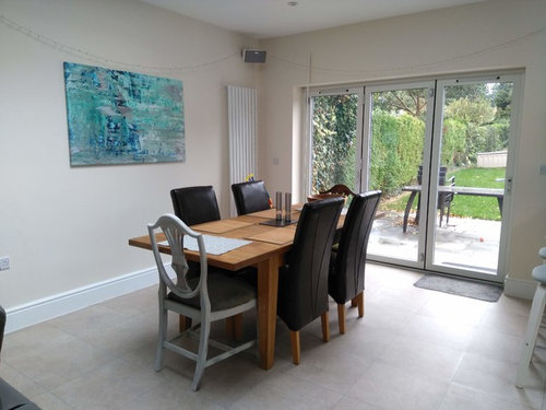
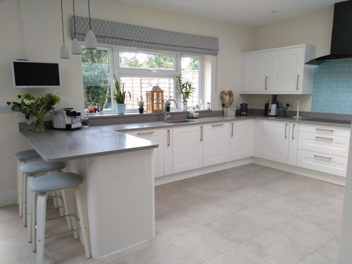
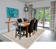
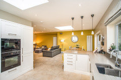
Kitchen Diner needing some warmth...

mml235
5 years ago

Hi there

Ok, so I have been a houzz member for years and have never requested help, but I really am in need of some suggestions please!

Over a year ago, we had a wrap around single storey extension built to house a second bathroom, utility, a kitchen diner, and family room seating area. I have struggled with the soft furnishings and accessories to finish it all off to my liking.

In hindsight I should have gone for either a wooden type floor or worktop. The flooring is LVT and the worktop Quartz. Along with the main colours bieng cream, grey & blue the overall feel of the room is cold, which is exactly what I didn’t want (wish I had Oneplan in my corner!)

On the plus side, we have an oak dining table, and so I attempted to bring the wooden theme into the kitchen area using accessories, however there are probably too many nick nacks laying around, which I also wanted to avoid. I have been yo yoing back and forth to every home store you can think of, only to return goods for one reason or another.


So, in summary I’m looking for any ideas or suggestions that would bring the whole area together creating a warmer cosy feel.

Right now we don’t have the budget to change the floor or worktop and therefore probably need a miracle to gain the look I'm after-ha! Long term we’ll change the worktop to an ash/oak or grey wood finish.

BTW I’m in the process of having the same blind made for the bi fold doors that is currently over the kitchen window.

Please help a desperate woman regain her sanity…:)

Comments (46)

  • Sarah West
    5 years ago
    It’s a lovely space, but you have a lot of large blocks of single colour and a cool colour scheme. I’d get out a mood board and add the things you can’t change, like counter tops and the like, then mess around with a colour wheel and some textures until you feel something pop out at you that you like. I’d be tempted to change the cream to a slightly warmer shade and add some texture from wall paper. Add in some plants and photos/artwork to give it life. The one blue art you have on the wall is slightly lost. Keep it but add others around it to make the illusion of a bigger piece. Dining rooms inspire conversation and appetites more when they are red or yellow toned, and yellow tones work really well with grey and blue. Perhaps experiment with some rich gold, brass or mustard shades in wallpaper to add texture.
    mml235 thanked Sarah West
  • mml235
    Original Author
    5 years ago

    Thanks Sarah. So I'm guessing I'd need to add wallpaper to the wall with the blue canvas? You know I love yellow and tried to incorporate it into the space, but felt it was just another colour that confused me with everything else not blending...I love the idea of a mood board and just googled it to see if I knew where to start with one...ummm not sure about that. Gold, brass, would that really go with the stainless steel handles and kitchen sink? Do you have any examples? :)

  • Related Discussions

    Help needed for open plan kitchen lounge diner floor

    Q

    Comments (17)
    Thanks urban space - we don't have under floor heating and the wood floor we had fitted about 5/6 yrs ago has been a nightmare. We did have an expansion joint but had so much movement and warping. We had the company back out beginning of this year and we had wanted to have a new floor at that stage but they said they could put right the existing one. Not sure on the technical term for what they did but they effectively relaid/ straightened it and used a resin with wood chips in to fill the gaps so you couldn't see them but within 5/6 months we have movement again and now all this resin is starting to rise out the top. For that reason I'm just not prepared to have a proper wood floor again - it might be down to the fitters but it has been extremely costly. By the time you add our dog into the mix and the scratches he has added to it I think a fake wood effect is the way to go for us
    ...See More

    Kitchen DIner Extention Inspiration needed
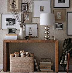
    Q

    Comments (12)
    Yes I liked the first pic just with the dark greys. The dishes will look great on the wall! If you do want to add colour though why not just build on the green and blue accessories you have? Perhaps add a large piece of art over the sofa in deep greens and blue? It doesn't have to be botanical, an abstract might also work. I quite like this one on the link. Then pick up the colour for a cushion another geometric or an ikat could work, maybe with a little fuschia in. I agree with MATH, I might move the fridge to the opposite wall. It's hard to tell from the pics what's there though. You could always buy a plantation style screen to hide it and maybe paint it in a deep Caribbean blue. I like your light but wonder if the room needs something more substantial like a large wooden/ply style? I'm not sure if tiles are needed as you've got an upstand and splashblack? The splashblack may break it up a bit? I personally quite like that wall white as the boiler blends in https://attikoart.com/collections/all/products/marino-stone
    ...See More

    need help with my kitchen diner extension!

    Q

    Comments (9)
    Thank you to respondees. I have my washing machine and tumble dryer in the garage. I will try to get a rough sketch of layout and sizes but original kitchen and diner is @ 6m long and 3m wide. I will definitely check out your websites for inspiration. Meantime, I have three main questions 1. Is there a general size for a dining room to accommodate a ten seater table? 2. I have drainpipes and drains outside my kitchen which I'm guessing would need rerouted. I heard this might cost £3000! Any comments would be gratefully received.3. This will be north facing so I hoped to get Kingspan super cosy insulation. I was wondering if I might be wise to get a wood frame also for fuel economy. Is this also cheaper and is it possible to get a kit? Thank you so much for any help.
    ...See More

    How to Need to decide on flooring - for an open plan kitchen diner s

    Q

    Comments (4)
    You'll see every single little bit of dust on a really dark floor. Especially if it's a really bright room. But I do like the Blackened Spa. Having said that, I'd go for a lighter colour that isn't too orange (I think the Royal oak is too orange). I'd probably go for something like Pale Ash, from the same range.
    ...See More
  • K D
    5 years ago
    How about a rug under the dining table to add a bit of colour there and break up the floor?
    mml235 thanked K D
  • Ste Stanley
    5 years ago
    The tiles above the cooker look great. The complimentary colour to that on a colour wheel would be orange so until you can introduce more wood through changing worktops and/or flooring why not consider painting the walls a bold orange? Something warm and zesty. If you’re not sure you could try just the wall next to the dining table. Then some orange kitchen accessories could be introduced to tie it in. Really nice space by the way!
    mml235 thanked Ste Stanley
  • Juliet Docherty
    5 years ago

    If a space feels cold, then usually materials are a good solution. To me, the pale blue/turquoise confuses things a little. There is a slight clash of creams and cool grey but the cold blue really confuses it even further. I would keep things neutral but change the materials and tones. A large round sisal rug in the kitchen area would break up the angles and add some warmth and texture. Eventually maybe oak bar stools or brown leather would work? I wouldn't replace the worktops as I think you can get it to work. Colour in the form of warm texture would feel warmer in my opinion than just 'pops' of colour. A more cool neutral wall colour on two walls, balanced by a dark contrasting colour on the cooker and picture wall would be my suggestion. Even a chocolatey colour like the one below would then be a great backdrop to some orange and give some warmth. Warmth doesn't just come from colour it can come from tone.


    mml235 thanked Juliet Docherty
  • A B
    5 years ago

    Your kitchen is lovely. To me the dining area really doesn't work with it though. The orange wood of the table, and the heavy black leather chairs and sofa. I also think the art is too strong on its own. I would possibly add a few more softer blue accessories like your plant pot on the windowsill. I think the I would get a set of the grey and white dining chair that you already have, and a grey wood or glass/metallic dining table. A large faded blue tone rug under the table could tie the space together. To add warmth I'd have a small console/sideboard etc on the dining room wall, and have more pictures there instead of just one large one. Finally a sandy/beige sofa would add warmth to the space.


    Struggling to find some good pics but this kind of idea:


    mml235 thanked A B
  • mml235
    Original Author
    5 years ago

    Thanks KD & Ste Stanley for your responses.

    Wow orange! The thought of incorporating that into this space scares me, but I’m happy to include it as a possibility. I would really love to be that bold, although choosing the wrong tone could make it go horribly wrong….any orange or mustard paint colour suggestions?

    As for the blue, I really love the colour but feel that could be part of the issue. The splashback is tiled (and budget is low) so I’d need to paint it, and if so should it be the same colour as the wall it’s on?

    Colourhappy

    I like the idea of 2 neutral walls and 1 or 2 walls with something more bold, but I thought the cream already used is neutral? It’s Dulux Natural Calico. Is this cool/neutral? If I was left to my own devices I would probably choose a grey shade for the bold/darker wall colour, or would that be too much grey in this room?

    Do you have any colour examples for quote

    ‘Colour in the form of warm texture. And a more cool neutral wall colour on two walls, balanced by a dark contrasting colour on the cooker and picture wall’.

    Sorry for all the questions, I’m really trying to understand this as I know it’s important and makes the world of difference...It's all about the tone :)

  • kikiamack
    5 years ago
    I think that the painting in the dining room is restricting your ability to warm up the space, as it is a “cool” picture. Maybe take it off the wall for a few days or replace it with another picture you might have to see if that helps. Also I think that the leather dining chairs are too heavy and jar against the lightness of the kitchen. Can you afford to replace them? I agree with all the comments about use of wood and natural materials to add warmth. I also think that a muted pale terracotta would work. I’ve included a picture with mixed dining chairs to show muted terracotta working with blue in a fairly clinical space. The overall result does not in any way look clinical though.
    My Houzz: Renovated Farmhouse Merges Historic and Modern Elements · More Info
    mml235 thanked kikiamack
  • kikiamack
    5 years ago
    I just wanted to add this picture as well to show muted terracotta with colours similar to your kitchen. They’ve also added a muted mustard yellow.
    Jennifer & Steve's Kitchen · More Info
    mml235 thanked kikiamack
  • Emmanuelle
    5 years ago
    Lovely space! To me, your kitchen area is great and I wouldn’t do much in there! The dining area looks too ‘new’! I think I would remove the leather chairs and the turquoise art. I would try to add ‘old wood’ somehow... old wooden or rattan chairs, mix with contemporary ones, couple of sheep skins or bright cushions on them; add plants...
    What about a ledge, along the whole back wall to display photos, art, small objects, pottery pots, small brass mirror, small plants...?
    I agree with colourhappy, I would paint the back wall a darker colour: mouse’s back, from F& B ?
    Above all, do it little by little, not in a one big shopping spree! And check your thrift shops! Old stuff/ furniture always add warmth rather than spanking new bits!
    mml235 thanked Emmanuelle
  • Juliet Docherty
    5 years ago

    Hi mml235, when you say the room feels cold, I think that is the issue that needs addressing. There's nothing worse than a room that doesn't feel right! I don't know what aspect it is, but I know from my own experience that greys work in some situations and not others, which is why in my house which is not the lightest, I only use warm 'greys'. On my monitor, the walls look quite creamy which can sometimes clash with certain greys (especially if they are cool) but it could be my monitor. A dark colour on the back wall and possibly the cooker wall would help to tie it together, but I would keep it a warm grey, something that ties in with the floor and doesn't clash. Rich colours such as terracottas and browns in wood would really help finish it off.

    mml235 thanked Juliet Docherty
  • mml235
    Original Author
    5 years ago


    This is the rest of the room. Everything is changeable apart from the sofa & mirror. We will come to the seating area once the kitchen diner colour/theme is agreed, 'phase2'

  • mml235
    Original Author
    5 years ago
    last modified: 5 years ago

    Thanks Jen P and Kikiamack

    Some great ideas here. The dinding chairs will be replaced at some point and I may just cover them temporarily. There are two styles there at present. The brown leather style is going, and the wooden chairs will be painted and re covered as I’ve inherited these and want to make use of them, so may end up being spares long term.

    Budget doesn’t allow to replace the sofa or dining table at present, but I appreciate the future vision! Not sure if there is enough space for a console table under the blue picture, although that would have been a great option. A friend said the space was too tight and I'm unsure how much room you need? Really like the picture of the warm wood and neutrals tones.

    I can easily remove the painting in the dining area, however I still have the same colour tiles on the opposite wall in the kitchen? The mixed dining chairs and tone of the wooden table look great together. I wonder If I could stain the dining table? I dislike ‘orange’ wood, but it seems my oak table has taken on this tone (:

  • minipie
    5 years ago

    A few suggestions that may or may not appeal


    - Butchers block on wheels the middle of the kitchen

    - Large rug under the entire seating area

    - Console behind the dining table, with two lamps on

    - Slipover overs for the leather chairs in white or pale grey

    - Paint the table, or sand and stain it, so it’s a more greyed colour

    - Soft textured throw over the back of the sofa - furry or woolly knitted or sheepskin

    - Wall colour could definitely do with changing, its pinky magnolia tones are fighting with the greys and turquoises. Perhaps a deeper blue/grey just in the sitting area and the back wall behind the dining room and then go for a cleaner white (similar to kitchen cabinets) in the kitchen area. I think the best way here to get warmth is with textures and lighting, not by trying to add warm colour on the wall where it will clash. Though the orange and terracotta pictured above do work really well so maybe pops of a warm colour.

    - Maybe swap the painting with the silver mirror?


    mml235 thanked minipie
  • mml235
    Original Author
    5 years ago
    last modified: 5 years ago

    Colourhappy you definitely understand my dilemma! This room attracts a lot of daylight, and is north facing. I would be happy to stay away from grey, but right now feel lost as to what colours to try. There are so many greys and neutrals out there it’s mind boggling for the average joe (me!). The walls are quite creamy, but Dulux NC was supposed to be a mushroom cream rather than a pinky cream, which is why I thought it might work ok...

    If I used a dark colour on the back and cooker walls, would it be a brown, or grey, or orange/yellows. Emmanuelle kindly suggested F&B Mouse’s back?

    Looking at these pictures, I have just noticed how grey the floor looks from certain angles! I always thought of it as more of a cream/oatmeal colour until now - I have a lot to learn!


    Thank you!

    Mia

  • Juliet Docherty
    5 years ago

    The problem is (and I don't want to overwhelm you) is there is no such thing as grey, unless made from pure black and white and virtually no paint company produces it as it doesn't sell. All the 'greys have a leaning towards one colour or another so they can look pinkish, greenish or blueish etc. If you look at your bottom image the walls look yellow, the floor violet and the sofa blue. The nearer in tone different 'greys' (or neutrals) are, the more likely they are to clash if they are not selected from the same hue family. This is why using contrasting tones (how dark or light) is always a good idea because it is less likely to cause problems. Two different greys in dark and light tones will always be more forgiving. If you can identify what hue (or colour) your floor and units are then you can go from there. Hope this helps.

    mml235 thanked Juliet Docherty
  • mml235
    Original Author
    5 years ago

    Thanks Emmanuelle and Minipie

    There’s something beautiful about old/rustic wood which I agree will work here. The ledge rather than a console table would take up less space and cost less too, so at this stage sounds like a great option. Another fab suggestion to do it little by little, I have a tendency to want it all done at once, which is not always the best way to go.

    My DH suggested a butchers block but again I was wondering what type of wood to go for if we did that, and I’m def going to get slipover covers for the chairs. I’m pleased you mention they should be white or pale grey because I was going to go with a darker grey! I actually removed a soft throw I had on the sofa that is grey/white. It is patterned which may confuse things again whilst I’m trying to streamline and bring it all together...I’ll def try swapping the canvas with the mirror.

    What about the blue tiles over in the kitchen area, should these stay or be changed to a neutral or painted or brick?

    I’ll look at getting a cool neutral tone for the walls that match the kitchen cabinets as a couple of you have mentioned this wall colour is an issue.

    I’m starting to feel more positive about being able to correct the mistakes in the room, without too much disruption or cost. Everyone's input is so helpful - before today I didn’t know what direction to go in!

  • mml235
    Original Author
    5 years ago

    Colourhappy I could hug you! I can totally see the yellow/violet/blue tones in my room (what a nana:)

    So would you recommend I take a floor tile and cupboard sample to a place that does ‘colour match’ paint? I’m guessing I would have a very close match or at least gain more insight of the tone/hues I’m working with, maybe using ready made colour samples as a guide be it warm/cool/neutral/rich etc?

  • Juliet Docherty
    5 years ago
    last modified: 5 years ago

    Hi mml235. No I wouldn't do that I would do it by eye. I don't want to be responsible for you spending a fortune on test pots but the truth is only you can see what they look like, as they look different on a screen etc. That's why it's a bit flakey giving paint advice when none of us can see the space. As a starting point Little Greene are brilliant as they do light and dark versions of their colours and have a much better range of neutrals than F&B. In my opinion F&B are too grey, blue or yellow and rarely do true neutrals. Slaked lime is a good colour from LIttle Greene, it may be a starting point? I always paint two good coats on a large piece of stiff card and then look at it next to everything.

    mml235 thanked Juliet Docherty
  • KK1000
    5 years ago
    In my opinion one oversized rug would give the room warmth and colour.
    mml235 thanked KK1000
  • KK1000
    5 years ago
    PS artwork doesn’t look finished it needs frame, then it would have more presence in the room.
    mml235 thanked KK1000
  • KK1000
    5 years ago
    By the way you have a beautiful place and you are overthinking it enjoy life it’s to short.
    mml235 thanked KK1000
  • ls1068
    5 years ago
    Hi mml235
    You’ve had some great suggestions on here, so just a couple of small additional thoughts..
    - what about 1 or 2 sizeable but not too heavy plants - eg a big ficus on the floor which will tie in with the plants you have in the kitchen.
    - I would also hold off doing too much until your blind is up. You might find that that gives your room a bit more definition already. Plus better to experiment once that’s up.
    mml235 thanked ls1068
  • mml235
    Original Author
    5 years ago

    Colourhappy I’ve already spent a small fortune on sample pots, so a few more won’t break the bank, and as long as I get the right feel for the room in the end it’s NP! I’ve just ordered a colour card from LG and will get some sample pots once that arrives. Thank you for the recommendation of (possible) paint colour.

    Thanks KK1000 & Is1068

    You’re both correct in suggesting to add soft furnishings and large plants. I think initially I have struggled with getting the basics right floor/walls/worktop etc to gain that cosier feel, and is probably the best way forward.

    Thank you for reminding me this dilemma is a ‘nice problem to have’ and is not a disaster by any means :) When we moved in our home needed renovating from top to bottom, and is still in the process of being completed. I’m really happy with the other rooms in the house that I’ve designed from scratch, however this space left me bemused no matter how many times I approached it! And now with the advise and help I’ve received from everyone here, I’m confident in starting over, one step at a time…

    Saying that, the blue tiles should they stay or go?

  • A S
    5 years ago
    Hi,
    I haven't had a chance to go through all the comments, but with regards to the tiles, I would replace them if possible with a grey splashback/tile, same in colour as the worktop. Alternatively, would it be possible to get the same worktop material in splashback form to get a seamless look.

    Removing the blue tiles would allow you to be more flexible in colour choice and selecting accent colours.
    mml235 thanked A S
  • Anthony (Beano)
    5 years ago
    Here goes :-)

    As said, the blue splash back would go, even a white glass splash back would be cheap and better looking, id try tester of f&b pavillion gray in the most Matt they do (sorry can’t remember the term they use), I’ve it in my living room, it’s got a real warmth! Also the blue pic, gota go :-), sorry to be harsh, I’d possibly do that wall a dark grey (as in colour happys first pic) get some nice framed prints (art.co.uk) 5 or 6 on that wall alone, it’s one thing about a hours, they are soulless without art! Some accent colours on the kitchen worktops, I’m feeling orange or mustard!

    But to sum up for me, blue splashback and pic to go, repaint the walls and loads of art and some nice bench to accents in the kitchen!
    mml235 thanked Anthony (Beano)
  • Anthony (Beano)
    5 years ago
    Last bit was ment to be some nice accents on kitchen worktops to add a splash! Not too much as it look a mess, ohh, and I love a few plants around the house too :-)
    mml235 thanked Anthony (Beano)
  • Carolina
    5 years ago

    Hi,

    Here's what I did: I painted your walls grey, hung curtains (Next), added a lamp, a console table and a grey rug.


    mml235 thanked Carolina
  • Sonia
    5 years ago

    Hi, what a lovely kitchen you have. It just looks a little bare, but you’ve had some great advice above so I won’t waffle on. I don’t think blue sits well in a north facing room, so paring away the blue will help. I love the blue splashback, but it is better in a south facing sunny room. Rugs will definitely warm things up and I like Colourhappy’s sisal ideas - that warm honey tone would be lovely and will tie in nicely with your wicker heart and wooden lantern on the windowsill. I saw this splashback on another post shared by a Houzzer and I loved it. That dull, almost terracotta colour is beautiful. Would go very well with the sisal too!


    The Datchworth Kitchen by deVOL · More Info


    mml235 thanked Sonia
  • Carolina
    5 years ago
    last modified: 5 years ago

    I hope we're not confusing you with all our ideas :-)

    But since I've painted the dining area, I thought I'd paint the living area too.


    mml235 thanked Carolina
  • mml235
    Original Author
    5 years ago
    last modified: 5 years ago

    Thank you Asifa S, Beano, Carolina & Forzaitalia.

    You guys have provided me with some more wonderful ideas. I’m not getting confused, but seeing the room with different furnishings and wall colours is a brilliant visual for me!

    So yes I’m going to change the blue tiles and blue canvas :-). Agreed it’s too cool a colour paired with the other materials and colours in the room. The curtains and rug under the table make the world of difference so I’ll look at those. There isn’t much wall space either side of the bi fold doors and is why I thought a roman blind would work instead of curtains.

    I really like what you’ve done with the seating area too, however that will be phase 2. We plan on getting a low unit and shelving (possibly oak) built whilst keeping the wall opposite the sofa clear as we have a projector and use that wall as our ‘screen’.

    Thanks everyone, you’ve all helped me immensely. I will update when I’ve made some changes, although I’m not sure when this will be as we have a hectic few months coming up (and I’m doing it all myself!) :-)

  • Carolina
    5 years ago
    last modified: 5 years ago

    Change the wall colour before you change the tiles. I think a different colour on the walls (a warm grey) will make a big difference. As will soft furnishings like rugs and curtains. And I feel that a lamp above the dining table will give a cosier feeling too. I'd change the tiles as a last resort, because I do like the colour (which is why I kept turquoise and teal in the mockups I did).

    Good luck. Don't overthink it ;-)

    mml235 thanked Carolina
  • mml235
    Original Author
    5 years ago

    Hi Carolina, yes wall colour is going to be the first change for sure! I love the lamp above the table too but that is where we have a skylight so doubt budget will allow us to have a suspended lamp in that position for now,


    Thanks a mil


  • pdando
    5 years ago
    I would swap the sofa with the single chair. Why look at the wall when you can also look out to the garden. Add some plants ... A parlour Palm ,more artwork on the dining room wall. Keep the wall colour ....just add colour with a rug/ cushions/ throw. Keep it simple ....you have a lovely space to work with. Your problem can be solved quite easily without spending a fortune.
    Splash back is fine in my opinion ,add another colour to compliment this as suggested.
    mml235 thanked pdando
  • Sarah West
    5 years ago
    The trouble with north facing rooms is that they make a lot of colours lose their sparkle. The light has a lot of grey, green and blue tones to it, which makes nice colours go horrid. You can either work with the light colour and go blue/ green / grey, or counter it with warm orange / yellow. I prefer to work with stronger colours where the light is dim to give a cosy look, as pale neutrals always seem cold and can look grubby. I’d go with a warm mustard yellow wall behind the dining table to bounce warm yellow light into the room. Ditch the cream for a yellow toned white paint in the rest of the kitchen so it looks white on the wall but not as stark as brilliant white (no blue tones in the white paint), then use bold shades of teal and blue to accent. All of this should still work with the grey, especially if it is cool grey. See this image to see the colour scheme at work in a bathroom.
    mml235 thanked Sarah West
  • daniellehinves83
    5 years ago
    Hi there - I had the same issue as you with my kitchen - felt a bit cold and clinical no matter what I did - I posted on here and got some great recommendations to make to help tie it all together. Things like the plant. Some patterned accessories blinds and the chairs (we previously had the same brown ones as you) made a big difference.

    Ours is north facing too so the green part way through the day looks great but can be a bit hospital-y in my view some of the day
    mml235 thanked daniellehinves83
  • mml235
    Original Author
    5 years ago

    Today, I got out all my F&B sample pots and painted those on cards. There are too many to list but around 7 colours in the grey/greige family. However to my surprise there is a company near me that does the full range of Little Greene Paints! I went to take a look through their samples and came up with these neutral/greys. I took a floor tile with me which the samples are sitting on top of in the picture. After looking through them all I decided to buy Slaked Lime 105, Slaked Lime Dark 151 and Rolling Fog 143 to paint on cards at home and put them in different areas of the room, against cupboards and furniture etc.

    One of the colours appear to blend best with the floor and the other blends better with the worktop...which is the best option? I’m guessing the floor?

    Also, if I tried the darker shade of either colour on one wall, for the lighter neutral walls should I use the same colour but the lighter version of the colour

    Example - Rolling Fog143 (darker wall) then Rolling Fog Pale158?

  • mml235
    Original Author
    5 years ago

    daniellehinves83 really like how your space turned out so thanks for the pictures! Where are the chairs from? I'll remove mine from the space when I decide what ones to change them for when budget allows.


    Thanks pdando, we have the sofa opposite the blank wall as we use that wall for the projector screen. We will look at this area after the rest of the room is agreed.


    Sarah West - this is a great example of how these colours can work together, I did actually look at the yellows today and really liked them. I think I'll feel safer getting my neutrals right first then looking at other colours to add in....oops forgot to add the pics...


  • PRO
    User
    5 years ago

    Hi

    You have had lot of responses but I have stopped reading after first one. Sarah is on spot. you need some yellow added to the room, perhaps stools , maybe chopping boards, plates, table cover ? You can as well make change of the plinth to get contrast i.e. graphite/anthracite/black.

    mml235 thanked User
  • mml235
    Original Author
    5 years ago

    Thanks for plinth idea!

    I've loved receiving everyone's input, it's been really inspirational for me.

    Is this the correct shade of yellow?

  • mml235
    Original Author
    2 years ago


  • mml235
    Original Author
    2 years ago

    A long time coming but...these were the final results from all your advice, which you can see worked amazingly well - thank you all so much. The update is, we have since moved and will be renovating all over again!! I felt happy with our end result, and always meant to update here as I love to see final results from others' stories too.

  • Sonia
    2 years ago

    Looks lovely. I don’t think yellow is used enough and it is the warmest colour ever!

    mml235 thanked Sonia
  • Lana
    2 years ago

    What a beautiful transformation, both are lovely warm colours and work well together. Would you mind sharing colour paint you used on your kitchen walls please? Thanks

    mml235 thanked Lana
  • Lana
    2 years ago

    Thank you mmI235, picking out paint colours is so tricky and confusing… glad yours worked out really beautifully. All the best.

    mml235 thanked Lana
United Kingdom
Tailor my experience with cookies

Houzz uses cookies and similar technologies to personalise my experience, serve me relevant content, and improve Houzz products and services. By clicking ‘Accept’ I agree to this, as further described in the Houzz Cookie Policy. I can reject non-essential cookies by clicking ‘Manage Preferences’.