Hi All,
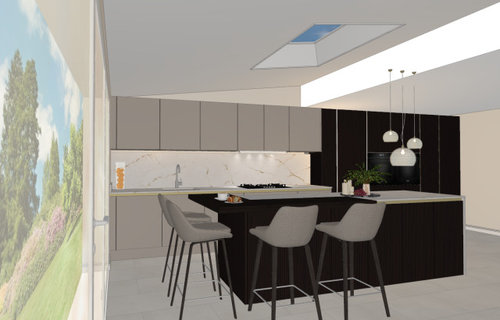
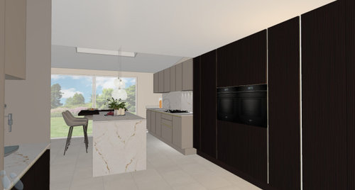
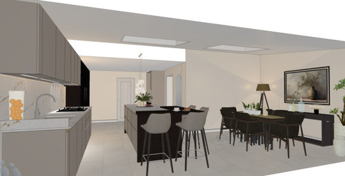
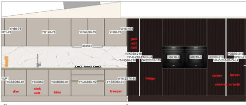
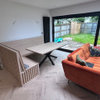
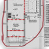
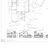
Just wanted your thoughts on a proposed kitchen layout (please refer to the attached images).
I initially liked the hob and sink on the wall run, but I'm now deliberating on moving the sink to the island and centring the hob so there is more countertop space either side (120cm as opposed to 60cm). The sink will not be used for washing up as we decided on using an adjacent utility room for that purpose (the dishwasher is there as well).
I'm also not sure the pull out tower larder right of the counter is a good idea. I had thought it would be useful for spices and sauces, but I am now thinking of increasing the sizes of both end larders to 60cm and having symmetry in all the tower units. Just makes for a cleaner aesthetic?
We're undecided on the colours - likely will change the cream to a lighter off white. The island perhaps would look better in just the off-white rather than having the textured brown. I suppose this is down to personal preference, but think it would look cleaner.
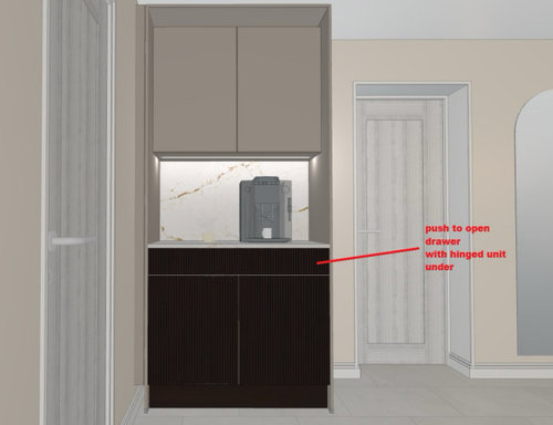
I also think the coffee station would look better in all off-white or all brown rather than mixing the two, but not sure which! Again, this is down to personal preference but would be good to hear others' thoughts. Thanks!
Also, has anyone had a kitchen from Kutchenhause or Nolte? I'm torn between the two, with the latter having more cabinet front options (one in particular which we like - the brown one) but it comes with a hefty premium!





minnie101
Jay SOriginal Author
Related Discussions
Kitchen layout advice needed
Q
Sorry, another kitchen layout/re-design question
Q
Open plan kitchen layout for kitchen diner/playroom.
Q
Kitchen Diner / Utility question(s)...
Q
Lifestyle Kitchens
Jonathan
Lifestyle Kitchens
Jay SOriginal Author
Jay SOriginal Author
Jonathan
Jay SOriginal Author