Decorating
6 Bold Colour Pairings We’re Loving on Houzz Right Now
Keen to add some colours to your interior but unsure what makes a winning combination? Look no further...

From a zingy combination of turquoise and coral and a sophisticated partnership of pink and charcoal to a full-bodied collision between mustard and plum, the pairing of two complementary colours can be a powerful thing, transforming a space entirely. Check out these pukka partnerships and let us know your favourites in the Comments.
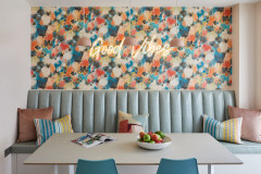
2. Burnt orange and dark aquamarine
Perhaps taking a cue from a peacock feather, this rich combination works because it’s the right way round.
Of the two shades, it’s the burnt orange that’s dominant – which is why Davonport Kitchen & Home opted to make it the secondary, accent colour here. (Imagine the two reversed – orange walls, green seating – and the result might not be as conducive to relaxing into a meal).
This way round, though, while each colour makes its mark, the bench seat jumps out while the wall colour sets the mood.
Thinking of renovating? Find and hire everyone you need, from interior designers to builders, carpenters and decorators, on Houzz.
3. Buttermilk and slate
Turning the convention of having a dark colour on the bottom half of a wall and the lighter shade above, this scheme by OPEN architecture gives the bathroom a more striking appearance.
The colours are cleverly linked, however. The dark frame on the shower screen (right) brings the grey into the bottom half of the room, while the doorway (seen in the mirror) is painted pale yellow and “breaks into” the darker upper half of the room.
These small details stop the feeling that the walls are closing in, which can be a risk when breaking this particular design “rule” (and breaking rules should always be encouraged – it just takes skill to do so with panache).
4. Turquoise and coral
There’s something distinctly seaside-y about the combination of these two vibrant shades – like a pinkish reef glimpsed through translucent blue-green tropical waters.
They also feel a little retro. The duo, employed here by architect Karen Parry, is often seen together in a midcentury palette and extensions of each colour would also work or could be added if you wanted to go for additional shades (think mustard and tan and variations on turquoise from aquamarine to rich teal).
It’s a joyful and fun juxtaposition.
5. Blush and inky blue
Masses of pink isn’t for everyone, but just a touch of this soft shade can really lift a scheme. In this kitchen by Glorious Building Co, the blush bar stools look glamorous and grown-up – not sickly or sweet. The deep blue backdrop tones down what can be a cutesy colour and gives it an edge.
More: 15 Richly Coloured Utility Rooms
6. Plum and mustard
For starters, these two hues are on opposite sides of the colour wheel, making them naturally complementary because they contrast yet have harmony.
The beauty of the example in this trad-with-a-twist kitchen, designed by Emilie Fournet, is that the two shades chosen are of equal intensity, which can be a helpful rule of thumb to observe when debating a palette.
Tell us…
Are these palettes perking up your renovation ideas? Which combo is your favourite? Let us know in the Comments.
The dusty nature of these mid-pink walls is warmed by the sun-like glow of that ochre canopy. The latter adds life to this child’s sweet bedroom and because, tonally, it’s complementing rather than competing with a shade of a similar level, the feel of the room remains calm. It’s perfect for a space in which to encourage good sleep.
Oatmeal-coloured features make for a neutral backdrop that lets the key colour duo take the lead.