Houzz Tours

House Tours

Houzz Tour: A Compact Flat Full of Clever, Space-maxing Ideas
The owners had originally intended to sell this flat, but loved the cool, airy redesign so much they kept it

When interior designer Alex Dauley first saw this petite flat in south London, it had been rented out for years; the decor was tired and the layout wasn’t making the most of the space. The owners, who’d also been the landlords, were keen to spruce it up so as to be able to sell it, but after Alex’s work on the place, they were bowled over and didn’t want to let it go. Enter their grown-up daughter, who was also very impressed – so much so that she and her partner decided to take on the flat and move in themselves.
“They weren’t expecting the finishes and end result to look as nice as they did, given the space we were working with,” Alex says. “But I always knew it would look great – I had a vision for the flat.” Check out the before and after photos for yourself below.
“They weren’t expecting the finishes and end result to look as nice as they did, given the space we were working with,” Alex says. “But I always knew it would look great – I had a vision for the flat.” Check out the before and after photos for yourself below.
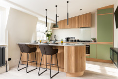
The new kitchen is fully bespoke, designed by Alex and built by her joiner. It meant she could make good use of every centimetre and, while she didn’t change the layout of the kitchen substantially – the locations of the appliances remained – there were subtle but significant tweaks.
For example, as you can see here in a pre-renovation photo, none of the appliances had previously been integrated, so the effect was visually cluttered.
The room had also felt dark – in part thanks to walnut-coloured cabinets and a black worktop – and unstreamlined, with wall cabinets intruding into the space on the left, above the hob, all of which added to the cramped feeling.
Find and hire an interior designer on Houzz today.
In the revamp, Alex opted for inset handles. “I didn’t want anything that protruded,” she says. She chose oak for this detail and the material is replicated around the room, which adds a sense of cohesion.
Elsewhere, many features are strategically light in colour, including the white induction hob. “I wanted the appliances, tap and so on to melt into the background,” Alex says.
The ceiling-mounted extractor is also white and barely visible. “We didn’t have enough depth for a pop-up,” she says, “and the client didn’t want to spend on a downdraft extractor. Also, the new window restricted options, so we chose a really nice, slimline ceiling design. It was never going to be a feature, so we aimed to hide it away.”
To ensure the pale scheme didn’t look bland, Alex added texture and carefully included a little deviation from all-white. “The beautiful tiles add a punch of colour,” she says. “Everything in the kitchen is a matt finish, so I wanted to bring a different materiality into the space and these are glazed, so also bounce light around the room.”
The tall cabinet on the left is a fridge-freezer with storage above and, next to the sink, there’s a slimline dishwasher and the washing machine.
Composite worktop, Apollo. Tiles, Ca Pietra.
Before, a bulky radiator took up valuable wall space. Alex has replaced this with a tall, skinny model that looks great in its own right (see first photo). She also bumped it along the wall a little, so it didn’t sit right where the dining table needed to go.
Although there were no major structural changes to the flat, Alex did remove part of the wall between the kitchen and hallway.
“This was the biggest change,” she says. “The hallway was cramped and dark, as was the kitchen, so we put in a glazed section of wall. It’s small, but it makes a huge difference to both spaces. The hall now feels much lighter, as it steals light from the kitchen, and the kitchen seems larger.”
A knock-on effect of giving up this wall space for glazing was the risk of losing valuable storage. To avoid this, Alex replicated what had been over the hob on the opposite wall. She also added a wall cabinet over the dining table.
Beyond the window, two doors are visible. The door on the right leads to one of the bathrooms, the other is the main door into the flat. Alex painted them and changed the handles to unify the aesthetic.
This side of the kitchen before felt cluttered thanks to wall cabinets and a bulky extractor hood protruding into the space.
The new internal window and its view into the kitchen seen from the hallway.
Read about the interior design charity Alex Dauley set up to promote diversity within her industry.
Read about the interior design charity Alex Dauley set up to promote diversity within her industry.
Previously, the wall on the right was completely unused.
It now hosts three shelves flanked by two discreet wall cabinets. “It’s nice to have open shelving along that chimney breast to allow for some display and colour, as well as additional storage,” Alex says.
The worktop is pale but lightly flecked with copper. “It adds subtle texture and is warmer than plain white,” Alex says.
“Because the kitchen and dining space are narrow and the dining table isn’t used all the time, we needed to come up with a clever way [for the owners] to be able to eat without taking up too much space,” Alex says of the oak veneer foldaway table she designed. “It has storage within it for a couple of chairs.”
The chairs fold and can be tucked into the table when it’s not in use. “They slide in, and when the table is closed, you can’t see them inside,” Alex says.
At the other end of the room, Alex tiled the chimney breast. “I wanted to do something a little different. When you do neutrals, it’s really important to have texture. These cream tiles give just a little bit of interest without being in your face,” she says.
Opposite, there’s more texture in the form of silk-effect wallpaper.
Wallpaper, Colefax and Fowler.
Opposite, there’s more texture in the form of silk-effect wallpaper.
Wallpaper, Colefax and Fowler.
Previously, the walls weren’t working at all hard.
Alex also made good use of the alcove on the other side of the chimney breast and created a work-from-home space with a small, bespoke desk.
The wall on the right wasn’t flat and Alex needed to build around it. “That’s why everything needed to be custom-made,” she says. “It’s the best way to maximise space.”
She also added a cupboard to the desk, which provides a little storage, but also hides an electrical box. “It’s a win-win,” she says.
“The space couldn’t take a lot of furniture, so we went for one really large sofa with legs, so it was up off the floor, giving the illusion of more space,” Alex says.
Sofa, Ikea.
Sofa, Ikea.
The old sofa looked bulkier because it sat directly on the floor, with no visible space beneath it. The colours of the new sofa and cushions have also really softened the aesthetic on this side of the room.
“The main bedroom is small, but goes onto a balcony, which is very nice,” Alex says.
“It was a bit of an odd shape, so we custom-made floor-to-ceiling wardrobes in a lovely oak veneer with very simple slab fronts. No fuss,” Alex says.
Conversion flats are often chopped about a bit and, here, an awkwardly positioned chimney breast influenced the shelving on the right.
“Having the chimney breast to one side was throwing the whole room off,” Alex explains, “so I said, ‘Why don’t we build some open shelves on the other side, so the bed feels purposely centred in the room?’ It meant the bed felt it belonged.”
“Having the chimney breast to one side was throwing the whole room off,” Alex explains, “so I said, ‘Why don’t we build some open shelves on the other side, so the bed feels purposely centred in the room?’ It meant the bed felt it belonged.”
There was no space for bedside lighting, so Alex added these terracotta pendants.
The window belongs to the balcony door. “We [used shutters] through the whole space; it keeps things simple,” she says. “Nothing in this flat could afford to be fussy, it just needed clean lines and no clutter, which makes the space feel larger.”
As one of three flats in a converted house in an urban area, soundproofing was not only a desirable feature, it was a Building Regulations requirement. As such, Alex opted for carpet and installed acoustic panels.
Herringbone carpet, Crucial Trading.
Alex gave the main bathroom (there’s a second, smaller one, not shown) an overhaul, removing a bath with an overbath shower, a too-large pedestal basin, a close-coupled toilet and floor-to-ceiling cream tiling. “They never used the bath and it’s not really a family flat, so it was easier to take it out entirely,” Alex says.
A new back-to-wall toilet created space above it for storage, which Alex enclosed behind push-to-open doors. “It was important we were able to have as little on show as possible and create as much storage as we could,” she says.
A smaller basin has been wall-hung, creating more floor space, and a mirror with wall lights attached confuses the eye into seeing a larger room. A small ledge provides space for a little display and personalisation.
Without being matchy-matchy, the aqua marine zellige tiles pick up on the tones of the ones in the kitchen. Brass, also repeated around the flat, introduces warmth, as does the oak detailing, again picking up on the use of this wood elsewhere.
“Every single room talks to the others,” Alex says. “There’s a common thread that runs through all the spaces, so the whole home feels cohesive and considered, which also makes it feel bigger.” Right on brief, then.
Tell us…
What’s your favourite detail in this cleverly designed flat? Let us know in the Comments.
Who lives here? A couple
Location Battersea, south London
Property A middle floor conversion flat in a Victorian house
Size Two bedrooms and two shower rooms
Designer Alex Dauley
Project year 2021
Photos by Tom St Aubyn
“The whole project was about taking this very small property and maximising it as much possible,” Alex says of her brief. The owners, a couple, wanted the finished flat to feel light and airy, as well as being functional.
“We wanted to increase the feeling of size, even though we couldn’t increase the size per se, and that influenced the very neutral colour palette,” Alex says. The walls throughout are white, but Alex has added soft blues and greens for warmth and interest.
Also boosting the sense of space are numerous bespoke elements, which add functionality, but also make for a streamlined look. This was particularly the case in the kitchen.