Houzz Tours

Kitchen Tours
7 Genius Ideas from 2023’s Kitchen Renovation Tours
Planning a kitchen re-do? Don’t start before you’ve absorbed some of these clever, inspiring designer tricks

You know when you visit someone’s place and they have a feature in their kitchen that wows you – something that has you going home thinking: why didn’t I think of that?
It’s a thought we often have when writing our many Kitchen Tours, which are packed with ingenious ideas by clever professionals. From concealed blinds for patio doors to a pantry that doubles as a lightwell and the pre-loved cabinets made to look brand new, we thought we’d round up just some of the best ideas to help inspire your kitchen update.
It’s a thought we often have when writing our many Kitchen Tours, which are packed with ingenious ideas by clever professionals. From concealed blinds for patio doors to a pantry that doubles as a lightwell and the pre-loved cabinets made to look brand new, we thought we’d round up just some of the best ideas to help inspire your kitchen update.
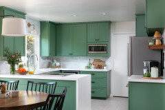
2. The flexible layout
A fully open-plan room can be perfect for hosting friends and family, but it may not work for day-to-day life.
In this 1930s house, designers Jessica and Ellie Pile of House of Norica undertook various internal reconfigurations to make the ground floor space fit the owners’ brief for a “more communal” space.
This included installing sliding barn doors between the kitchen and living room. “The ground floor is now a multifunctional space,” Jessica says. “It can be one big social area, but you can also shut the living room off if you’re entertaining or if, down the line, the children are watching TV, for instance.”
The designers picked sliding doors to maximise space. “If you want double doors,” Jessica says, “you have to factor in how far they’ll swing into the room.”
Take a look around this airy kitchen-diner
Find reviewed architects in your area on Houzz.
3. The ‘dirty kitchen’
“The ‘dirty kitchen’ contains all the things you don’t want to see – the microwave, toaster, oven,” says Lu Bai of Matthew Giles Architects, who designed this clever secret room, hidden amid a row of tall kitchen cabinets in an Edwardian house. “The worktop continues inside and it’s also somewhere you can put all the washing-up before you deal with it.”
The exposed original brickwork is a nice visual contrast when the door is open. And when it’s closed? You’d never know it was there.
Tour the whole of this Edwardian house.
4. The hidden roller blinds
Extensive glazing can be wonderful during the day – but at night, when there’s nothing but a shiny black surface between you and the garden…? Not everyone will enjoy that feeling of exposure, nor the aesthetic of the cold, black glass.
Curtains are an option, but may take up more floor space than you would like, or simply not float your boat in a kitchen space. So what can you do? Make like architect Francesco Pierazzi, who ingeniously created a pocket cavity in the bulkhead where roller blinds can be concealed during the day, then pulled down for privacy in the evening.
See more neat designs in this modern renovation.
More: How to Start a Kitchen Renovation
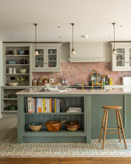
5. The new kitchen that isn’t new
When the owners of this Victorian semi briefed Emma Gurner of Folds Inside, they wanted to transform their whole kitchen, but didn’t want to replace the old cabinets or their appliances. A tough ask.
Yet Emma pulled off an impressive, waste-saving transformation, successfully reusing – and reinventing – the existing dark wood kitchen.
She had the cabinets professionally sprayed using two tones of blue paint – a darker shade on the base units and a fresher pale blue on the wall and tall unit (click on the link below to see the paler units). She then fitted modern brass handles to replace dated curved steel ones, and laid red, chevron-patterned encaustic tiles on the floor.
Discover how colour breathed new life into this open-plan room.
6. The bonus internal window
The middle room in Victorian properties that have been extended – often it’s the one that used to have French windows opening onto a side return – are notoriously dark, having been enclosed in the centre of the house by the new extension.
We’ve come across some great solutions to this common conundrum on Houzz, but this is the first time we’ve seen this idea. “The owners didn’t want the back of the kitchen to be too dark, which is often a problem with these extensions,” architect Kieran Hawkins of Cairn says. “So we used the pantry as a way of bringing light into [both] the kitchen and the living room. It’s a top-lit little space and acts almost as a lightwell, because it’s flooded with natural light [from a small window opposite this one, above the kitchen ceiling].”
“The pantry is one of the least-occupied rooms in the house, but it’s actually one of the most important in terms of making all the others work,” he says. “Without it, the living room would be really dark.”
Learn more about how this clever pantry works.
7. The triangular pantry
One of the owners of this kitchen runs a baking business from home and needed more space for her cake-making. She and her husband also wanted him to be able to cook and entertain within the same space – at the same time as she was baking – but without expanding the room’s footprint.
Julia Yong of York House Designs wasn’t phased, and cleverly made full use of the tight space. At the epicentre of the new kitchen’s design was the owner’s pantry, which – due to spatial constraints – had to share an awkward-shaped triangular spot with the underfloor heating manifold.
The new cabinet is designed to make excellent use of the tricksy corner space, and opens up into a small but perfectly formed standalone baking zone, with space to store tins and equipment.
See the numerous clever space-boosting tricks Julia employed in this kitchen.
Tell us…
Do you have a favourite tip or idea from a Houzz Tour story you’ve read? Share it in the Comments.
Modest additions don’t have to be flat-roofed and open-plan, as this 3.5m x 6m extension on a Victorian semi demonstrates.
Its architect, Amos Goldreich, designed the structure, which has an asymmetrical roof, to replace an impractical conservatory. He wanted to give his clients something a little different to bring both character and practicality to the new room.
The semi-open-plan space is divided by rafters, which both connect the two areas and extend down to become a room divider containing storage and shelves open to both sides.
Read how the design for this broken-plan space came about.